Back to:
Drawing Scatter Graphs WORKSHEET
Suitable for Grades: Algebra I, IM 1
CCSS: 8.SP.A.1, HSS.ID.B.6
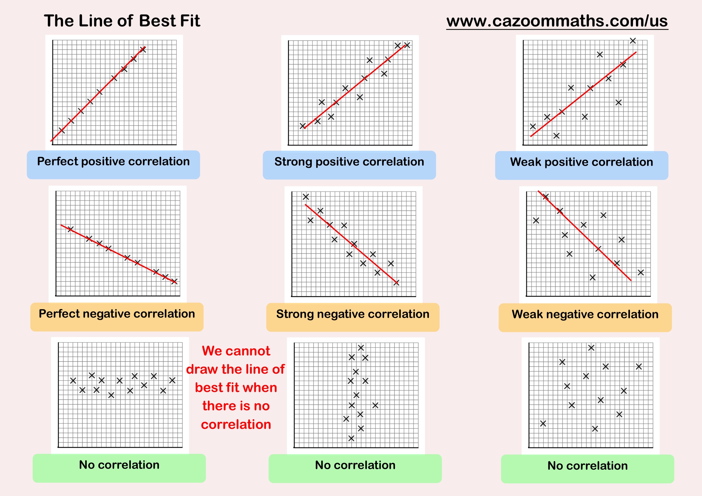
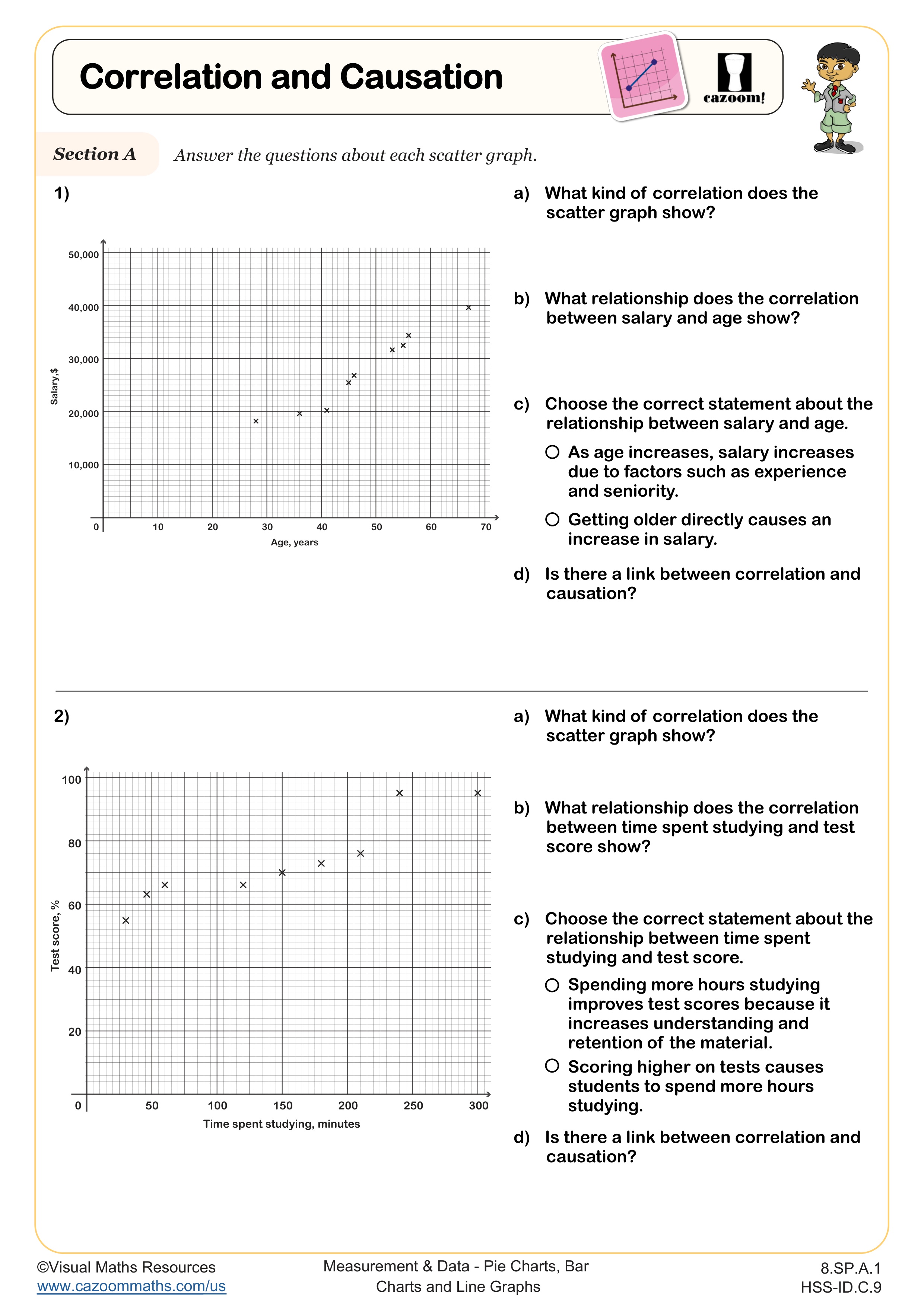
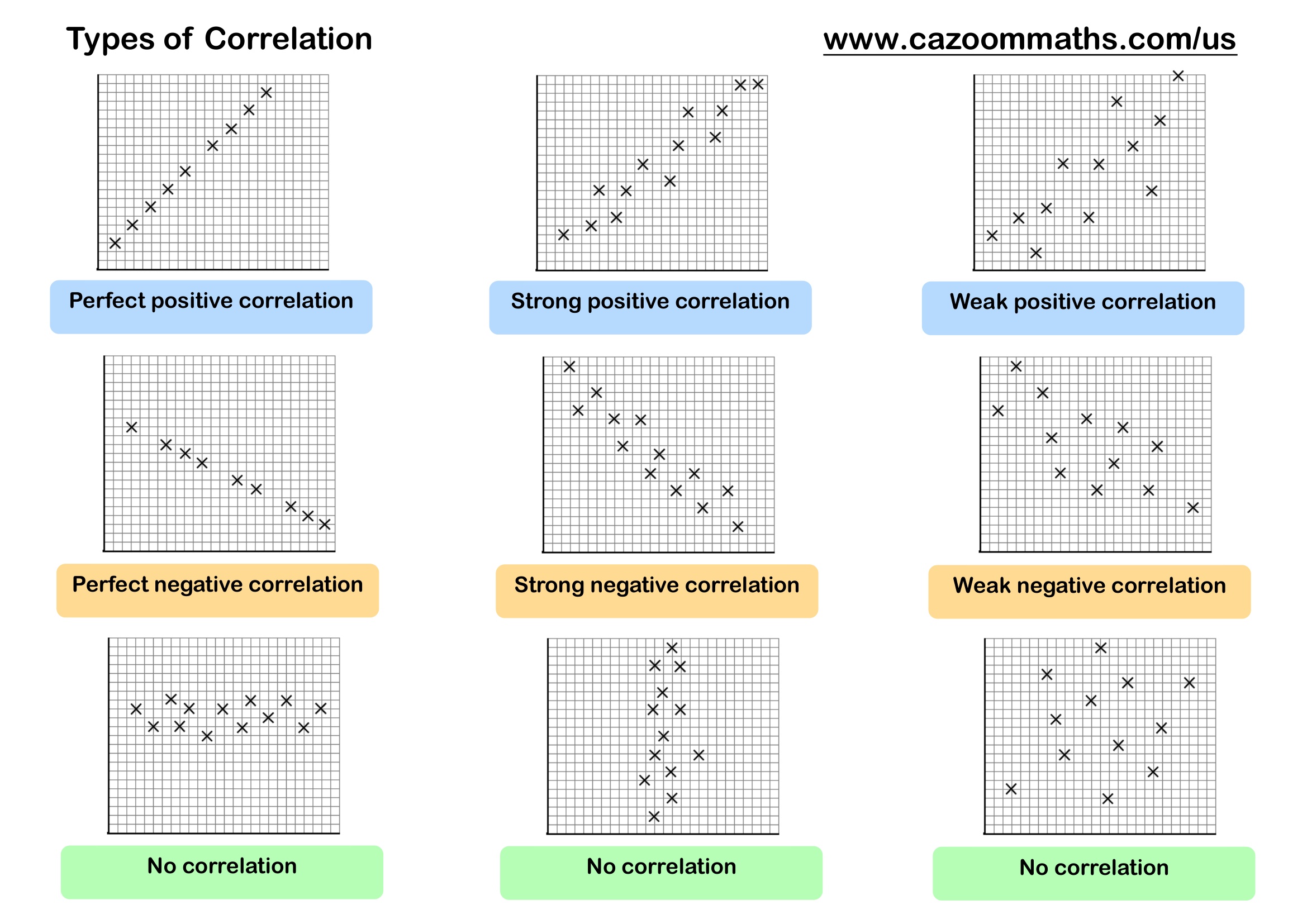
CCSS Description: Construct and interpret scatter plots for bivariate measurement data to investigate patterns of association between two quantities. Describe patterns such as clustering, outliers, positive or negative association, linear association, and nonlinear association.
Represent data on two quantitative variables on a scatter plot, and describe how the variables are related. a. Fit a function to the data; use functions fitted to data to solve problems in the context of the data. Use given functions or choose a function suggested by the context. Emphasize linear, quadratic, and exponential models. b. Informally assess the fit of a function by plotting and analyzing residuals. c. Fit a linear function for a scatter plot that suggests a linear association.
Represent data on two quantitative variables on a scatter plot, and describe how the variables are related. a. Fit a function to the data; use functions fitted to data to solve problems in the context of the data. Use given functions or choose a function suggested by the context. Emphasize linear, quadratic, and exponential models. b. Informally assess the fit of a function by plotting and analyzing residuals. c. Fit a linear function for a scatter plot that suggests a linear association.
Drawing Scatter Graphs WORKSHEET DESCRIPTION
This worksheet helps students practice plotting scatter graphs through a range of real-world examples.
Students are given data tables in different contexts, including weekly exercise compared to resting heart rate, the age of cars against their value, rental prices in relation to distance from a city center, and the number of ice creams sold compared with the daily temperature. Learners plot the data accurately on pre-drawn axes. The variety of examples encourages students to think about how scatter graphs can be used to identify trends and draw conclusions from everyday situations.
Working through these activities builds confidence with coordinates, strengthens graphing skills, and introduces the idea of correlation in a meaningful and engaging way.
All worksheets are created by the team of experienced teachers at Cazoom Math.

RELATED TO Drawing Scatter Graphs WORKSHEET
Frequently Asked Questions
This drawing scatter graphs worksheet is designed for students in Algebra I and IM 1 and aligns with Common Core State Standards.