4th Grade Statistics Worksheets
All worksheets are created by the team of experienced teachers at Cazoom Math.
What statistics skills do 4th graders learn?
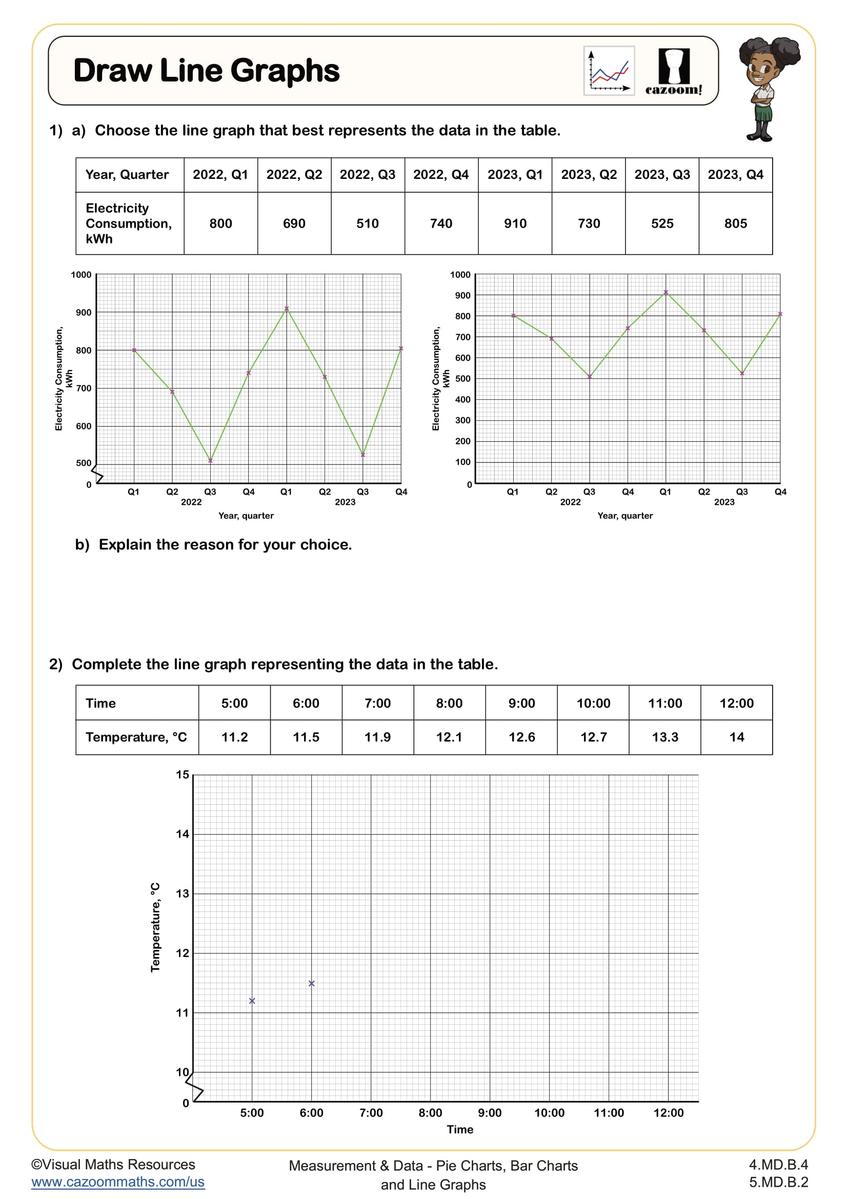
Fourth grade statistics focuses on organizing, displaying, and interpreting data through various graphical representations. Students work with line graphs to show changes over time, which aligns with Common Core Standard 4.MD.B.4. They learn to create graphs with appropriate scales, label axes clearly, and use the visual representation to answer questions about trends and specific data points.
A common error students make is plotting points without paying attention to scale intervals. Teachers frequently see students place data points evenly spaced regardless of the actual values, especially when the scale counts by fives or tens. Students benefit from practice that requires them to first examine the scale before plotting any points, which helps them understand that physical spacing on the graph must match mathematical spacing in the data.
How does 4th grade statistics build on previous learning?
By 4th grade, students bring experience from earlier grades working with picture graphs and bar graphs. They've learned to collect data, organize it in tables, and represent it visually. Fourth grade extends this foundation by introducing line graphs, which require understanding ordered pairs and coordinate grids. This represents a significant conceptual leap because line graphs show continuous change rather than discrete categories.
This work prepares students for 5th grade, where they'll create and interpret more complex line graphs with fractional or decimal values. The skills developed in 4th grade statistics also support algebraic thinking, as students begin recognizing patterns, making predictions, and understanding how one variable changes in relation to another. Many teachers find that strong graphing skills in elementary school translate directly to success with functions and coordinate geometry in middle school.
Why are line graphs important for displaying data?
Line graphs excel at showing how data changes over time, making them ideal for displaying trends and patterns. Students learn that connecting the data points with lines helps visualize whether values are increasing, decreasing, or staying constant. This representation makes it easy to spot patterns at a glance and make predictions about what might happen next in a sequence.
Line graphs appear frequently in real-world contexts that 4th graders can understand and relate to. Weather forecasters use line graphs to show temperature changes throughout the day, scientists track plant growth over weeks, and coaches monitor improvement in athletic performance over a season. These applications connect to STEM fields where data visualization is critical. Students who understand how to read and create line graphs can interpret information from news articles, scientific studies, and digital dashboards they encounter in everyday life.
How can teachers use these statistics worksheets effectively?
These worksheets provide structured practice in creating line graphs with varying levels of complexity. Students work through exercises that require careful attention to scale, accurate plotting of coordinates, and proper labeling of graph components. The answer keys allow students to check their work independently and help teachers quickly identify whether errors stem from plotting mistakes, scale misunderstandings, or misreading data tables.
Teachers find these worksheets useful for small group instruction when students need targeted support with graphing conventions. They work well as independent practice after whole-class instruction or as a review before state assessments that include data interpretation questions. Some teachers assign them as homework with clear expectations that students show their plotting process, while others use them during math stations where students can collaborate and discuss why certain data points belong in specific locations on the grid.