Algebra I Bivariate Data Worksheets
All worksheets are created by the team of experienced teachers at Cazoom Math.
What Does Bivariate Data Cover in Algebra I?
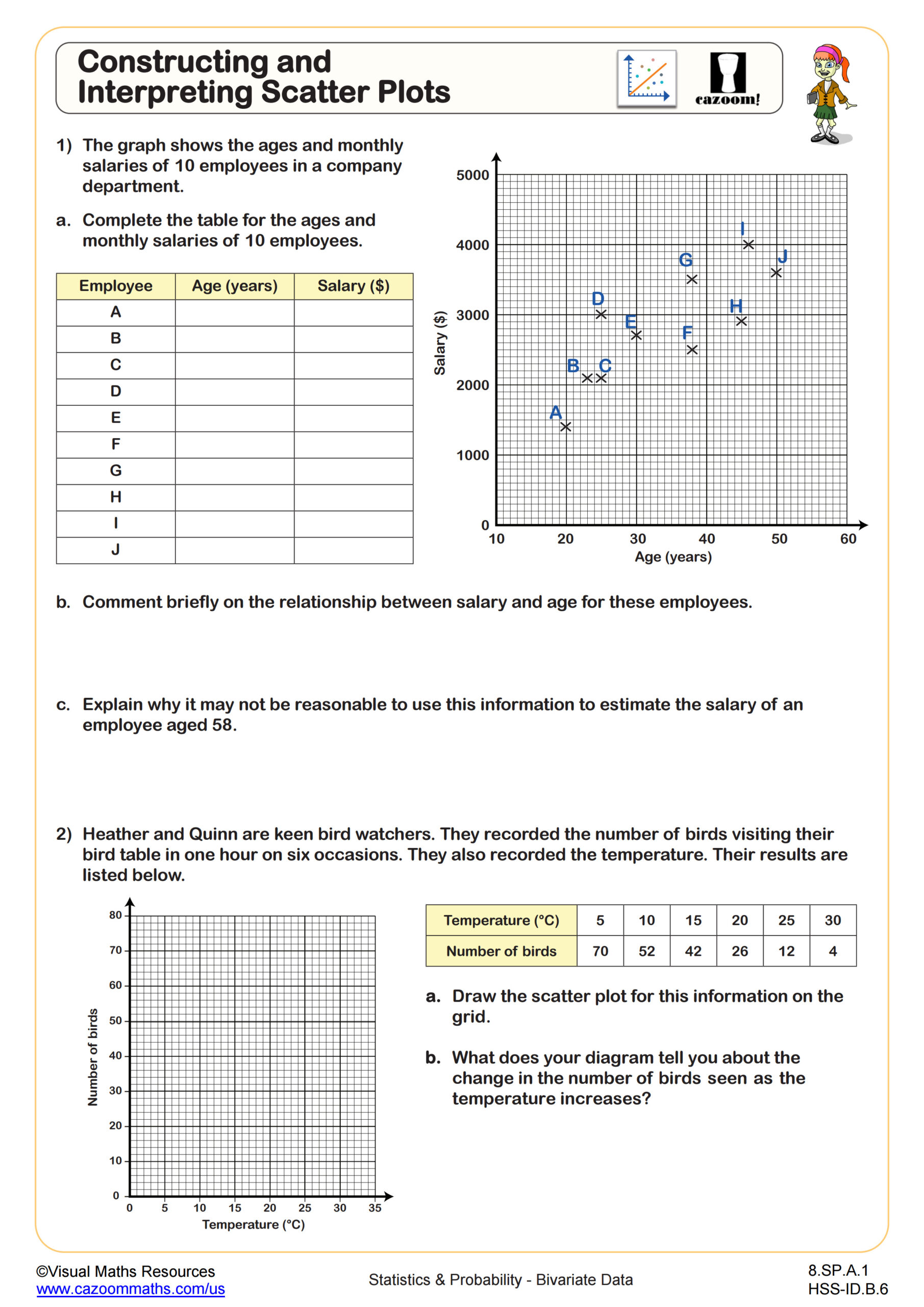
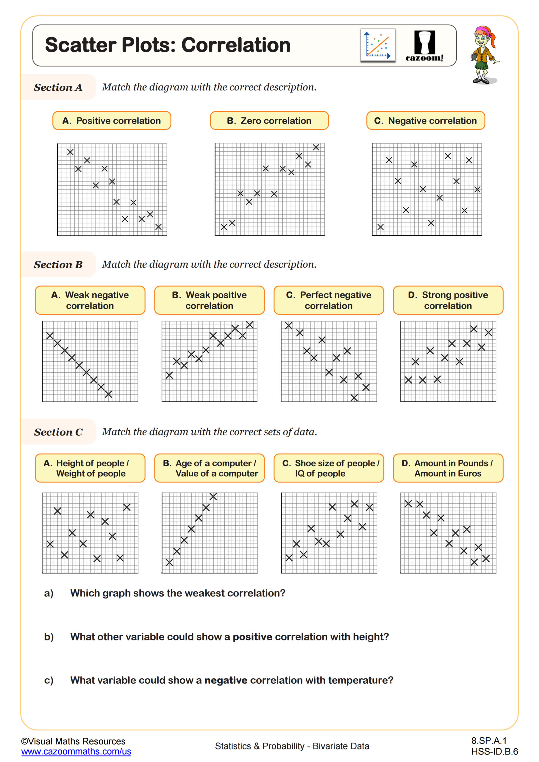
Bivariate data in Algebra I focuses on analyzing relationships between two quantitative variables through scatter plots and trend analysis. Students learn to construct scatter plots by plotting ordered pairs, identify correlation types (positive, negative, or none), describe the strength of associations, and fit lines of best fit to make predictions. This topic directly supports Common Core standards for interpreting data patterns and introduces students to statistical reasoning they'll build upon in later courses.
Many students initially plot points correctly but struggle with describing what the overall pattern reveals about the relationship. Teachers often observe that students want to connect every individual point rather than recognizing the general trend across all data. Helping students step back to see the "big picture" pattern rather than focusing on individual variations proves crucial for understanding correlation and making reasonable predictions from scatter plots.
How Does Bivariate Data Appear on Standardized Tests?
Standardized tests like the SAT, ACT, and state assessments regularly include scatter plot questions that assess whether students can interpret data patterns, identify correlation types, and make predictions using lines of best fit. Test questions typically present real-world scenarios with scatter plots already constructed, asking students to describe the relationship, identify outliers, or determine which equation best represents the trend line. Students must demonstrate understanding of what positive and negative slopes indicate about variable relationships.
Students lose points when they confuse correlation strength with correlation direction, or when they fail to recognize that outliers don't necessarily invalidate an overall trend. Another common error occurs when students select trend lines that pass through the most points rather than lines that best represent the overall pattern. Tests also assess whether students understand that correlation doesn't prove causation, requiring careful reading of answer choices that make causal claims based solely on scatter plot patterns.
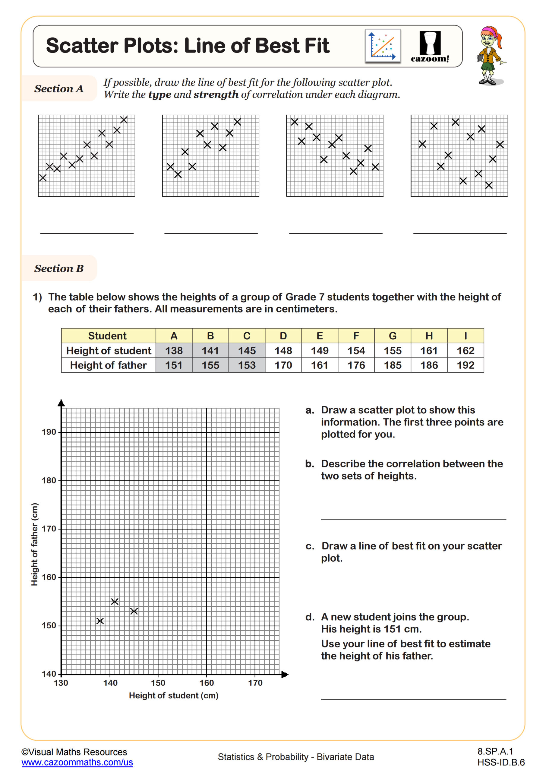
What Is a Line of Best Fit and How Do Students Use It?
A line of best fit, also called a trend line, represents the linear relationship between two variables in a scatter plot by capturing the overall direction and pattern of the data. Students learn to draw lines that have roughly equal numbers of points above and below, minimizing the total distance between all points and the line itself. While Algebra I introduces the concept visually and through estimation, students later learn formal methods like least-squares regression in statistics courses. The goal is understanding that the line summarizes the relationship and enables predictions for values not in the original dataset.
Real-world applications make this skill immediately relevant across STEM fields. Meteorologists use lines of best fit to predict temperature changes based on historical data, sports analysts project player performance trends, and environmental scientists model pollution levels over time. Medical researchers analyze relationships between exercise duration and heart rate, while economists examine connections between education levels and income. These authentic contexts help students recognize why approximating relationships between variables matters beyond the math classroom.
How Can Teachers Use These Bivariate Data Worksheets Effectively?
These worksheets scaffold student learning by progressing from basic scatter plot construction to more complex tasks involving correlation identification and trend line analysis. Each worksheet includes varied problem types that require students to work with data tables, interpret existing scatter plots, and apply their understanding to new contexts. The structured format allows students to build confidence with foundational skills before tackling multi-step problems that combine construction, interpretation, and prediction tasks. Answer keys enable students to check their work independently and identify specific areas needing additional practice.
Teachers effectively use these worksheets for multiple purposes throughout the unit. They work well as guided practice immediately following direct instruction on scatter plots, as review materials before unit assessments, or as targeted intervention for students who struggle with data interpretation on quizzes. Many teachers assign different worksheets to small groups during stations or pair work, then facilitate whole-class discussions comparing results. The worksheets also serve as homework assignments that prepare students for the data analysis questions appearing on state tests and college entrance exams, building both procedural fluency and conceptual understanding.