Algebra I Cumulative Frequency and Box Plots Worksheets
All worksheets are created by the team of experienced teachers at Cazoom Math.
What Skills Do Students Practice with Cumulative Frequency and Box Plots in Algebra I?
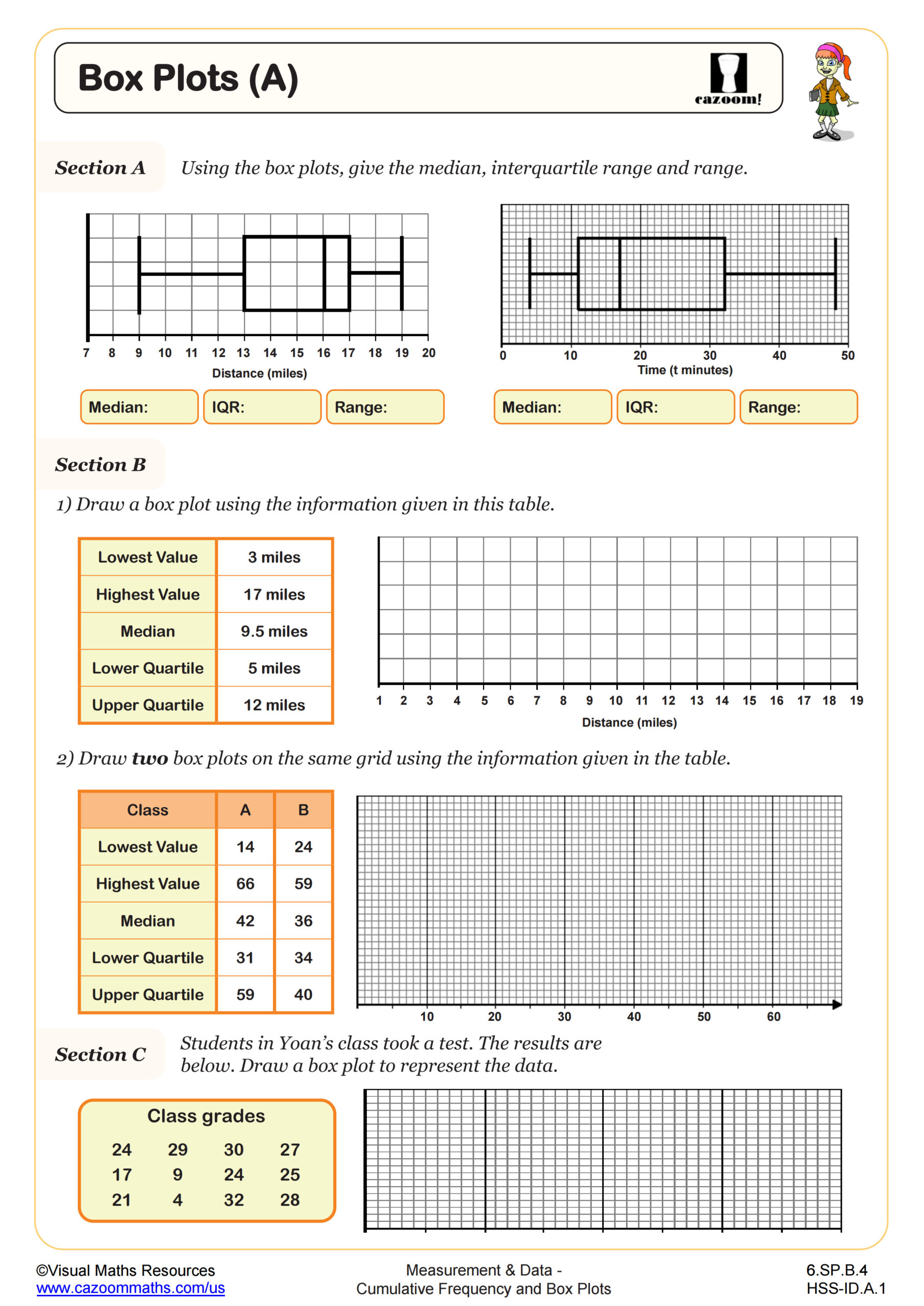
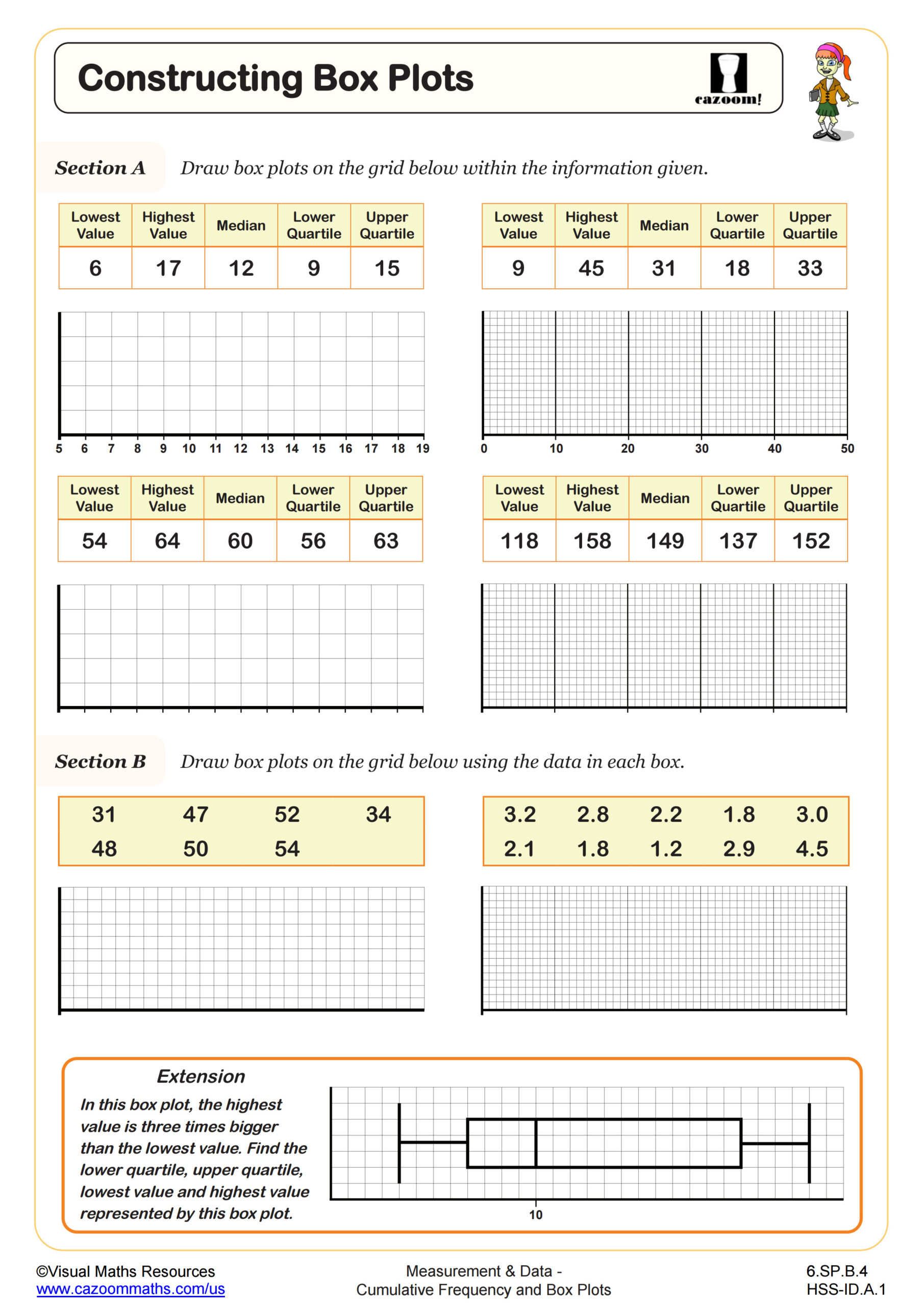
Students learn to order data, calculate the five-number summary (minimum, Q1, median, Q3, maximum), construct box plots on number lines, and interpret the visual representation of data distribution. This topic typically appears in the statistics and data analysis unit of Algebra I, connecting directly to measures of center and spread covered earlier in the course. The Common Core State Standards address this through HSS-ID.A.1 and HSS-ID.A.2, emphasizing visual representations of quantitative data.
A common error occurs when students confuse the position of quartiles with their values, particularly when working with datasets that don't divide evenly into four parts. Teachers often observe students counting data points incorrectly or forgetting to arrange values in ascending order first. Understanding that Q2 equals the median helps students anchor their quartile calculations, and recognizing that the box itself represents the middle 50% of data makes interpretation more intuitive during class discussions about real-world datasets.
How Do Standardized Tests Assess Box Plot Knowledge?
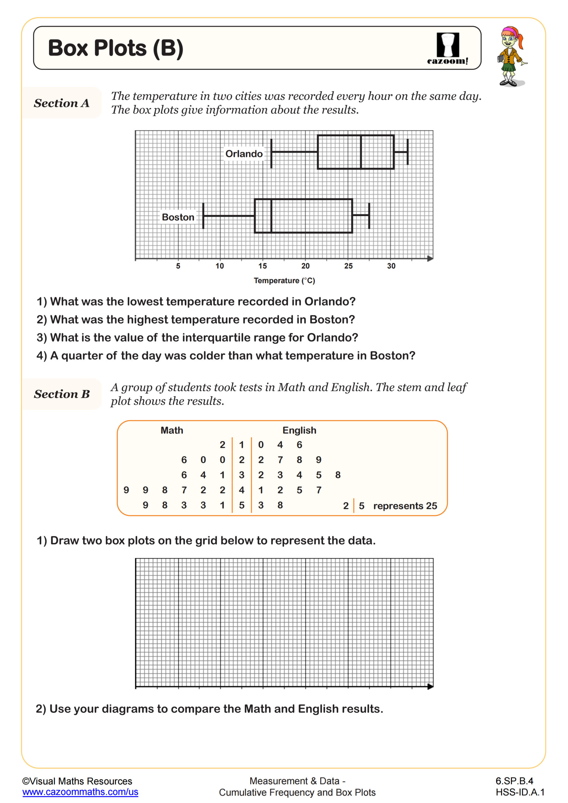
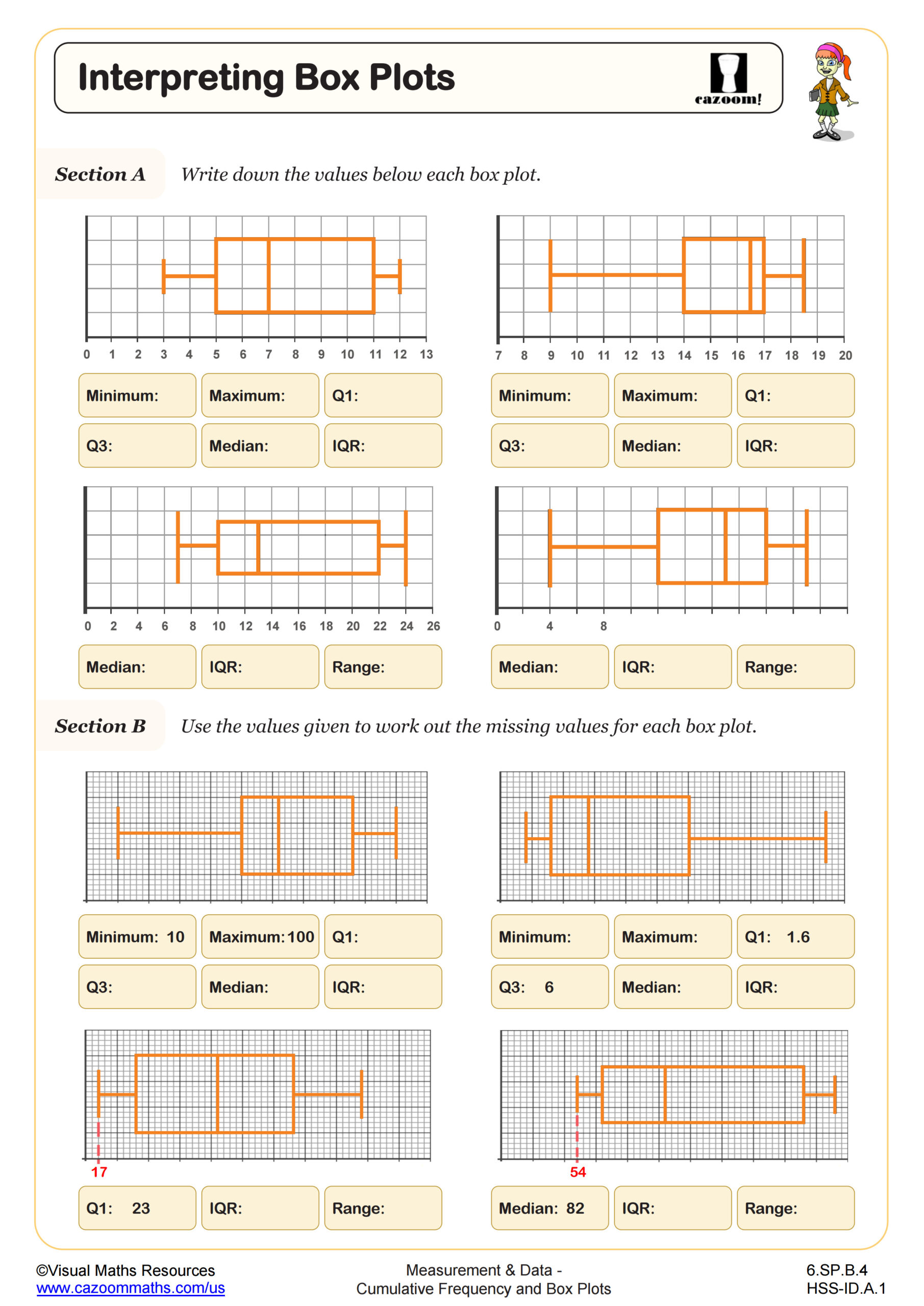
The SAT, ACT, and state assessments frequently present box plots alongside other data representations, asking students to compare distributions, identify medians and ranges, or determine which dataset matches a given box plot. Questions often require students to recognize what box plots reveal about skewness, variability, and central tendency without providing the original data. Test makers expect students to interpret interquartile range as a measure of spread and to understand that longer whiskers or boxes indicate greater variability in those portions of the data.
Students lose points when they misidentify the median as the mean or assume equal spacing between quartiles indicates evenly distributed data. Another frequent error involves comparing box plots from different scales or failing to recognize that box length directly corresponds to the interquartile range. Teachers notice that students who practice reading box plots in context, such as comparing test scores across classes or rainfall across regions, perform significantly better on these assessment questions than those who only memorize construction steps.
What Is the Interquartile Range and Why Does It Matter?
The interquartile range (IQR) measures the spread of the middle 50% of data by subtracting the first quartile from the third quartile. This statistic proves more resistant to outliers than range or standard deviation, making it valuable for comparing datasets with extreme values. Students calculate IQR directly from the five-number summary and visualize it as the length of the box in a box plot. The IQR also serves as the foundation for identifying outliers using the 1.5×IQR rule, where values beyond Q1 - 1.5×IQR or Q3 + 1.5×IQR are marked as potential outliers.
Data scientists and researchers rely on IQR when analyzing skewed distributions in fields from epidemiology to economics. Environmental scientists use box plots and IQR to compare pollution levels across monitoring stations, while quality control engineers track manufacturing consistency by monitoring whether production measurements stay within acceptable IQR bounds. College-bound students encounter IQR repeatedly in AP Statistics, psychology research methods, and any STEM course involving data collection and analysis.
How Can Teachers Use These Box Plot Worksheets in Algebra I Classrooms?
The worksheets progress from constructing box plots with clearly defined datasets to interpreting pre-made plots and comparing multiple distributions. This scaffolded approach allows students to build procedural fluency with quartile calculations before tackling the conceptual understanding required for interpretation questions. Answer keys enable students to verify their five-number summaries and box plot positions immediately, catching calculation errors before they compound into misconceptions about data distribution.
Teachers effectively use these worksheets for differentiated practice during statistics units, assigning construction problems to students still developing computational skills while challenging advanced learners with interpretation and comparison tasks. The worksheets work well as homework following introductory lessons, as review stations before unit assessments, or as intervention materials for students struggling with standardized test preparation. Pairing students to compare their box plots from identical datasets reveals interesting discussions about scale choice and outlier identification, reinforcing that multiple correct approaches exist for representing the same data visually.