Algebra I Frequency Polygons and Histograms Worksheets
All worksheets are created by the team of experienced teachers at Cazoom Math.
What Do Students Learn About Frequency Polygons and Histograms in Algebra I?
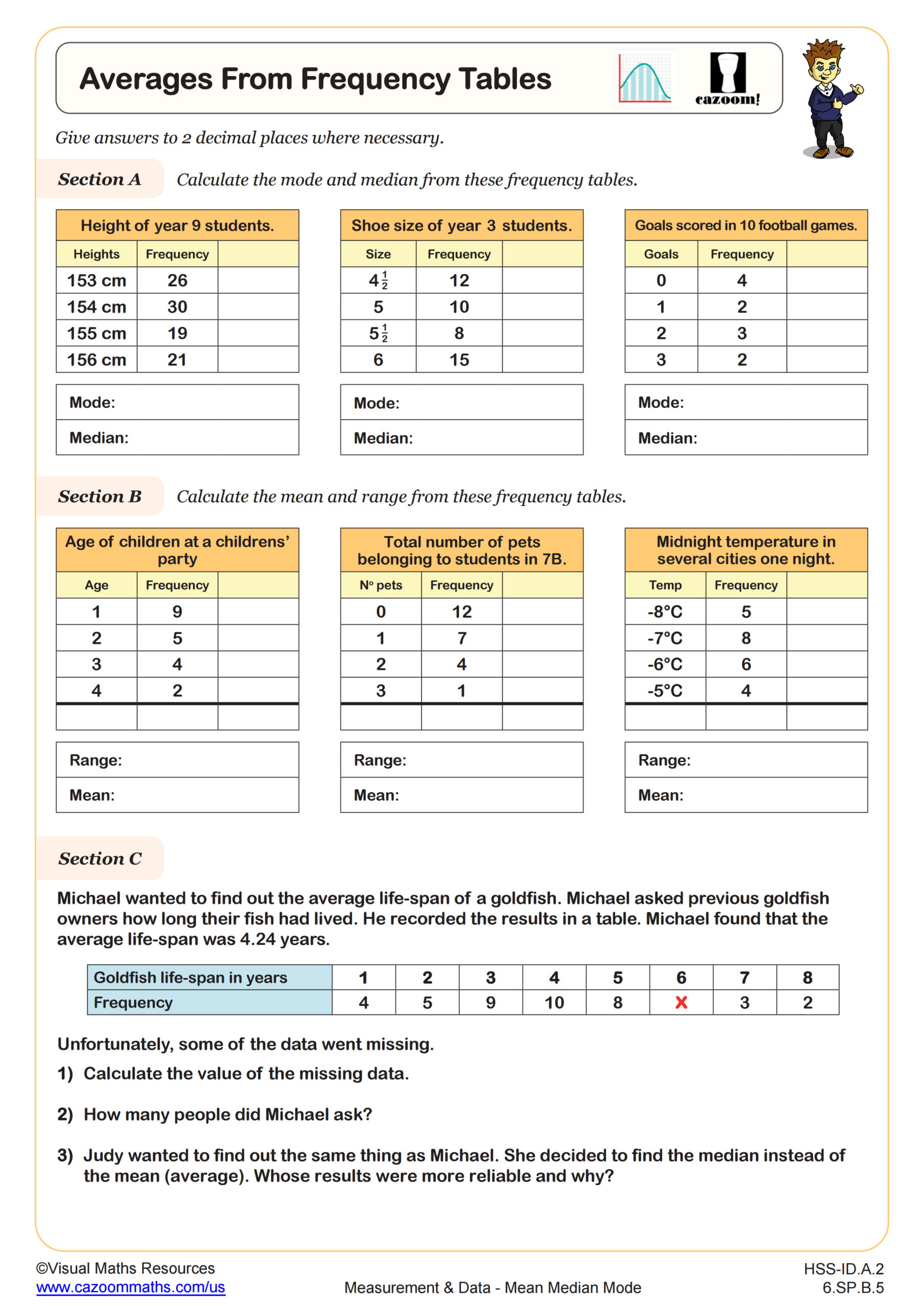
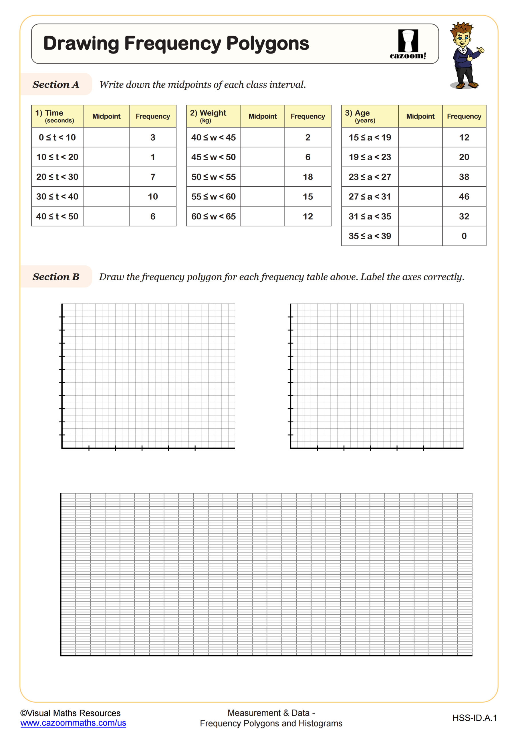
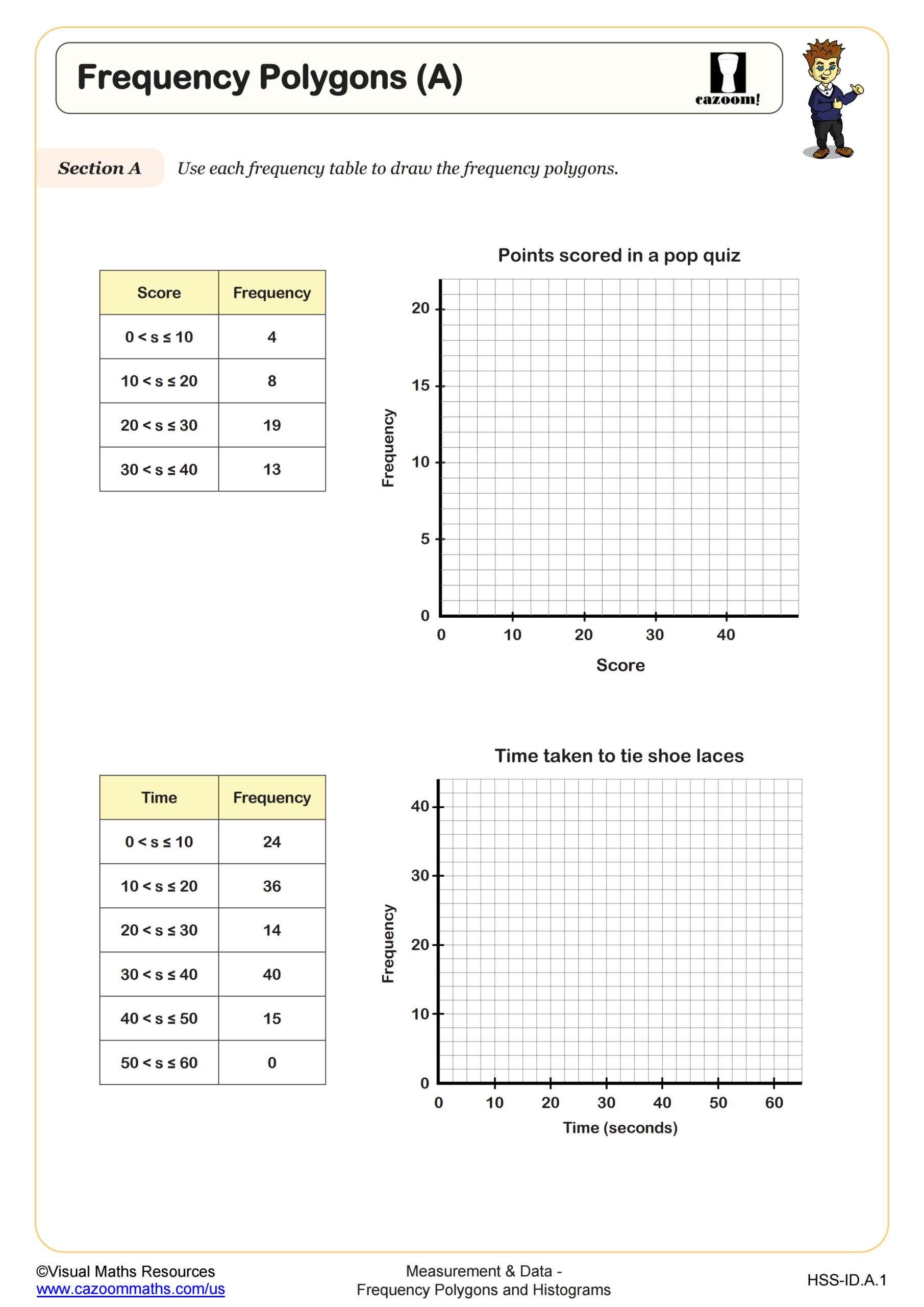
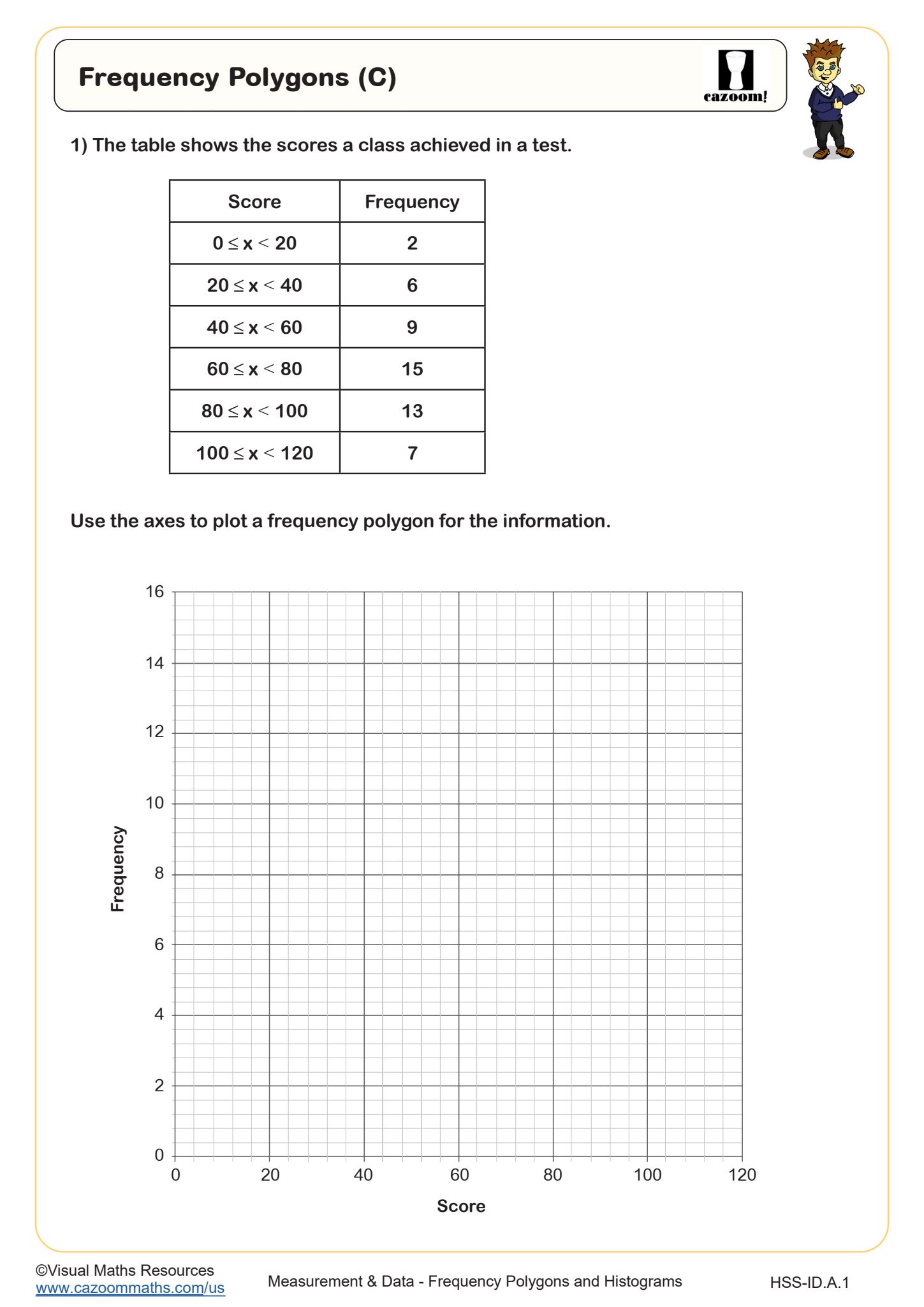
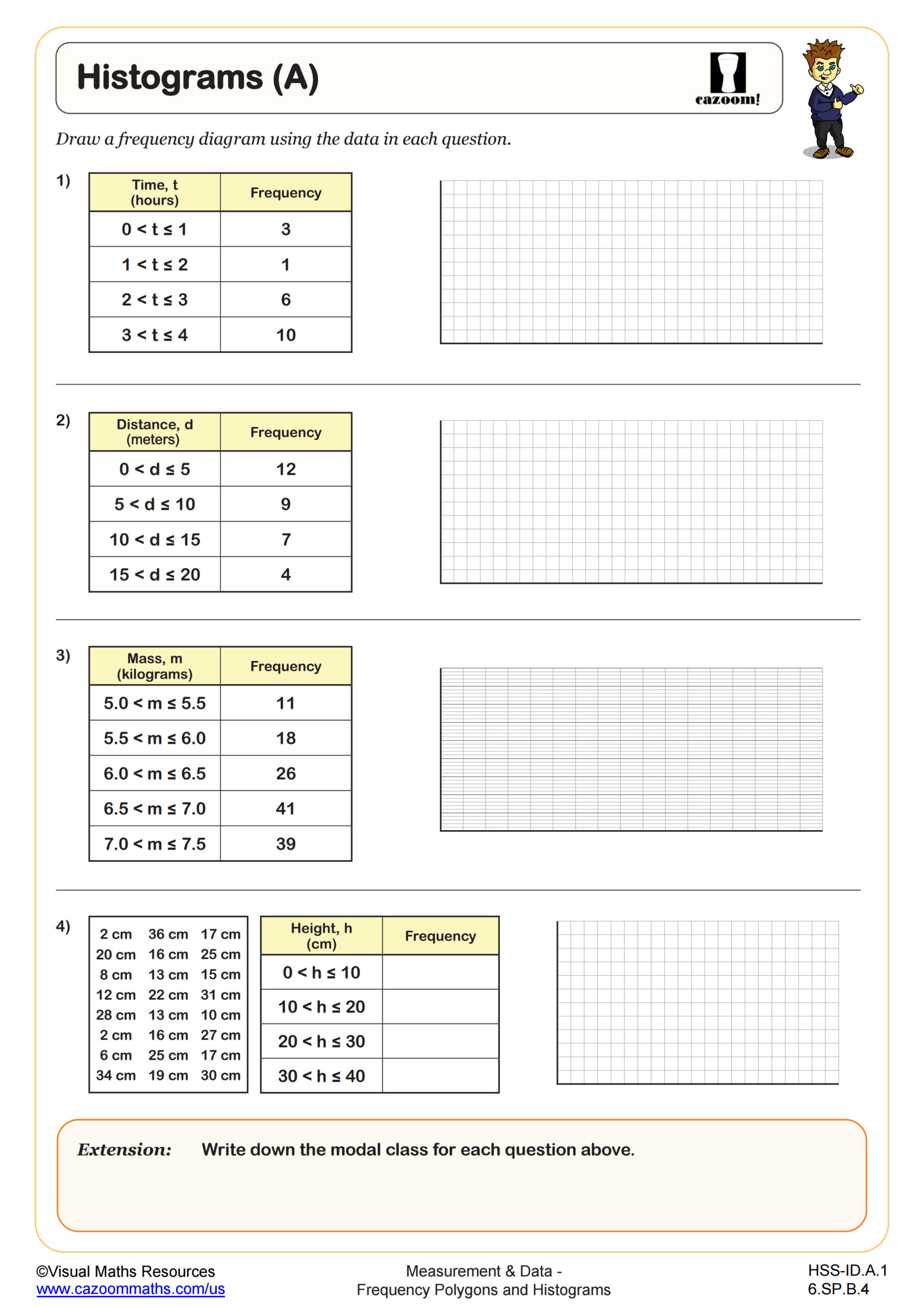
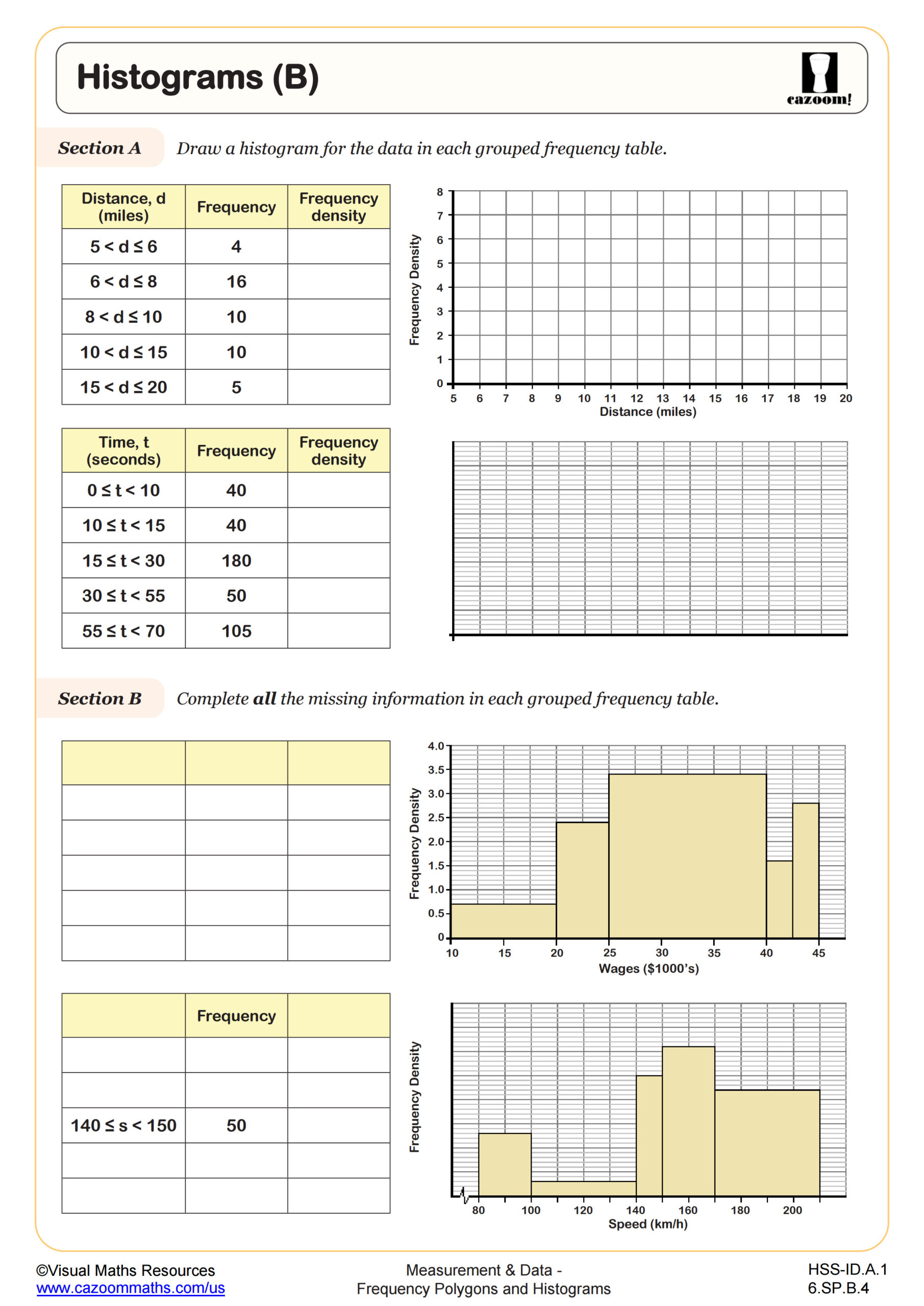
Students learn to construct and interpret histograms by organizing data into intervals and representing frequencies with bars, then extend this skill to create frequency polygons by plotting points at class midpoints and connecting them with line segments. The curriculum emphasizes understanding when each representation is most appropriate, calculating mean and median from grouped frequency tables, and recognizing how data distribution affects these measures.
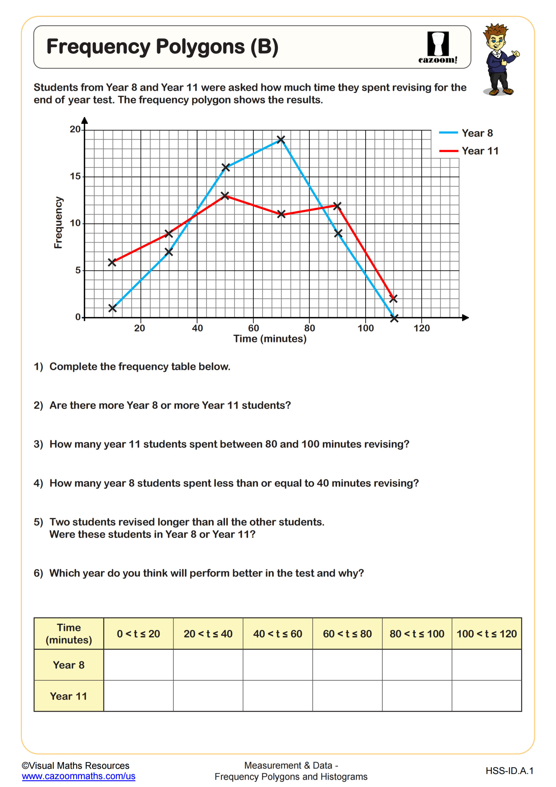
Teachers often notice students initially treat histograms like bar graphs, leaving gaps between bars or using individual data values instead of continuous intervals. A common error occurs when students forget that histogram bars touch because they represent continuous data ranges, while bar graphs show discrete categories. Students typically make the breakthrough when they recognize that both representations show the same information but frequency polygons make it easier to compare multiple data sets on one graph.
How Do Frequency Polygons and Histograms Appear on the SAT and State Assessments?
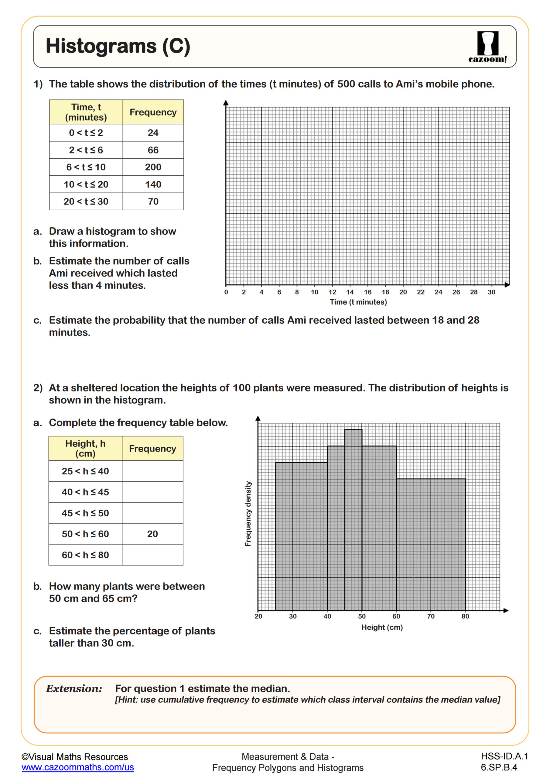
Standardized tests require students to interpret data from histograms and frequency polygons rather than simply construct them, asking questions about data distribution, comparing frequencies across intervals, or calculating summary statistics. The SAT Problem Solving and Data Analysis section regularly includes histogram interpretation, often combined with questions about percentages, probability, or identifying specific data values within ranges. State assessments test whether students can extract information from these graphs to make real-world decisions.
Students lose points when they misread histogram scales, particularly when the y-axis doesn't start at zero or uses irregular intervals. Another frequent error involves calculating the total number of data values by counting bars instead of summing the frequencies each bar represents. Many students also struggle with questions asking them to identify the interval containing the median, requiring them to count cumulative frequencies rather than simply locate the middle bar.
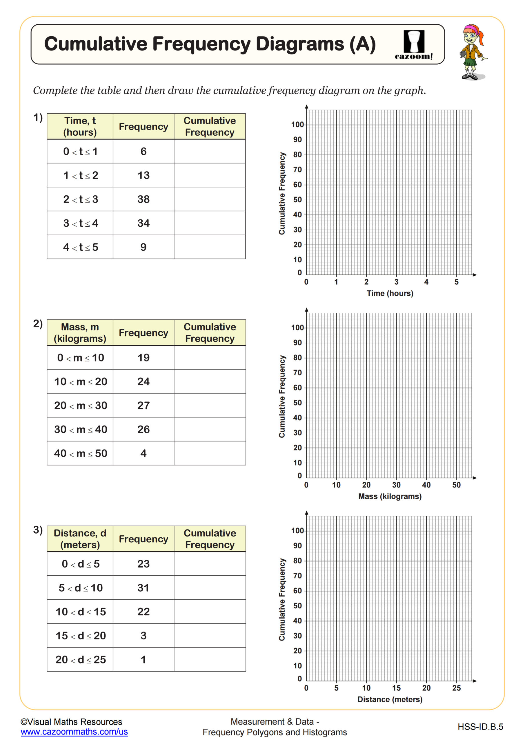
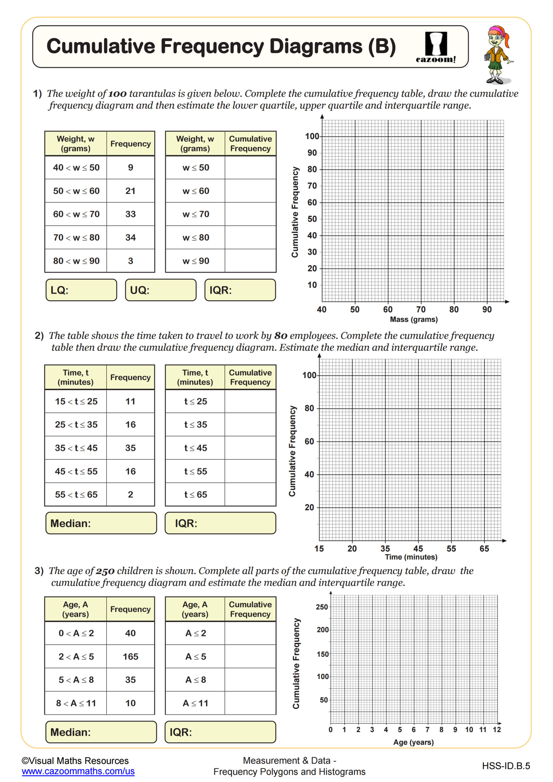
Why Do Students Connect Frequency Polygons to Cumulative Frequency Diagrams?
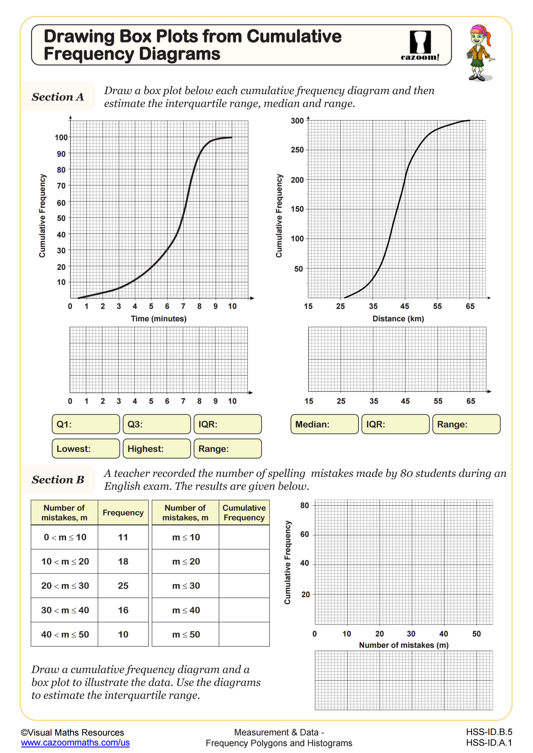
Frequency polygons show the frequency within each class interval, while cumulative frequency diagrams plot the running total of frequencies up to each class boundary, creating an S-shaped curve that helps students find medians and quartiles graphically. Understanding this connection prepares students for creating box plots, which require identifying these quartile values. Teachers find that students who practice converting between these representations develop stronger intuition about data distribution and the relationship between different statistical displays.
This skill connects directly to quality control applications in manufacturing, where engineers use cumulative frequency curves to determine what percentage of products fall within acceptable measurement ranges. Environmental scientists apply these techniques when analyzing pollution levels over time, identifying threshold values that affect ecosystem health. Public health professionals use cumulative frequency diagrams to track vaccination rates or disease prevalence across different age groups, making decisions about resource allocation based on these visual data patterns.
How Can Teachers Use These Worksheets for Algebra I Data Analysis Skills?
The worksheets build skills progressively, starting with reading and interpreting completed histograms and frequency polygons before advancing to construction tasks that require students to organize raw data, determine appropriate intervals, and create accurate visual representations. The variety includes calculating averages from frequency tables, which reinforces the connection between visual and numerical data analysis. Answer keys show complete solutions with proper scales, labeled axes, and correct interval boundaries, giving students clear models for their own work.
Many teachers use these worksheets for targeted intervention when reviewing for unit tests, assigning specific sheets that address gaps revealed during formative assessment. The materials work well for paired activities where one student creates a histogram from a data set while their partner creates a frequency polygon, then they compare representations to discuss what each shows more clearly. Teachers also find these sheets valuable for SAT preparation sessions focused on data interpretation, since the question formats mirror what students encounter on standardized tests while building procedural fluency.