Algebra I Pie Charts and Bar Charts Worksheets
All worksheets are created by the team of experienced teachers at Cazoom Math.
What Do Students Practice with Pie Charts and Bar Charts in Algebra I?
Students work with interpreting existing graphs, creating graphs from data tables, and making decisions about which visualization best fits different data scenarios. The Algebra I curriculum introduces these as part of data analysis and statistics standards, where students learn to organize, display, and analyze information. This foundation supports more advanced work in Algebra II and statistics courses, where students encounter histograms, box plots, and scatterplots.
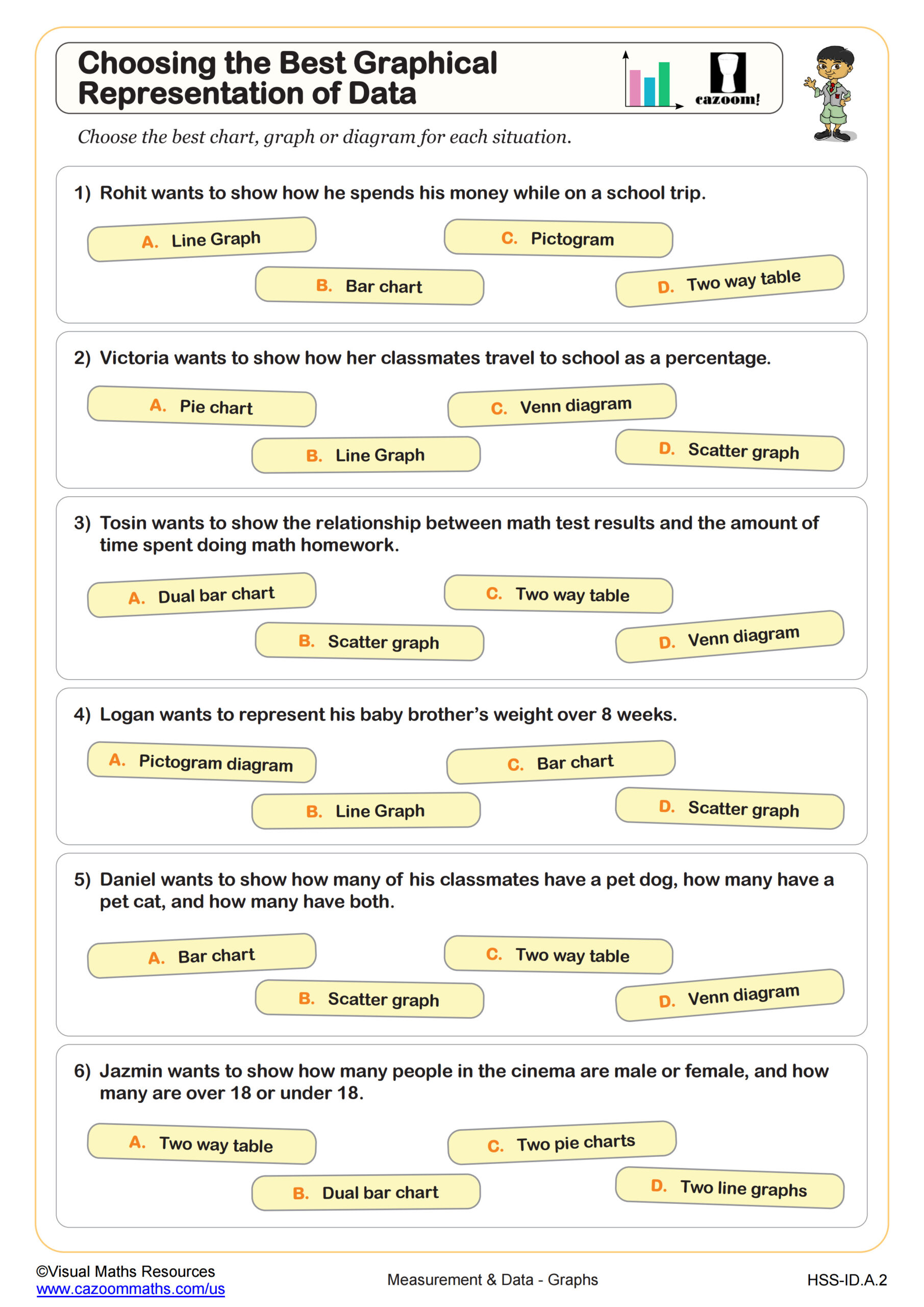
A common error occurs when students create pie charts for data that doesn't represent parts of a whole. Teachers frequently see students attempting to make pie charts for temperature changes over time or comparing heights of different buildings, where bar charts would be far more appropriate. The worksheet addresses this by presenting scenarios where students must justify their graphical choices, not just create any chart.
How Do Pie Charts and Bar Charts Appear on the SAT and State Tests?
Standardized tests expect students to read information from both chart types and answer questions about percentages, comparisons, and data relationships. The SAT includes questions where students must interpret a pie chart showing budget allocations or a bar chart comparing quantities across categories. State assessments often ask students to identify which graph type would best represent a described data set, testing conceptual understanding rather than just calculation skills.
Students lose points when they misread scale on bar charts or incorrectly calculate percentages from pie chart sections. Another frequent mistake involves comparing values across different pie charts without considering that the charts might represent different total amounts. Test questions deliberately include distractors that seem correct if students make these common errors, making practice with both interpretation and graph selection valuable for assessment preparation.
When Should Students Choose a Pie Chart Over a Bar Chart?
Pie charts work best when data represents parts of a whole that add up to 100%, such as budget categories, market share percentages, or time allocation throughout a day. Bar charts excel at comparing separate quantities that don't need to total 100%, like sales figures across different stores, test scores for different students, or rainfall amounts in various cities. Students confidently tackle graph selection once they recognize this fundamental distinction between showing composition versus making comparisons.
This skill connects directly to real-world data literacy that STEM careers require. Market researchers use pie charts to show product category distribution, while scientists use bar charts to compare experimental results across different conditions. College-bound students encounter both chart types in introductory economics, psychology, and science courses, where professors expect students to interpret research findings presented graphically. Understanding when each visualization clarifies versus confuses data helps students become better consumers of information in news media and academic research.
How Can Teachers Use These Worksheets in Algebra I Classes?
The worksheets provide structured practice in analyzing data scenarios and matching them to appropriate visual representations. Students work through examples that require them to explain their reasoning, which reveals whether they truly understand the conceptual differences between chart types or are simply guessing. The included answer keys show not just which graph to choose, but why that choice makes the data clearer, helping teachers address misconceptions during review sessions.
Many teachers use these worksheets as test preparation before assessments that include data interpretation questions. They work well for paired activities where students debate which graphical representation works best and must defend their choices to a partner. The materials also serve as intervention resources for students who performed poorly on previous assessments involving graphs, providing focused practice on the decision-making process rather than just mechanical graphing skills.