Algebra I Real Life Graphs Worksheets
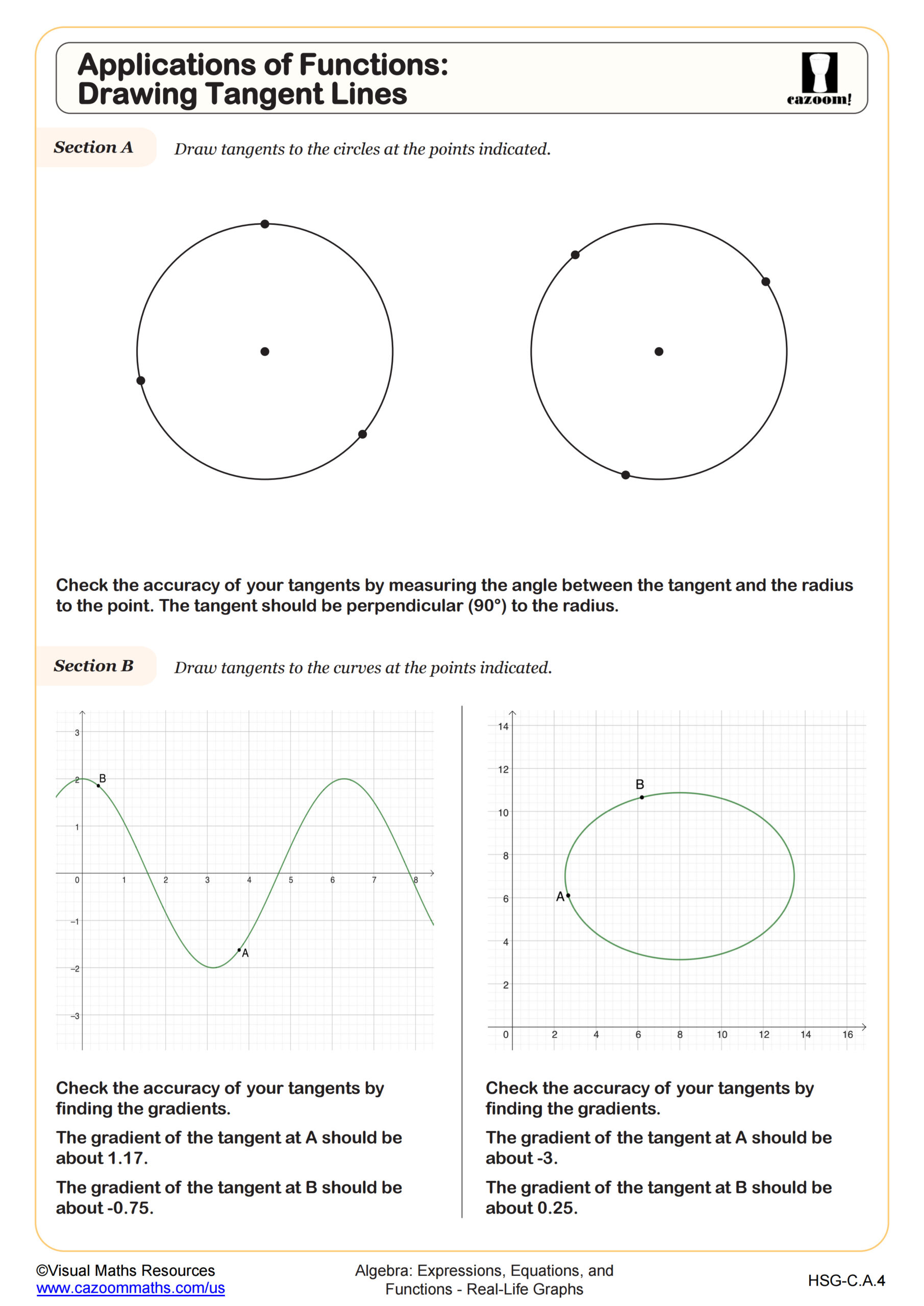
Applications of Functions: Drawing Tangent Lines
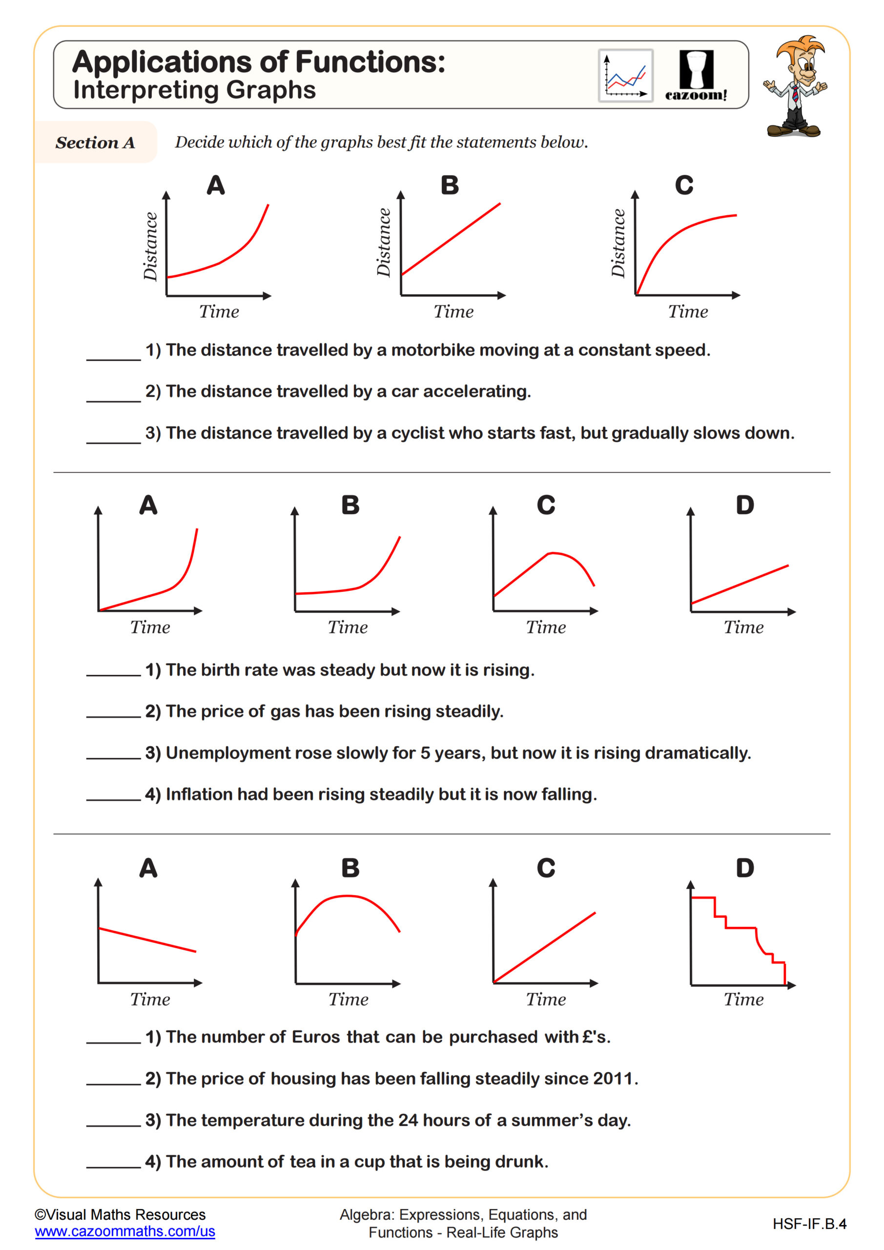
Applications of Functions: Interpreting Graphs
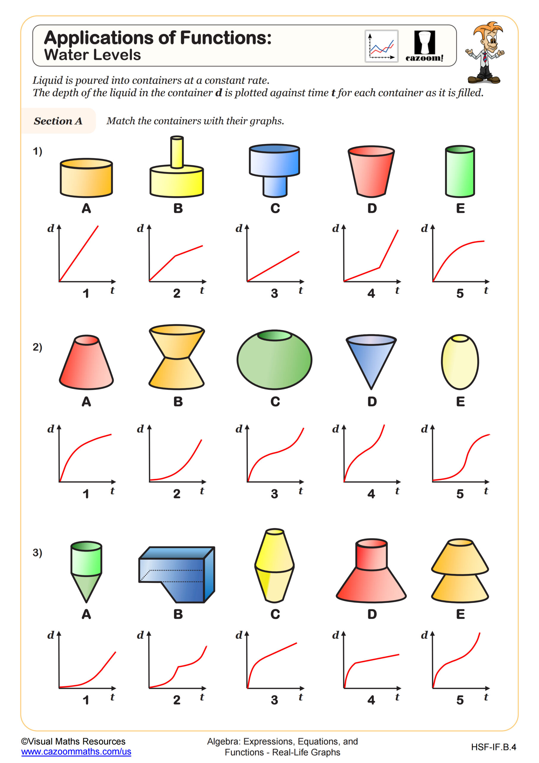
Applications of Functions: Water Levels
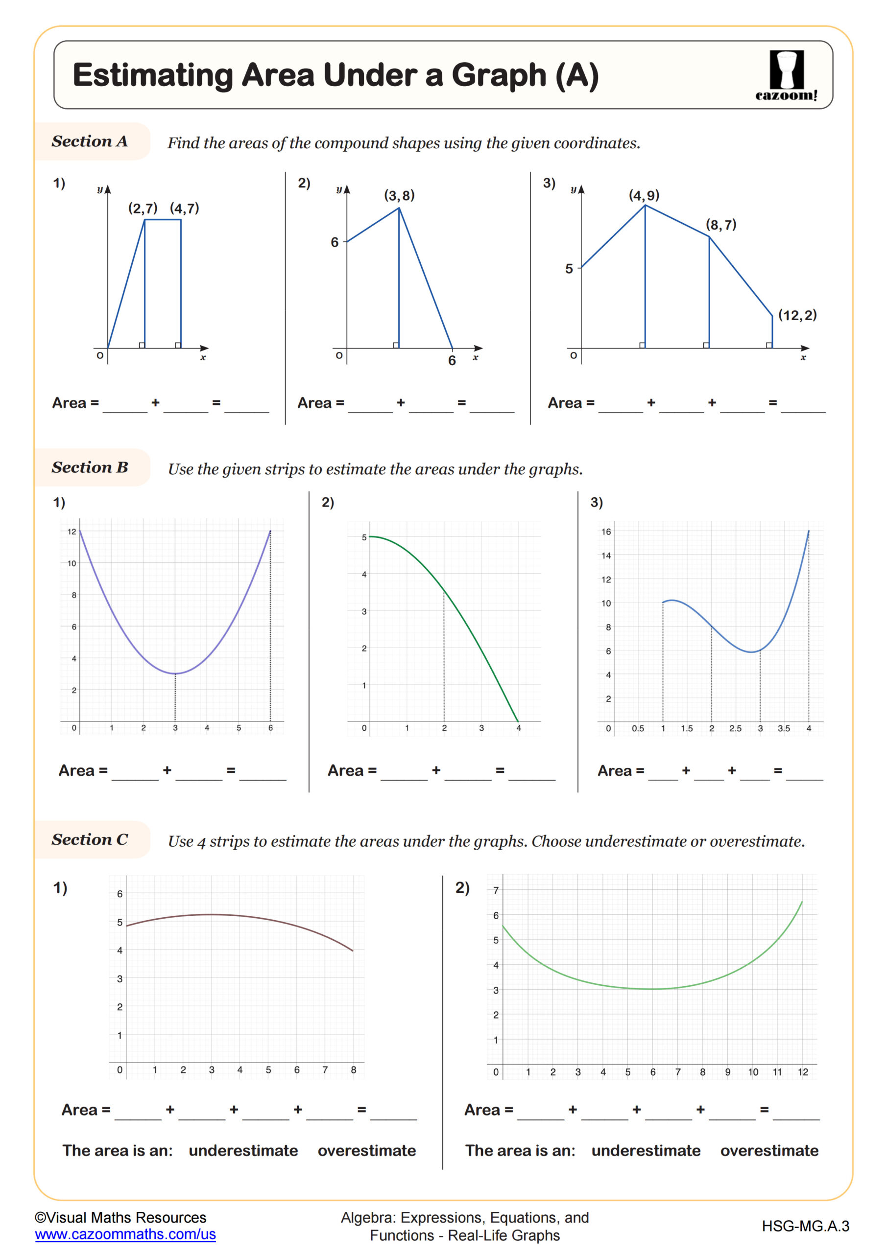
Estimating Area Under a Graph (A)
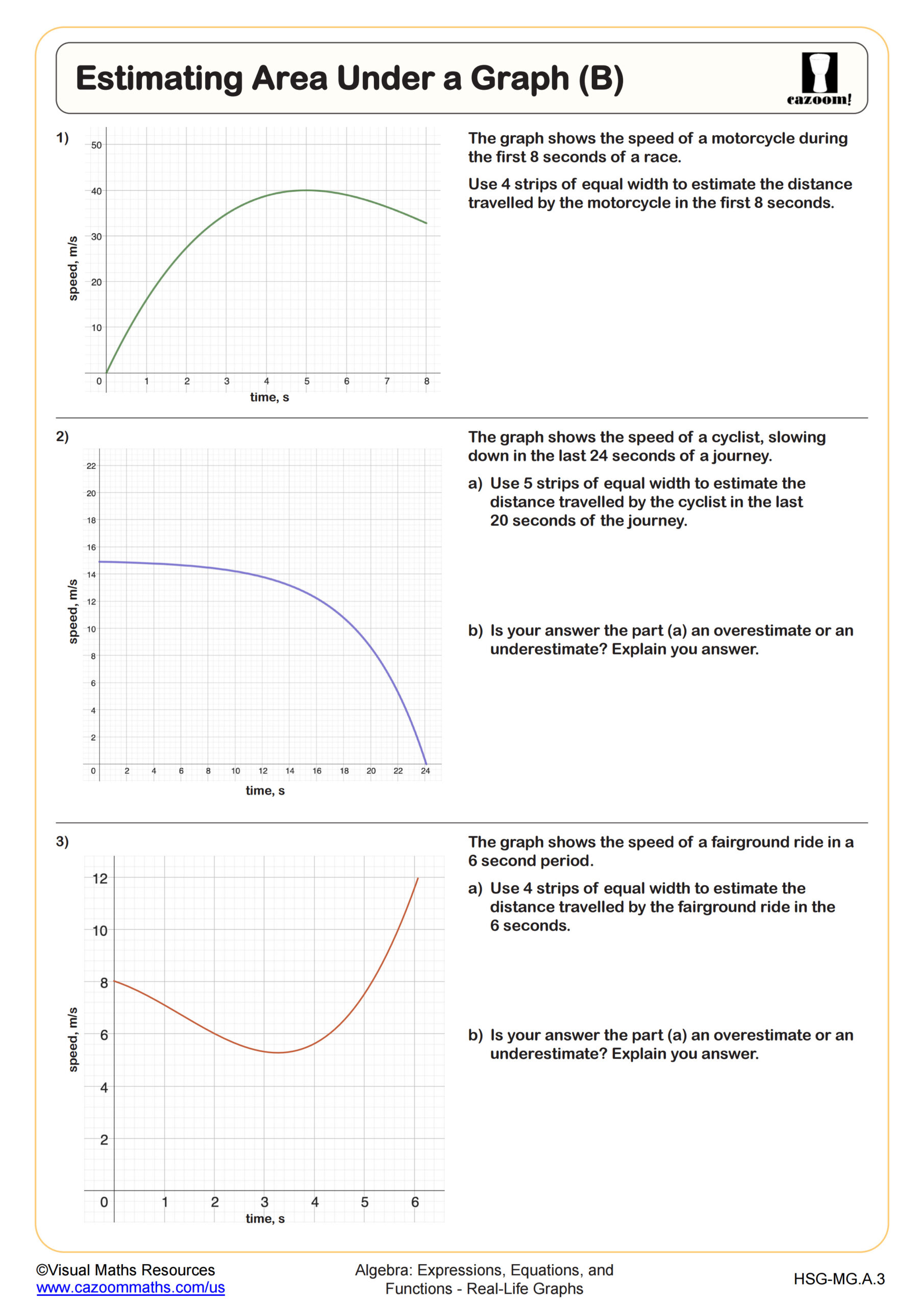
Estimating Area Under a Graph (B)
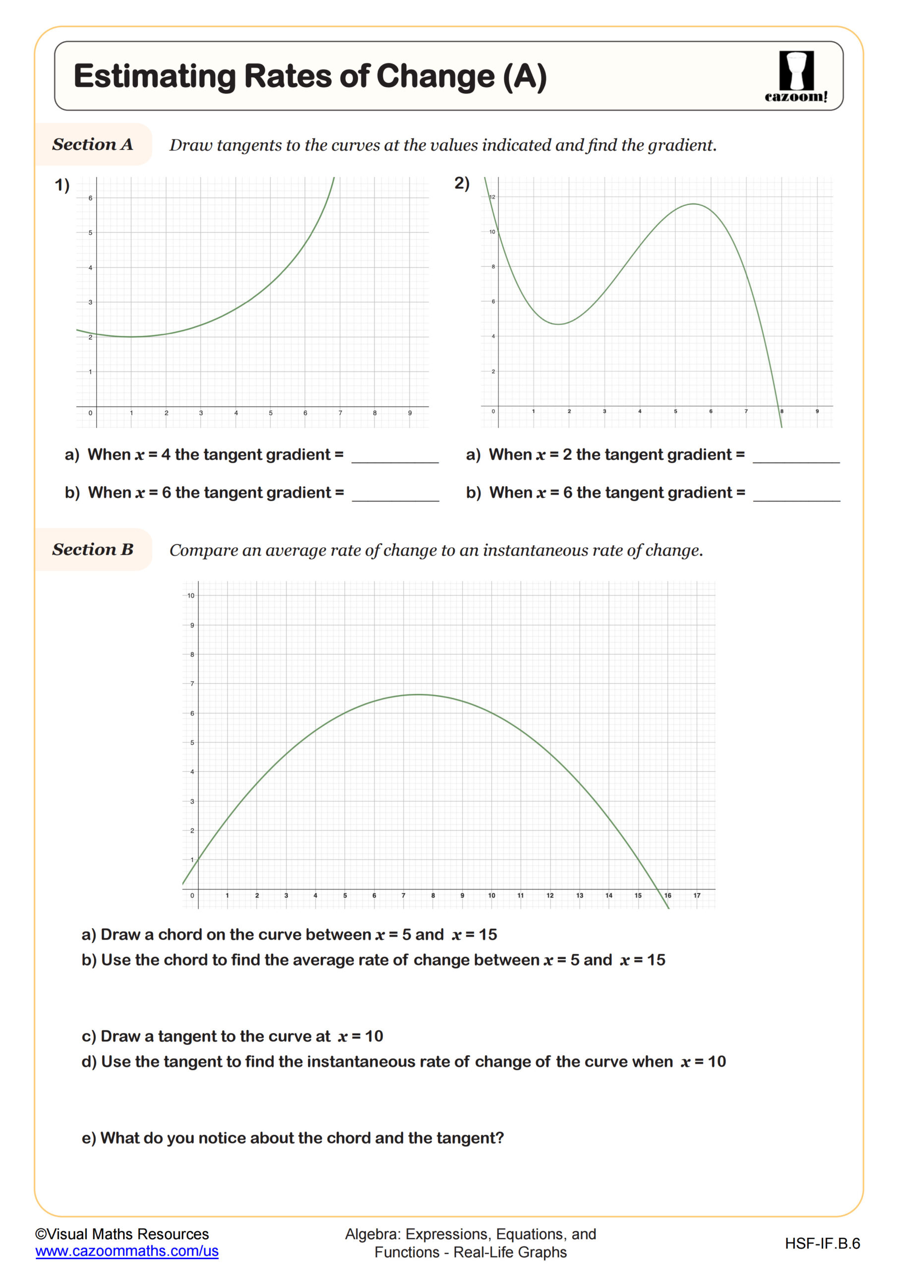
Estimating Rates of Change (A)
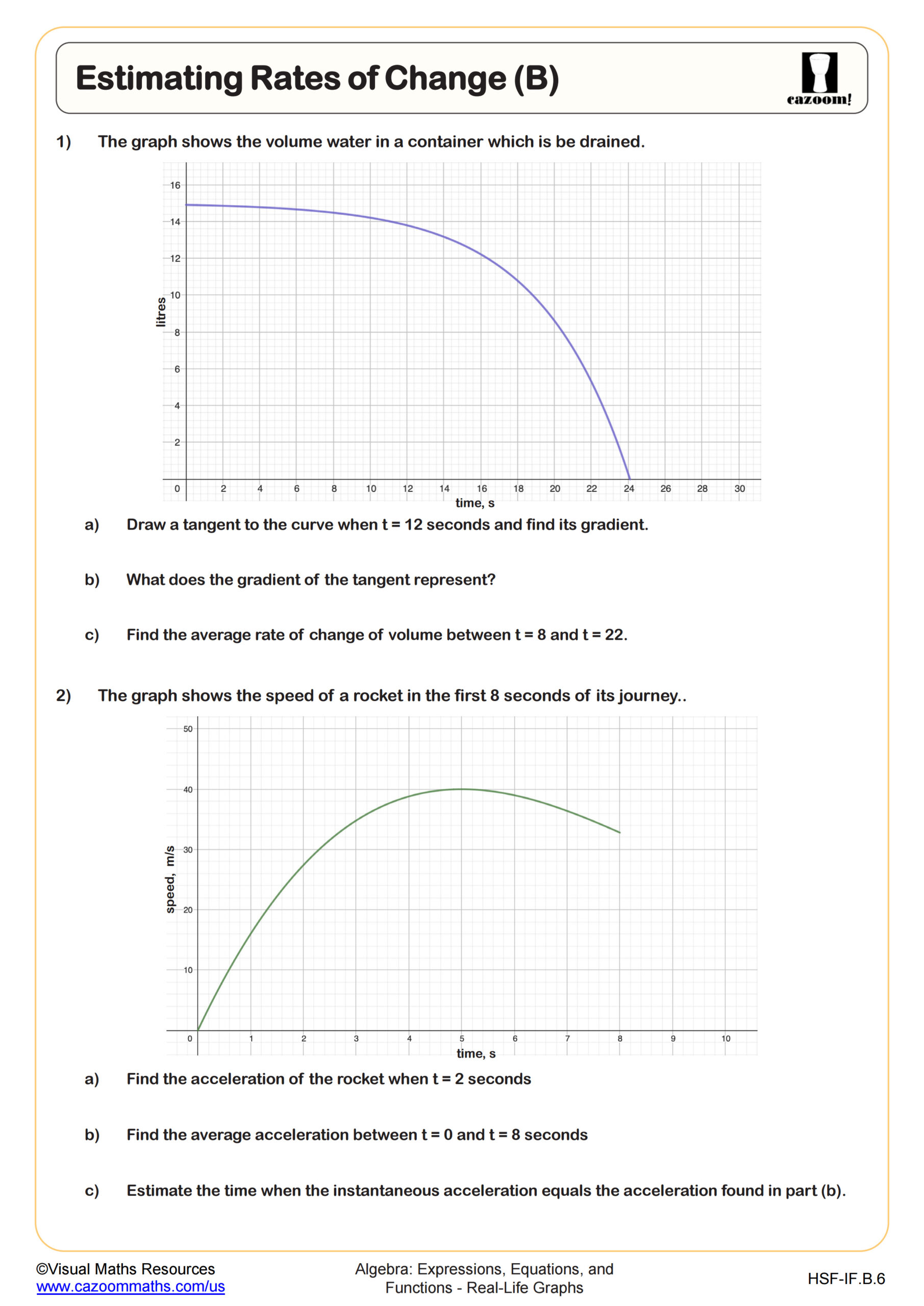
Estimating Rates of Change (B)
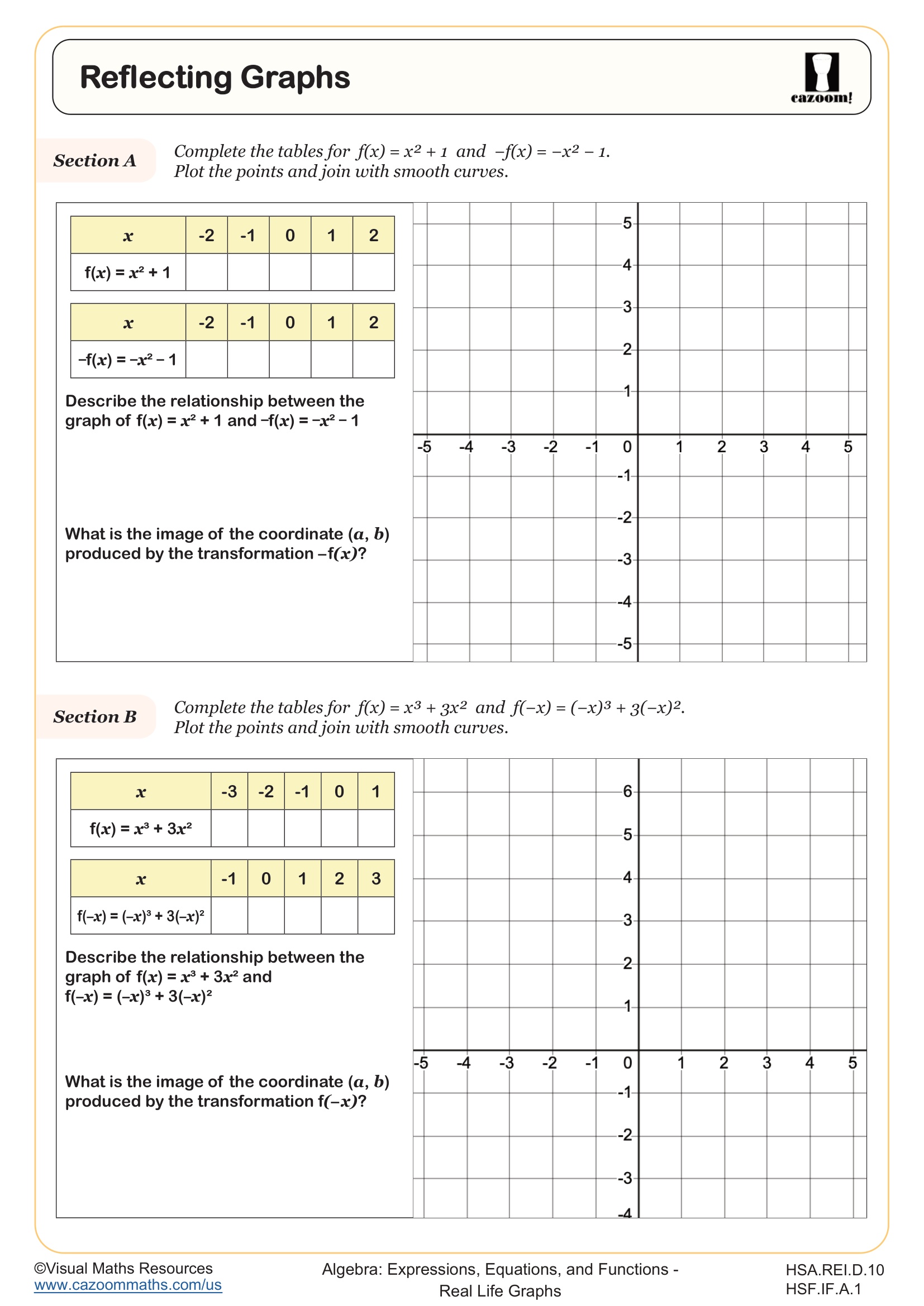
Reflecting Graphs
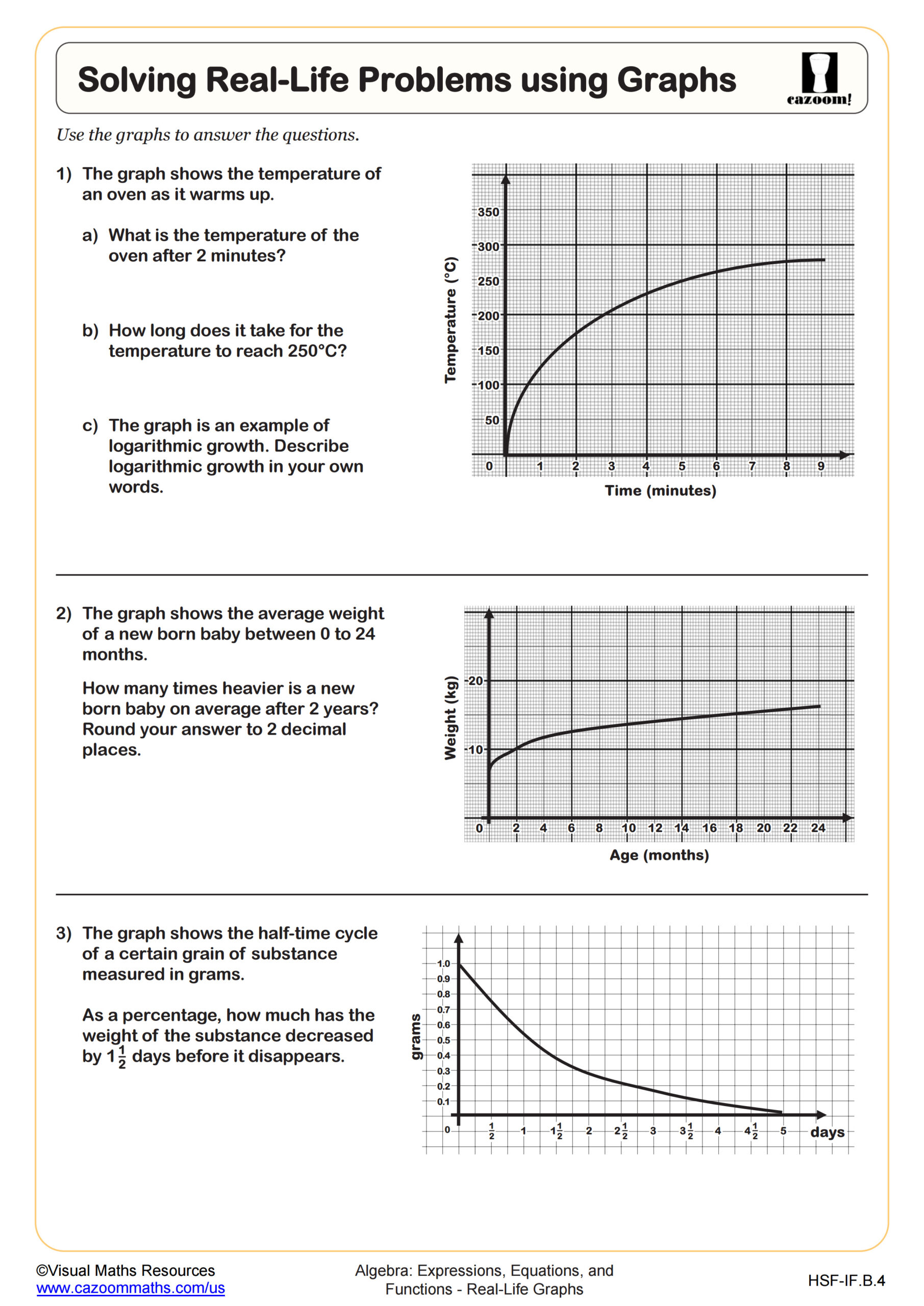
Solving Real-Life Problems using Graphs
All worksheets are created by the team of experienced teachers at Cazoom Math.
What Real-World Graph Skills Do Algebra I Students Learn?
Algebra I students learn to interpret graphs representing real-life situations, including distance-time graphs, cost-revenue relationships, and rate-of-change scenarios. This topic extends beyond plotting ordered pairs to analyzing what graph features mean in context: recognizing constant rates as straight lines, identifying maximum and minimum values, and understanding how steepness relates to speed or intensity. The Common Core State Standards emphasize functions and their representations, making real-life graphs a bridge between abstract algebra and practical problem-solving.
A common misconception emerges when students treat every graph like a coordinate grid exercise. Teachers often see students attempt to find equations or calculate slopes when the question simply asks them to read information directly from the graph, such as identifying when two quantities are equal or determining which time period shows the fastest growth. Students lose valuable points by overthinking straightforward interpretation questions.
How Are Real Life Graphs Tested on the SAT and ACT?
Standardized tests present real-life graphs within word problems that require students to extract specific information, compare rates of change, or make predictions based on trends. The SAT Math section regularly includes questions about distance-time graphs, population models, and business scenarios where students must interpret intersections, slopes, or areas under curves. These questions assess whether students can translate between graphical representations and real-world meaning, often without providing explicit equations.
Students lose points when they misread axis labels or units, a surprisingly frequent error on timed tests. Teachers notice that students rush through context clues and assume standard scales, missing that one axis might represent thousands of dollars or that time intervals skip hours. Another common mistake involves confusing steeper slopes with greater quantities rather than greater rates of change, particularly on distance-time graphs where a steeper line means faster speed, not greater distance traveled.
What Does Estimating Area Under a Graph Reveal?
Estimating area under a graph introduces students to a foundational calculus concept through geometric reasoning. Students partition the area into rectangles or triangles, calculate individual areas, and sum them to approximate the total. In Algebra I, this typically involves simpler curves and piecewise linear graphs rather than complex functions. This skill develops visual problem-solving abilities and prepares college-bound students for integral calculus, where area under curves represents accumulated quantities.
Real-world applications make this concept meaningful: area under a velocity-time graph represents total distance traveled, while area under a power-time graph shows energy consumption. STEM careers regularly use these interpretations. Engineers calculate fuel consumption by analyzing flow rate graphs, and environmental scientists determine total pollution output by examining emission rate curves over time. Students confidently tackle these problems once they recognize that multiplying rate by time yields a total quantity, whether that's miles, kilowatt-hours, or gallons.
How Can Teachers Use These Algebra I Worksheets Effectively?
These worksheets scaffold real-life graph interpretation from straightforward reading exercises to more complex rate-of-change analysis. Teachers find that starting with clearly labeled graphs and explicit questions helps students build confidence before moving to worksheets requiring inference or estimation. The progression from basic interpretation to estimating areas under graphs mirrors the cognitive development needed for standardized test success, where questions often combine multiple skills within a single context.
Many teachers use these worksheets for differentiated instruction, assigning simpler interpretation tasks to students still mastering function notation while challenging advanced students with rate-of-change estimation. The complete answer keys make these worksheets practical for test preparation stations, where students work through problems independently and self-check their reasoning. Teachers also report success using these as warm-up activities before introducing related algebraic concepts, since visual graph analysis often clarifies abstract function behavior that equations alone don't reveal.