Algebra I Stem and Leaf Diagrams Worksheets
All worksheets are created by the team of experienced teachers at Cazoom Math.
What Do Algebra I Students Learn About Stem and Leaf Diagrams?
In Algebra I, students learn to construct stem and leaf diagrams from raw data sets, identify the median and quartiles directly from the display, and calculate the interquartile range to measure data spread. The curriculum emphasizes understanding how stem and leaf plots preserve individual data values while organizing them in numerical order, making them superior to histograms when actual data points need to remain visible.
Students practice working with datasets of varying sizes and learn to choose appropriate stem values based on the data range. A common error occurs when students encounter back-to-back stem and leaf diagrams for comparing two datasets; they often read the values on the left side incorrectly, forgetting that those leaves should be read right-to-left from the stem. Teachers find that having students circle or highlight the stem helps prevent misreading the plot structure.
How Are Stem and Leaf Diagrams Tested on the SAT and State Assessments?
Standardized tests like the SAT and state assessments typically present students with a completed stem and leaf diagram and ask them to find specific statistical measures such as the median, range, or interquartile range. Questions may also require students to identify how many data points fall within a certain interval or to compare distributions shown in back-to-back stem and leaf plots. The ACT occasionally includes questions asking students to determine which data set matches a given stem and leaf display.
Students lose points when they fail to count leaves accurately or when they don't recognize that each leaf represents a separate data point. Another frequent mistake involves calculating the median without first determining the correct position, especially when the dataset contains an even number of values. Teachers notice that students who practice reading the actual data values from the plot, rather than just looking at the visual shape, perform significantly better on assessment questions.
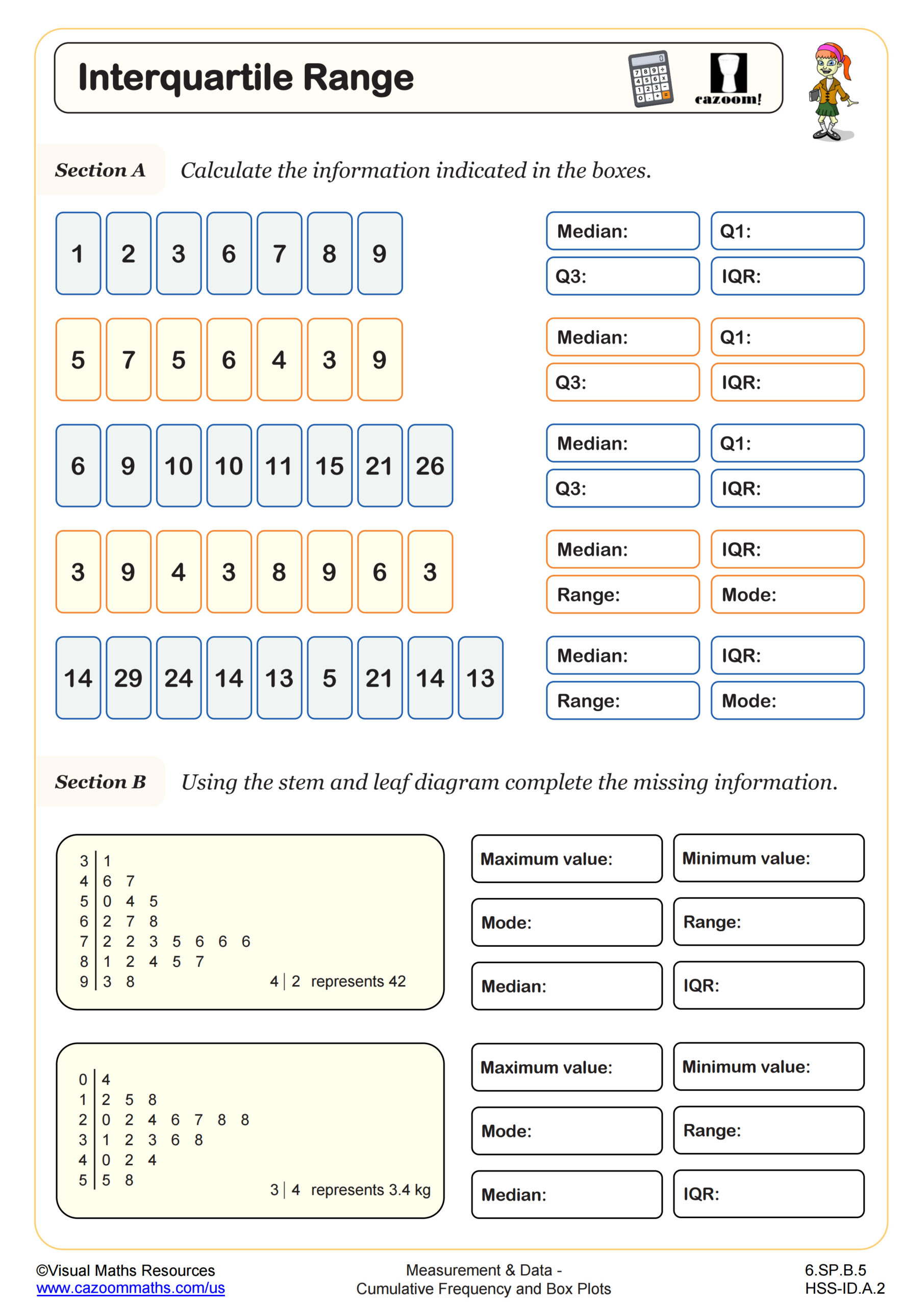
What Is the Interquartile Range and How Do Students Find It from Stem and Leaf Diagrams?
The interquartile range (IQR) measures the spread of the middle 50% of data by calculating the difference between the third quartile (Q3) and first quartile (Q1). From a stem and leaf diagram, students first count the total number of data points to locate the median position, then identify Q1 as the median of the lower half and Q3 as the median of the upper half. The IQR equals Q3 minus Q1, providing a measure of variability that's resistant to outliers.
This skill connects directly to quality control in manufacturing, where engineers use the IQR to establish acceptable variation ranges for products. In environmental science, researchers analyze temperature or pollution data using the IQR to identify unusual readings. College-bound students encounter the IQR again in AP Statistics when constructing box plots and identifying outliers using the 1.5 × IQR rule, making this foundational work in Algebra I valuable for STEM pathways.
How Can Teachers Use These Stem and Leaf Diagram Worksheets in Algebra I?
The worksheet provides structured practice with stem and leaf diagrams alongside interquartile range calculations, allowing students to develop fluency with both creating displays and extracting statistical information from them. The included answer key enables students to check their work independently, which helps them identify whether errors stem from construction mistakes or calculation errors. Teachers can use this resource to introduce the connection between visual data organization and numerical statistical measures.
In classroom settings, these worksheets work well as a review before unit assessments or as targeted practice for students who need additional support with data analysis standards. Many teachers assign them as homework after introducing the concept, then use class time to address common errors revealed in student work. The worksheets also serve effectively in paired activities where one student creates a stem and leaf diagram from given data while their partner calculates the interquartile range, then they switch roles to check each other's accuracy.