High School Frequency Polygons and Histograms Worksheets
All worksheets are created by the team of experienced teachers at Cazoom Math.
What's the Difference Between Frequency Polygons and Histograms?
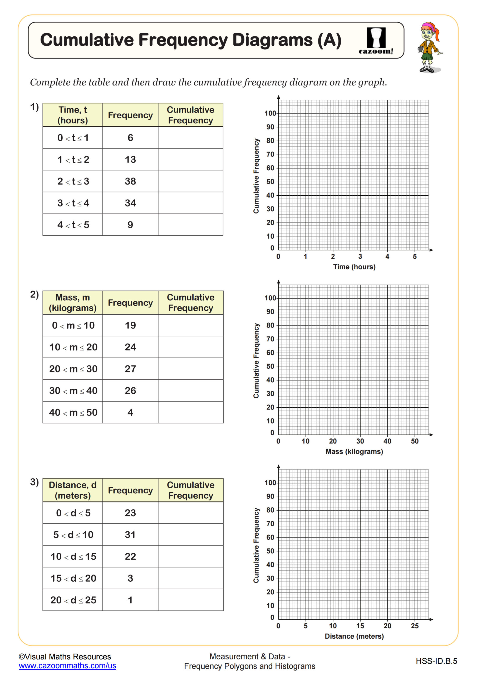
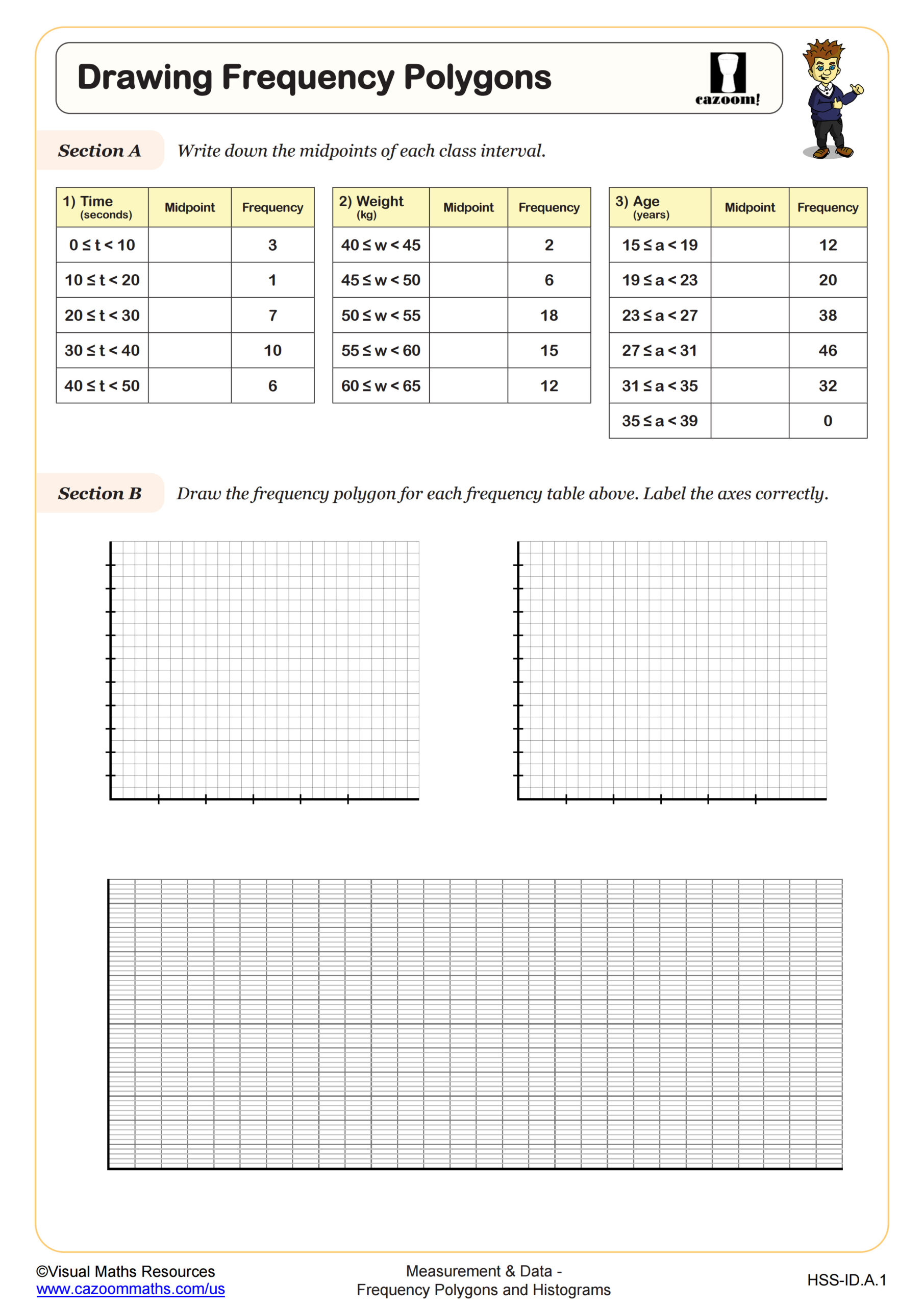
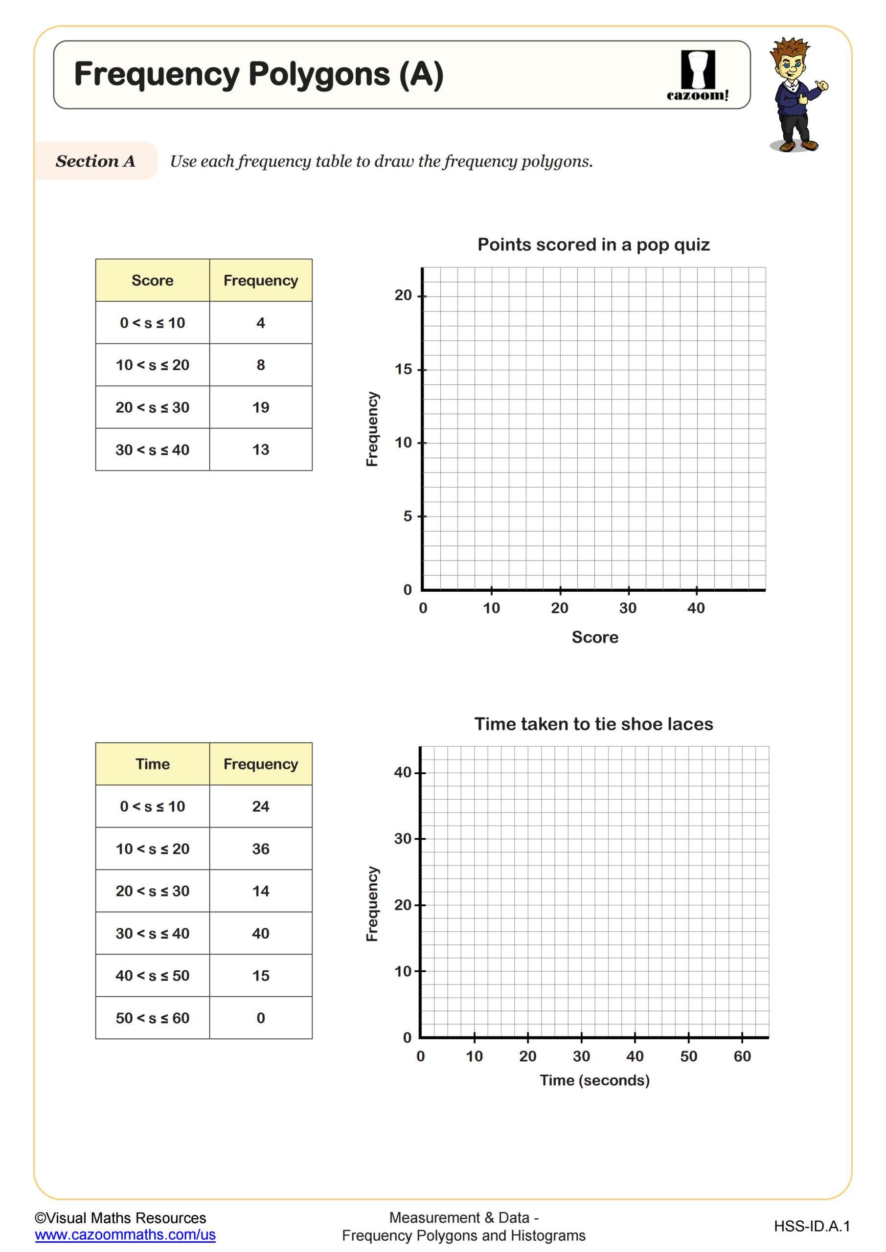
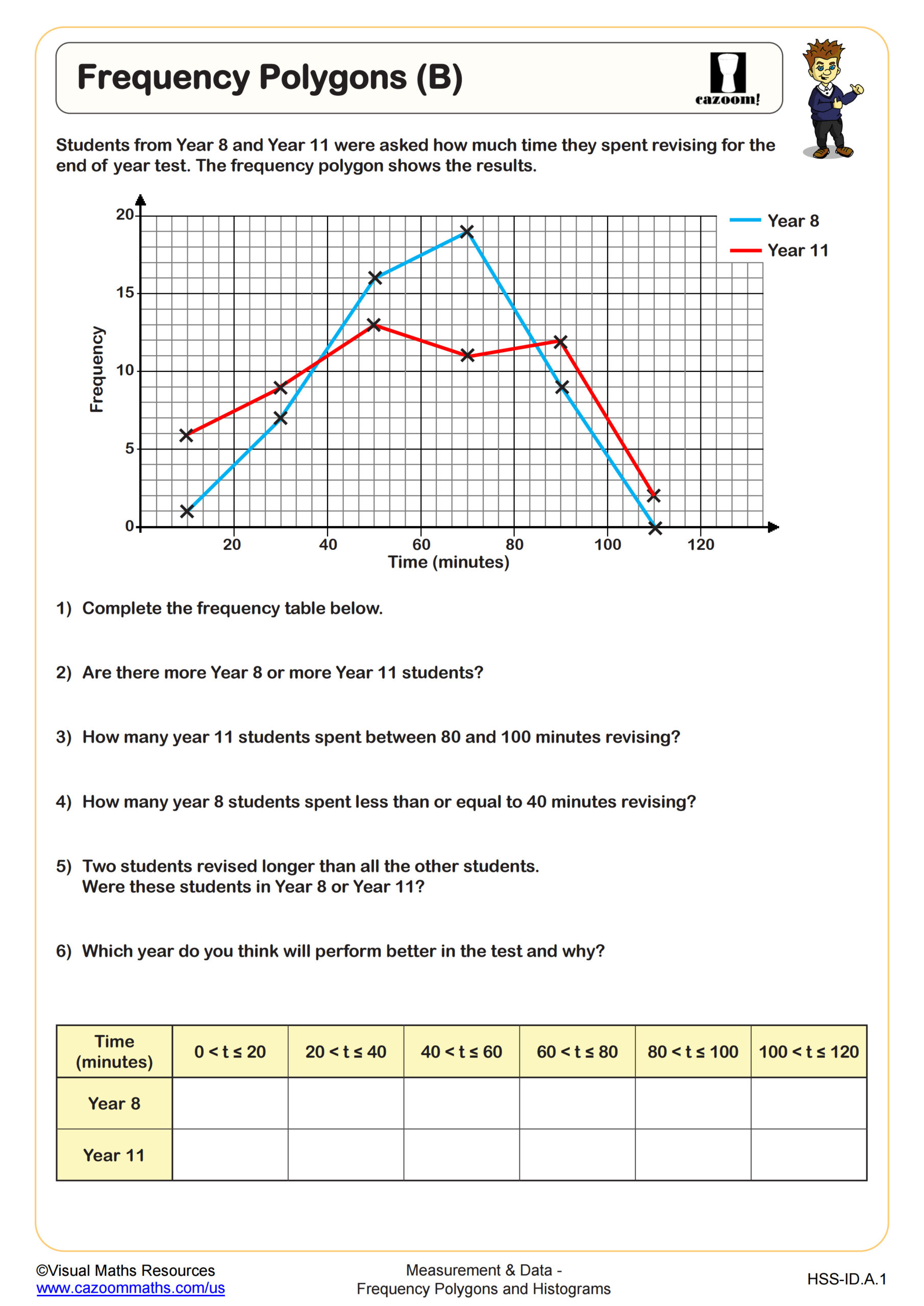
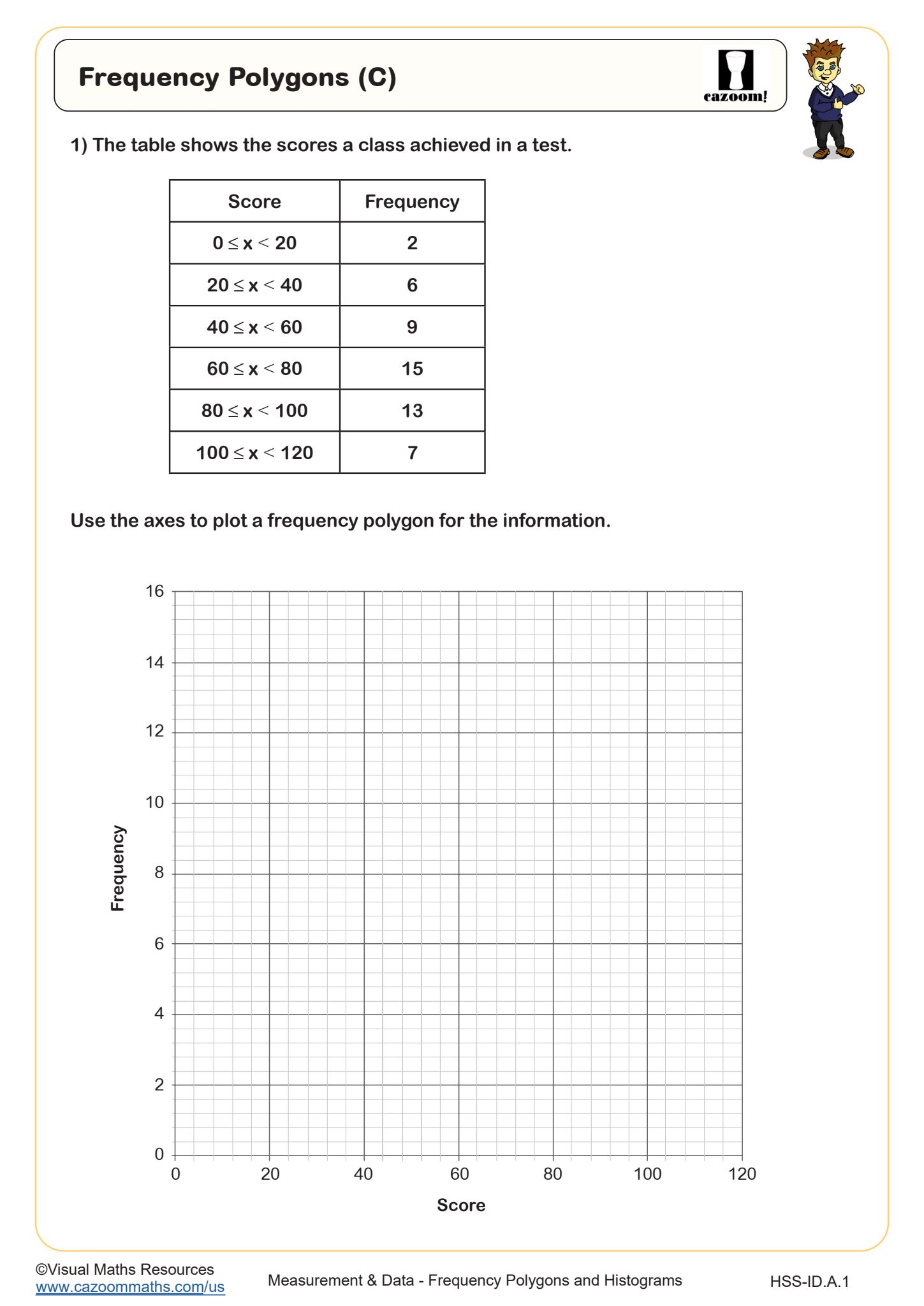
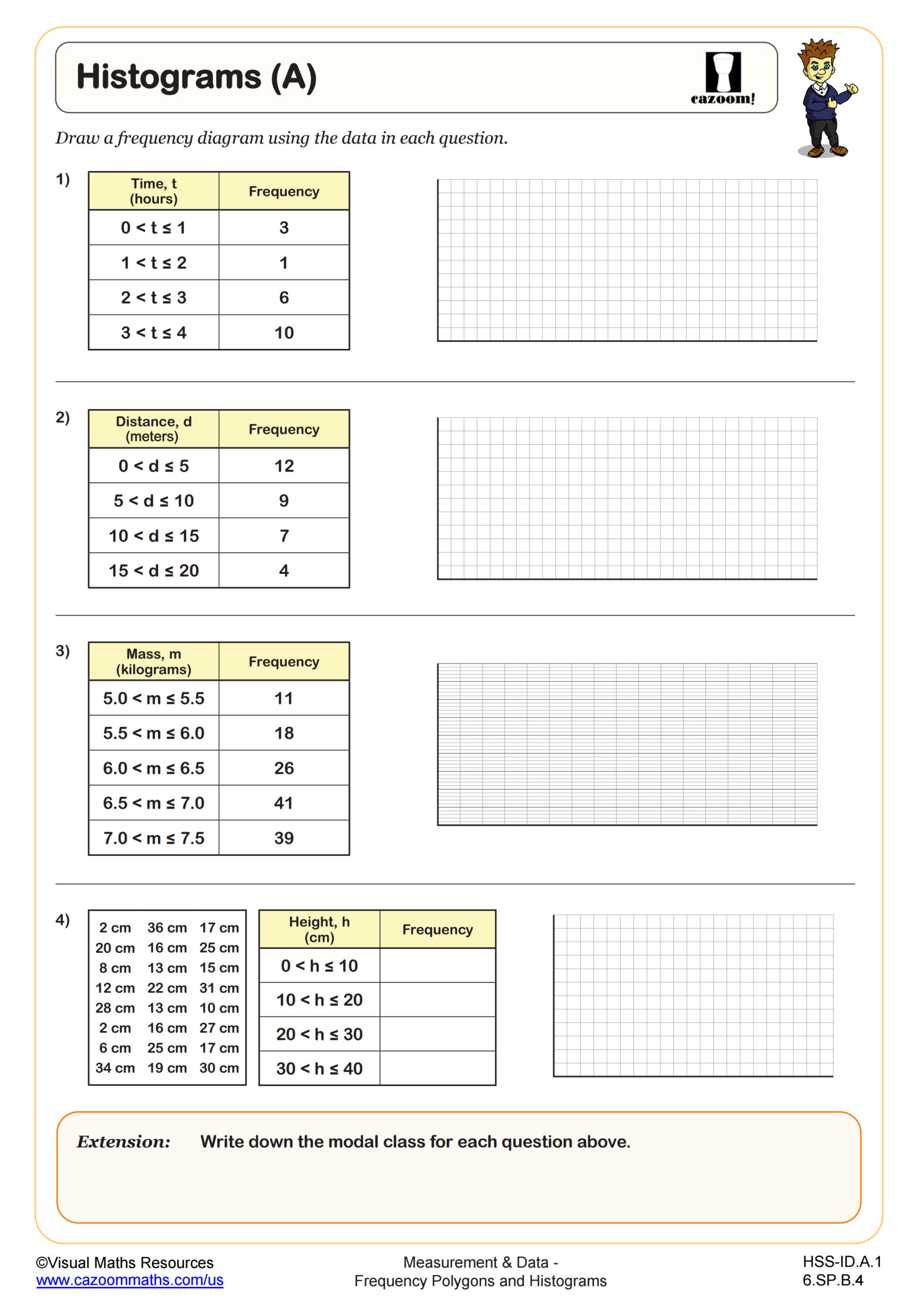
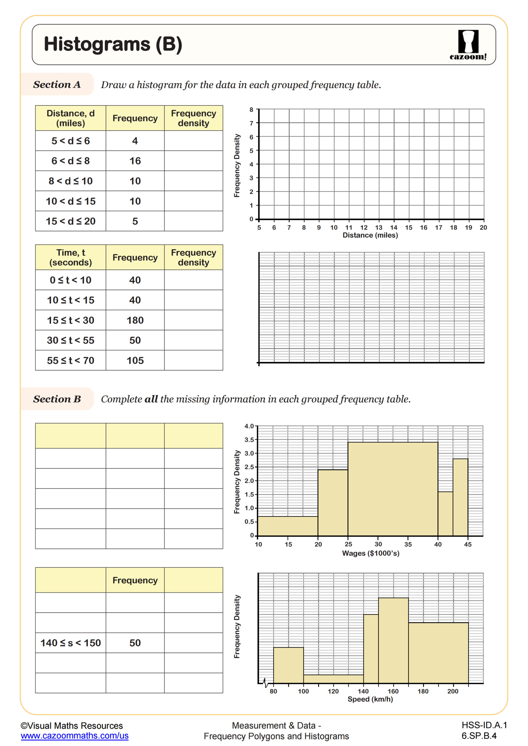
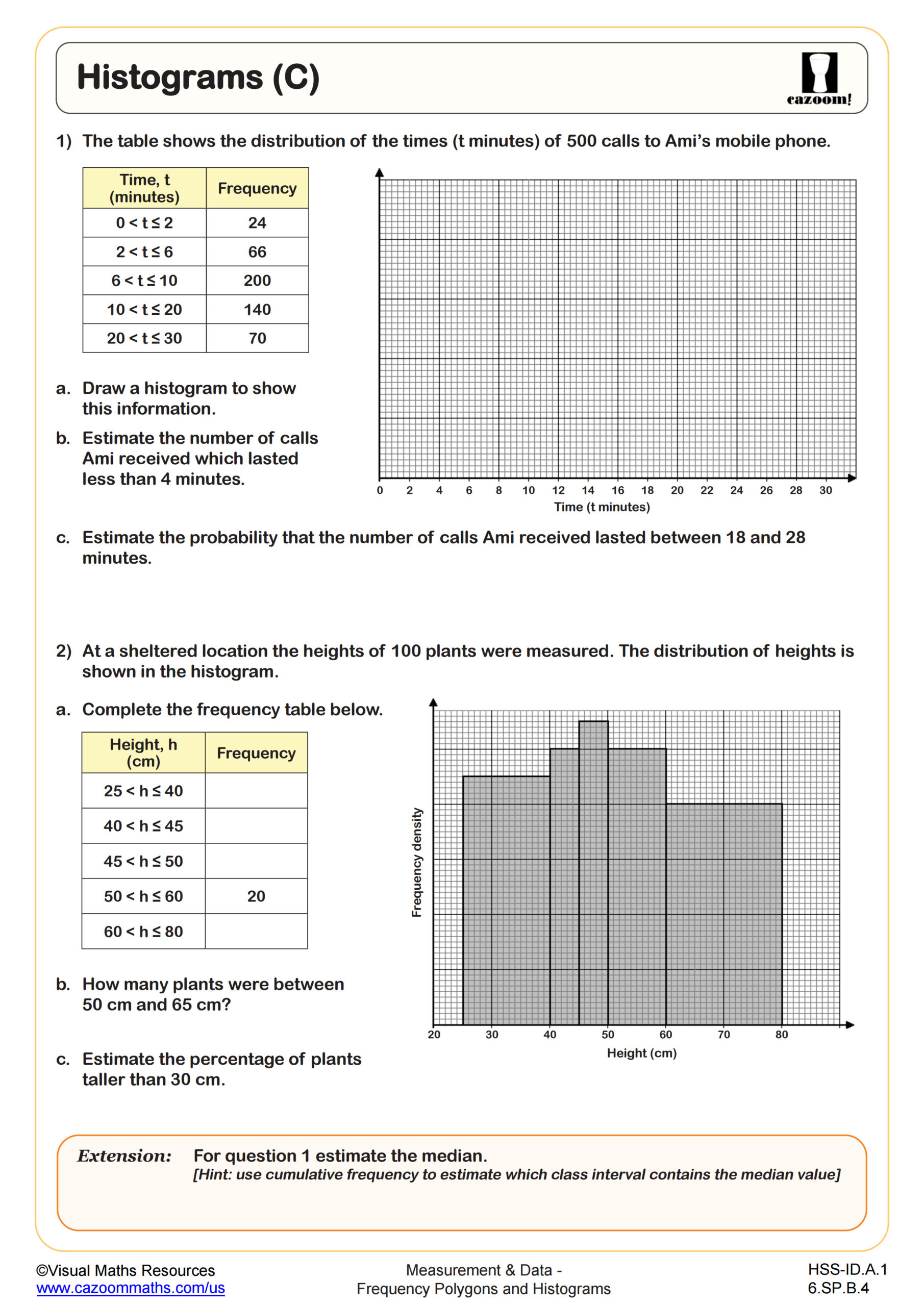
Histograms use bars to display continuous data grouped into class intervals, with bar heights representing frequency or frequency density and no gaps between bars. Frequency polygons connect the midpoints of these bars with line segments, creating a visual representation that highlights data trends and makes comparing multiple distributions easier. Both graphs organize data into intervals rather than showing individual values, making them useful for large datasets where patterns matter more than specific data points.
Students frequently lose points on assessments by treating histograms like bar charts, leaving gaps between bars or using them for categorical rather than continuous data. The shift to frequency polygons typically creates an "aha" moment when students realize they're plotting the same information in a different format. Many teachers find success having students first draw a histogram, then overlay the frequency polygon on top before drawing it independently, which reinforces how the two representations connect.
Which Grade Levels Cover Frequency Polygons and Histograms?
These worksheets align with high school mathematics courses including Algebra I, Algebra II, Geometry, Precalculus, and the Integrated Math pathway (IM 1, IM 2, IM 3). The topic typically appears when students study data analysis and statistics units, which span multiple high school courses depending on how districts sequence their curriculum. State assessments frequently include histogram interpretation and construction as part of statistics and probability standards.
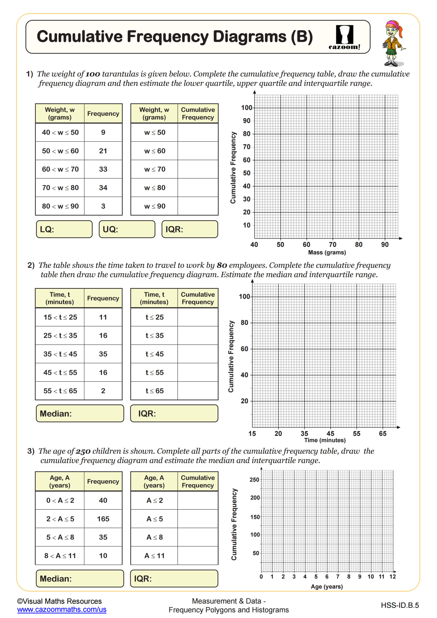
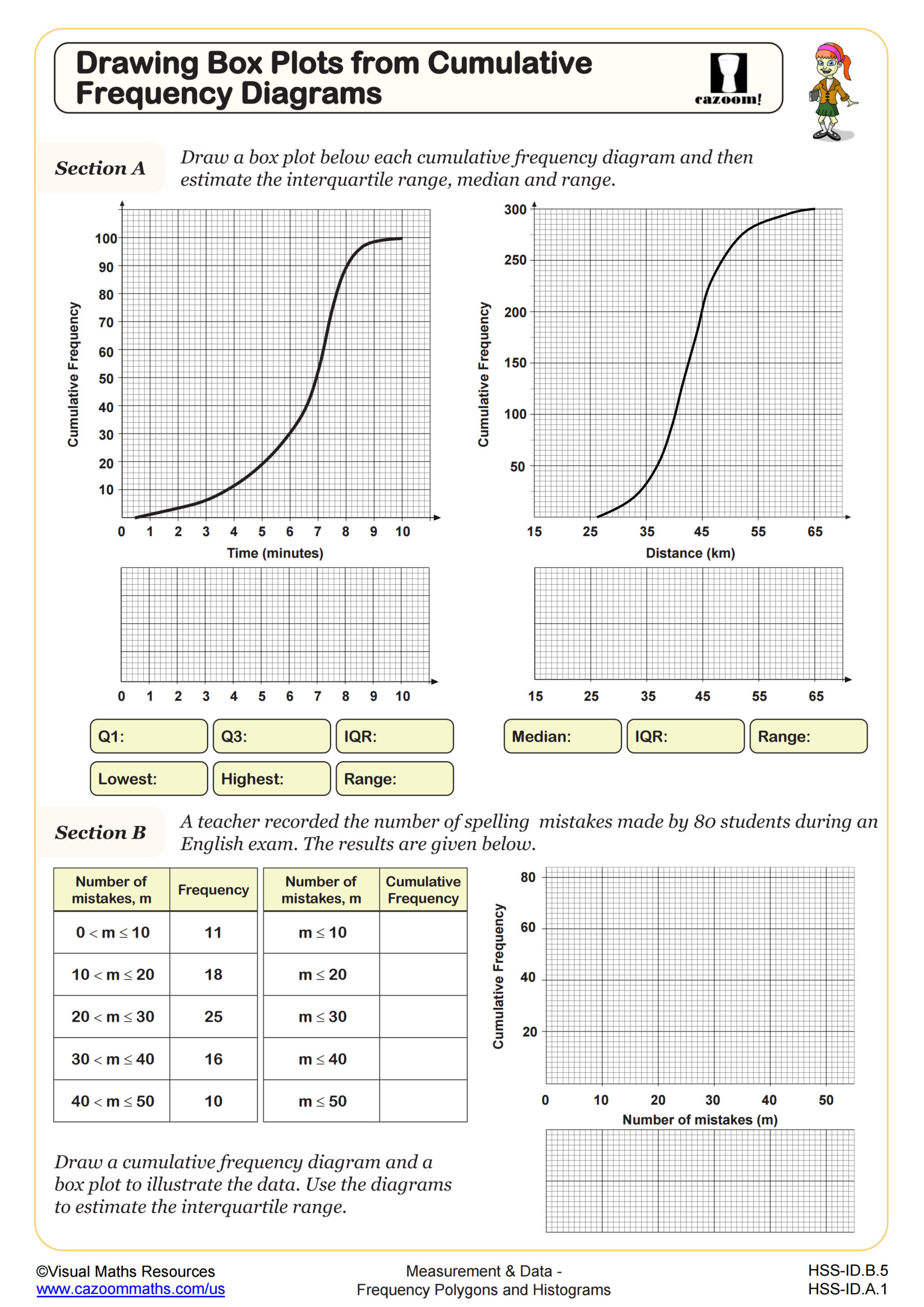
The progression builds complexity across grade levels. Early high school courses focus on reading histograms and basic construction with given class intervals, while later courses expect students to choose appropriate intervals, work with frequency density when intervals vary, calculate measures of central tendency from grouped data, and construct cumulative frequency diagrams. Precalculus students encounter more sophisticated applications, including using histograms to identify distribution shapes and make inferences about populations.
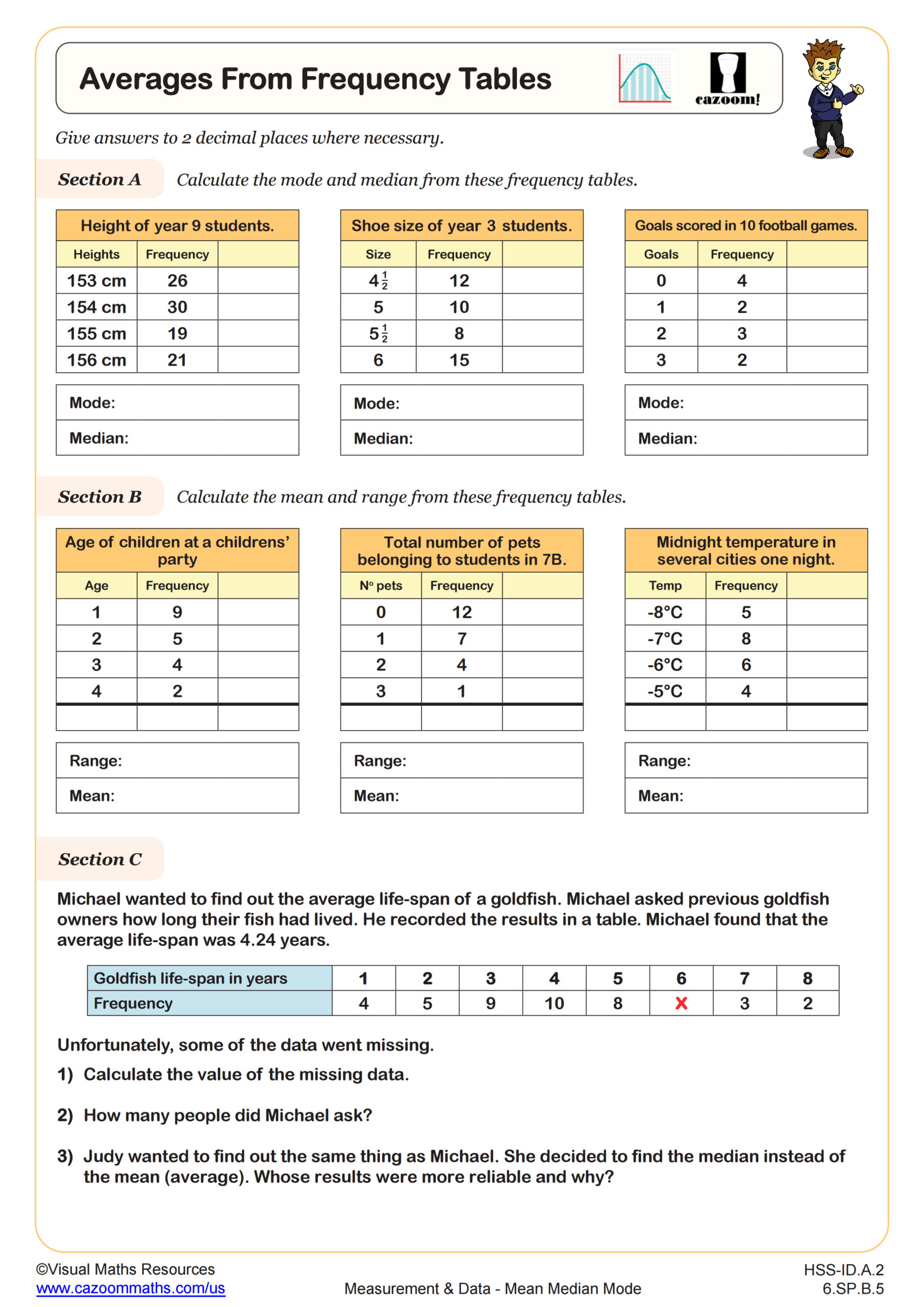
How Do Students Calculate Averages from Frequency Tables?
Calculating averages from frequency tables requires students to use class midpoints rather than individual data values. Students multiply each class midpoint by its frequency, sum these products, then divide by the total frequency to find the mean. This method produces an estimated mean since the original data values aren't available, only the intervals where they fall. Teachers notice that students confidently tackle this process once they recognize that frequency acts as a multiplier showing how many times each midpoint value appears.
This skill connects directly to real-world data analysis in fields like quality control, epidemiology, and market research, where data arrives pre-grouped rather than as individual measurements. Manufacturing engineers use frequency tables to track product dimensions and calculate whether average specifications meet standards without measuring every single item. Environmental scientists analyze pollution levels grouped into concentration ranges, calculating mean values to assess air or water quality trends over time, making this more than just an abstract mathematical exercise.
How Can Teachers Use These Worksheets Most Effectively?
The worksheets scaffold learning by separating conceptual understanding (identifying what histograms show) from procedural skills (constructing them accurately). Some sheets focus specifically on interpreting existing graphs, while others guide students through the construction process step-by-step. The cumulative frequency diagram worksheets at levels A and B provide differentiated practice, with level A offering more structure and level B requiring greater independence. Answer keys allow students to check their work immediately, which proves particularly valuable when students practice choosing class intervals or calculating frequency density.
Many teachers use these materials for targeted intervention when standardized test data reveals gaps in data representation skills. The worksheets work well for station rotation activities, where one group constructs histograms while another calculates statistics from frequency tables. They're equally effective as homework following direct instruction or as review materials before unit assessments. Paired work often helps because one student can focus on calculations while their partner ensures accurate graphing, then they switch roles for the next problem.