Integrated Math 1 Frequency Polygons and Histograms Worksheets
All worksheets are created by the team of experienced teachers at Cazoom Math.
What Do Frequency Polygons and Histograms Cover in Integrated Math 1?
In Integrated Math 1, frequency polygons and histograms introduce students to statistical data representation methods aligned with Common Core standards for interpreting categorical and quantitative data. Students learn to construct histograms by organizing data into intervals (bins) and representing frequencies with vertical bars, then create frequency polygons by plotting midpoints of each interval and connecting them with line segments. This topic builds on earlier work with dot plots and bar graphs while establishing foundations for more advanced statistical concepts.
Teachers frequently observe that students overlook closing the frequency polygon to the horizontal axis at both ends, creating incomplete graphs that misrepresent the data distribution. Another common error involves forgetting to calculate class midpoints accurately, especially when working with unequal interval widths. Students show significant improvement when they first organize data in frequency tables before attempting to graph, as this intermediate step reduces calculation errors and clarifies the relationship between numerical data and visual representation.
How Do Frequency Polygons and Histograms Appear on Standardized Tests?
Standardized assessments including state tests and the SAT Problem Solving and Data Analysis section regularly feature questions requiring students to interpret histograms or construct frequency representations from given data sets. Test questions typically ask students to identify modal classes, compare distributions, calculate relative frequencies, or determine how changes in interval width affect histogram appearance. Students must demonstrate understanding of how bin size impacts data visualization and accurately read information from these graphs under timed conditions.
Students lose points when they confuse frequency with cumulative frequency or misread interval boundaries on histograms with unequal class widths. Many rush through problems involving overlapping intervals (such as 0-10, 10-20) without clarifying whether endpoints belong to the left or right interval. Another testing pitfall occurs when students incorrectly estimate frequencies from frequency polygons by reading the line height at interval boundaries rather than at midpoints, leading to systematic errors in data interpretation questions.
What Makes Frequency Polygons Different from Histograms?
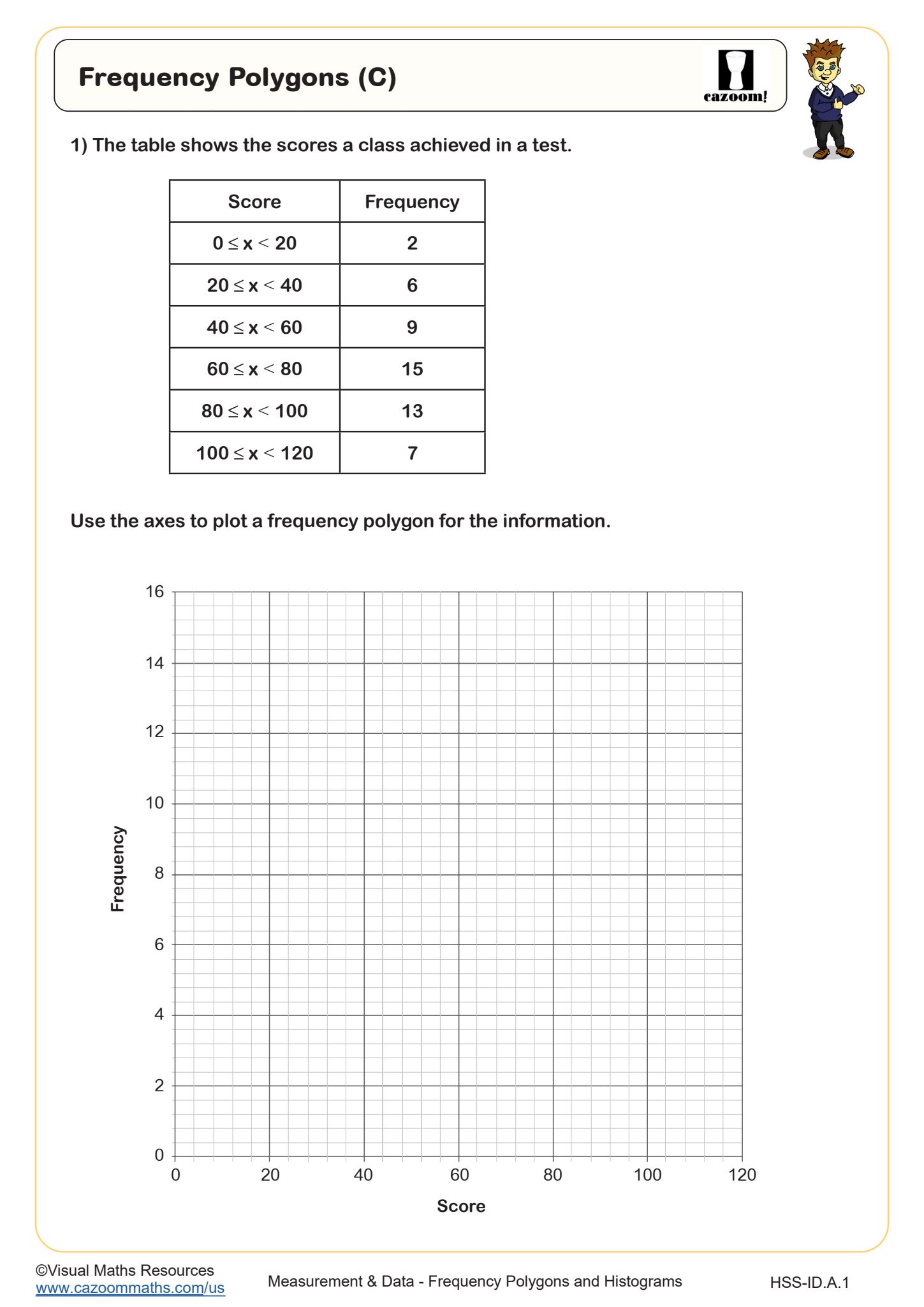
Frequency polygons display the same distributional information as histograms but use connected line segments instead of bars, with each point plotted at the midpoint of its class interval at the height representing that interval's frequency. While histograms emphasize individual interval counts through separated bars, frequency polygons highlight the overall shape and trend of the distribution. Students construct frequency polygons by first finding the midpoint of each class interval (adding the lower and upper boundaries and dividing by two), plotting these coordinates, then connecting consecutive points with straight lines that extend to the horizontal axis at both ends.
This visualization technique proves particularly valuable in fields like public health and economics where analysts compare multiple data distributions simultaneously. Epidemiologists overlay frequency polygons to track disease patterns across different time periods or populations, while market researchers use them to compare consumer behavior trends. Students preparing for STEM careers benefit from recognizing that frequency polygons make pattern recognition easier when analyzing trends, though histograms remain preferable when emphasizing discrete interval counts rather than continuous distribution shapes.
How Can Teachers Use These Worksheets in Integrated Math 1?
The worksheet provides structured practice that guides students through the complete process of creating both graph types from the same data set, reinforcing the connection between these complementary representations. Students work with realistic data scenarios that require organizing information, calculating midpoints, determining appropriate scales, and constructing accurate graphs. The included answer key allows teachers to quickly identify whether errors stem from calculation mistakes, conceptual misunderstandings about graph construction, or careless plotting, enabling targeted feedback during review sessions.
Many teachers find these materials effective for differentiated instruction, assigning them as independent classwork while circulating to assist struggling students with interval calculations. The worksheet works well as a formative assessment before unit tests, helping identify students who need additional support with scale selection or midpoint calculations. Teachers also use these resources during collaborative learning activities where student pairs construct graphs independently then compare results to self-check accuracy, building both technical skills and mathematical communication abilities that support broader Integrated Math 1 learning objectives.