Integrated Math 2 Pie Charts and Bar Charts Worksheets
All worksheets are created by the team of experienced teachers at Cazoom Math.
What Do Students Learn About Pie Charts and Bar Charts in Integrated Math 2?
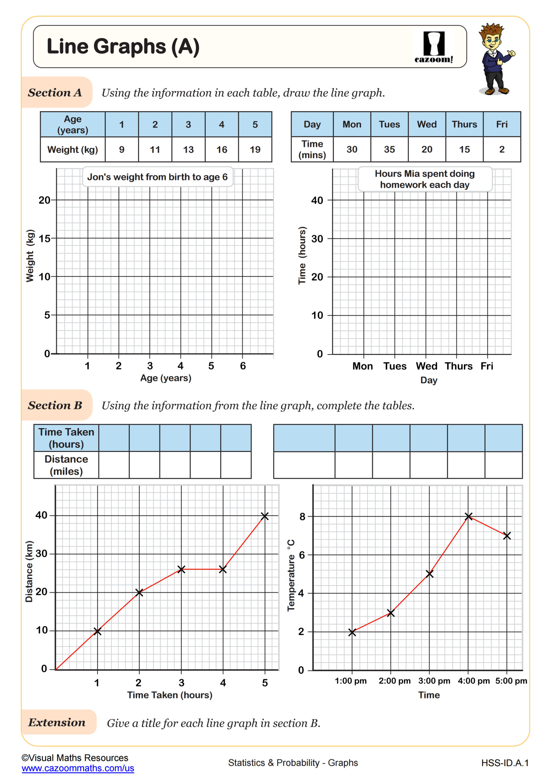
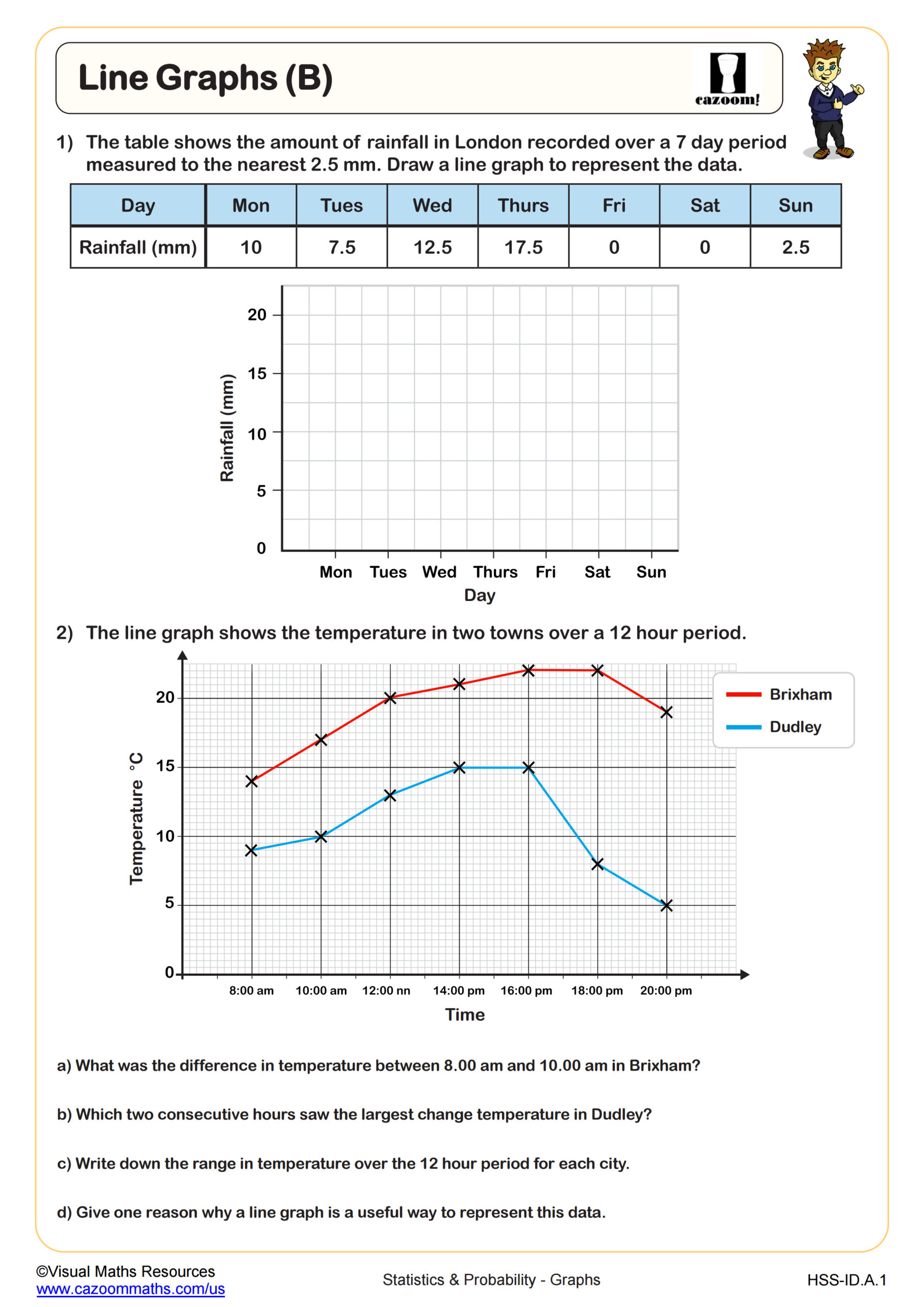
In Integrated Math 2, students develop proficiency in creating and interpreting two fundamental data visualization types: pie charts that show parts of a whole through circular sectors, and bar charts that compare quantities across categories using rectangular bars. This curriculum focus aligns with Common Core standards for statistical reasoning, requiring students to select appropriate chart types based on data characteristics, calculate precise sector angles using proportional reasoning, and draw valid conclusions from visual displays.
Many teachers observe that students initially struggle to determine when a pie chart is more appropriate than a bar chart. The breakthrough typically happens when students recognize that pie charts work best for showing composition (like budget allocation or survey responses totaling 100%), while bar charts excel at comparing separate quantities that don't need to sum to a whole (like monthly sales figures across different stores).
How Do Pie Charts and Bar Charts Appear on the SAT and ACT?
Standardized tests like the SAT and ACT regularly include data interpretation questions featuring pie charts and bar charts, often embedded within multi-step problems that require students to extract information from visual displays and perform calculations. Students must demonstrate their ability to read sector labels and percentages, compare bar heights accurately, and combine data from multiple sources. The SAT calculator section frequently presents real-world scenarios where students analyze budget distributions shown in pie charts or compare trends displayed in bar charts.
Students lose points when they misread chart scales or fail to account for what the chart actually represents. A common error occurs when students see a pie chart showing percentages and forget to multiply by the total population to find actual values. Similarly, on bar chart questions, students sometimes compare absolute bar heights without noticing that different charts use different scales, leading to incorrect conclusions about which category is larger.
How Do Students Calculate Sector Angles for Pie Charts?
Calculating sector angles requires students to recognize that each category's portion of the whole corresponds to its portion of the 360 degrees in a complete circle. Students multiply the decimal or percentage representation of each category by 360 to determine its sector angle. For example, if a category represents 25% of the data, its sector angle measures 0.25 × 360 = 90 degrees. Teachers often notice that students who struggle with proportional reasoning benefit from first converting all data to fractions with a common denominator before calculating angles.
This skill connects directly to real-world applications in business analytics and STEM fields, where professionals create visual representations of market share, experimental results, or resource allocation. Data scientists regularly construct pie charts to communicate budget distributions to stakeholders, while engineers use them to show material composition in manufacturing projects. The proportional reasoning students develop through sector angle calculations strengthens their quantitative literacy across disciplines.
How Can Teachers Use These Pie Charts and Bar Charts Worksheets in Integrated Math 2?
These worksheets provide structured practice that builds from reading and interpreting existing charts to constructing accurate visual displays from raw data sets. The progression helps students develop both analytical skills (extracting information from charts) and technical precision (calculating angles, drawing proportional sectors, and scaling axes appropriately). Answer keys enable students to self-check their sector angle calculations and verify that their chart constructions accurately represent the given data, making these resources effective for independent practice or homework assignments.
Teachers find these worksheets particularly valuable for differentiated instruction and targeted review before state assessments or unit tests. Students who finish classwork early can work ahead on more complex chart interpretation problems, while those needing additional support can focus on foundational skills like reading chart labels and calculating basic percentages. The worksheets also work well for paired activities where students compare their constructed charts and discuss any differences in their visual representations, deepening their understanding of accuracy and precision in data display.