Middle School Pie Charts and Bar Charts Worksheets
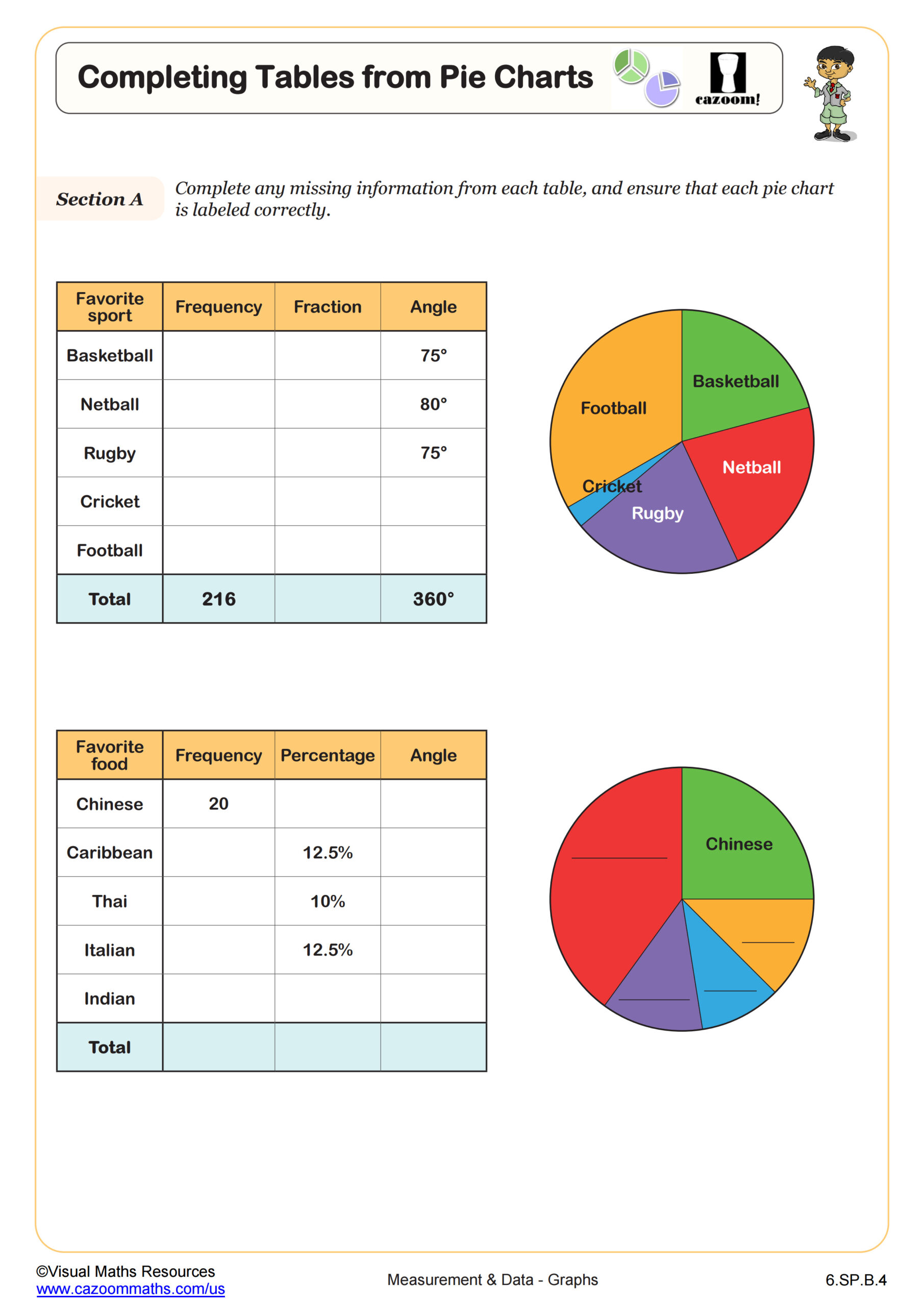
Completing Tables from Pie Charts
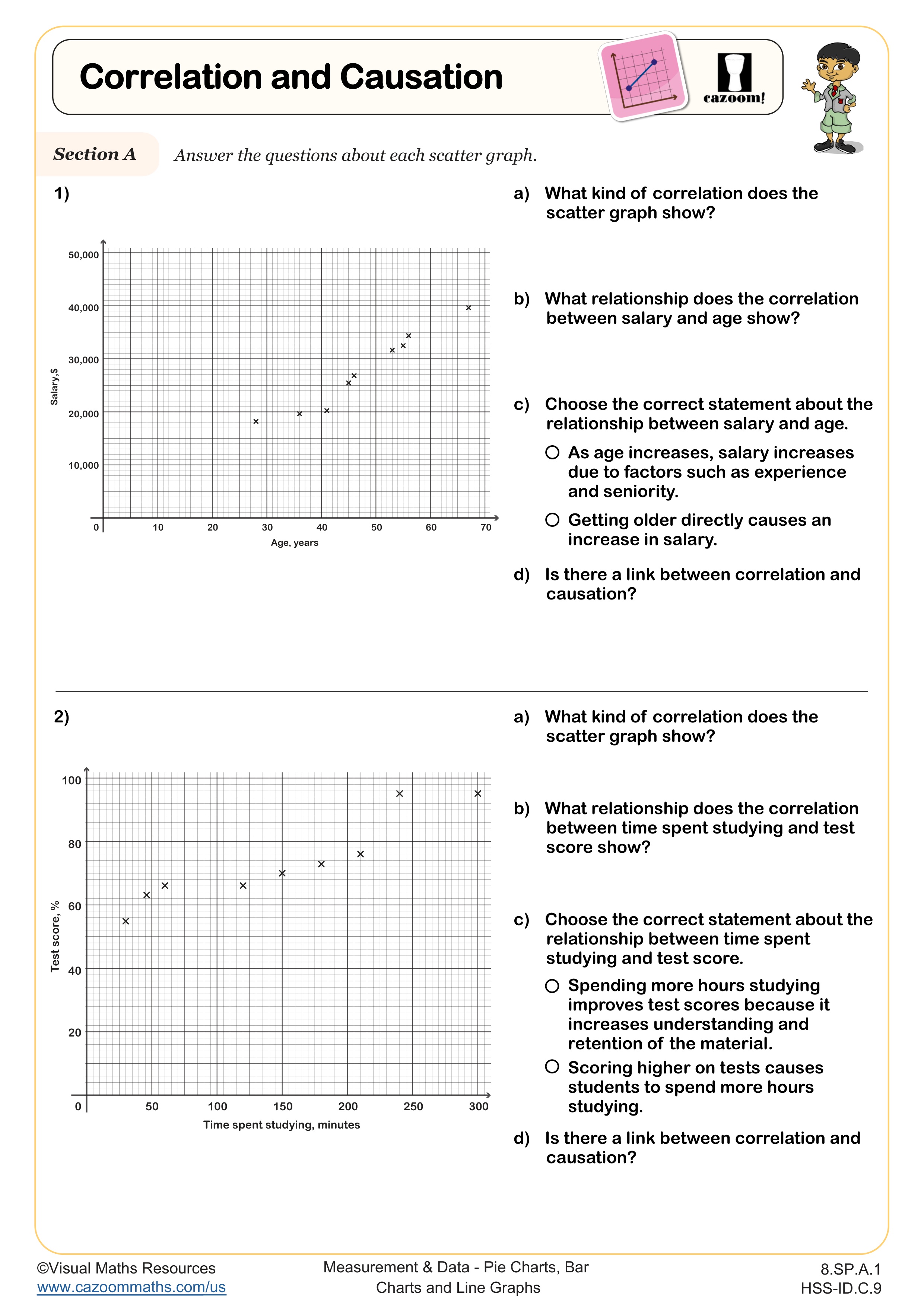
Correlation and Causation
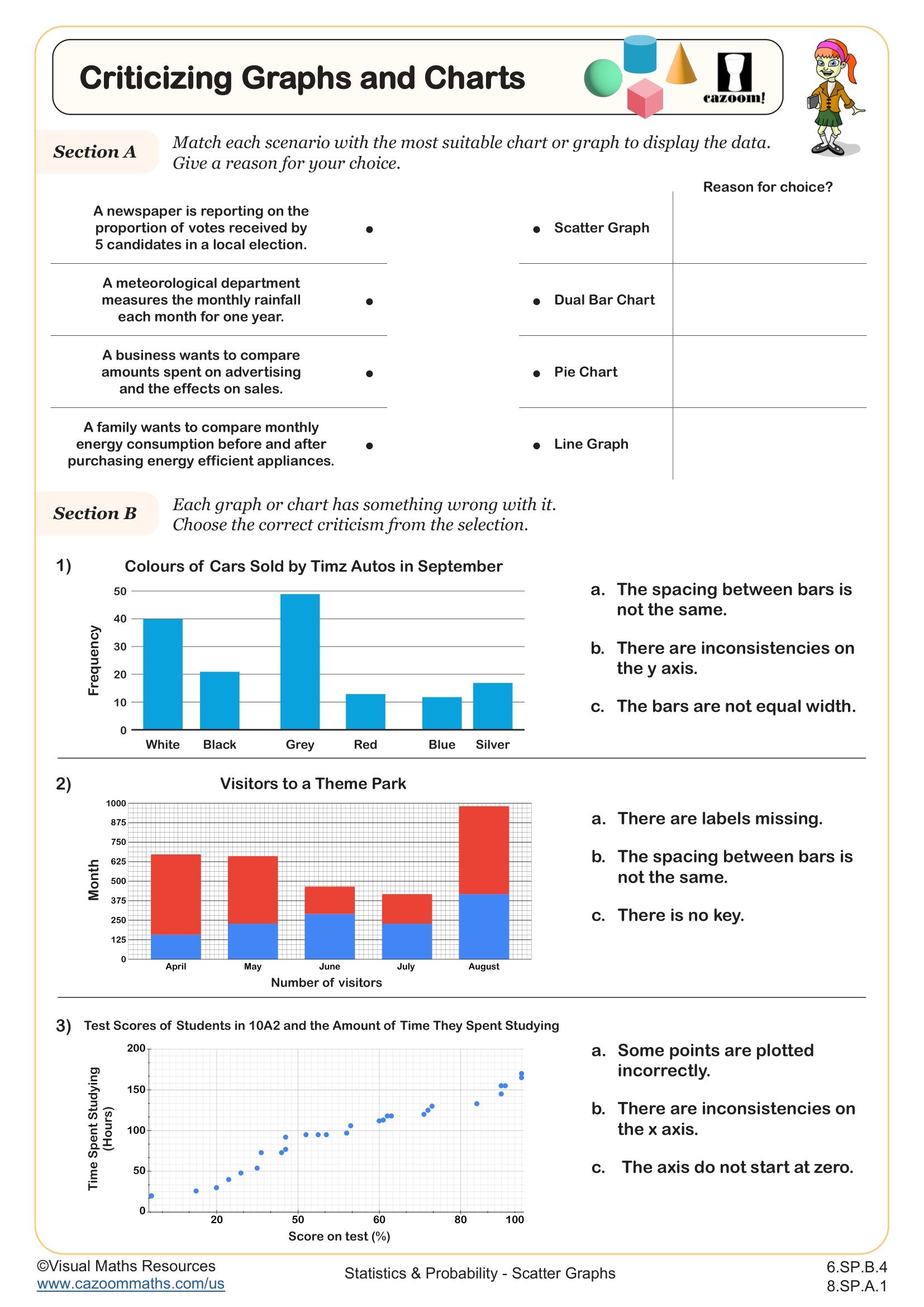
Criticising Graphs and Charts
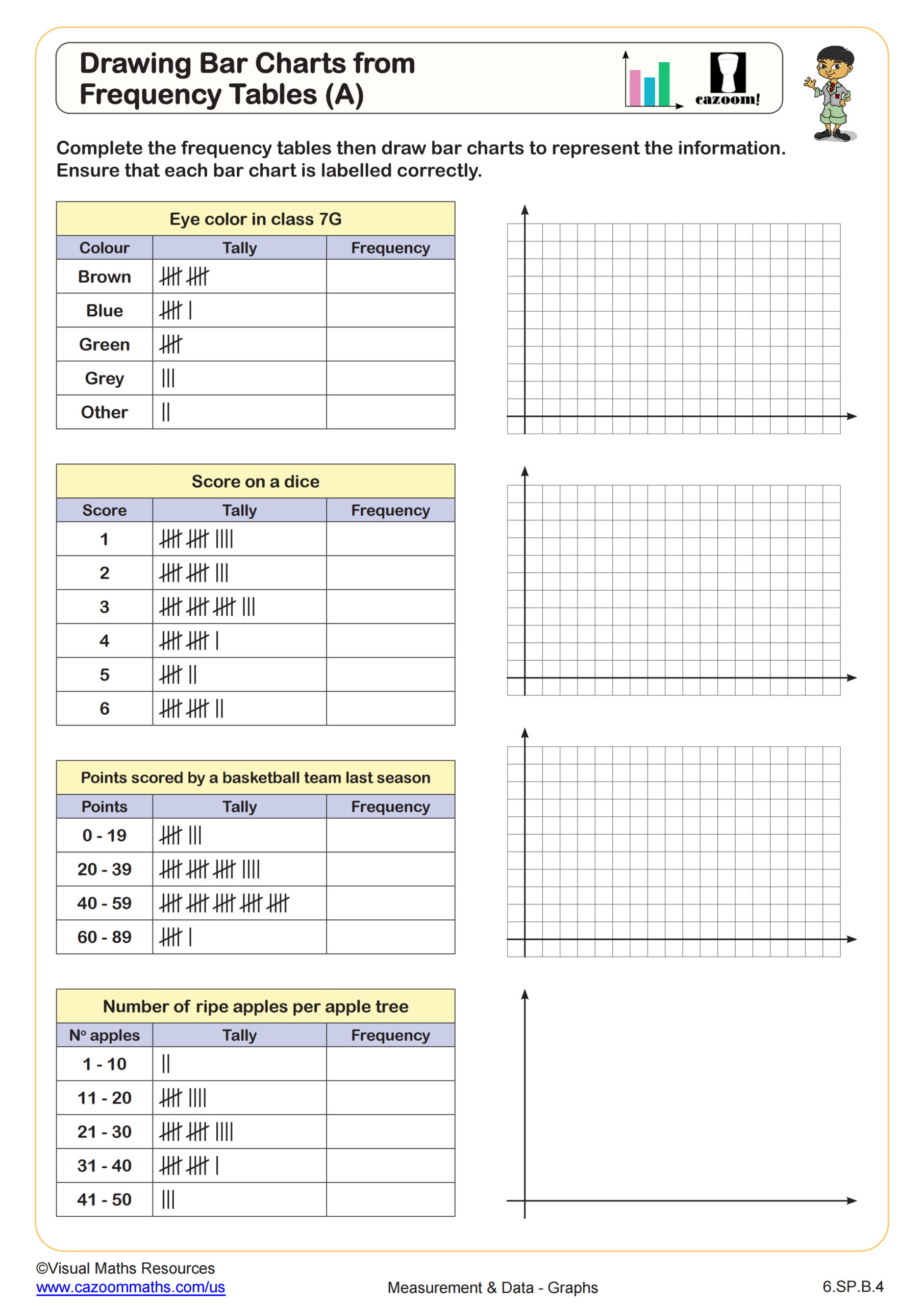
Drawing Bar Graphs from Frequency Tables (A)
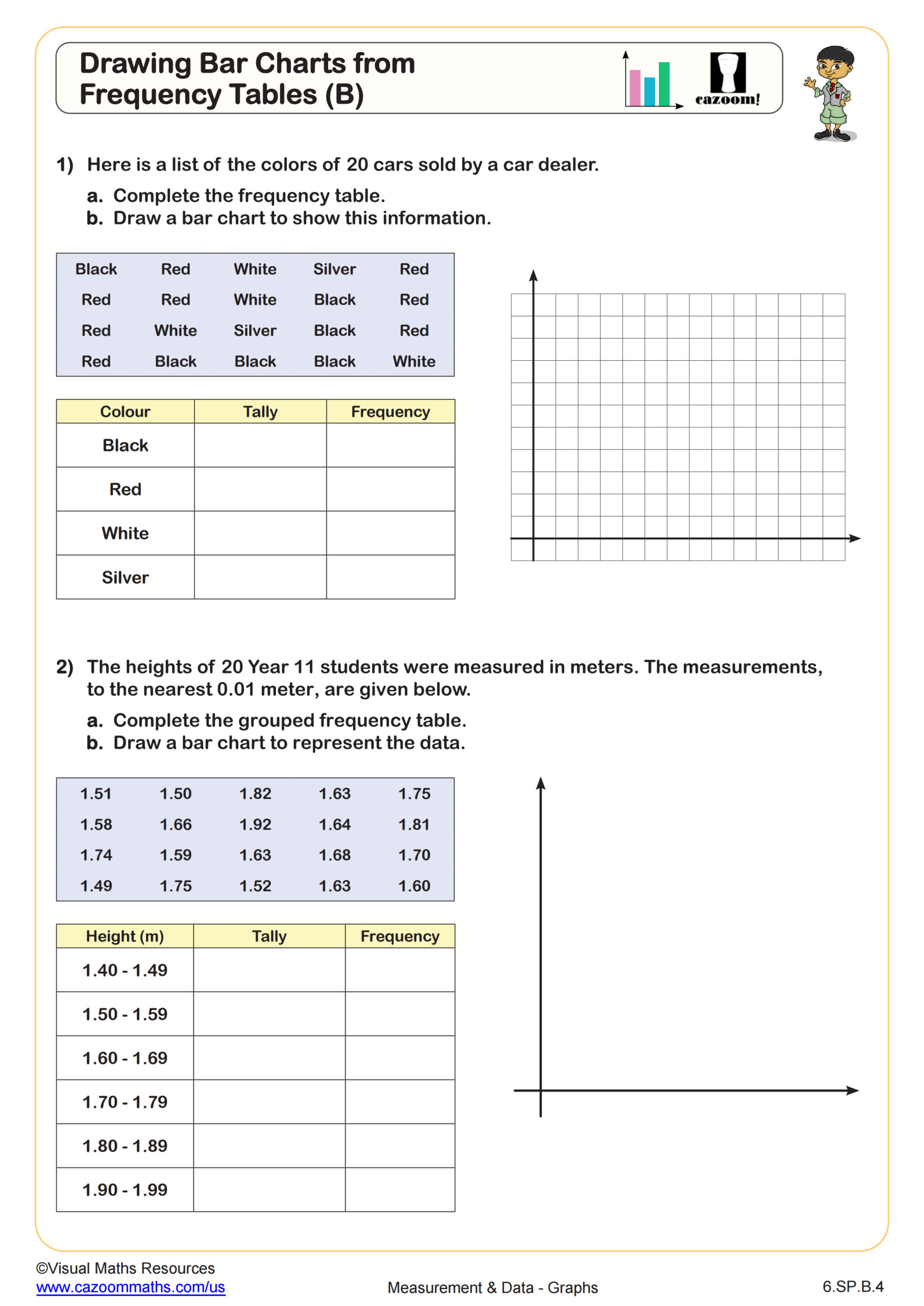
Drawing Bar Graphs from Frequency Tables (B)
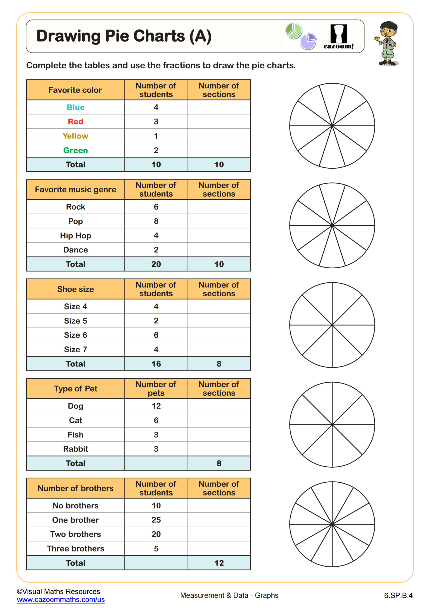
Drawing Pie Charts (A)
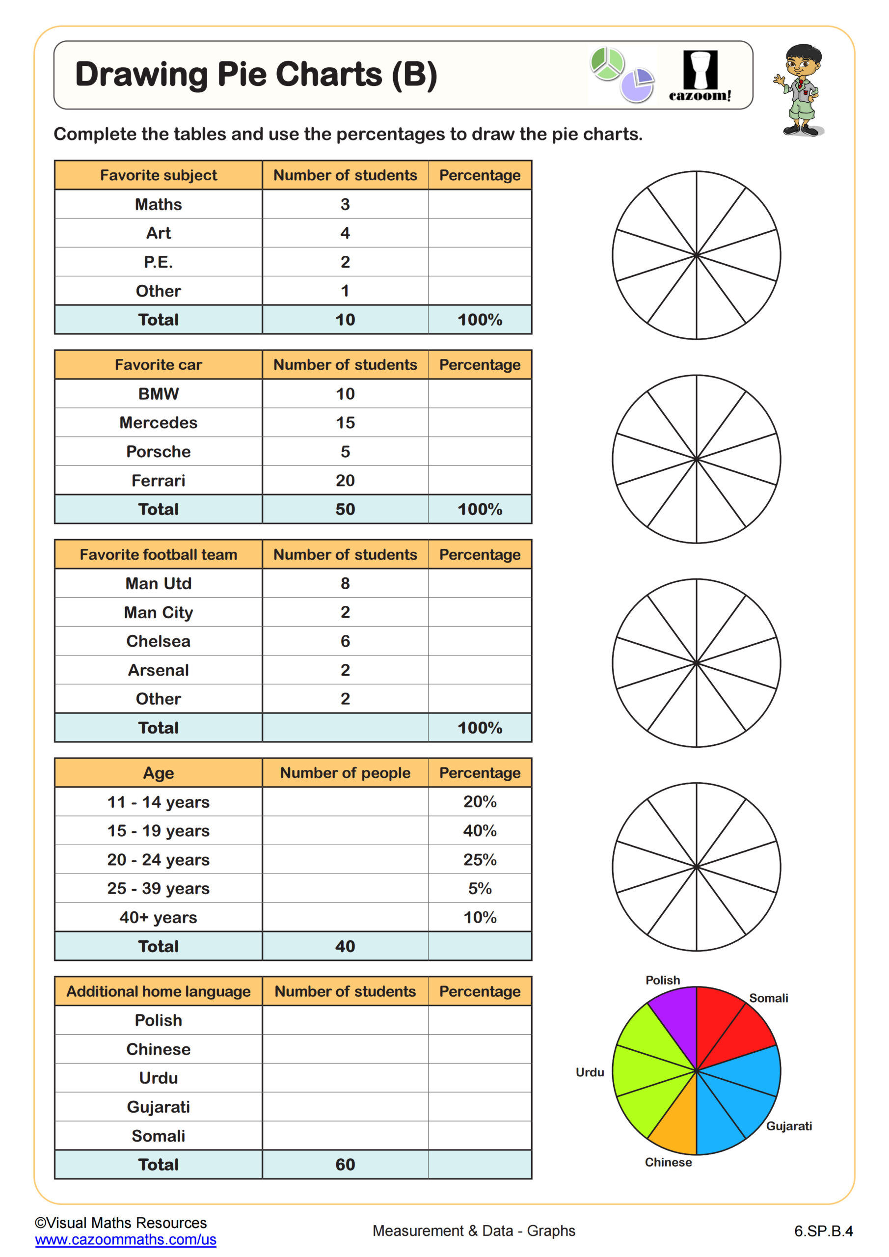
Drawing Pie Charts (B)
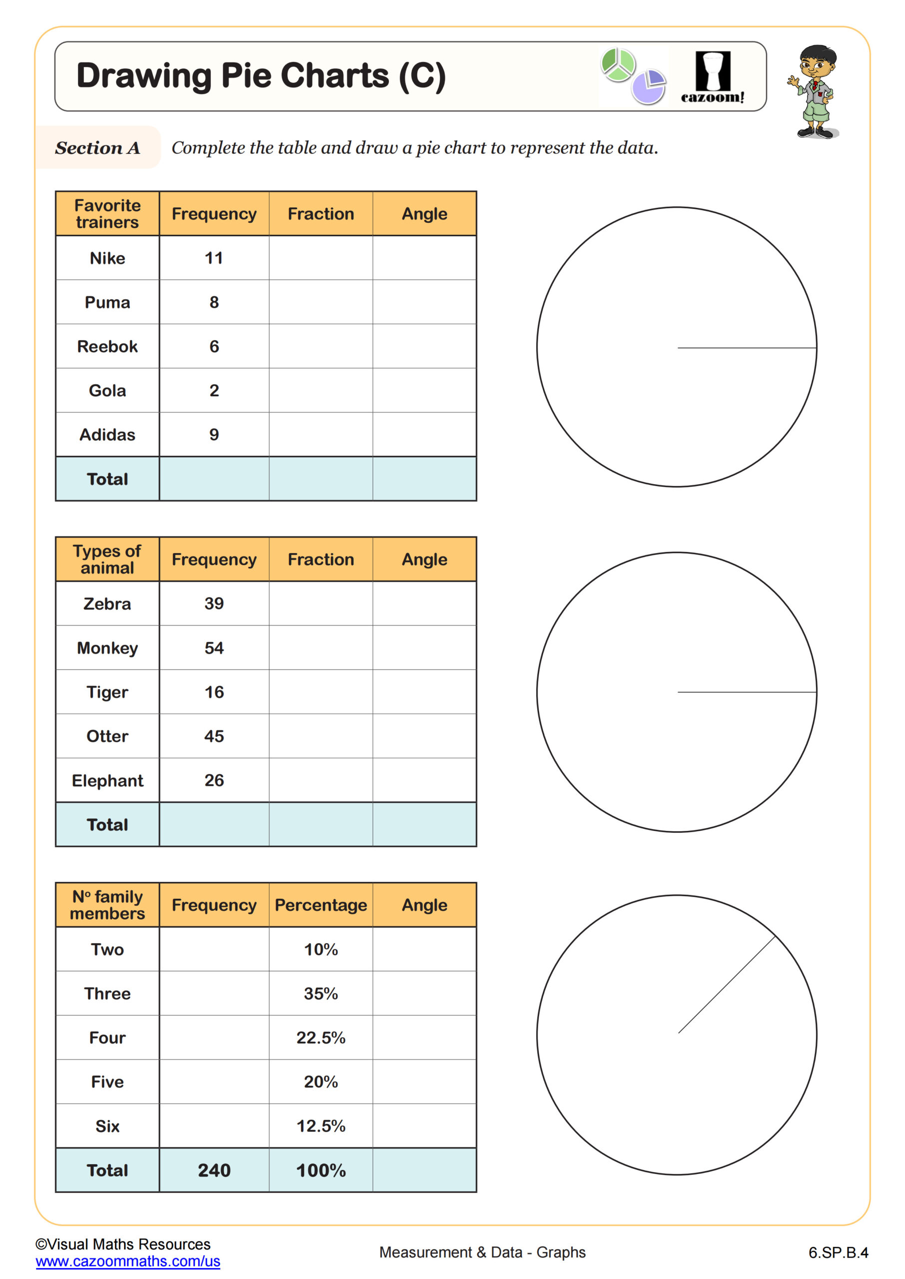
Drawing Pie Charts (C)
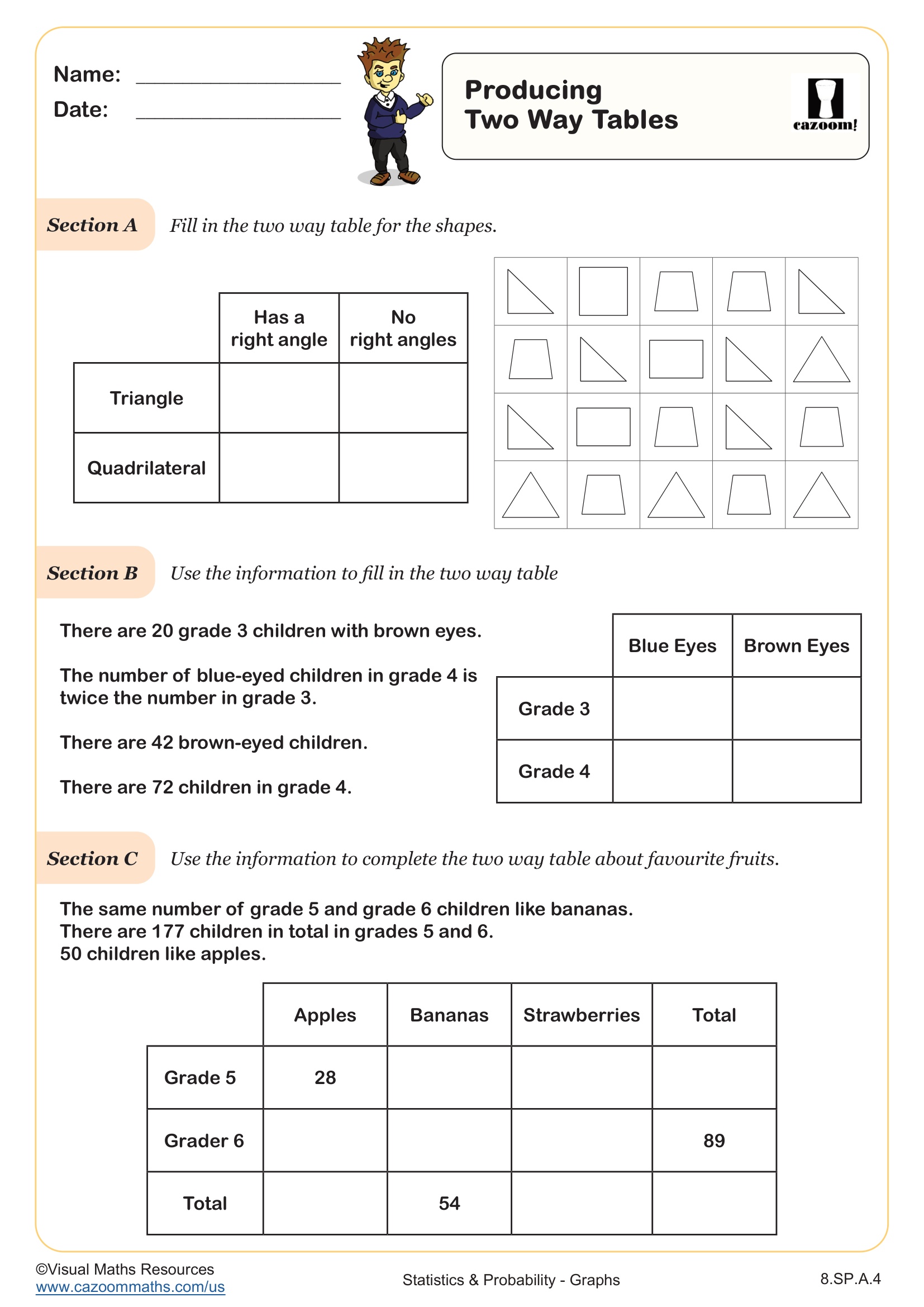
Producing Two Way Tables
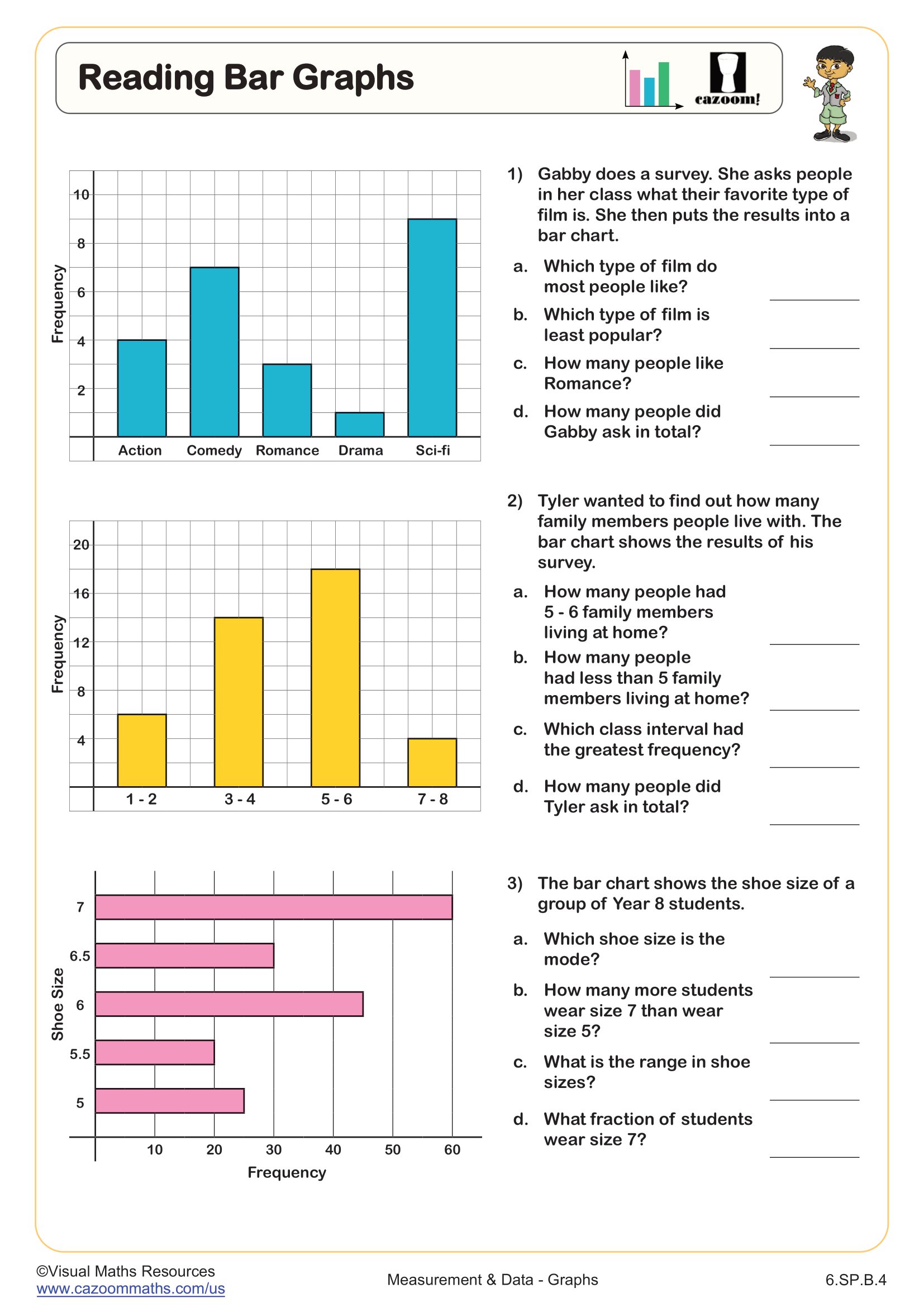
Reading Bar Graphs
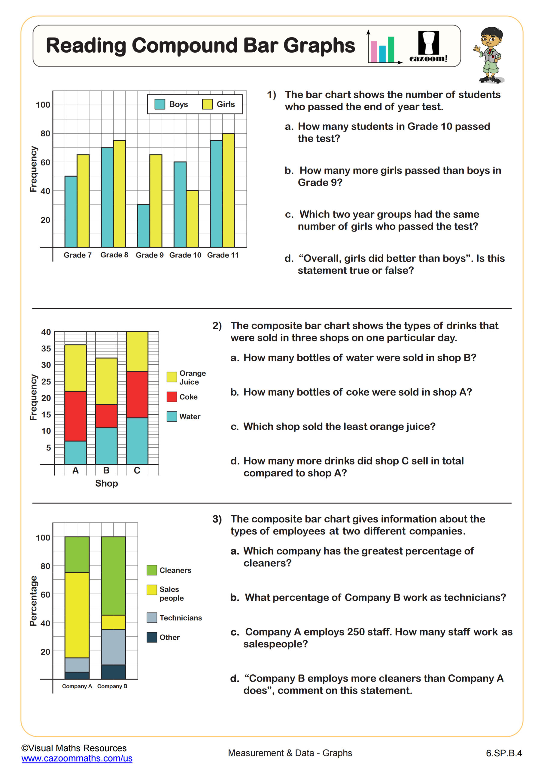
Reading Compound Bar Graphs
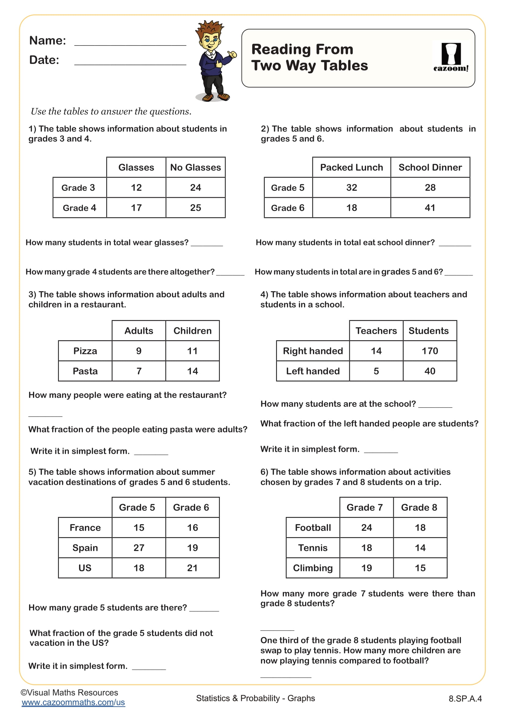
Reading from Two Way Tables
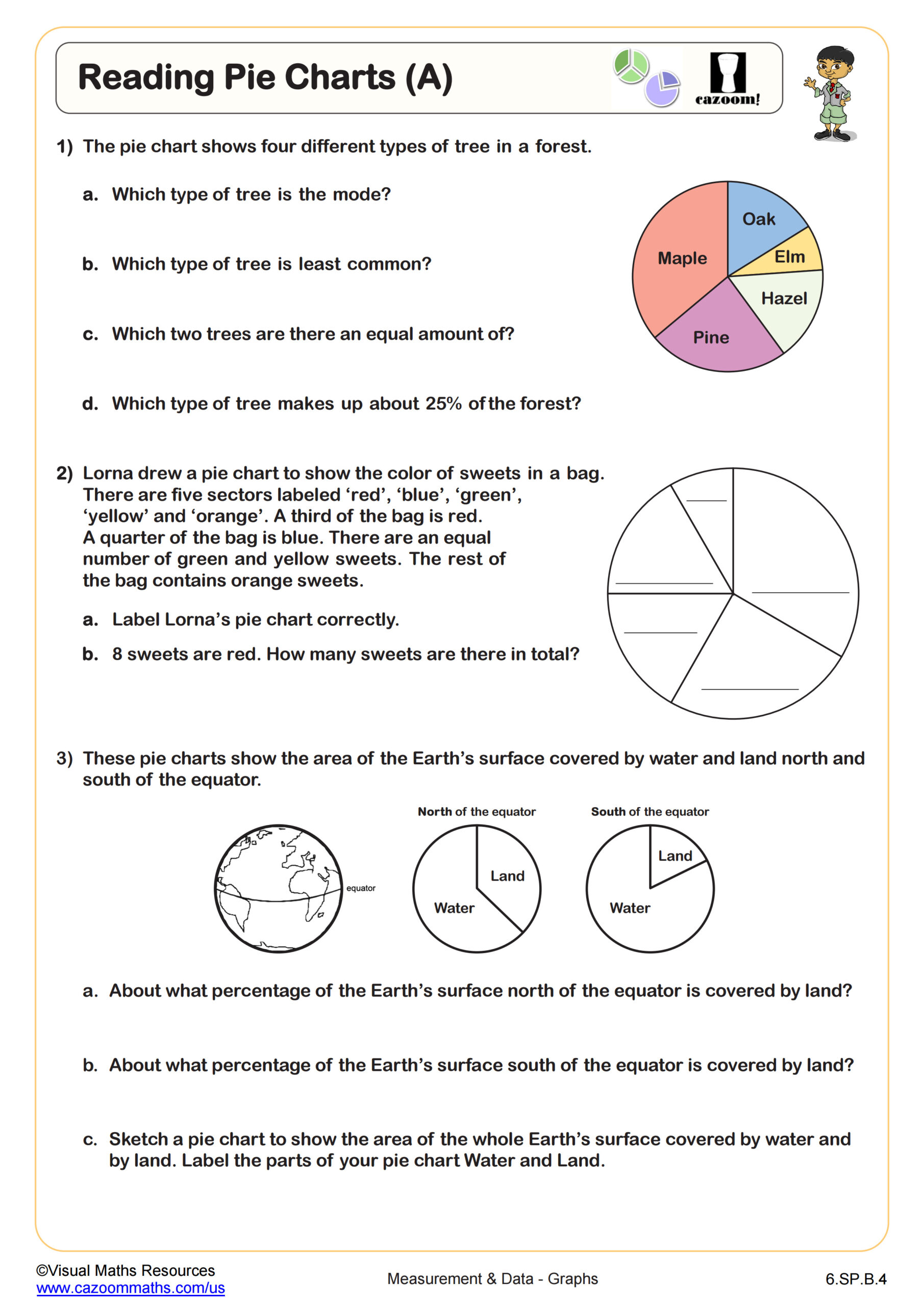
Reading Pie Charts (A)
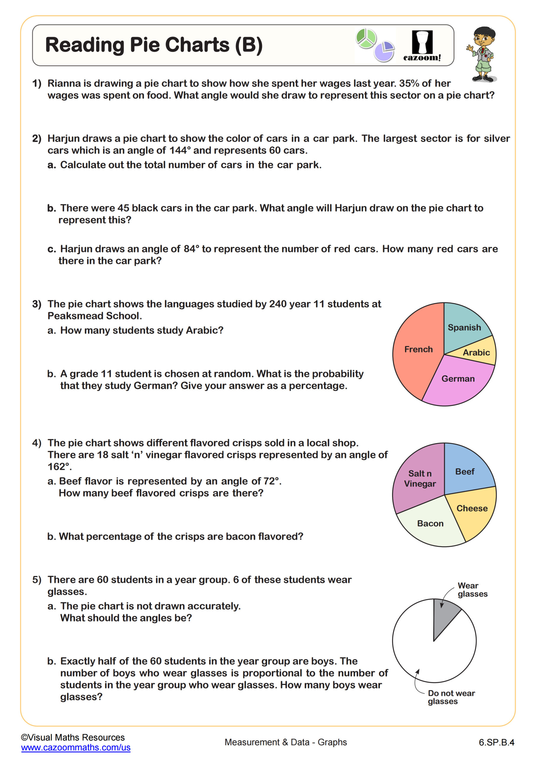
Reading Pie Charts (B)
All worksheets are created by the team of experienced teachers at Cazoom Math.
What's the Difference Between Pie Charts and Bar Charts?
Bar charts display categorical data using rectangular bars with heights or lengths proportional to the values they represent, making them ideal for comparing discrete categories. Pie charts divide a circle into sectors where each slice represents a proportion of the whole, showing parts of a complete data set. Both serve distinct purposes in the Common Core State Standards for statistics and probability starting in sixth grade.
Students often make the mistake of trying to use pie charts when they need to show change over time or compare values that don't add to a meaningful whole. Bar charts work better for survey responses where people could choose multiple options, while pie charts excel at showing budget allocations or demographic breakdowns where all categories combine to equal 100%. Understanding when to select each graph type becomes a tested skill on state assessments.
What Grade Levels Use Pie Chart and Bar Chart Worksheets?
These worksheets address middle school grade levels, specifically sixth grade, seventh grade, and eighth grade. Students encounter bar graphs and data representation starting in elementary school, but middle school deepens their analytical abilities by introducing two-way tables, comparative analysis, and decision-making about appropriate graph types for given scenarios.
The progression across middle school builds systematically. Sixth graders focus on accurate reading and basic construction of single bar graphs and simple pie charts. Seventh grade introduces comparative bar graphs, two-way frequency tables, and analyzing data distributions. By eighth grade, students select between multiple graphical representations based on data characteristics and make inferences from more complex visual displays, preparing them for high school statistics courses.
How Do Students Create Two-Way Tables From Graph Data?
Two-way tables organize categorical data by displaying the relationship between two variables in rows and columns, with frequencies or counts filling the cells. Students extract information from bar graphs showing multiple categories and reorganize it into table format, or reverse the process by converting table data into appropriate graphs. This skill requires understanding how the same data can be represented through different formats.
Two-way tables appear constantly in STEM fields, particularly in scientific research and data analysis. Medical researchers use them to compare treatment outcomes across different patient groups, while environmental scientists organize climate data by region and season. Market researchers analyze consumer preferences by age group and product category using these tables. Students who master converting between graphs and tables develop flexibility in data interpretation that serves them throughout science coursework and standardized testing situations.
How Can Teachers Use These Worksheets Most Effectively?
The worksheets scaffold learning by starting with straightforward graph reading exercises before progressing to construction tasks and then advancing to comparison and selection problems. This graduated approach allows students to build confidence with basic interpretation before tackling the more demanding skills of creating graphs or choosing appropriate representations. Answer keys enable students to check their work immediately, identifying misconceptions before they become ingrained.
Teachers find these worksheets valuable for differentiated instruction during statistics units, assigning different difficulty levels based on student readiness. They work well as warm-up activities to activate prior knowledge before introducing new graph types, or as exit tickets to assess understanding after lessons. Many teachers use them for targeted intervention with students who struggle during state assessment preparation, while others assign them as homework to reinforce classroom learning without requiring extensive parent explanation.