Middle School Scatter Graphs Worksheets
All worksheets are created by the team of experienced teachers at Cazoom Math.
What Are Scatter Graphs and Why Do Students Learn Them?
Scatter graphs, also called scatter plots, display paired data as points on a coordinate plane to reveal patterns and relationships between two quantitative variables. Middle school students learn to create these graphs, identify correlation types, and interpret trends as part of the statistics and probability domain in Common Core State Standards. This foundation prepares students for more advanced statistical analysis in high school algebra and supports data literacy skills tested on state assessments.
A common misconception emerges when students assume that correlation proves causation. Many students confidently draw a line of best fit through clustered points but then incorrectly conclude that one variable causes changes in the other. Teachers address this by presenting scatter plots with obvious correlations but no causal relationship, such as ice cream sales and drowning incidents (both increase in summer due to a third variable: temperature).
Which Grade Levels Use Scatter Graph Worksheets?
These scatter graph worksheets align with middle school curriculum for 6th, 7th, and 8th grade students. The topic appears most prominently in 8th grade standards, where students analyze bivariate data and construct scatter plots to investigate patterns of association, but foundational coordinate graphing and data interpretation begin in earlier middle school grades. This progression prepares students for high school algebra courses that depend heavily on understanding relationships between variables.
The worksheets increase in complexity across grade levels. Students typically start by plotting points and identifying obvious positive or negative correlations in 6th grade. By 7th grade, they distinguish between strong and weak correlations. In 8th grade, students draw lines of best fit, use them to make predictions, and recognize that linear associations don't always describe real-world data perfectly, building critical thinking about mathematical models.
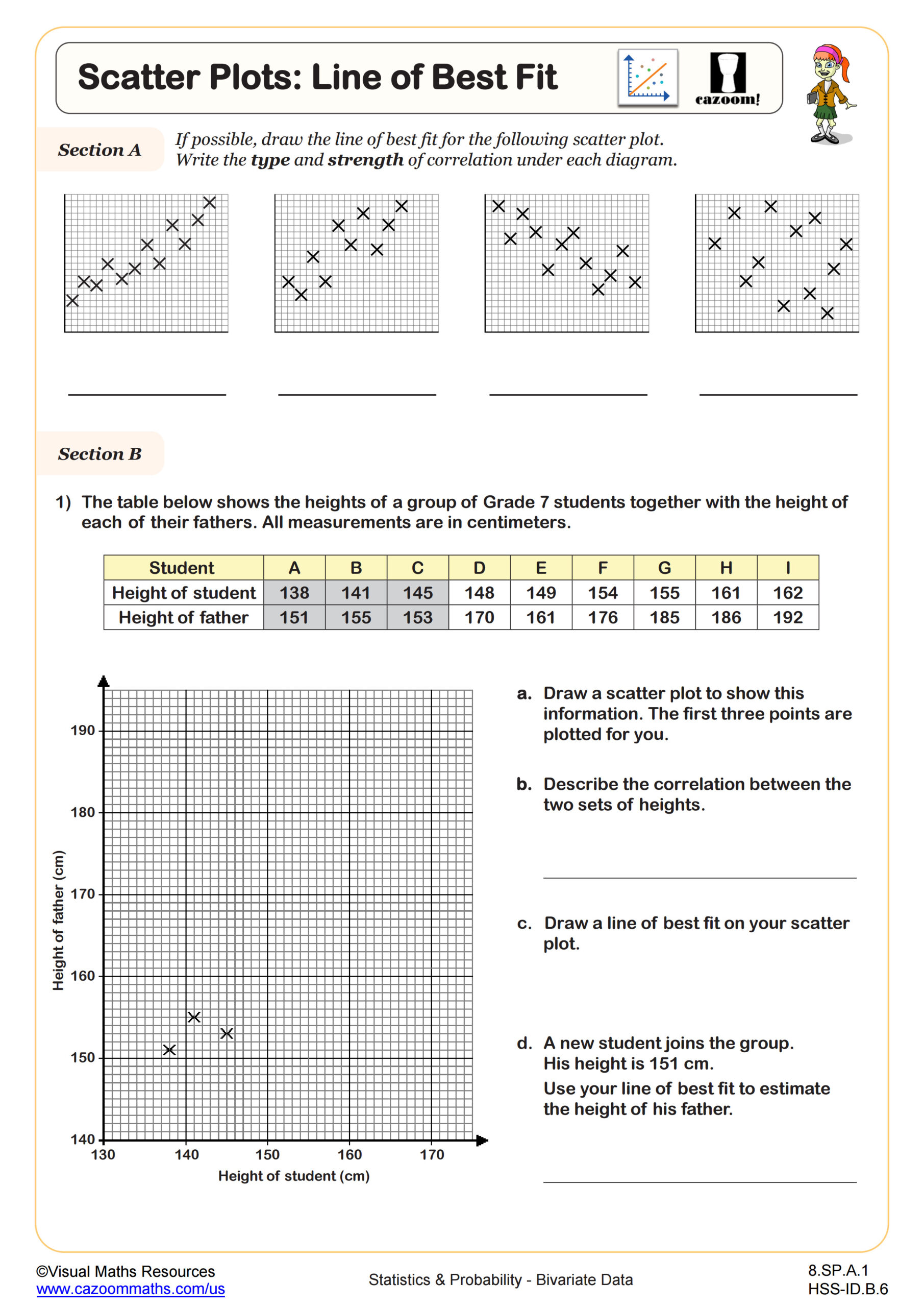
How Do Students Draw Lines of Best Fit?
A line of best fit is a straight line drawn through the center of data points on a scatter plot to model the general trend, with roughly equal numbers of points above and below the line. Students learn to draw these lines by eye in middle school, positioning the line so it minimizes the overall distance to all points rather than connecting specific dots. This visual approach builds intuition before formal linear regression in high school algebra, where students calculate equations using statistical methods.
Lines of best fit connect directly to STEM careers that require data analysis and prediction. Meteorologists use them to model temperature trends over time, engineers apply them to predict material strength under different conditions, and medical researchers analyze relationships between medication dosages and patient responses. When students recognize that the scatter plots in their worksheets mirror how scientists and analysts make evidence-based predictions from real measurements, the abstract skill gains concrete purpose beyond the math classroom.
How Can Teachers Use These Scatter Graph Worksheets Effectively?
The worksheets provide structured practice that moves students from basic plotting to complex interpretation, with each subtopic building on coordinate graphing skills students developed in earlier grades. Teachers find the answer keys particularly valuable for identifying where students lose points: forgetting to label axes, scaling graphs incorrectly, or misidentifying correlation direction. The progression from constructing plots to analyzing correlation to drawing lines of best fit mirrors the sequence most textbooks follow, making these worksheets straightforward to integrate into existing unit plans.
Many teachers assign scatter graph worksheets during warm-ups to maintain graphing fluency throughout the school year, not just during the statistics unit. Others use them for differentiated instruction, providing simpler correlation identification worksheets to students still mastering the concept while advanced learners work on line of best fit problems. The worksheets also work well for paired activities where one student plots data while their partner identifies the correlation type, then they check their work together using the answer key before switching roles for the next problem.