Back to:
Bar Charts vs Histograms RESOURCE (FREE DOWNLOAD)
Bar Charts vs Histograms RESOURCE DESCRIPTION
This resource compares bar charts and histograms, with examples and a list of differences, useful for classroom discussions.
All worksheets are created by the team of experienced teachers at Cazoom Math.

RELATED TO Bar Charts vs Histograms
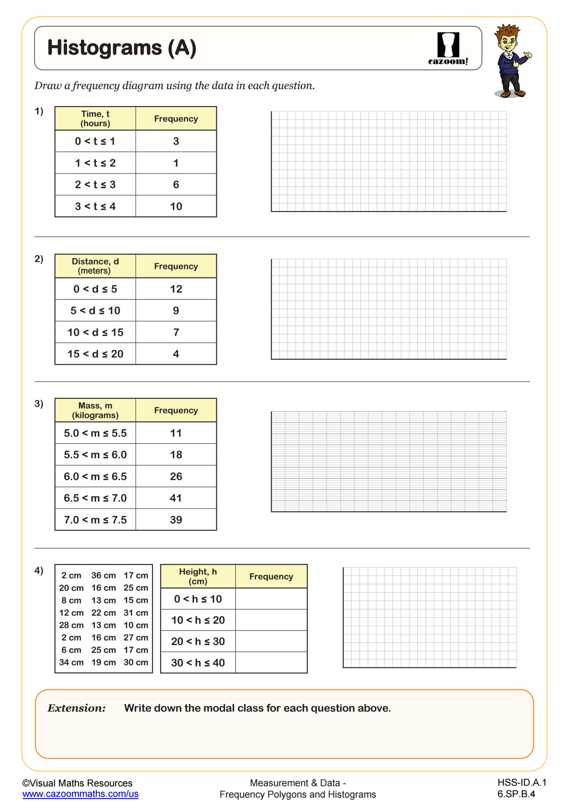
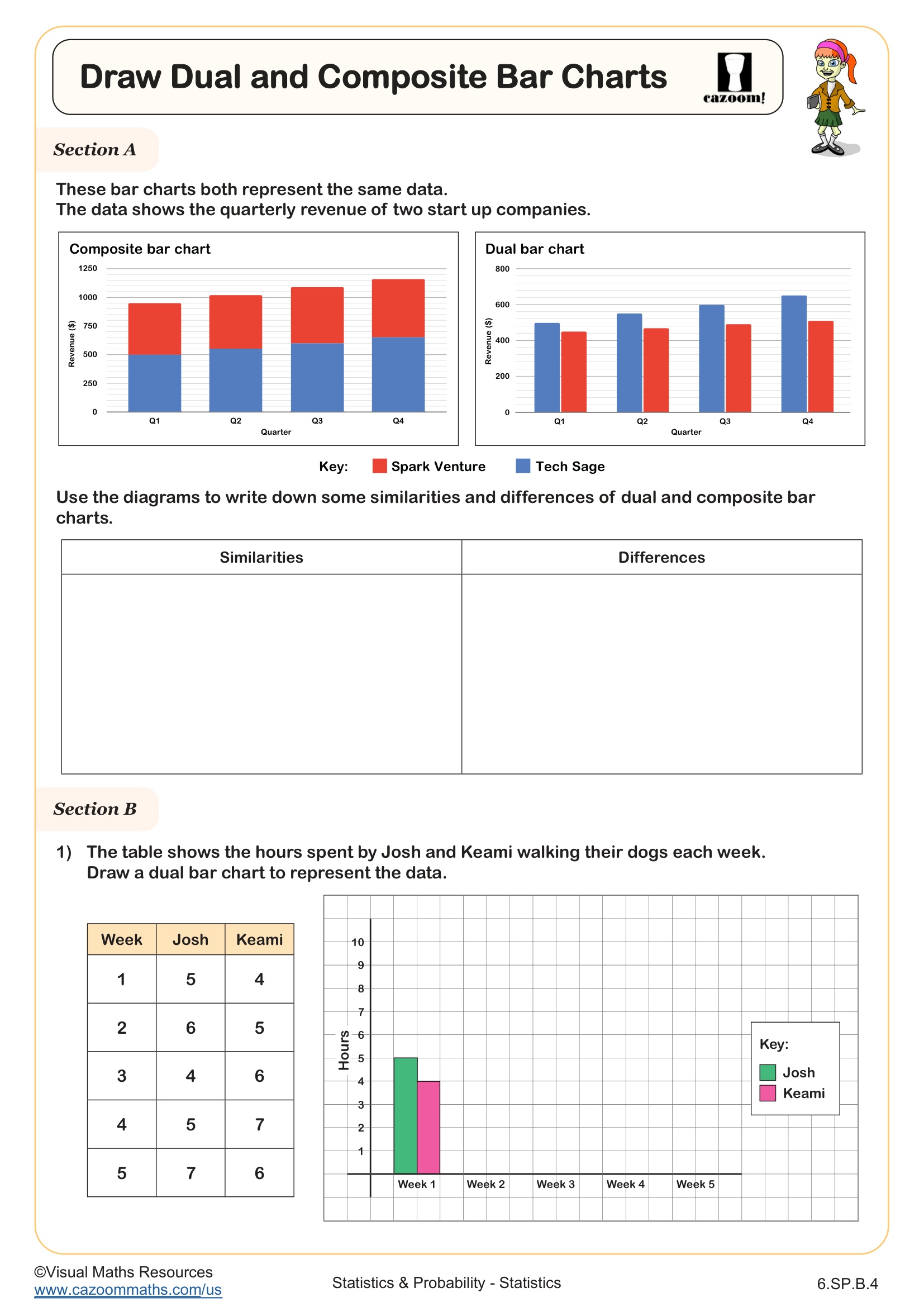
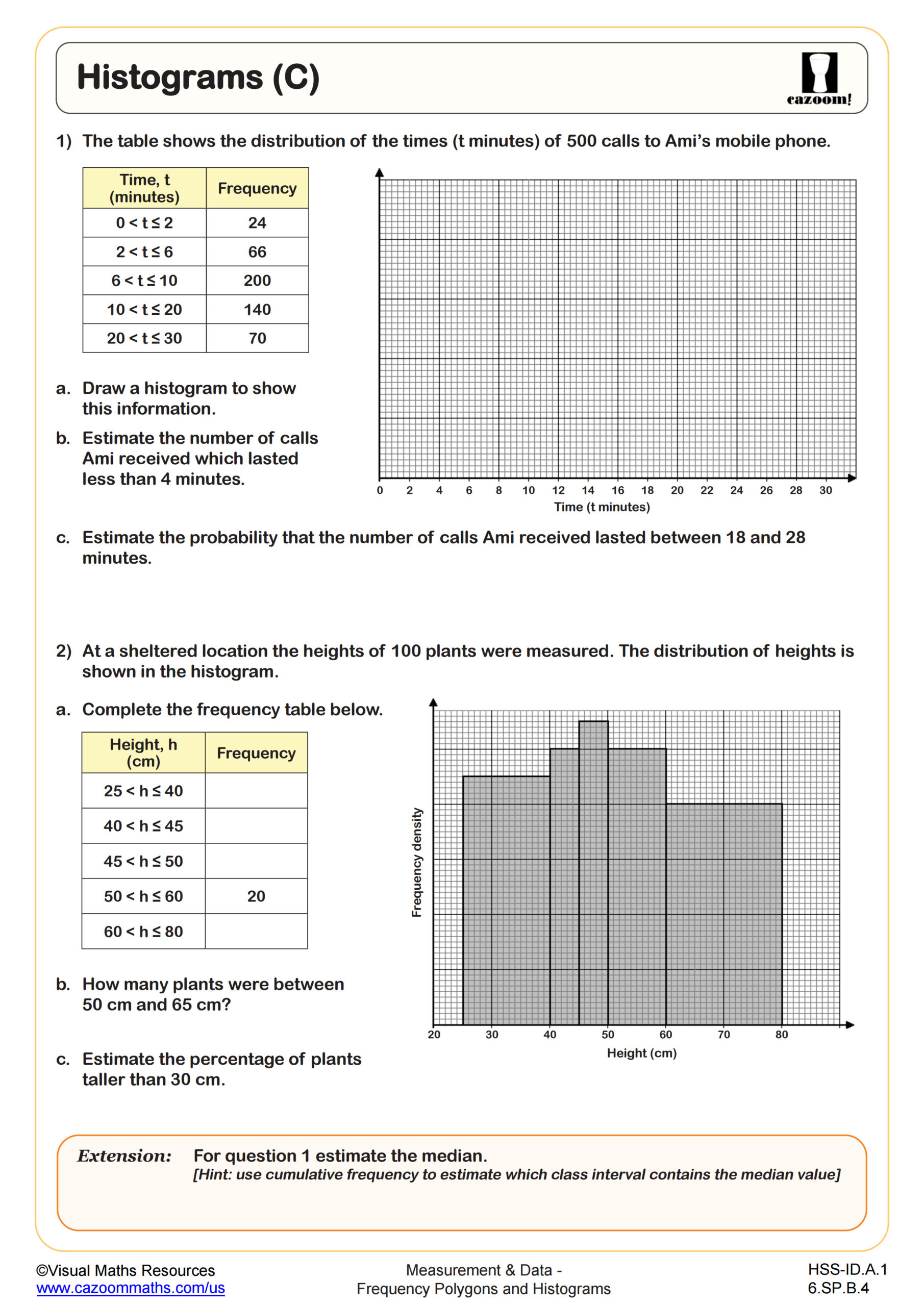
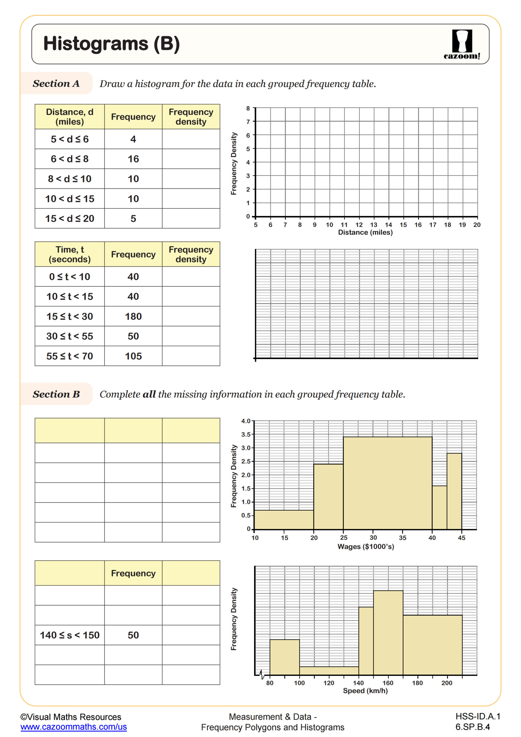
Bar Charts vs Histograms
This resource clarifies the difference between bar charts and histograms, two common ways to visualise data, ensuring learners use them correctly.
Why is understanding this difference important?
Bar charts and histograms look similar but are used for different data types:
- Bar charts: Represent categorical data (data divided into groups).
- Histograms: Show the distribution of numerical data.
- Choosing correctly: Using the wrong chart leads to misinterpretation.
How can this resource help?
This resource offers a clear comparison:
- Definitions: Explains what each chart is and the data it displays.
- Visual examples: Illustrate the differences with clear examples.
- Key distinctions: Highlights how to tell bar charts and histograms apart.
- Free PDF download: Provides a handy reference tool.
Benefits for learners:
- Improves understanding of different data visualisation techniques.
- Develops skills in choosing the appropriate chart type for data.
- Supports accurate data analysis and interpretation.
This resource is perfect for teachers introducing these concepts or providing Review support. It's also a valuable tool for students needing extra practice or for parents helping with mathhomework.
Explore our wide range o