Year 9 Histograms and Frequency Polygons Worksheets
All worksheets are created by the team of experienced teachers at Cazoom Maths.
6 Ways Our Ready-to-use Year 9 Frequency Polygon and Histograms Worksheets Support Homework Success
At this stage, students are expected to move beyond simple bar charts into more precise statistical diagrams. Regular practice of polygons and histograms helps students develop their skills in working with class intervals and their midpoints, as well as scaling. Students can see how different visualisations show the same data through distinct viewpoints when they study both graph types together. The process of comparing data sets and describing trends mathematically becomes more effective for them through repetition.
Specific learning benefits include:
• The activity helps students develop their ability to read data presented in grouped tables.
• The student learns to manage class intervals and boundaries, which leads to better precision in his work.
• The method provides better analysis of both symmetrical and skewed distribution patterns.
• The course delivers fundamental information which students require to succeed in their GCSE statistics program.
• The book helps students improve their exam technique by providing detailed step-by-step solutions to problems.
• Students can use the program to conduct their own research while studying the given content.
Worksheet Topics at a Glance: Frequency Polygon, Histograms and More
These worksheets follow a clear path from guided examples to independent questions. Pupils begin by plotting frequency polygons step by step, then proceed to histograms with both equal and unequal class widths. Later sheets combine both skills to encourage comparison. Fully worked solutions are included, allowing students to verify their methods.
The worksheets in this collection include:
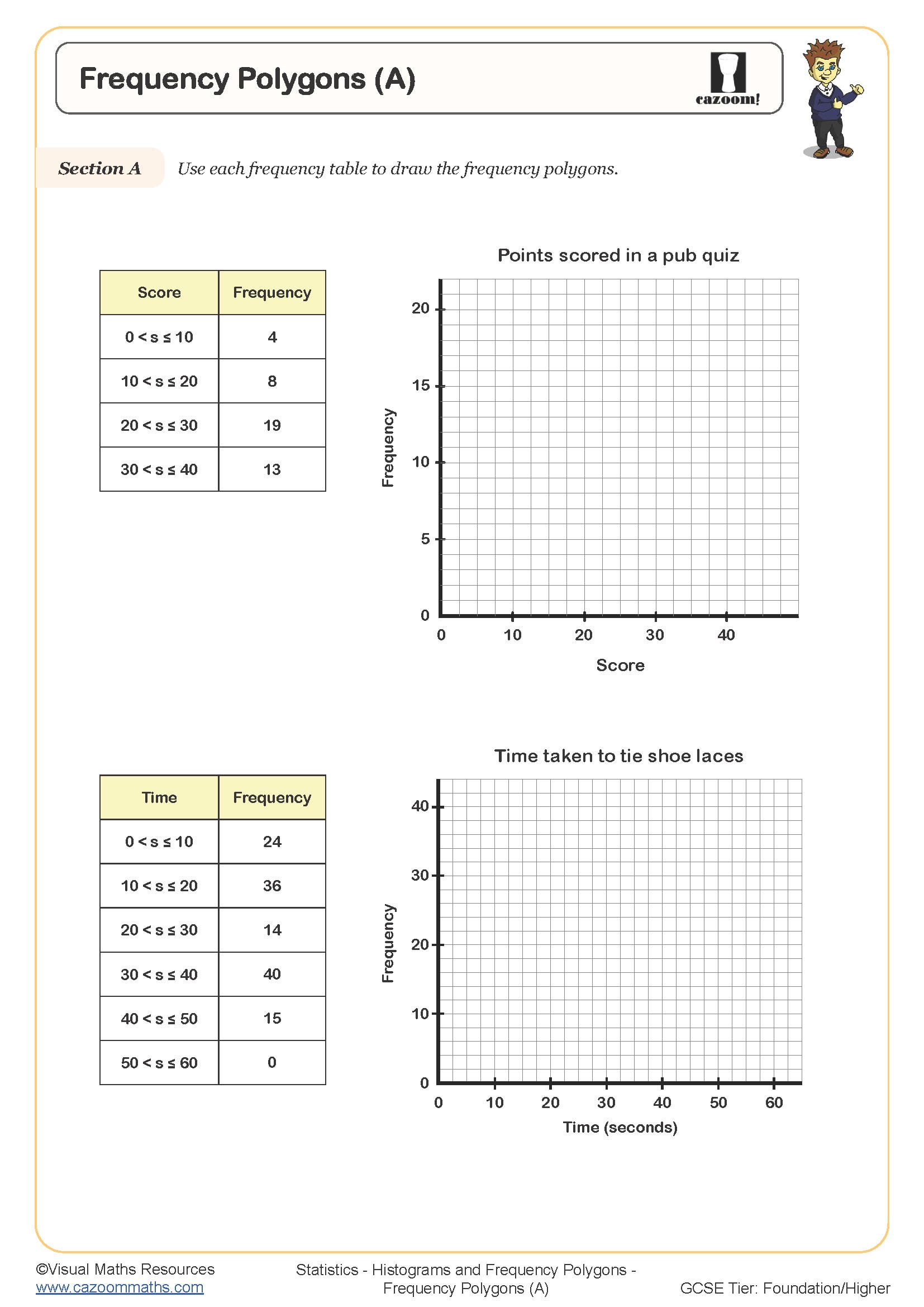
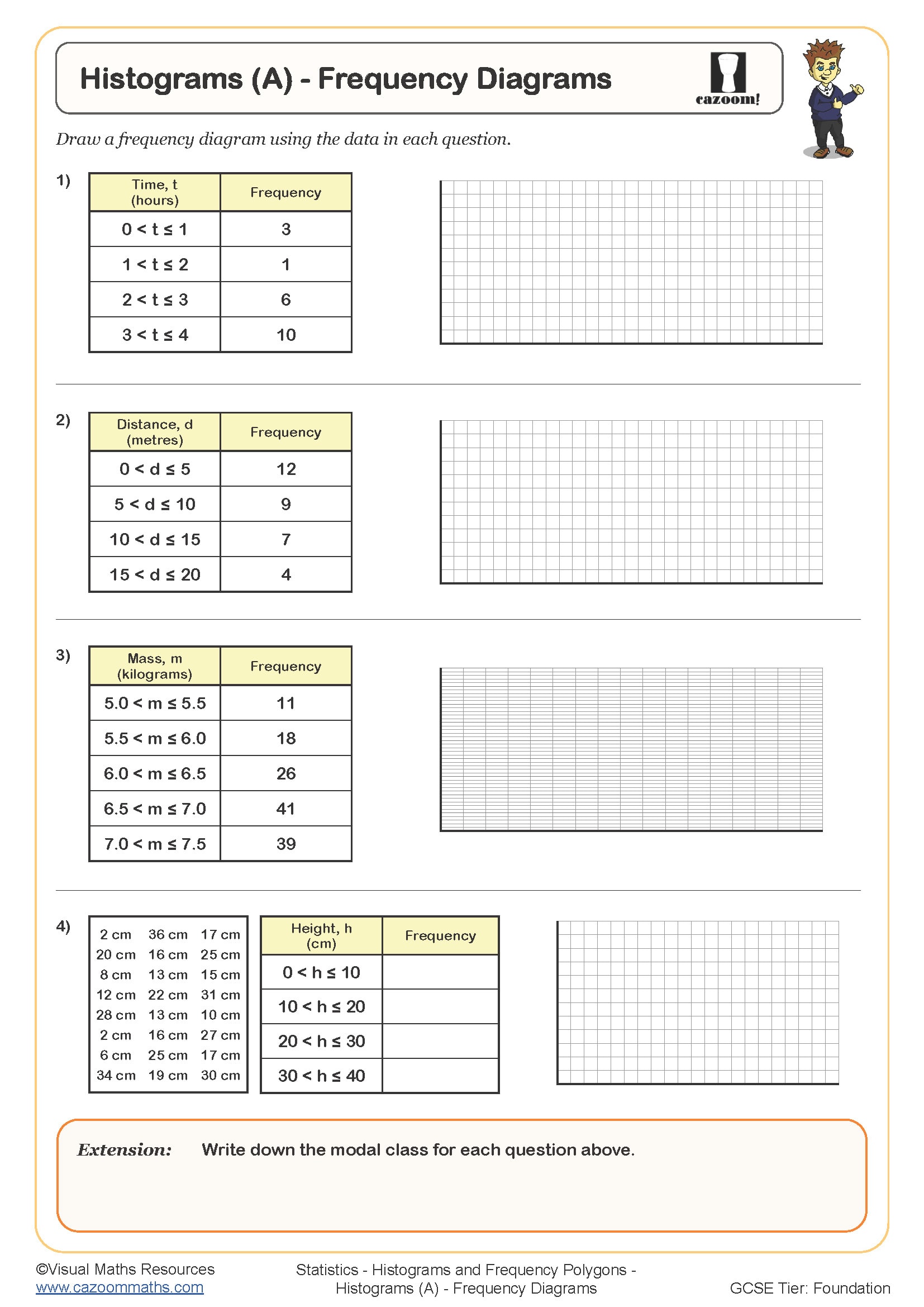
• Frequency Polygon — introduces plotting points from frequency tables and joining with straight lines
• Histograms — teaches accurate bar drawing with unequal class widths
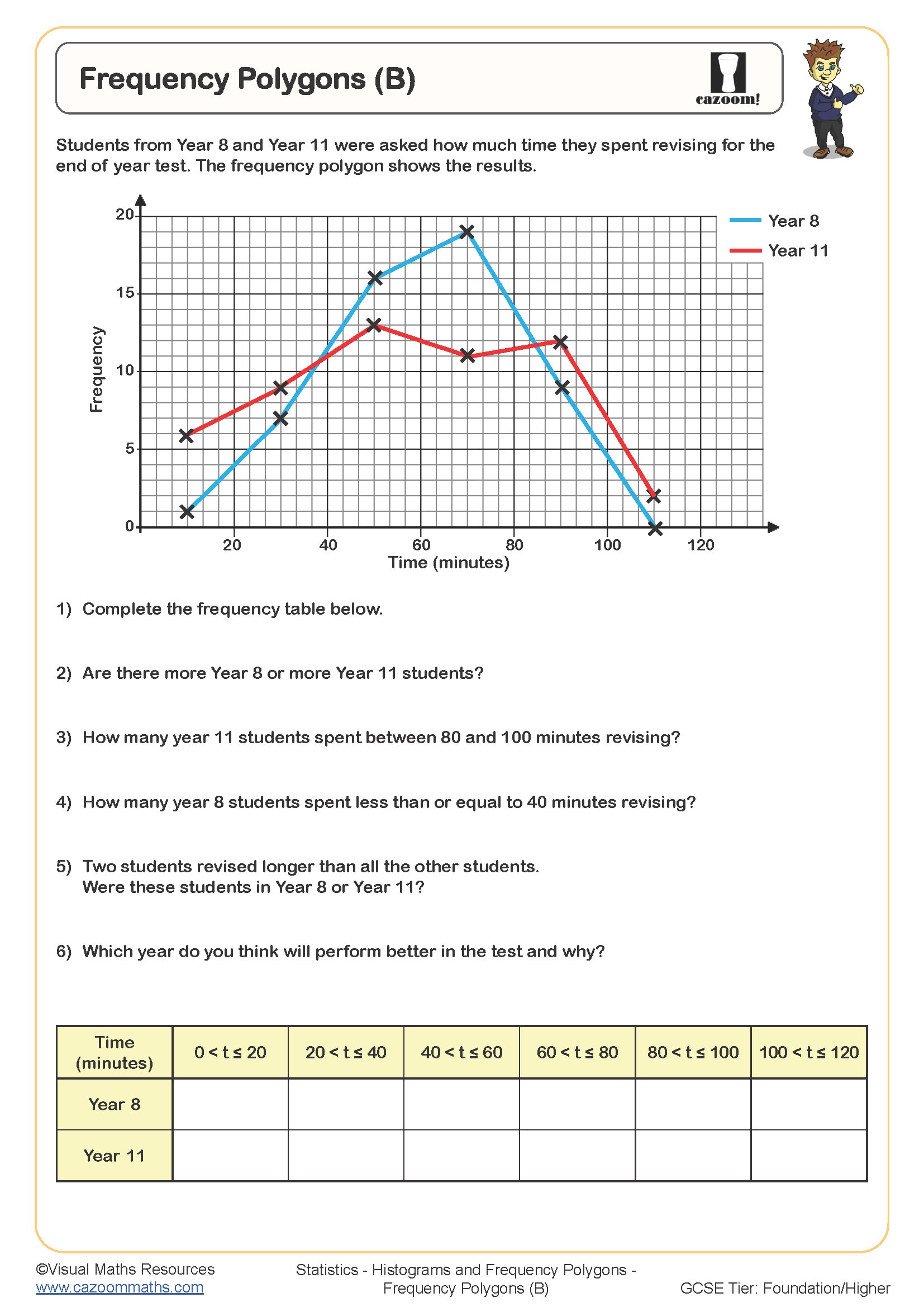
• Frequency Polygons and Histograms — combines both graph types to strengthen comparison skills
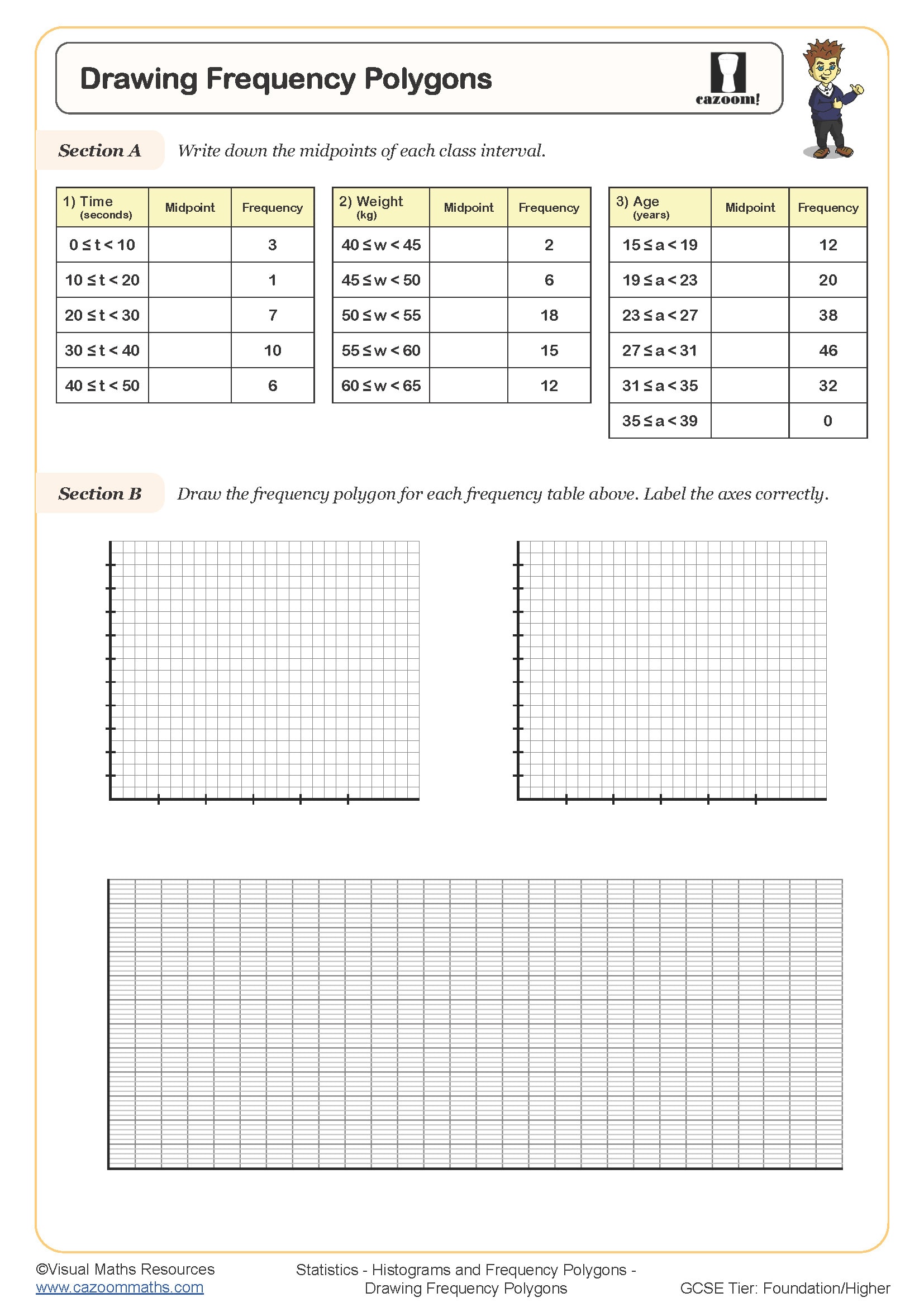
• Drawing Frequency Polygons — practices extracting and plotting midpoints with precision
• Drawing Histograms — reinforces scaling and bar widths from grouped data
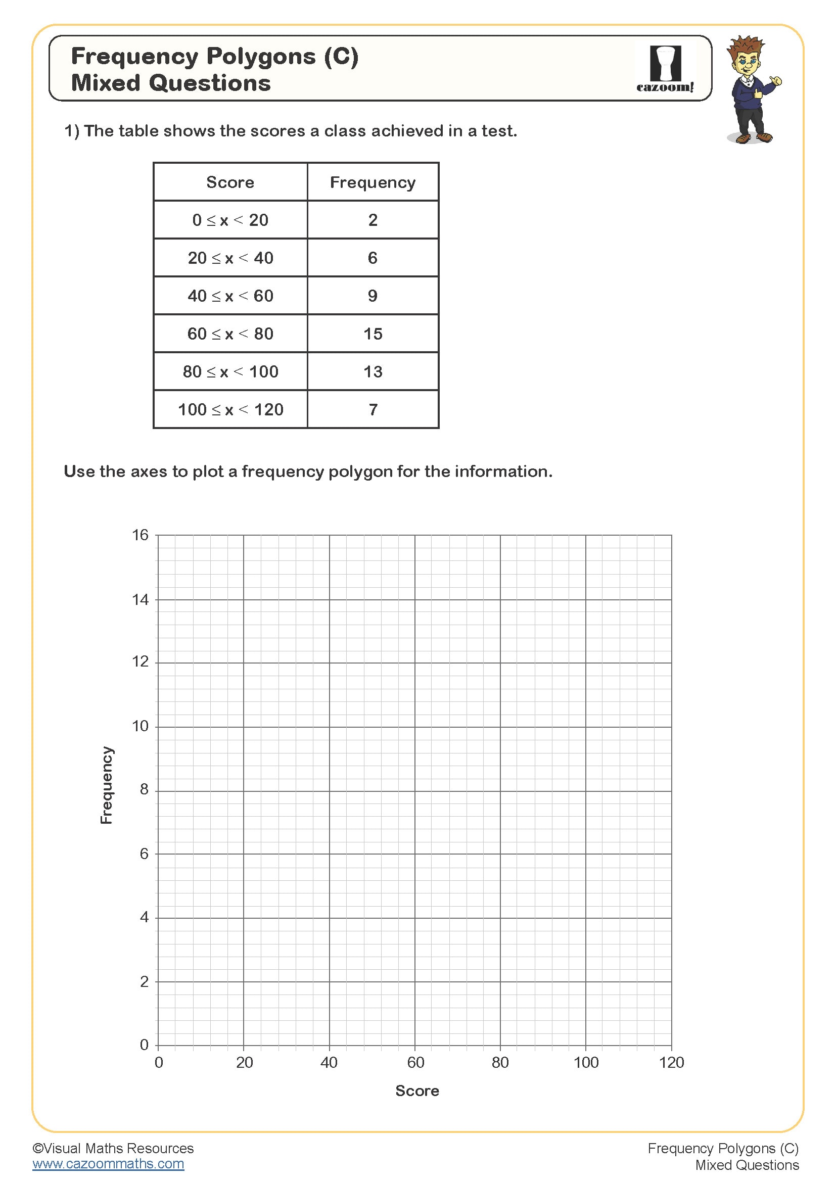
• Frequency Polygons and Histograms (2) — extends skills with more challenging data sets
Support Every KS3 Statistics Topic With Cazoom Maths Worksheets
Teachers often look for resources that can support mixed-ability groups without adding to their planning time. The worksheets start with simple problems that advance to more difficult tasks, which makes the content adaptable. The worked solutions present each step of the reasoning process to students so they can identify their mistakes at specific points. The system enables students to check their answers, which results in two benefits. The process saves teachers time for grading while students develop their ability to self-check their work. The sheets progress at a steady pace, making them suitable for whole-class instruction, homework tasks, and individualised support.
Every Student’s First Step to Practical Maths: Year 9 Statistics Worksheets
The ability to represent data visually is useful beyond maths lessons. Polygons and histograms are applied in everyday and academic settings, such as:
• Analysing rainfall or temperature changes in geography and science
• Comparing player statistics in sports performance reviews
• Tracking sales or profits over time in business studies
• Identifying trends in public health data
• Monitoring social media engagement patterns
• Reviewing travel times and transport delays
• Comparing test results to highlight performance across groups