Year 11 Cumulative Frequency and Box Plots Worksheets
All worksheets are created by the team of experienced teachers at Cazoom Maths.
What are cumulative frequency and box plots used for in GCSE maths?
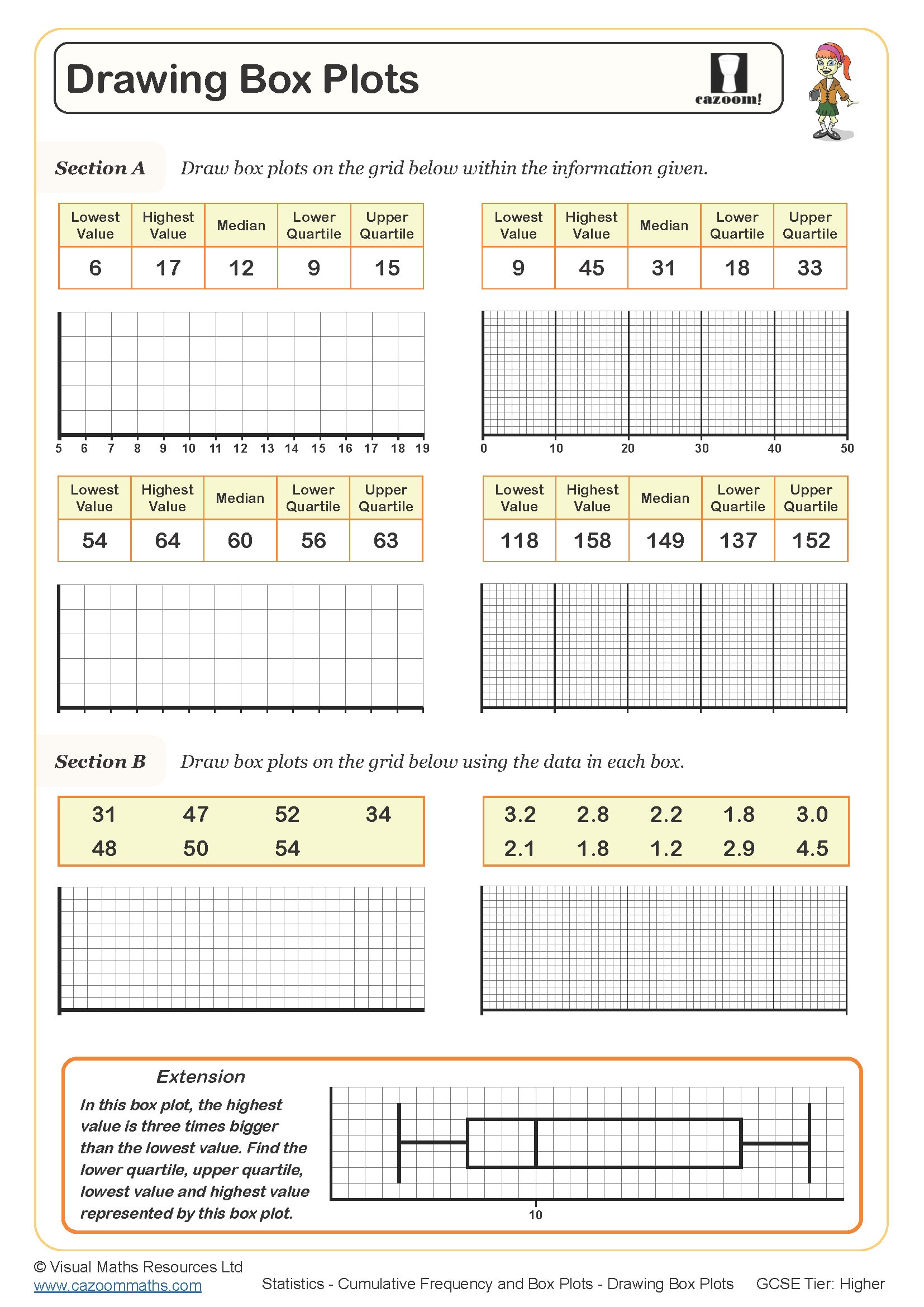
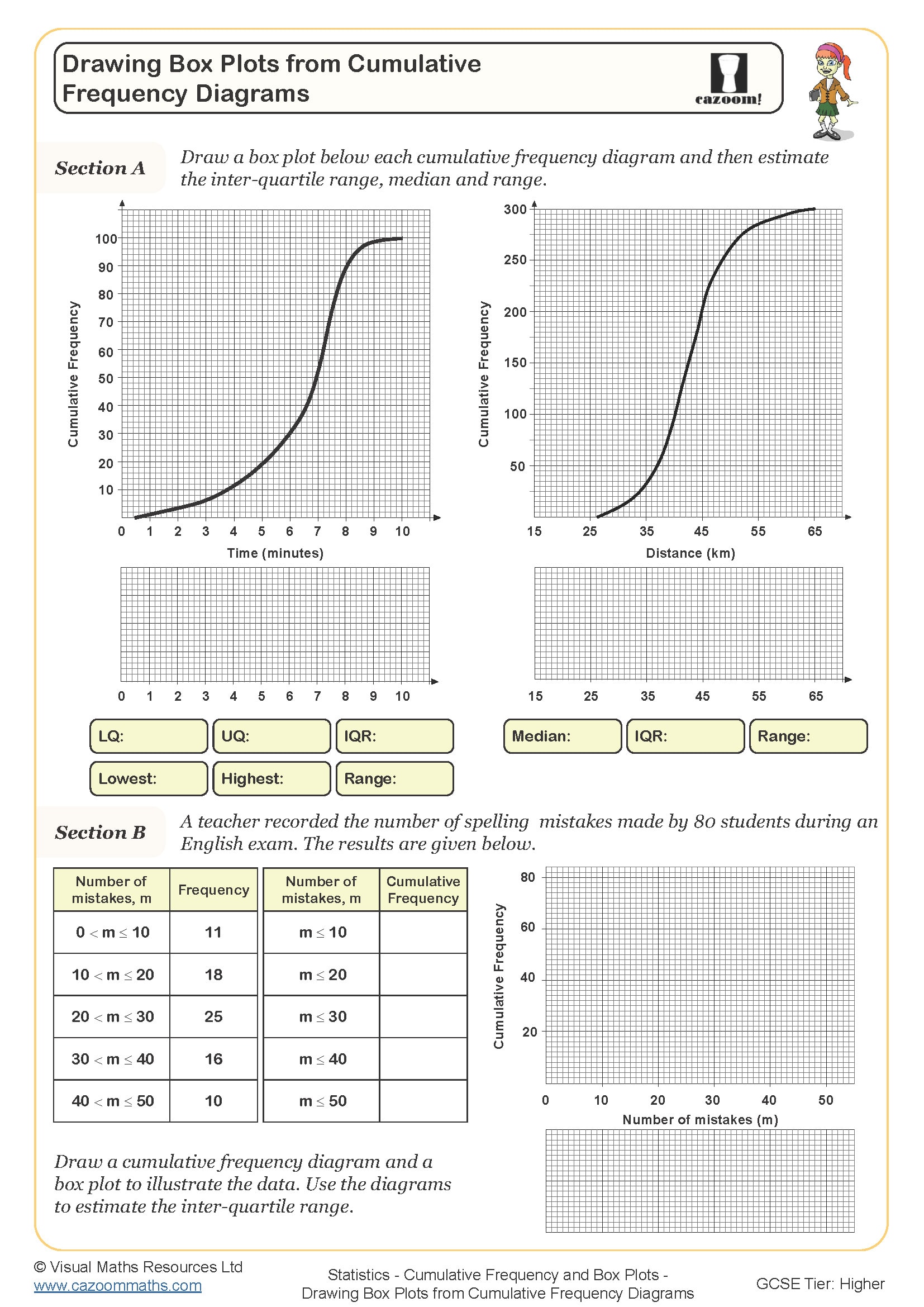
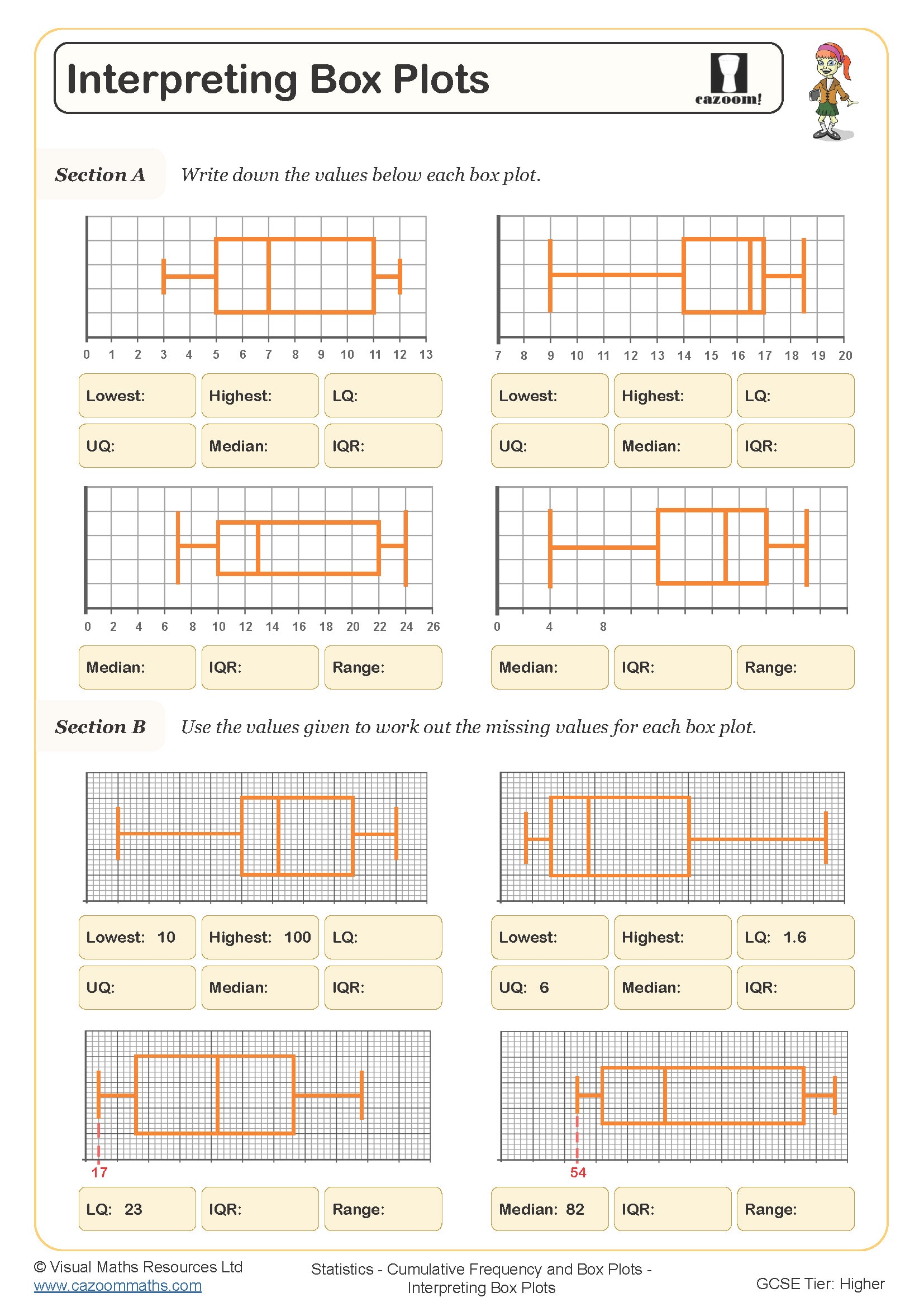
Cumulative frequency diagrams and box plots are statistical tools that help students analyse large datasets and identify key measures of spread and central tendency. At GCSE level, students need to construct cumulative frequency curves from grouped frequency tables, then use these to estimate medians, quartiles, and interquartile ranges. Box plots (also called box-and-whisker diagrams) provide a visual summary of these five key values, making it easier to compare different datasets.
Exam questions typically require students to work between different representations of the same data. A common error occurs when students plot cumulative frequency at the midpoint of each class interval rather than at the upper boundary. Exam mark schemes expect precise plotting and clearly labelled axes, with students losing marks for incorrectly positioned points or missing scale information. Understanding these diagrams is also required for answering comparison questions where students must interpret differences in spread or central tendency between two distributions.
Which year groups study cumulative frequency and box plots?
Cumulative frequency and box plots appear in the KS4 curriculum, typically taught in Year 10 or Year 11 as part of GCSE preparation. This topic builds on earlier work with averages, range, and simple data representation from Key Stage 3, but introduces more sophisticated methods for handling grouped continuous data. Students need confidence with inequalities, scales, and reading values from graphs before tackling this content.
The difficulty in Year 11 worksheets reflects GCSE Higher tier expectations, where students must not only construct diagrams accurately but also interpret them to make comparisons. Questions often combine cumulative frequency with probability or require students to estimate how many data values fall within a specific range. Teachers often use this topic during spring term revision, as it connects statistical representation skills with ratio and percentage work when discussing quartiles and outliers.
How do you calculate the interquartile range from a cumulative frequency diagram?
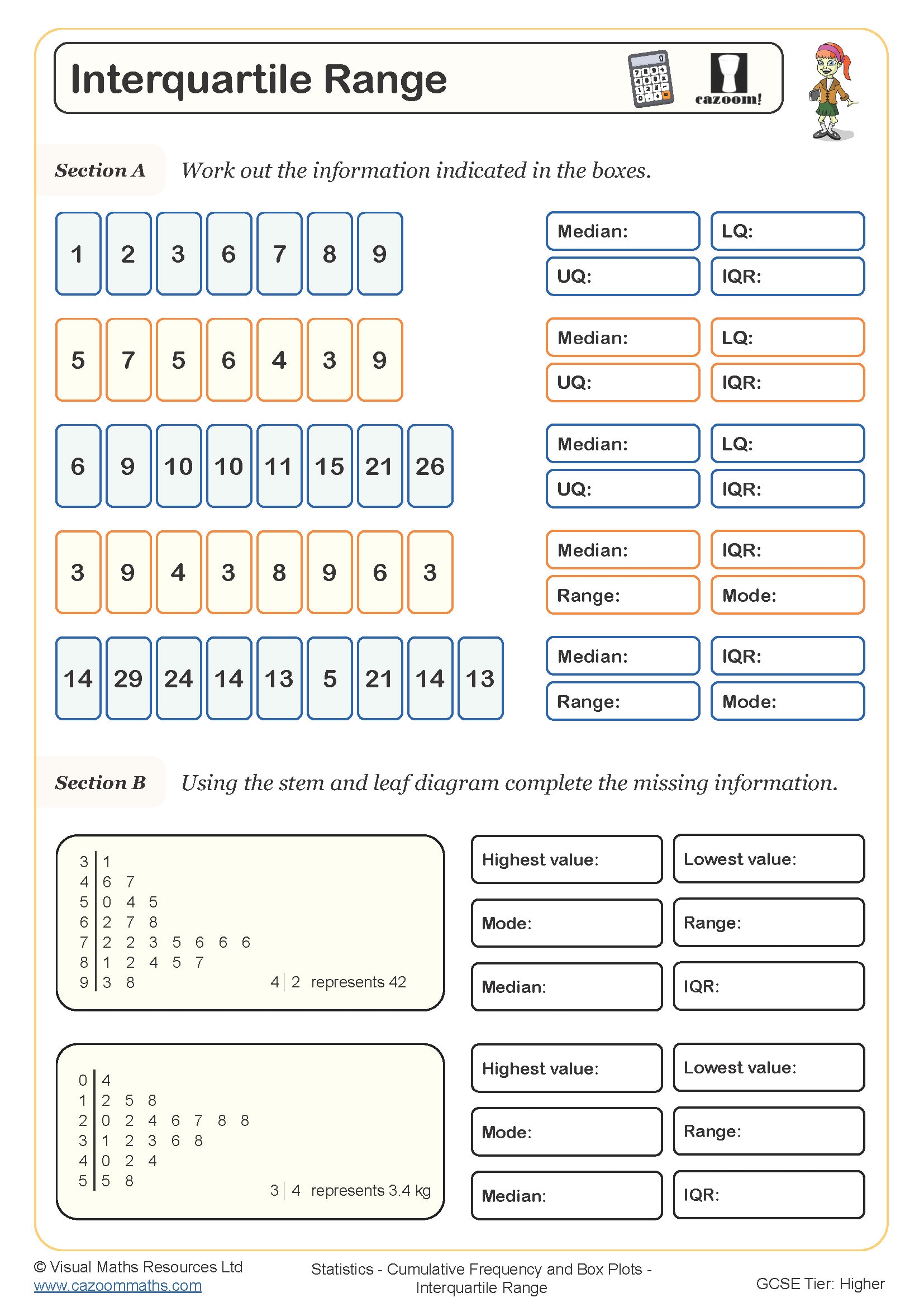
The interquartile range (IQR) measures the spread of the middle 50% of data and is calculated by subtracting the lower quartile (Q1) from the upper quartile (Q3). On a cumulative frequency diagram, students find Q1 by locating one quarter of the total frequency on the vertical axis, drawing across to the curve, then reading down to find the corresponding value. They repeat this process at three quarters of the total frequency to find Q3, then calculate IQR = Q3 - Q1.
This measure appears frequently in real-world statistical analysis, from medical research examining patient response times to quality control in manufacturing where engineers use the IQR to identify product consistency. Sports scientists analyse athletes' performance data using box plots and IQR to monitor training effectiveness, as the IQR is less affected by extreme values than the range. Understanding IQR helps students grasp why outliers matter in data interpretation, a concept that becomes increasingly important in A-level statistics and data science courses.
How do these worksheets help students master cumulative frequency diagrams?
The worksheets provide structured practice starting with completing cumulative frequency tables before moving to graph construction and interpretation. Students work through problems that require careful attention to scale selection, boundary values, and accurate curve drawing. The resources include examples with different class widths and inequality notation, helping students recognise that the same principles apply regardless of how data is presented.
Many teachers use these worksheets during targeted intervention sessions with students who struggle with graph work, as the answer sheets allow for immediate feedback on plotting accuracy. They work well for homework revision where students can attempt construction questions independently, then self-assess against model answers. In classroom settings, pairing students to compare their cumulative frequency curves often highlights plotting errors and generates productive discussion about why curves should be smooth and never decrease. The worksheets also suit exam preparation lessons where time constraints matter, helping students build speed in table completion and quartile calculation.