Bar Charts and Pictograms Worksheets
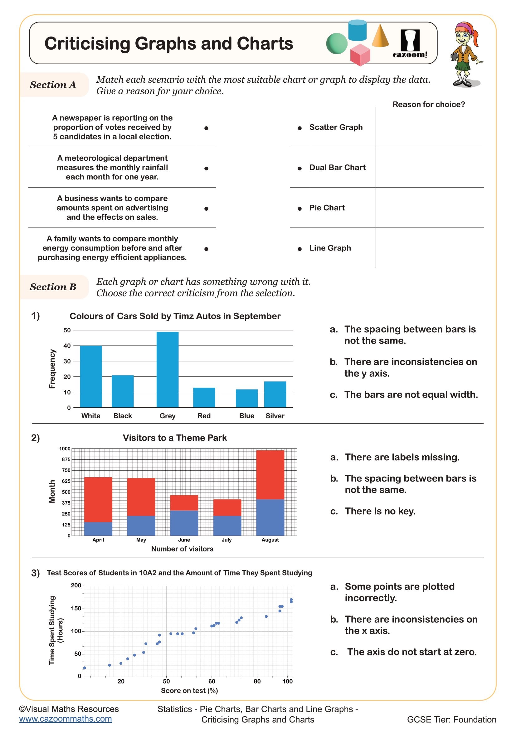
Criticising Graphs and Charts
Year groups: 7, 8
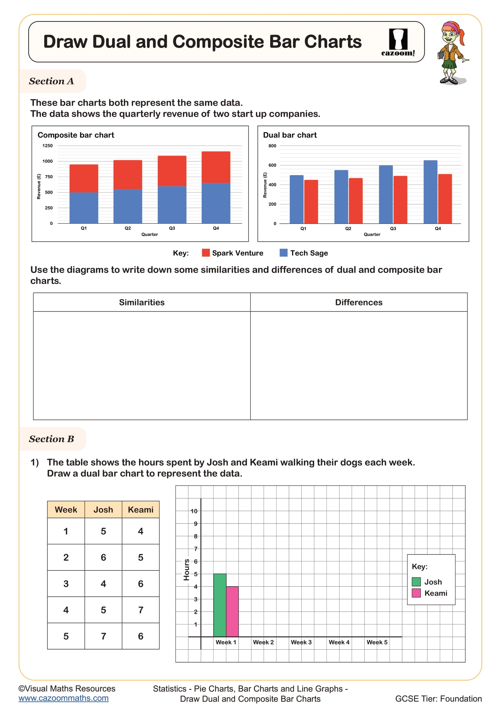
Draw Composite and Dual Bar Charts
Year groups: 7, 8
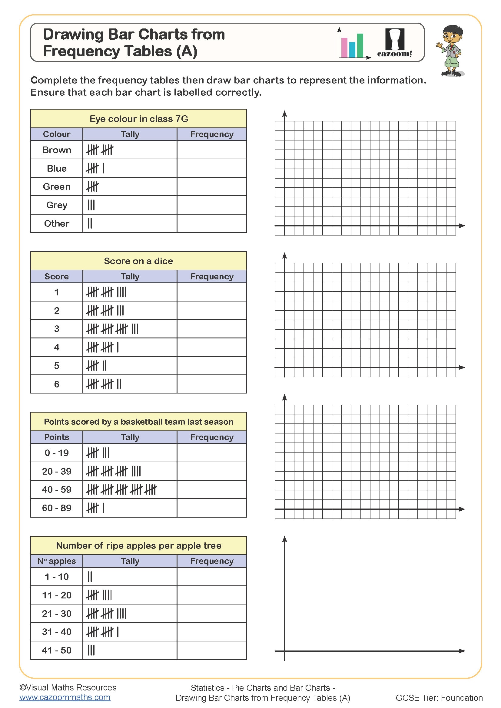
Drawing Bar Charts from Frequency Tables (A)
Year groups: 7, 8
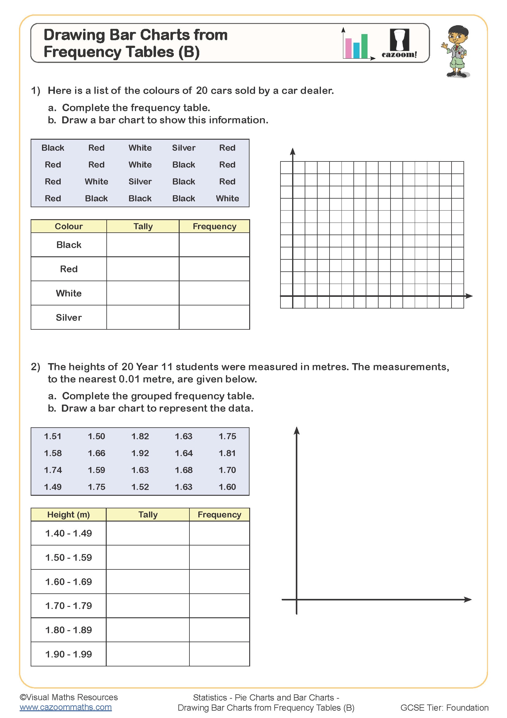
Drawing Bar Charts from Frequency Tables (B)
Year groups: 7, 8
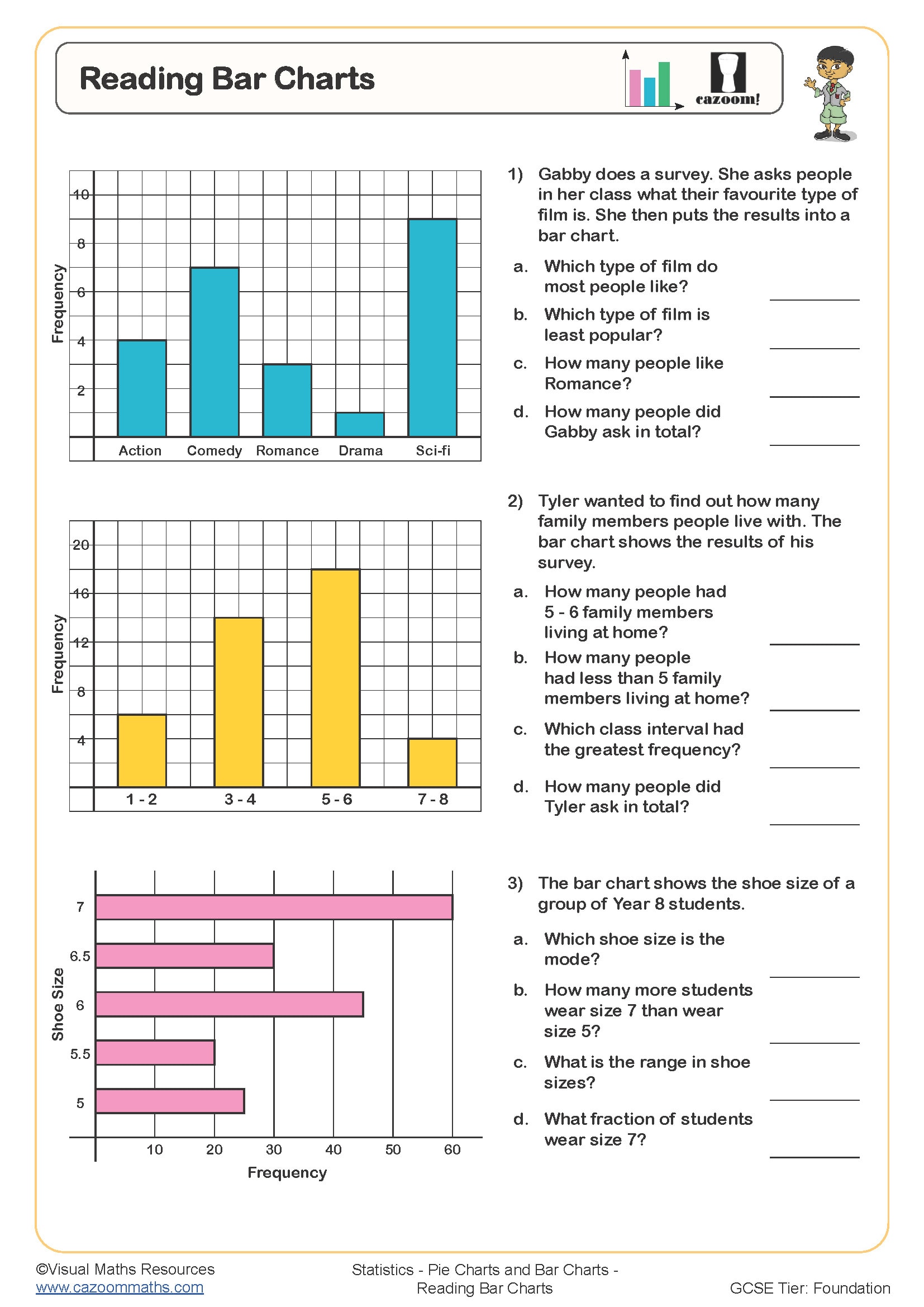
Reading Bar Charts
Year groups: 7, 8
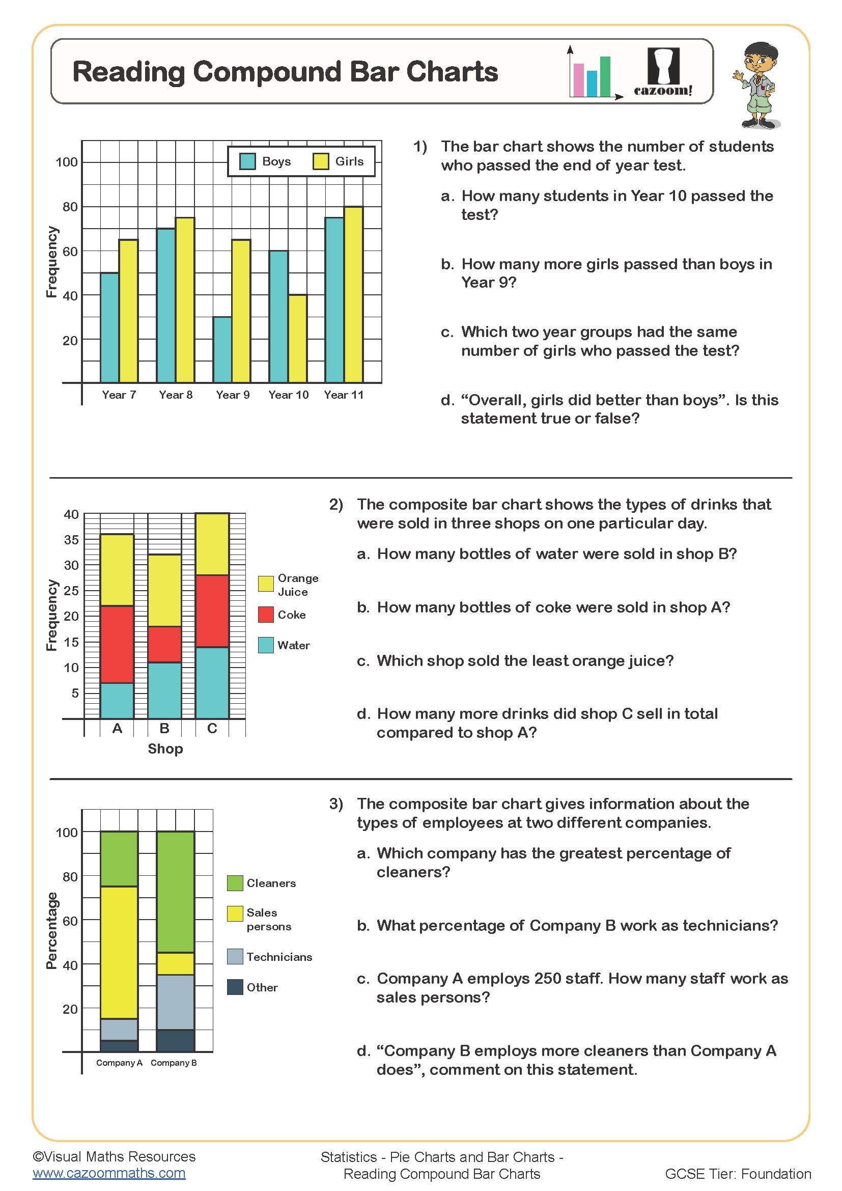
Reading Compound Bar Charts
Year groups: 7, 8
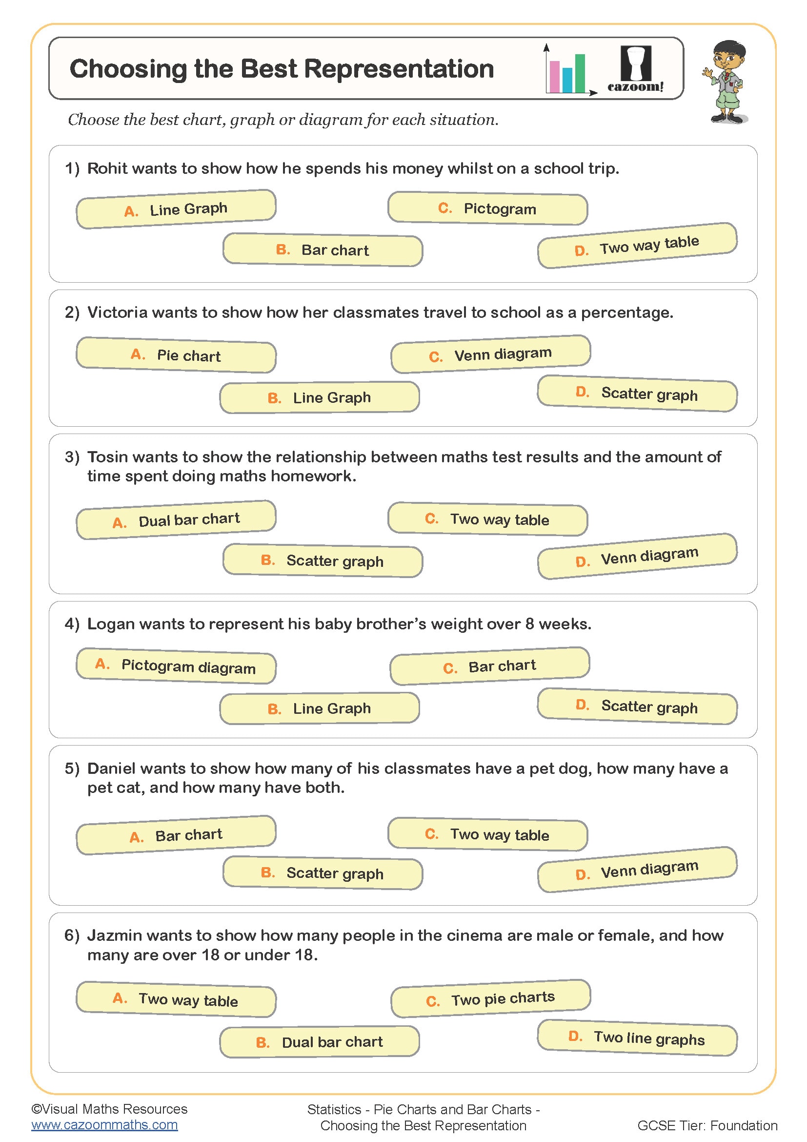
Choosing the Best Representation
Year groups: 8, 9
All worksheets are created by the team of experienced teachers at Cazoom Maths.
Printable Worksheets for Bar Charts and Pictograms with Answers
Download our printable PDF Bar Charts and Pictograms Worksheets with answers here. These carefully designed resources give students clear practice in drawing bar charts from frequency tables, completing and interpreting pictograms using keys, reading scales, and comparing values, and identifying errors or misleading features in charts. Created by experienced teachers, each worksheet builds step by step to help KS3 and GCSE learners develop strong confidence and fluency with core statistical representations.
From Reading Compound Bar Charts to Drawing Bar Charts: What Skills Do KS3-KS4 Students Master?
Bar charts and pictograms are key methods for representing discrete and categorical data. Bar charts use rectangular bars to compare quantities across groups, making patterns easy to see at a glance. Whereas, Pictograms use pictures or symbols to represent data, helping students connect visual cues to numerical values.
The Cazoom Maths team of UK curriculum experts has specifically curated a wide variety of activities to build statistical literacy, carefully sequenced from concrete pictogram interpretation to sophisticated multi-dataset comparisons. Reading Pictograms introduces scaled symbols and partial representations. Drawing Pictograms develops accuracy in choosing appropriate scales and symbols. Reading Bar Charts involves interpreting the axes and extracting values. Drawing Bar Charts progresses to independent scale selection and accurate plotting. Grouped Bar Charts extend understanding to comparative analysis across multiple categories. Two-Way Tables connect visual representation to numerical organisation, preparing pupils for higher-tier probability work.
How These Bar Charts and Pictograms Worksheets Build Mathematical Confidence
The visual scaffolding elements in these resources help students connect numerical data to graphical displays. The grid backgrounds enable students to create exact plots, and different colors in grouped charts help them identify separate datasets. Cazoom Maths statistical resources start with reading pre-given numbers before students need to calculate totals and find differences, and recognize patterns. The step-by-step learning sequence helps teachers provide individualized support to students during a lesson through different activities: foundation pupils who work on reading and basic drawing tasks, and their peers who handle comparative analysis. The systematic teaching approach helps students improve their scale reading accuracy and graph-drawing skills, which are essential for GCSE statistics assessment.
Beyond Classrooms: Real-Life Uses of Bar Charts and Pictograms
Here are some real-life examples to help students see why these charts matter.
•Weather reports and news show data using simple charts.
•Sports results are displayed clearly with scores and rankings.
•Surveys and shopping trends reveal group and preference comparisons.
•These skills help with exams, daily tasks, and future careers.