KS3 Pie Charts, Bar Charts and Line Graphs Worksheets
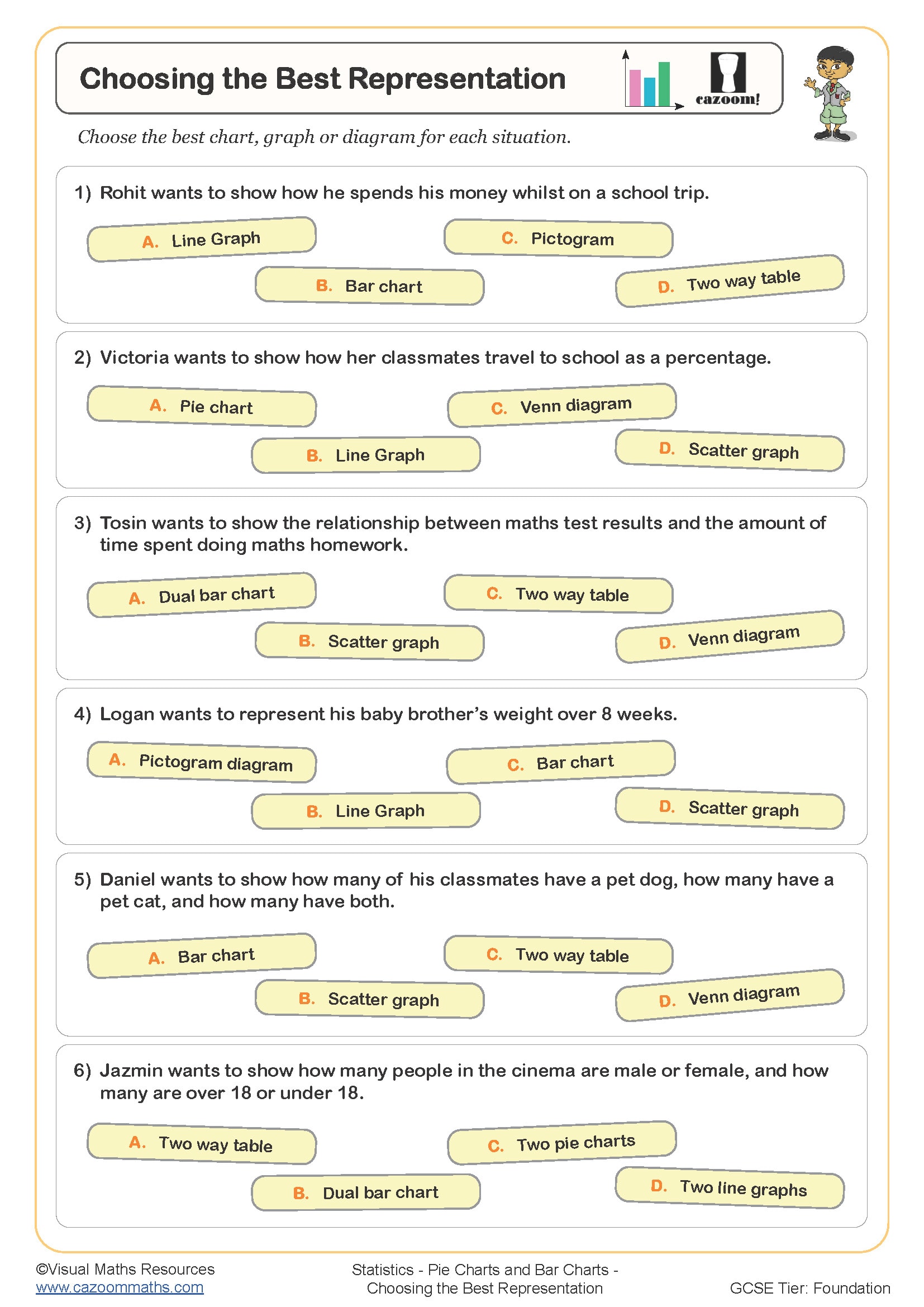
Choosing the Best Representation
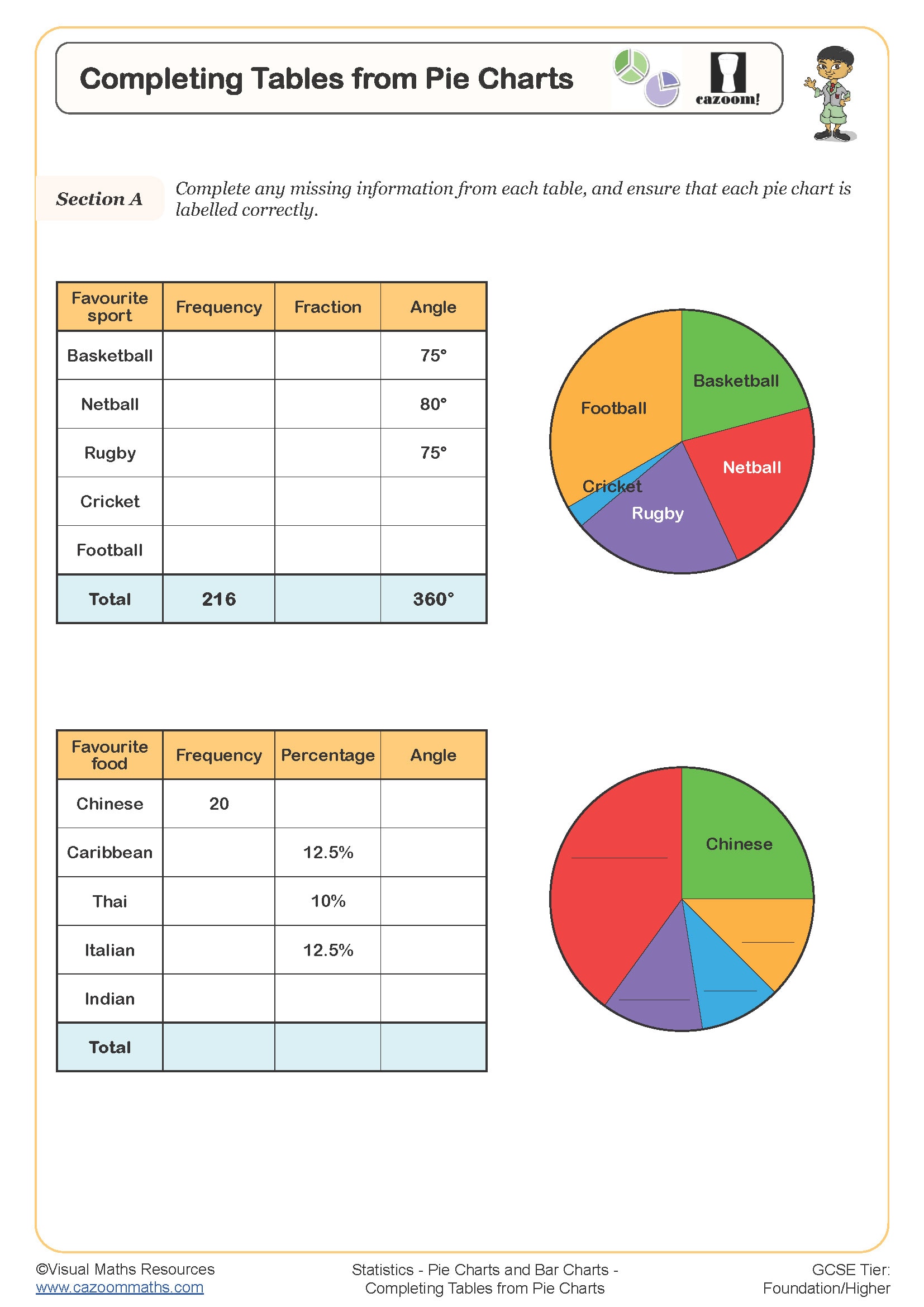
Completing Tables from Pie Charts
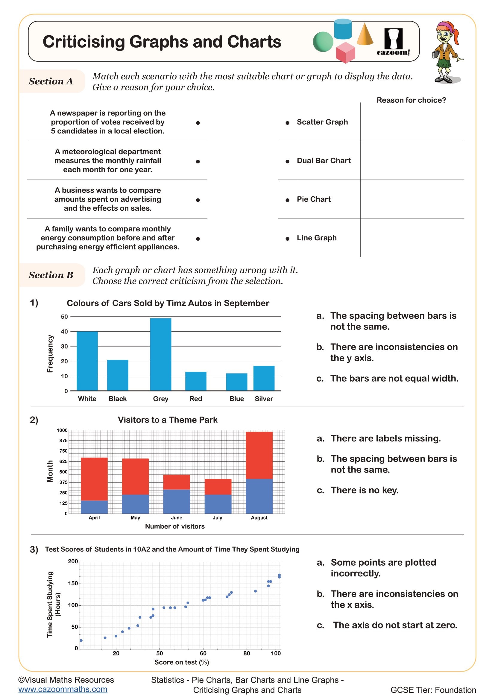
Criticising Graphs and Charts
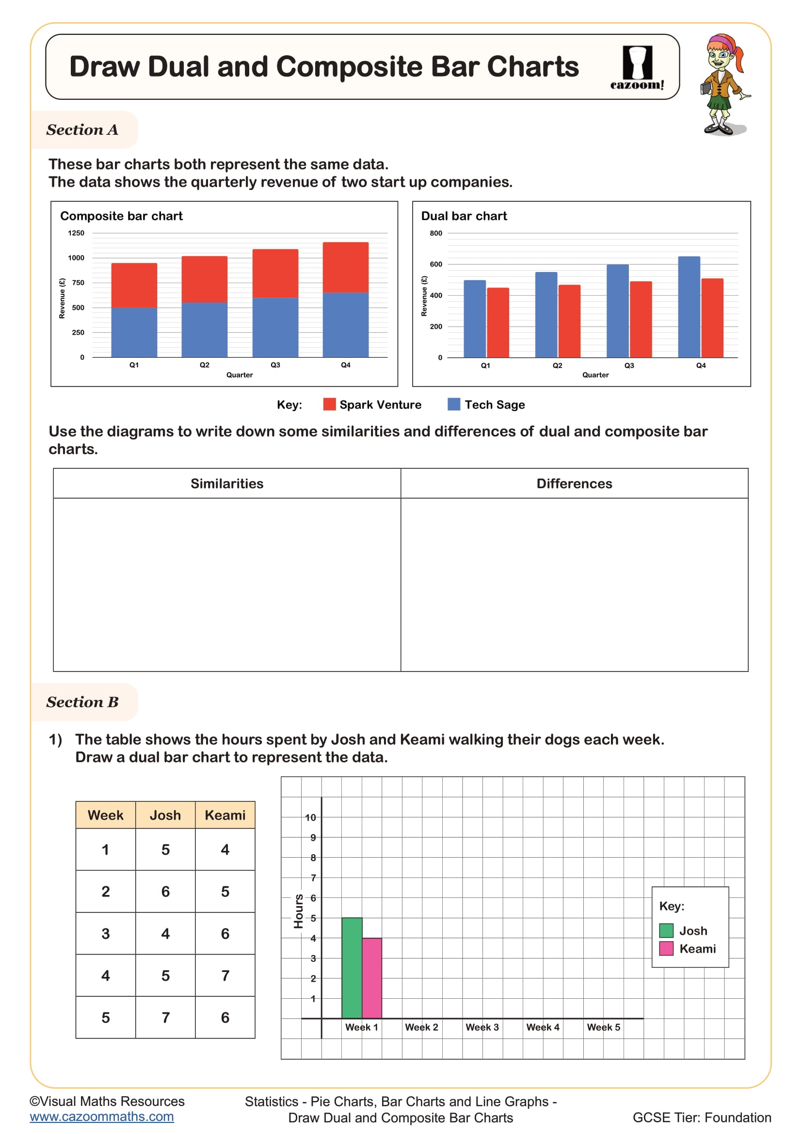
Draw Composite and Dual Bar Charts
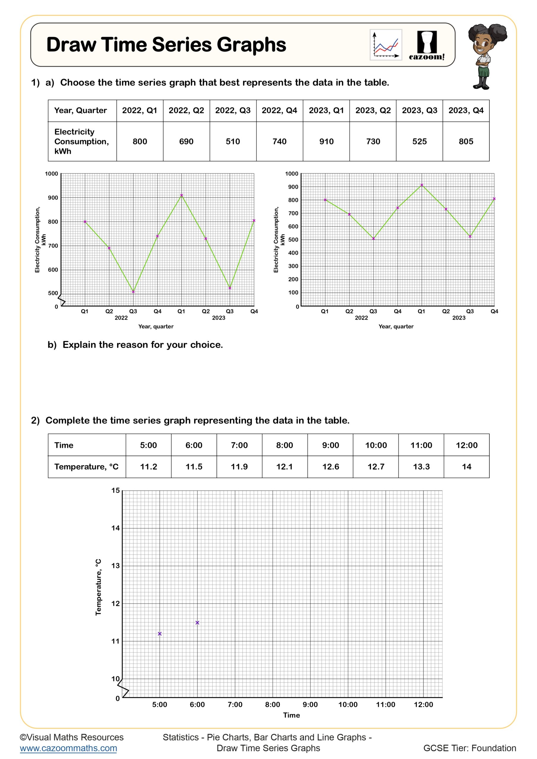
Draw Time Series Graphs
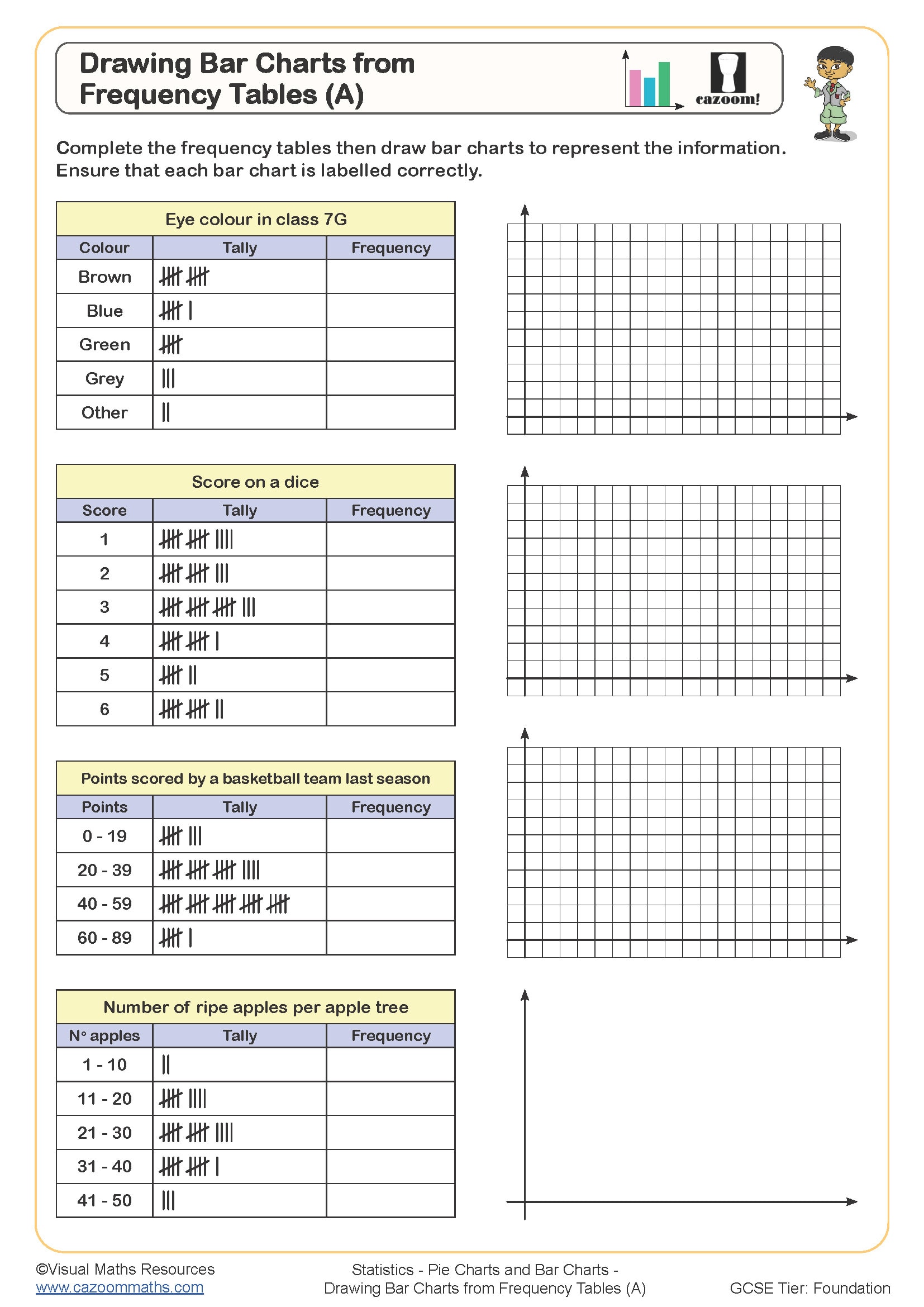
Drawing Bar Charts from Frequency Tables (A)
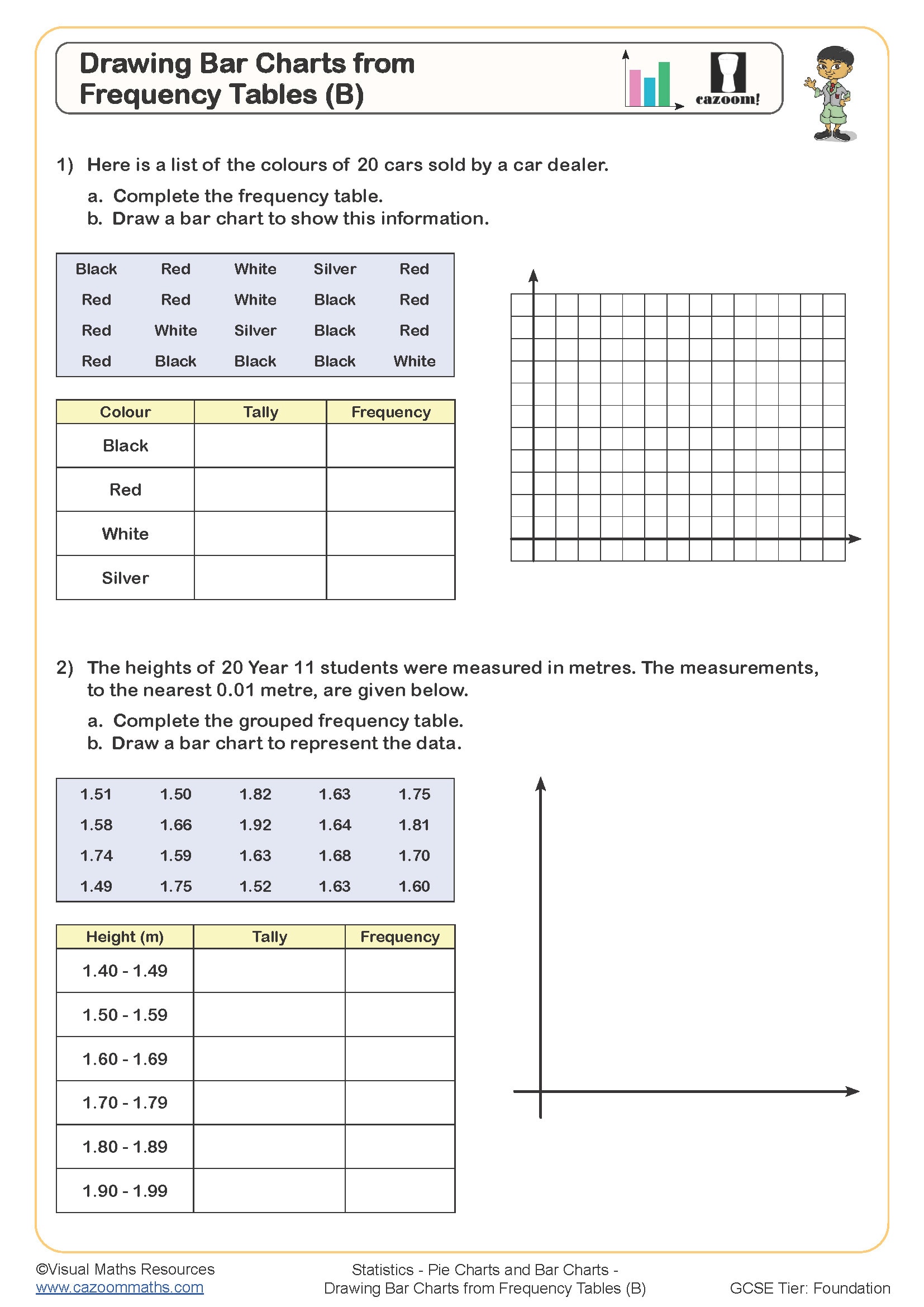
Drawing Bar Charts from Frequency Tables (B)
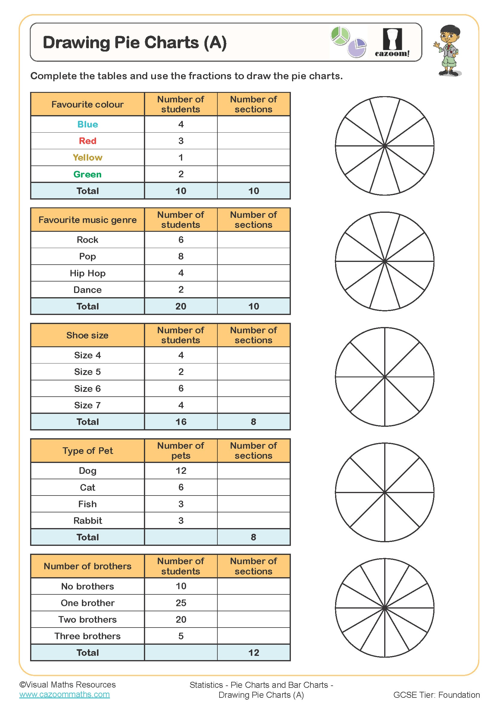
Drawing Pie Charts (A)
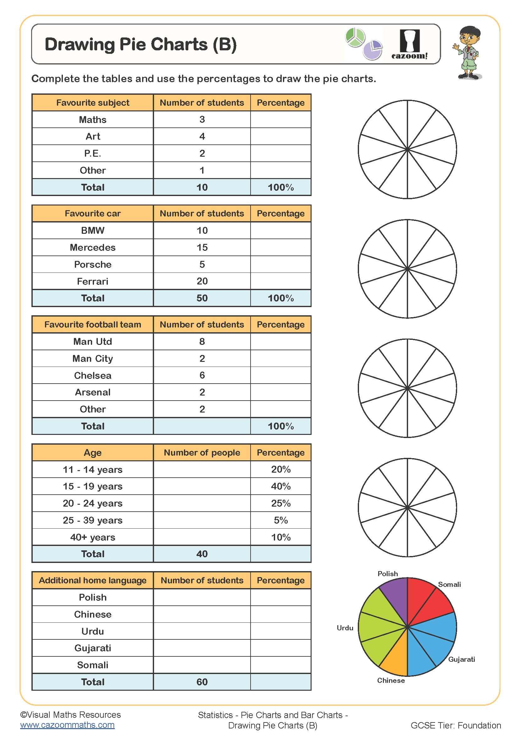
Drawing Pie Charts (B)
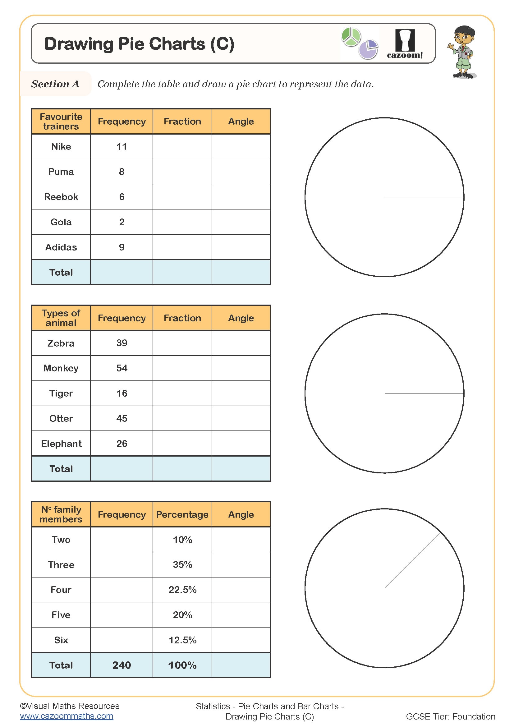
Drawing Pie Charts (C)
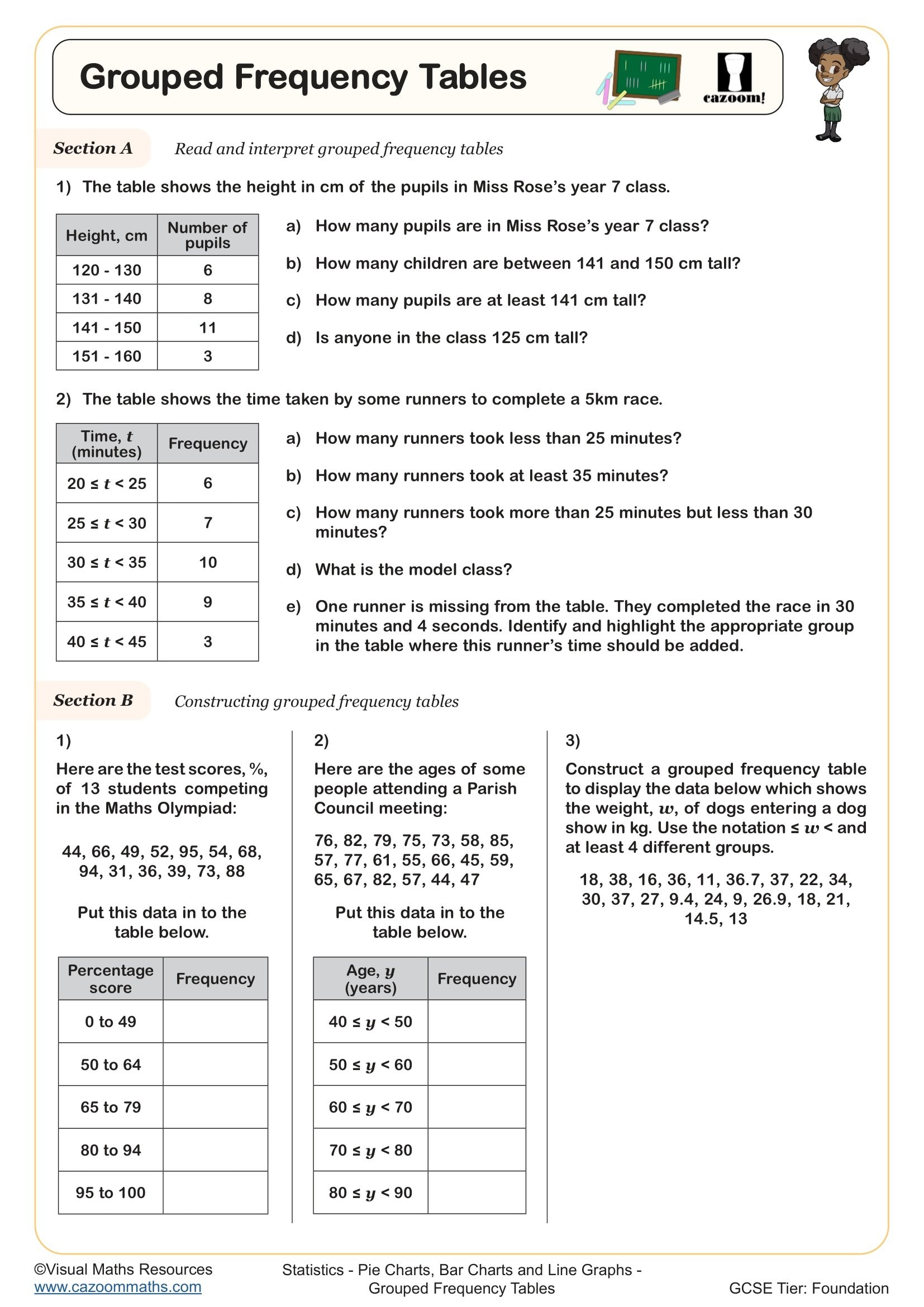
Grouped Frequency Tables
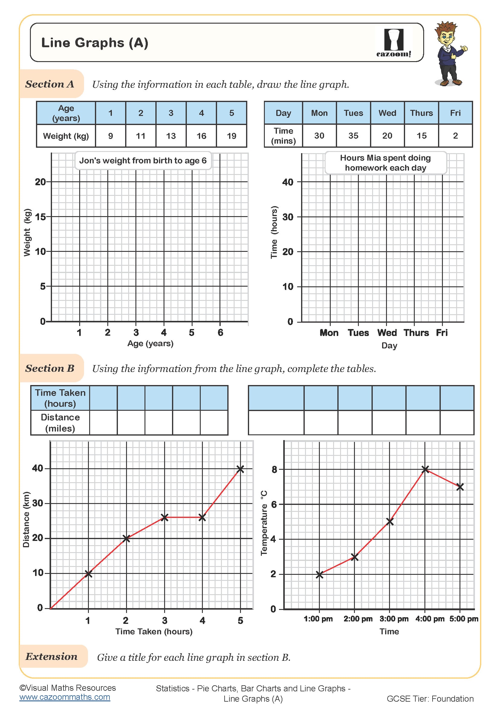
Line Graphs (A)
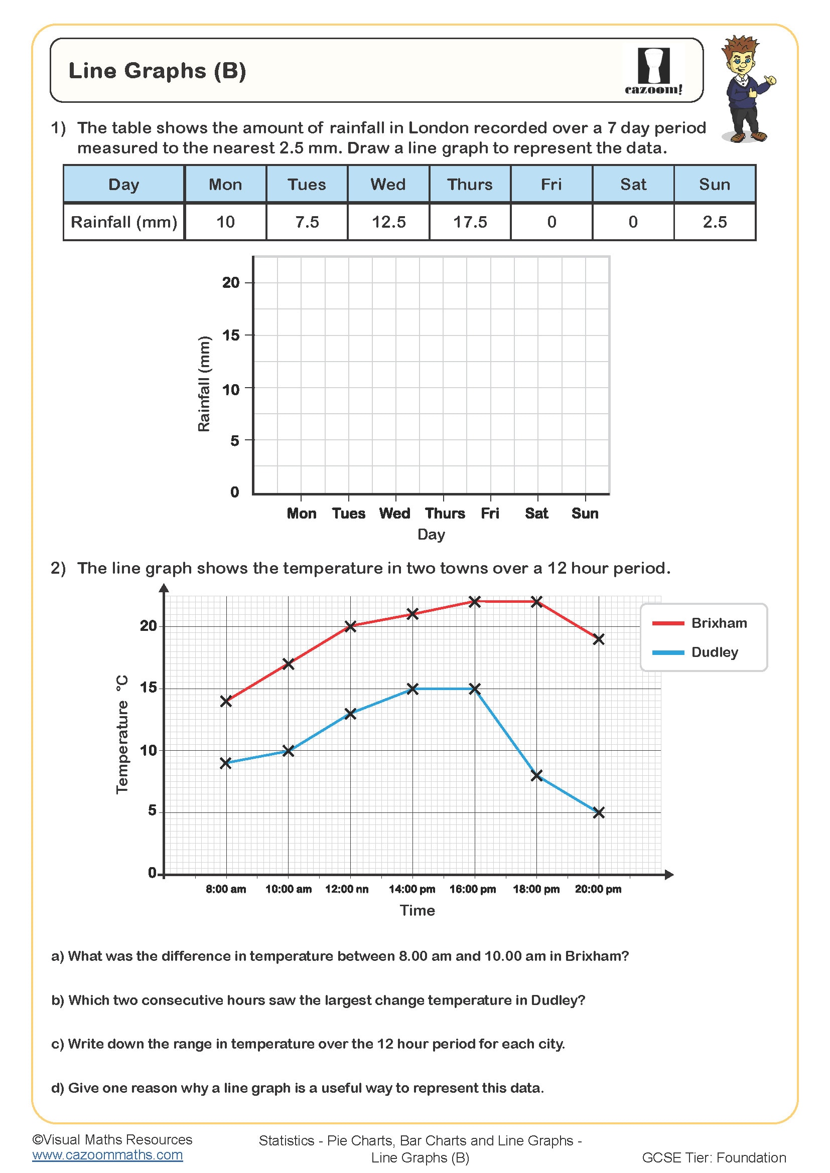
Line Graphs (B)
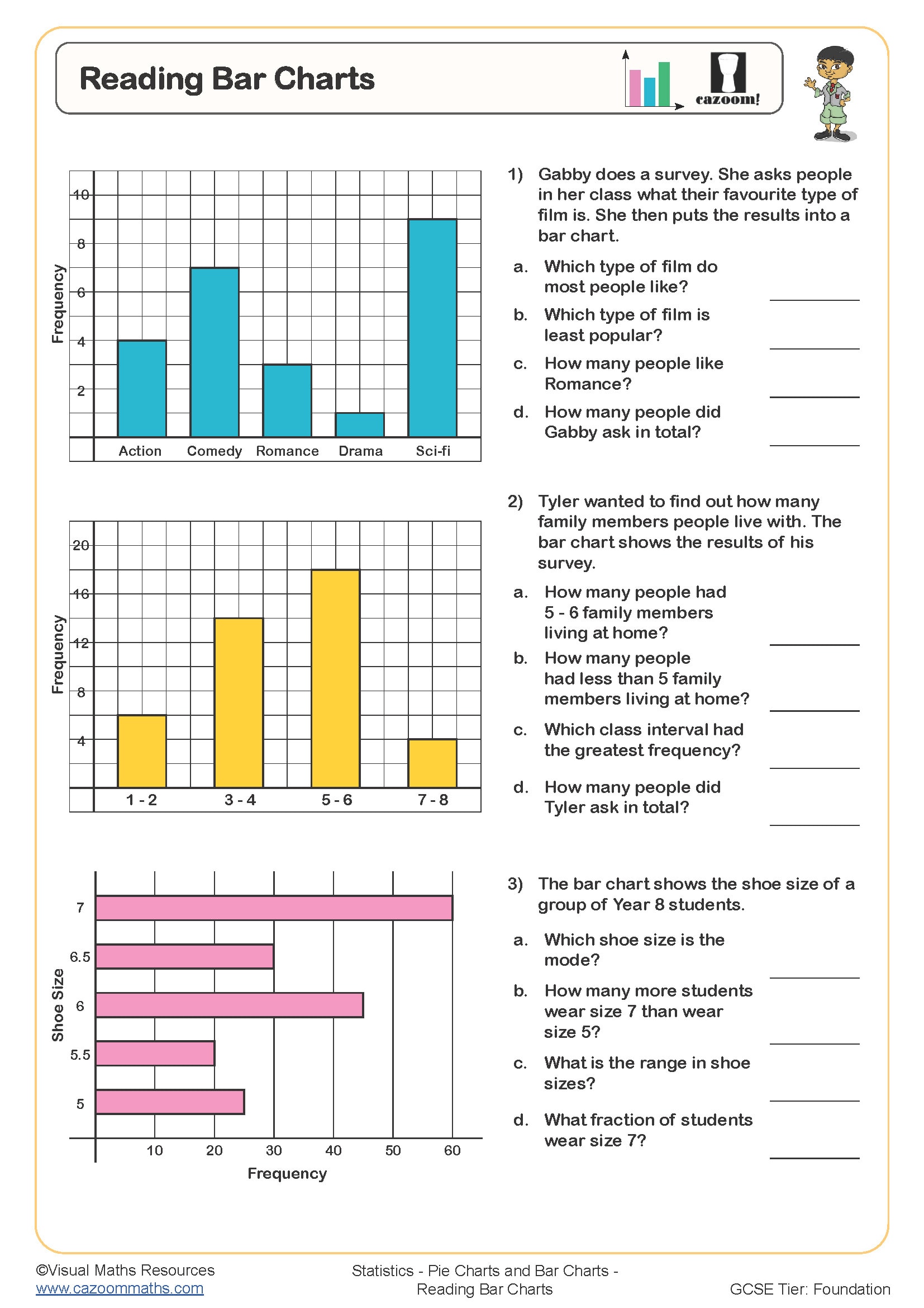
Reading Bar Charts
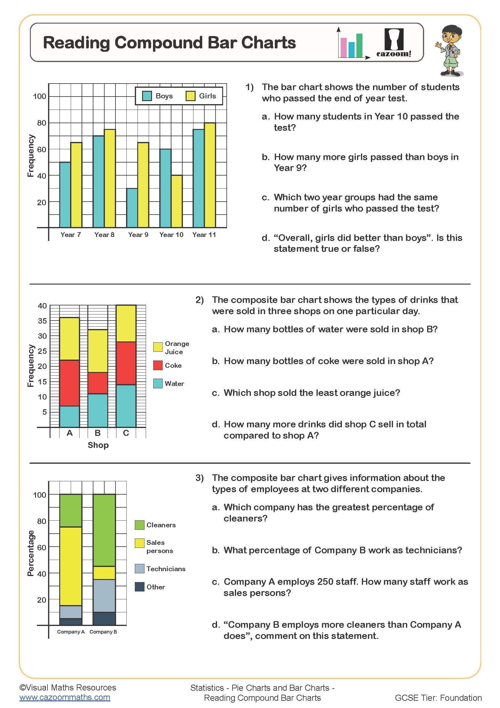
Reading Compound Bar Charts
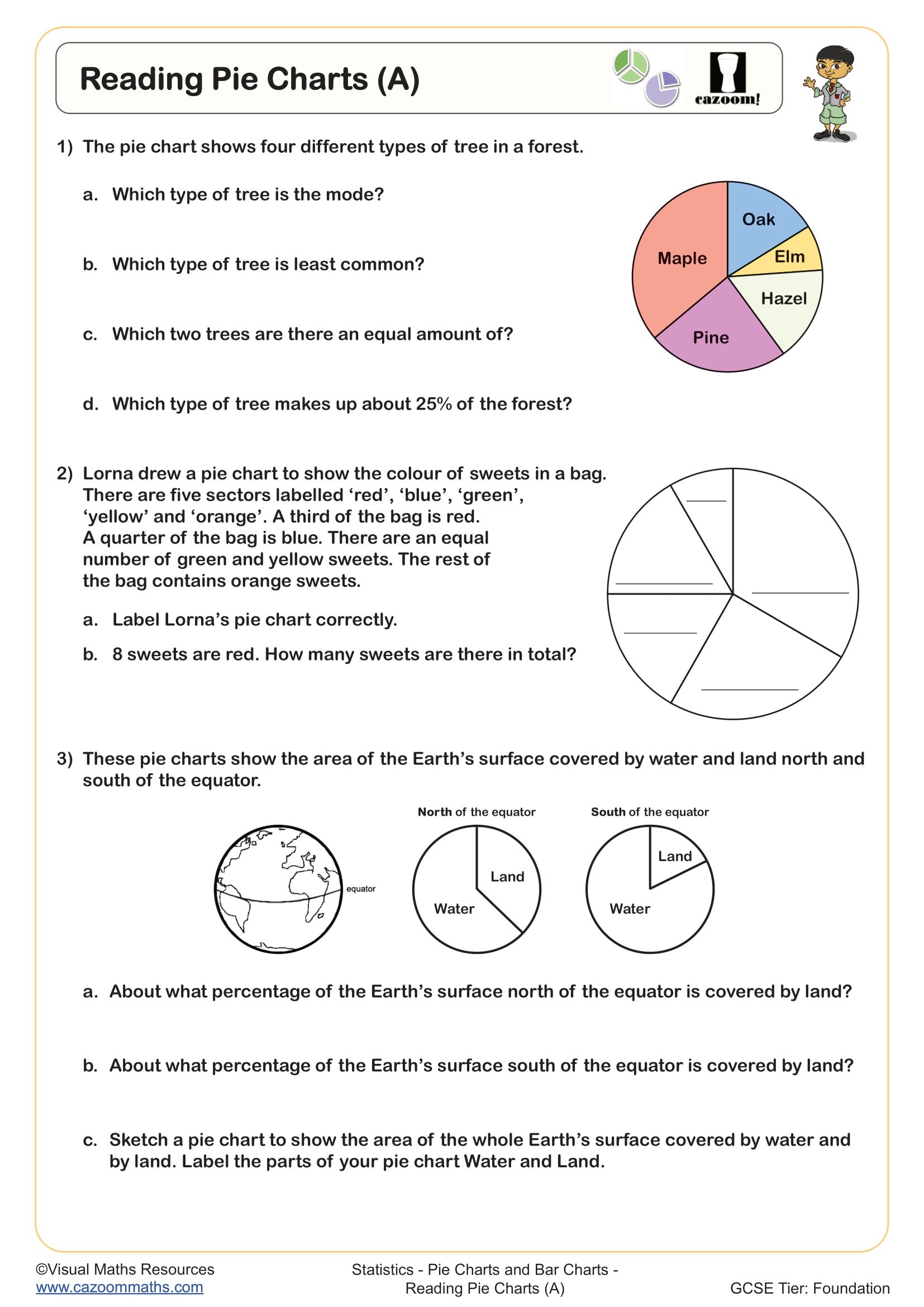
Reading Pie Charts (A)
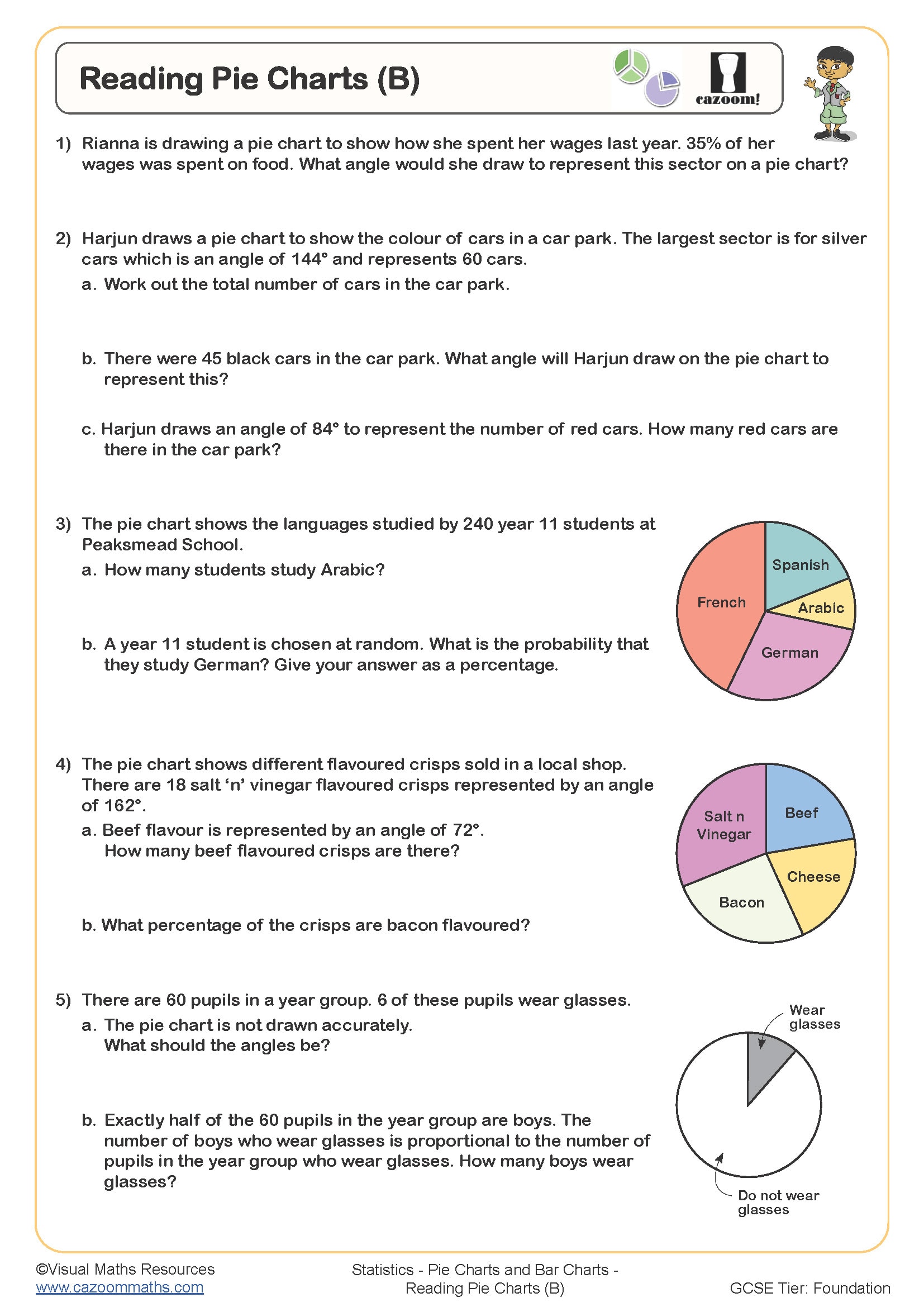
Reading Pie Charts (B)
All worksheets are created by the team of experienced teachers at Cazoom Maths.
What is the difference between pie charts, bar charts and line graphs?
Pie charts show proportions of a whole using sectors of a circle, with each sector's angle calculated from percentages or fractions of the total. Bar charts compare discrete categories using separate bars with heights representing frequencies or values, whilst line graphs show continuous data over time by plotting points and connecting them to reveal trends. The National Curriculum expects KS3 students to select appropriate graph types based on whether data is categorical, discrete or continuous.
A common error occurs when students attempt to use a line graph for categorical data such as favourite colours or transport methods, connecting points that have no meaningful relationship. Teachers frequently notice students mixing up when to calculate angles for pie charts (360° × frequency ÷ total) versus simply reading bar heights, particularly when questions ask them to construct one type from data already shown in another format. Understanding these distinctions becomes particularly important when students analyse real data sets in science practicals or geography fieldwork.
Which year groups cover pie charts, bar charts and line graphs?
These worksheets support Years 7, 8 and 9 students working through the KS3 statistics curriculum. Year 7 typically begins with interpreting straightforward pie charts, bar charts and line graphs, reading values directly from scales and answering simple comparison questions. Students consolidate drawing accurate bar charts and line graphs using given scales before progressing to calculating pie chart angles.
Year 8 extends this to constructing all three graph types from raw data, including choosing appropriate scales and working with larger data sets that require careful angle calculations. By Year 9, students compare data across multiple representations, convert between graph types, and interpret more complex scenarios including grouped frequency diagrams and time series graphs. Teachers notice that progression often stalls when students lack fluency with angle calculations or proportional reasoning, making regular practise with varied data sets particularly valuable for building confidence before GCSE.
How do you calculate angles for pie chart sectors?
To calculate pie chart angles, students divide each frequency by the total frequency, then multiply by 360° to find the sector angle. For example, if 15 out of 60 students chose football, the calculation becomes (15 ÷ 60) × 360° = 90°. Students should check their angles sum to 360° (or very close, accounting for rounding) before drawing sectors using a protractor measured from the radius.
This skill connects directly to data analysis in geography fieldwork, where students might represent land use surveys or questionnaire results visually. In business contexts, companies use pie charts to show market share, budget allocation and customer demographics. Teachers frequently observe that students who struggle with this concept often have gaps in percentage and fraction work rather than issues with the graph itself, which is why worksheets that combine angle calculations with fraction simplification help reinforce the underlying proportional relationships that make pie charts meaningful statistical tools.
How can teachers use these worksheets effectively in lessons?
The worksheets build skills progressively, starting with interpretation questions where students read values from prepared graphs before moving to construction tasks that require accurate measuring and plotting. Many worksheets include worked examples showing the complete process, from organising data in frequency tables through to calculating angles or choosing scale intervals. This scaffolding helps students tackle multi-step problems without becoming overwhelmed by the procedural demands.
Teachers use these resources flexibly depending on class needs: as starter activities to recap prior learning, as differentiated independent work where different students attempt different graph types, or as structured intervention for students who struggle with accuracy when using protractors and rulers. The answer sheets make them particularly useful for homework tasks where students can self-assess their constructions, or for paired work where one student creates a graph and their partner interprets it, then they swap roles. Several schools use selected worksheets as low-stakes assessments to identify which graph type needs additional teaching time before moving to GCSE-style examination questions.