Pie Charts, Bar Charts and Line Graphs Worksheets
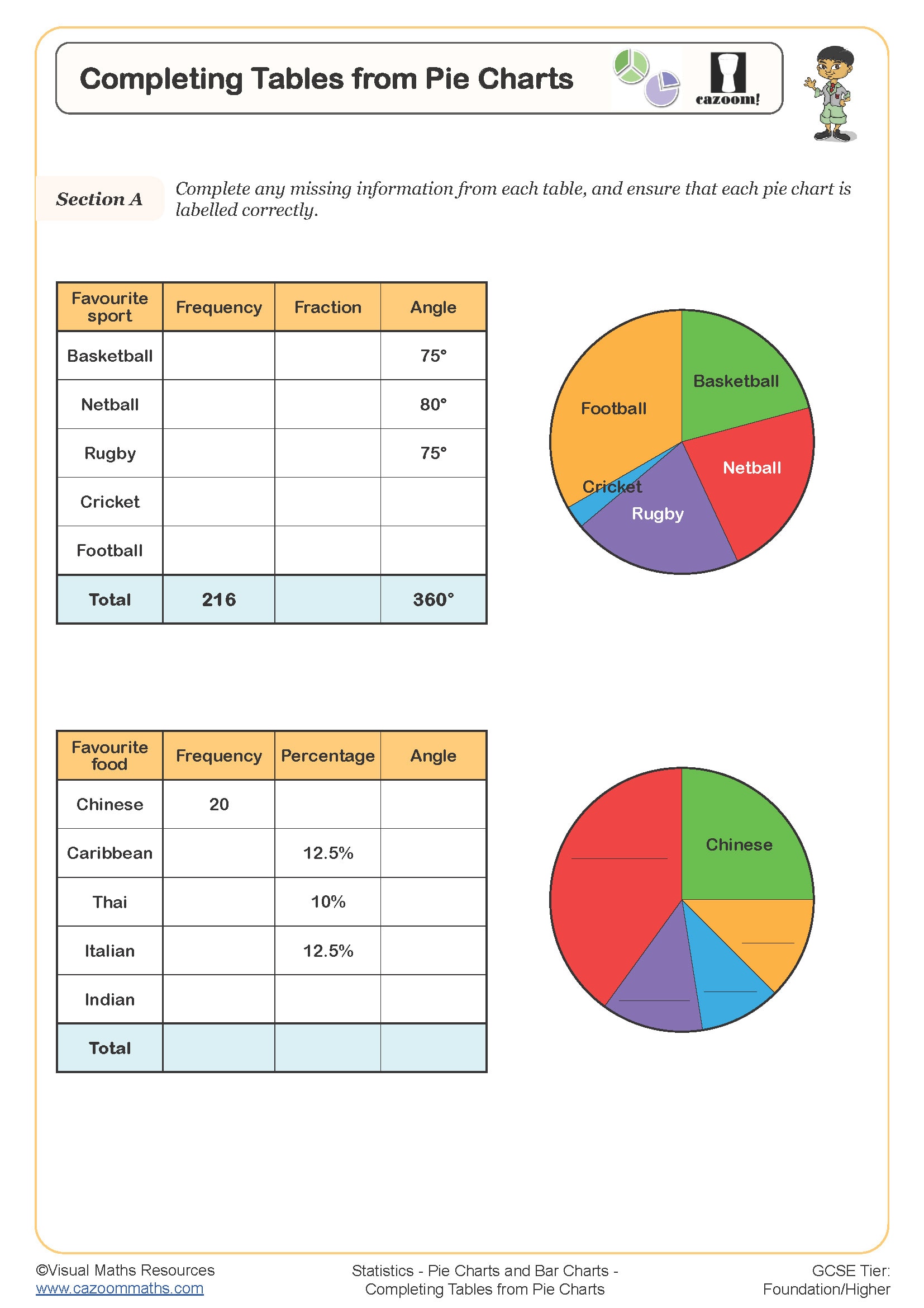
Completing Tables from Pie Charts
Year groups: 7, 8
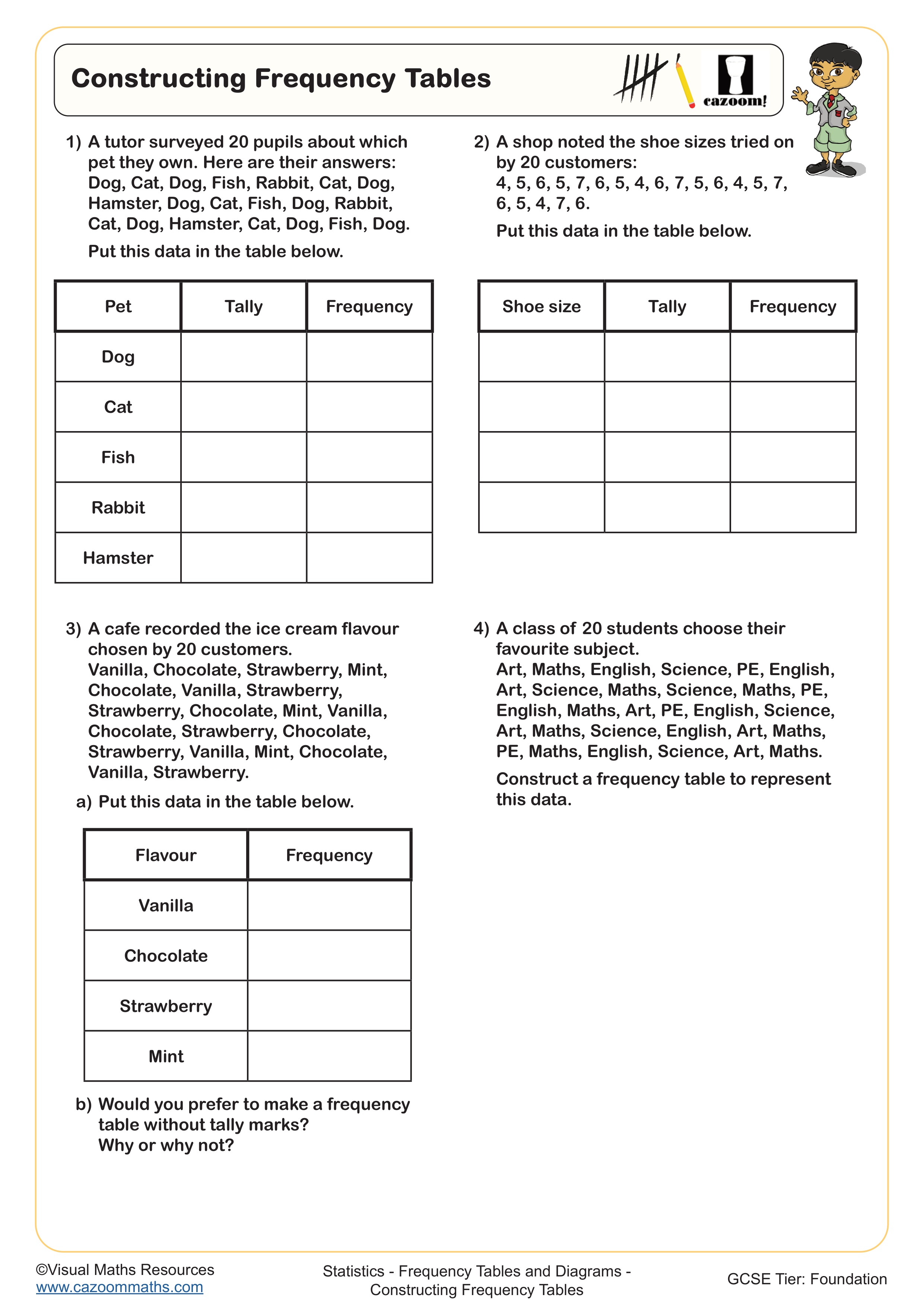
Constructing Frequency Tables
Year groups: 7, 8
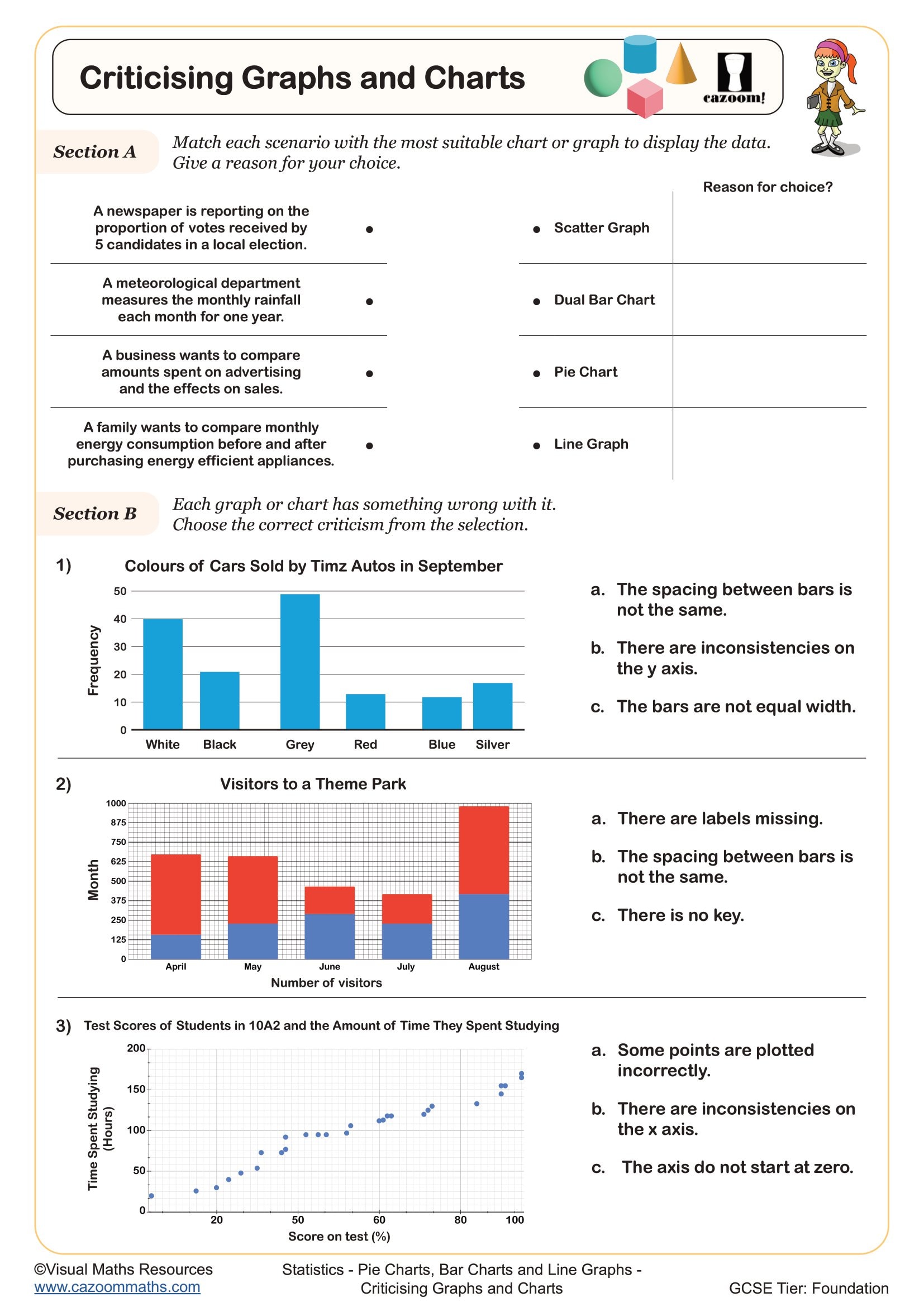
Criticising Graphs and Charts
Year groups: 7, 8
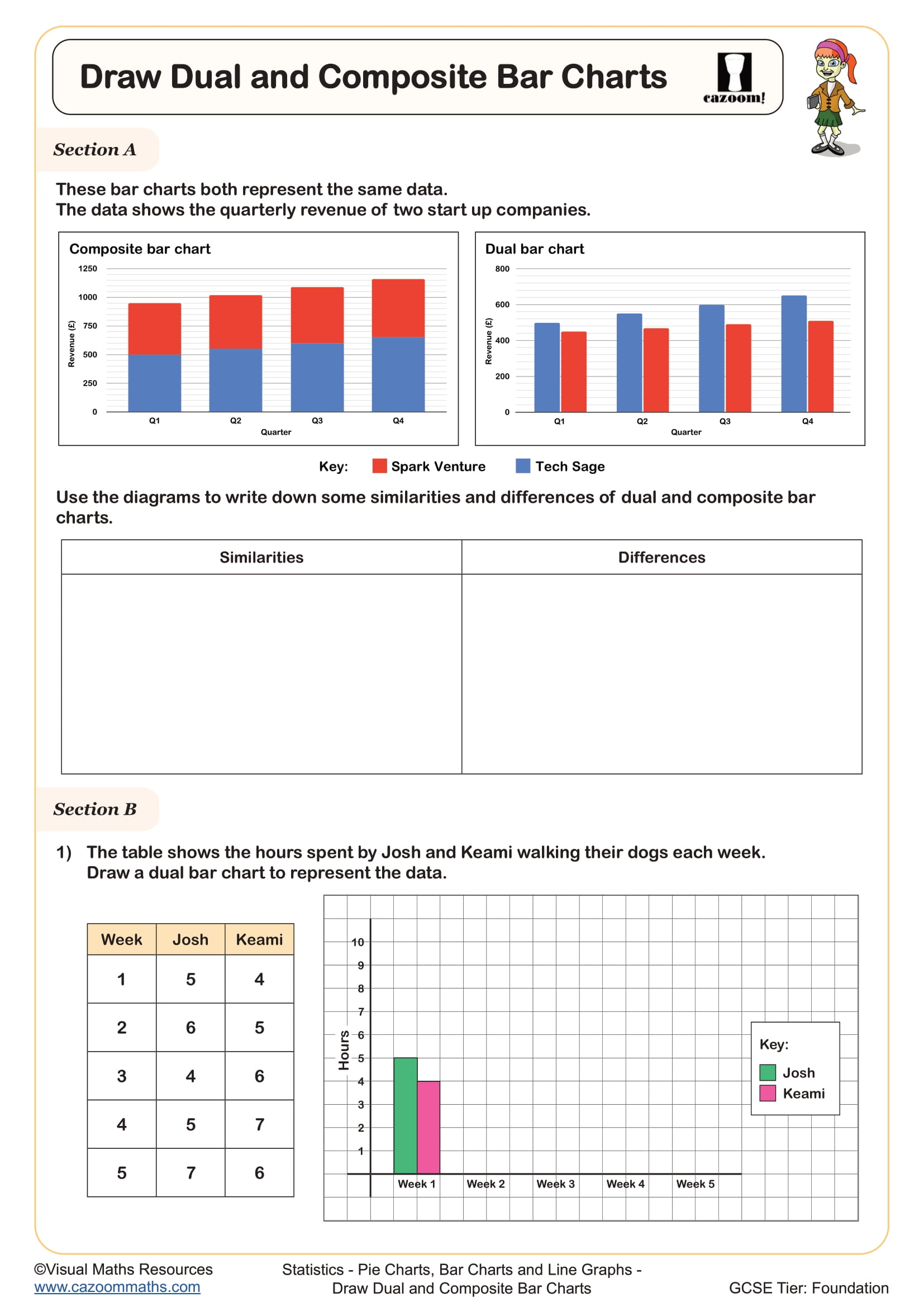
Draw Composite and Dual Bar Charts
Year groups: 7, 8
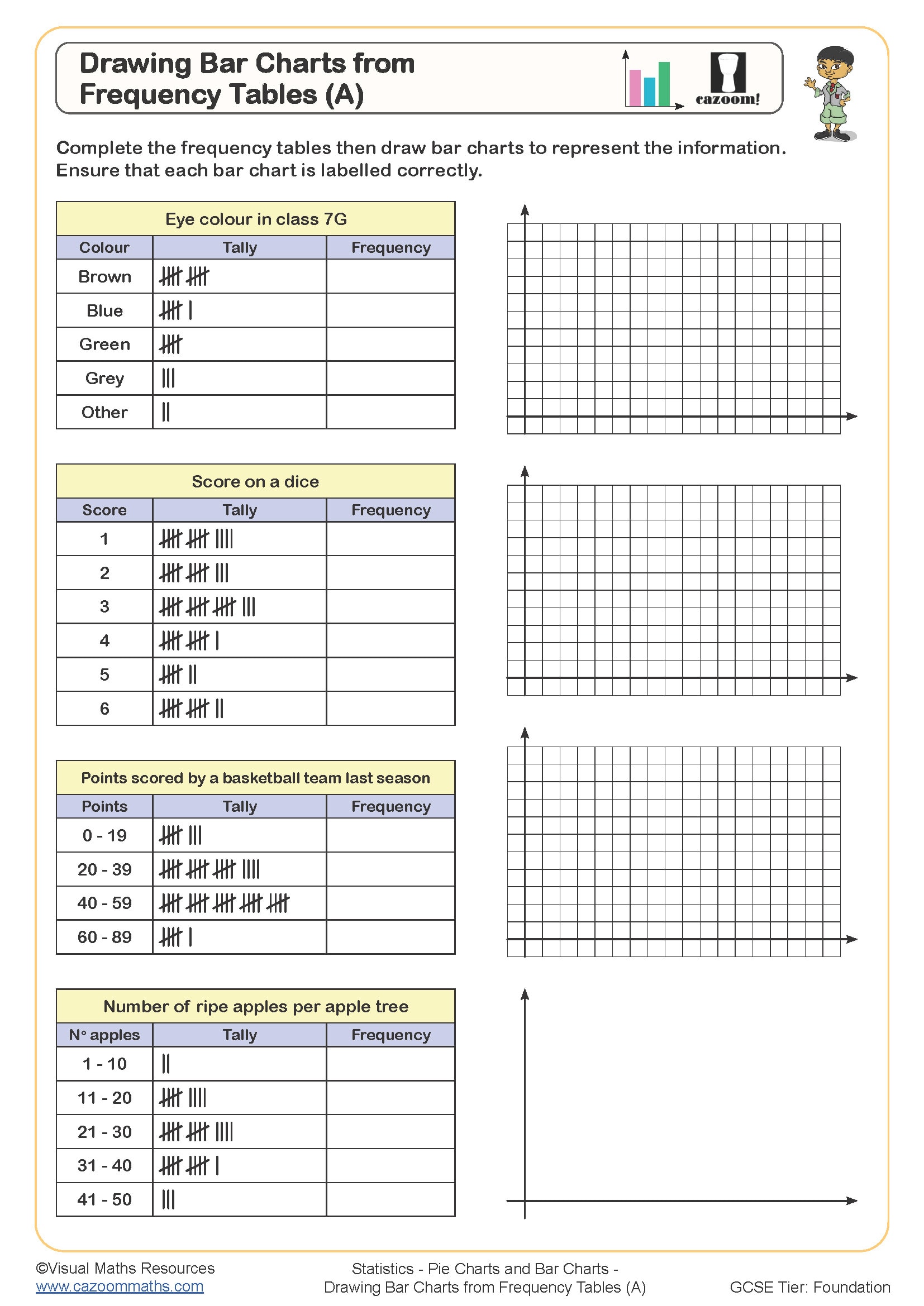
Drawing Bar Charts from Frequency Tables (A)
Year groups: 7, 8
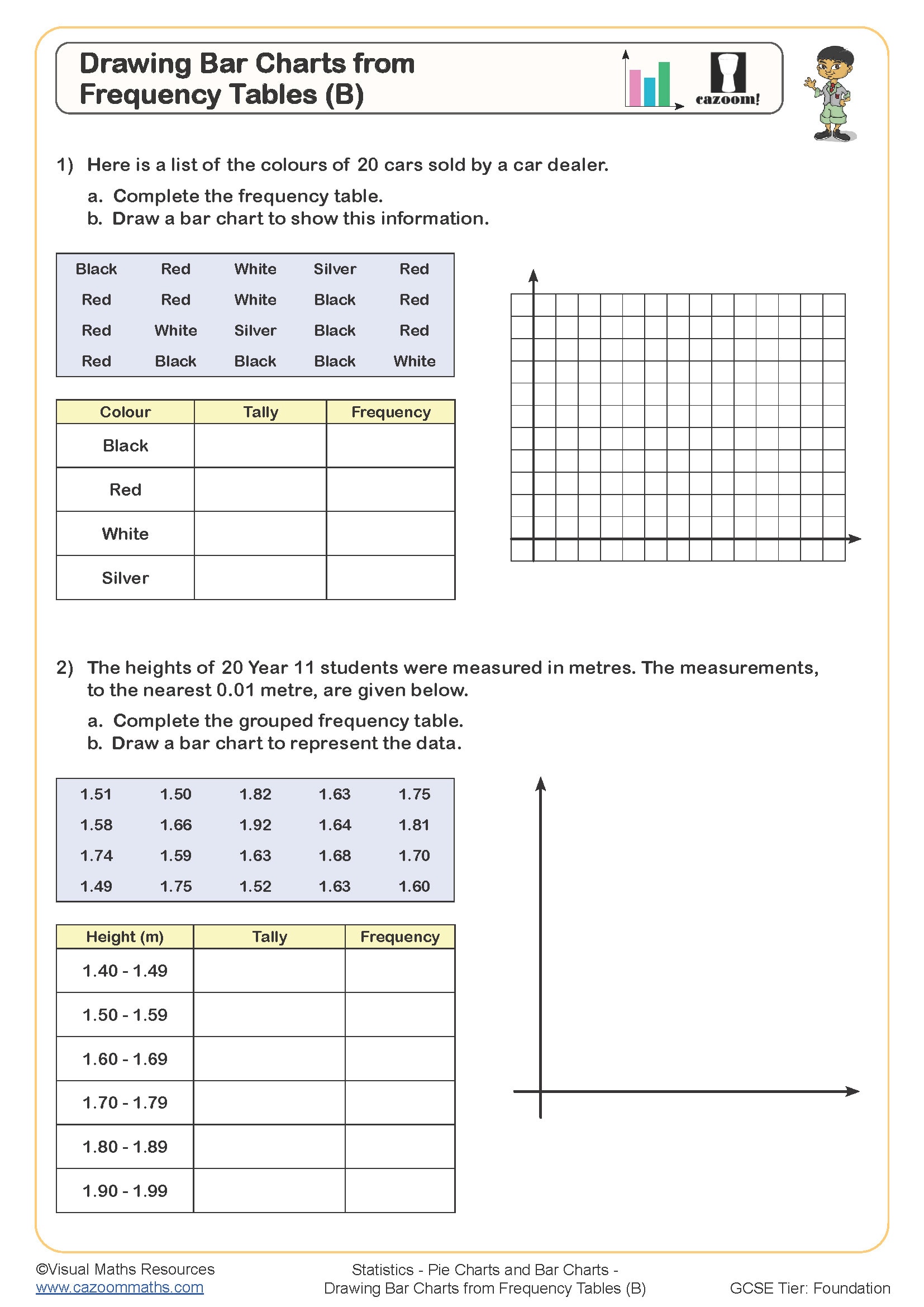
Drawing Bar Charts from Frequency Tables (B)
Year groups: 7, 8
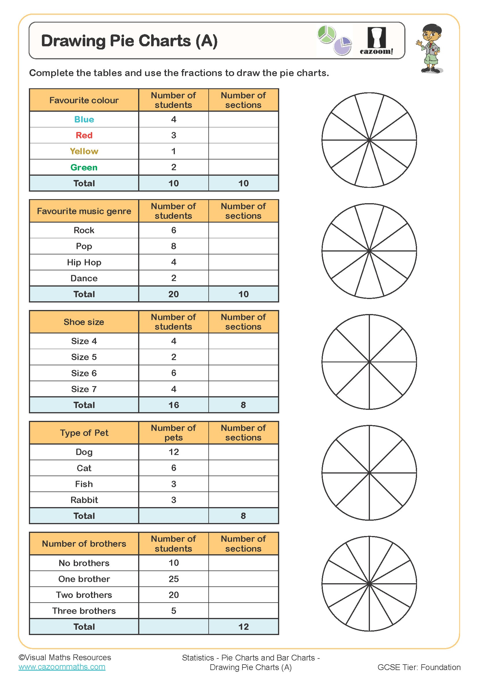
Drawing Pie Charts (A)
Year groups: 7, 8
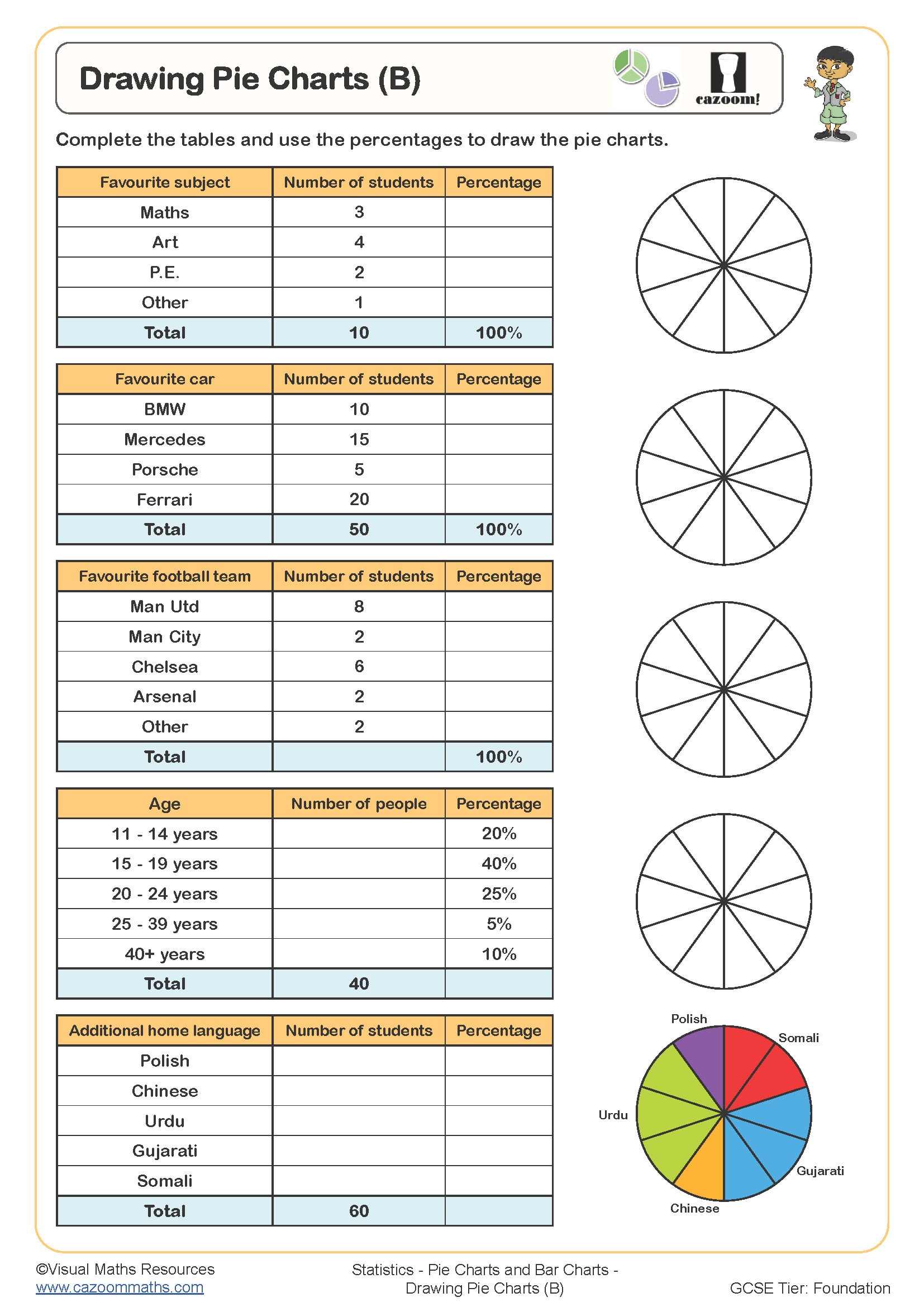
Drawing Pie Charts (B)
Year groups: 7, 8
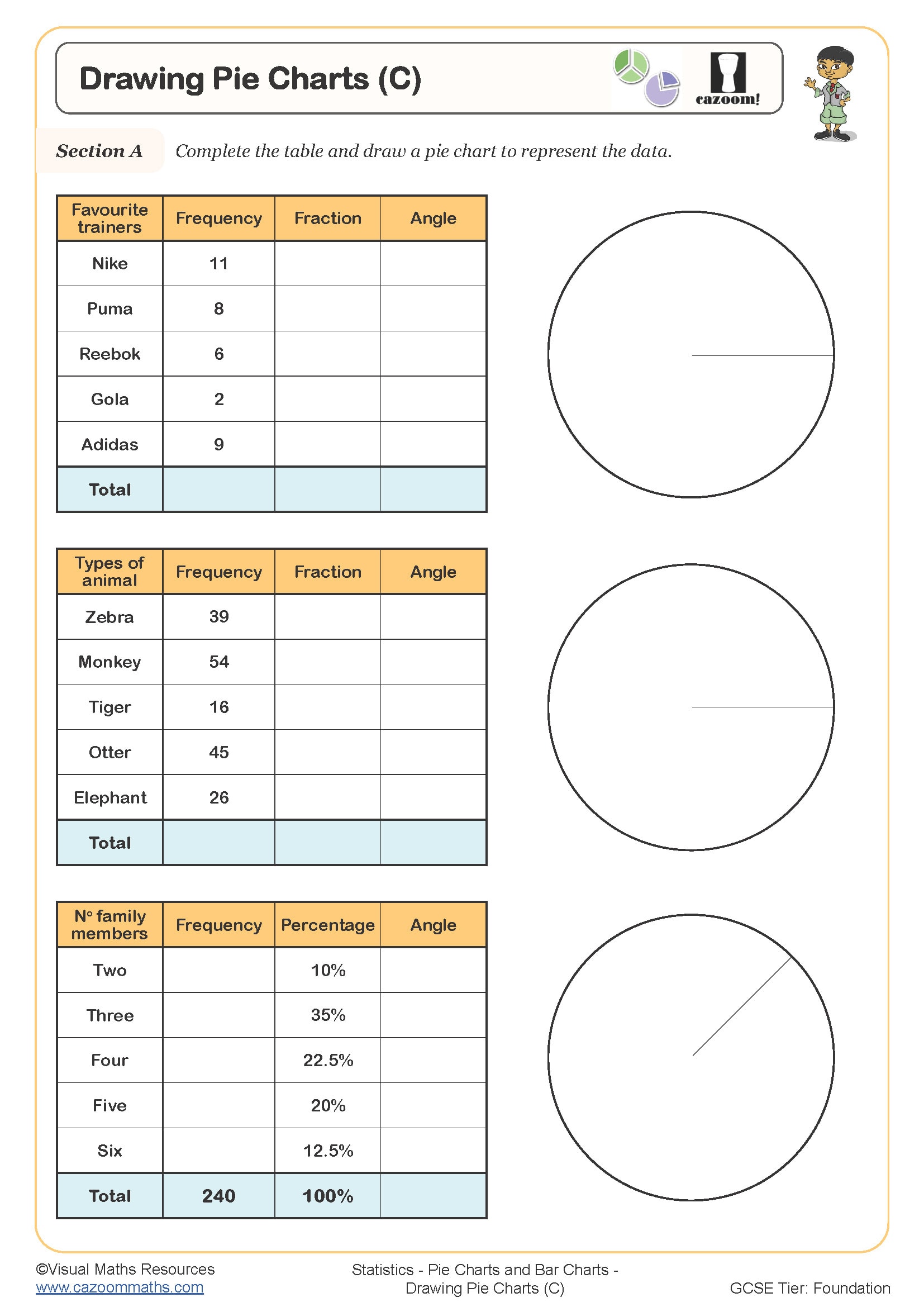
Drawing Pie Charts (C)
Year groups: 7, 8
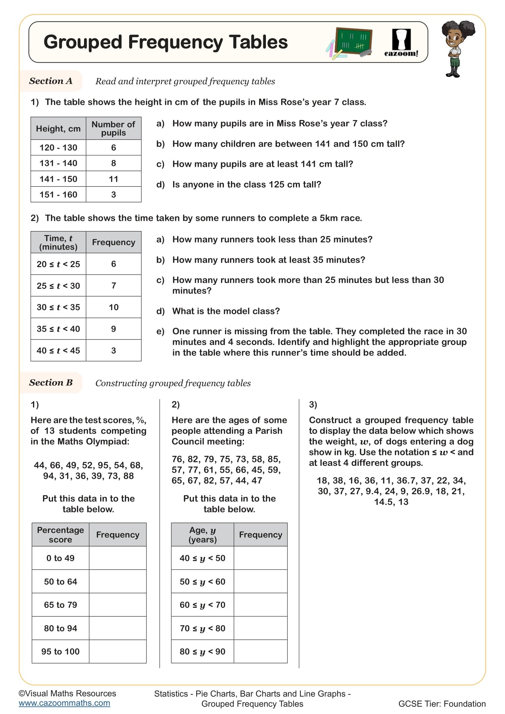
Grouped Frequency Tables
Year groups: 7, 8
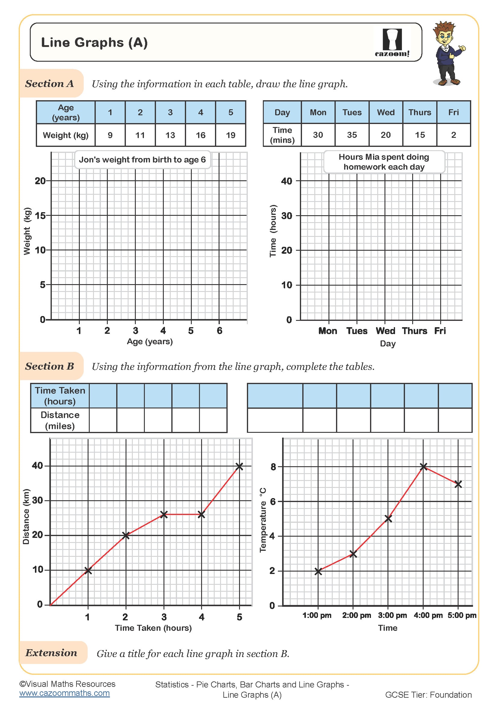
Line Graphs (A)
Year groups: 7, 8
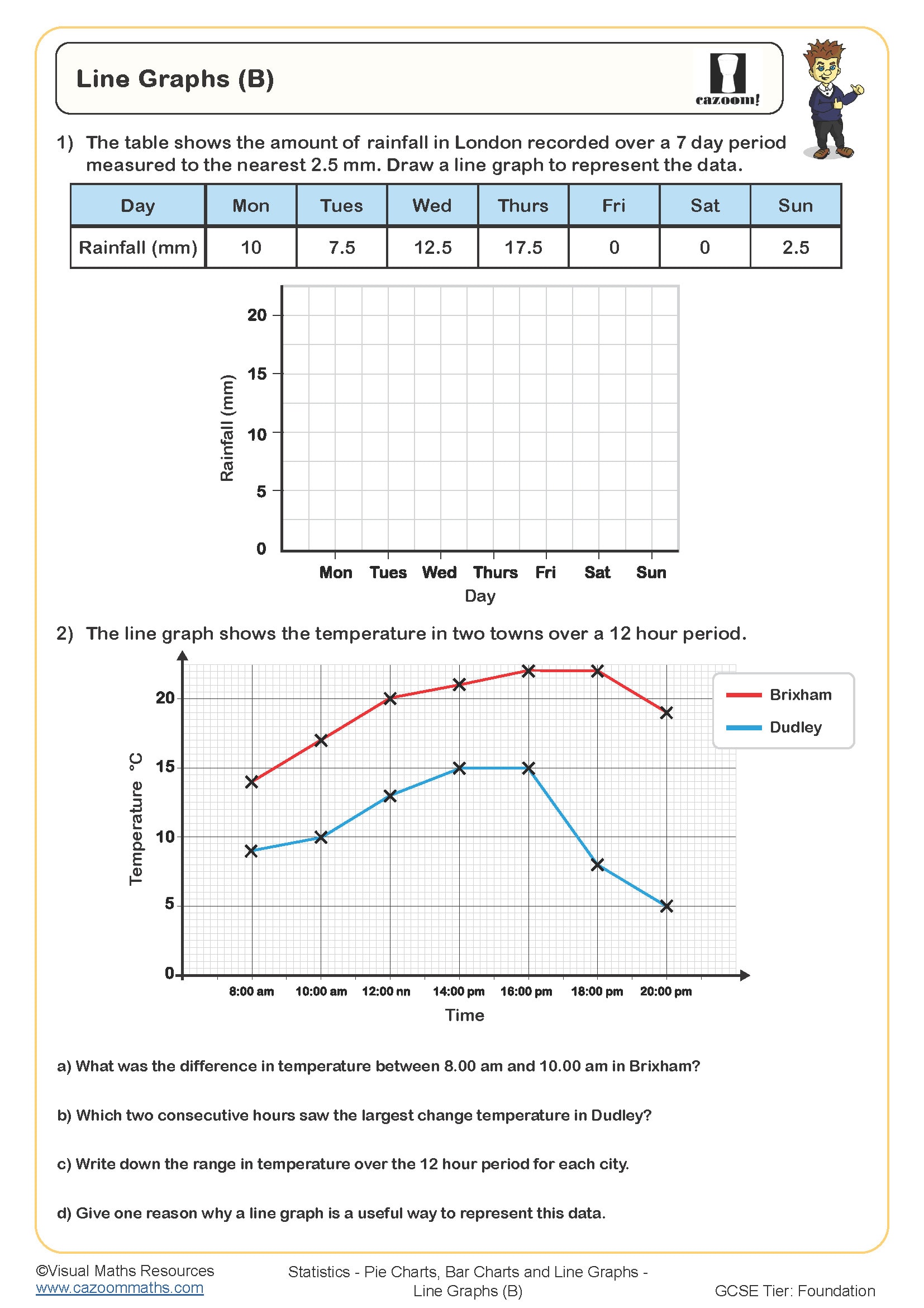
Line Graphs (B)
Year groups: 7, 8
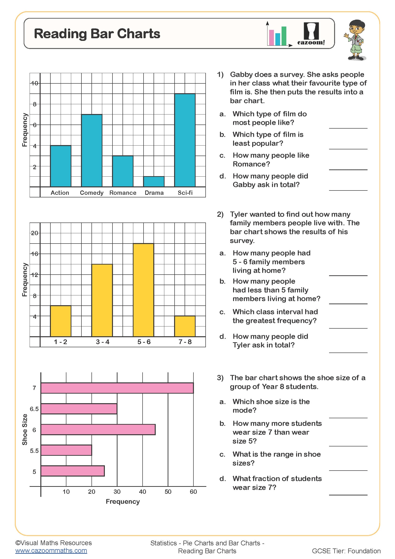
Reading Bar Charts
Year groups: 7, 8
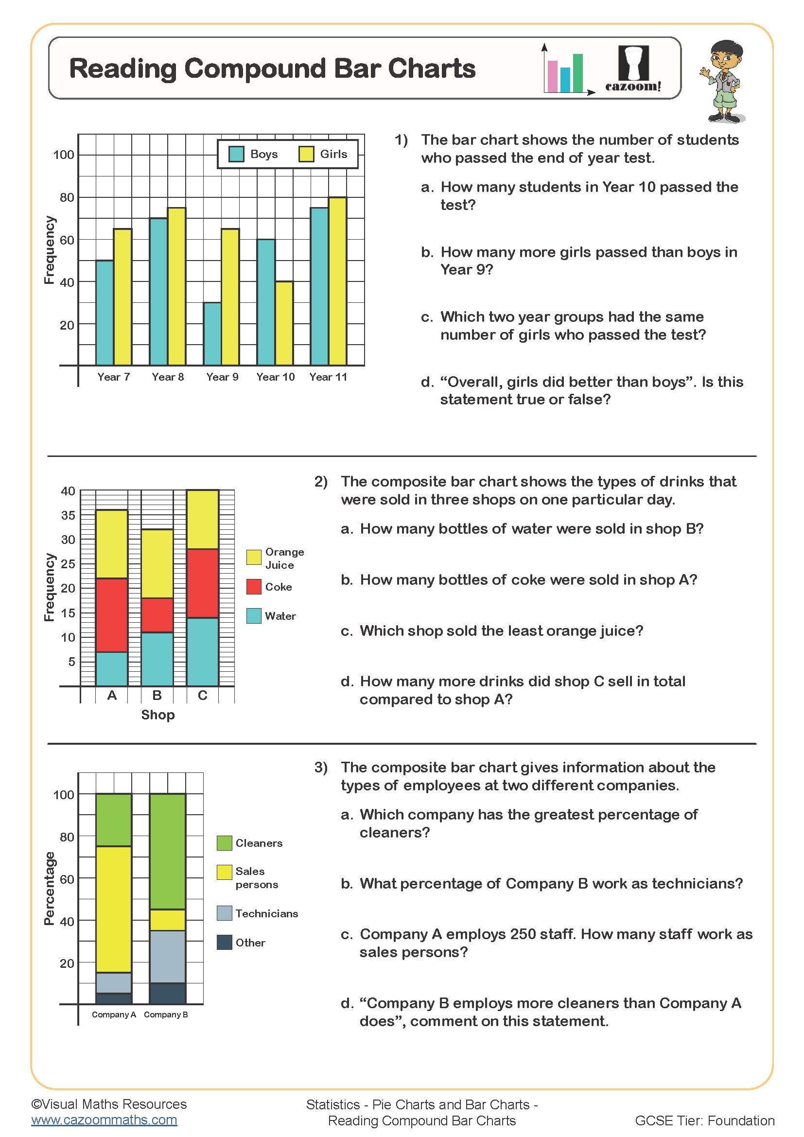
Reading Compound Bar Charts
Year groups: 7, 8
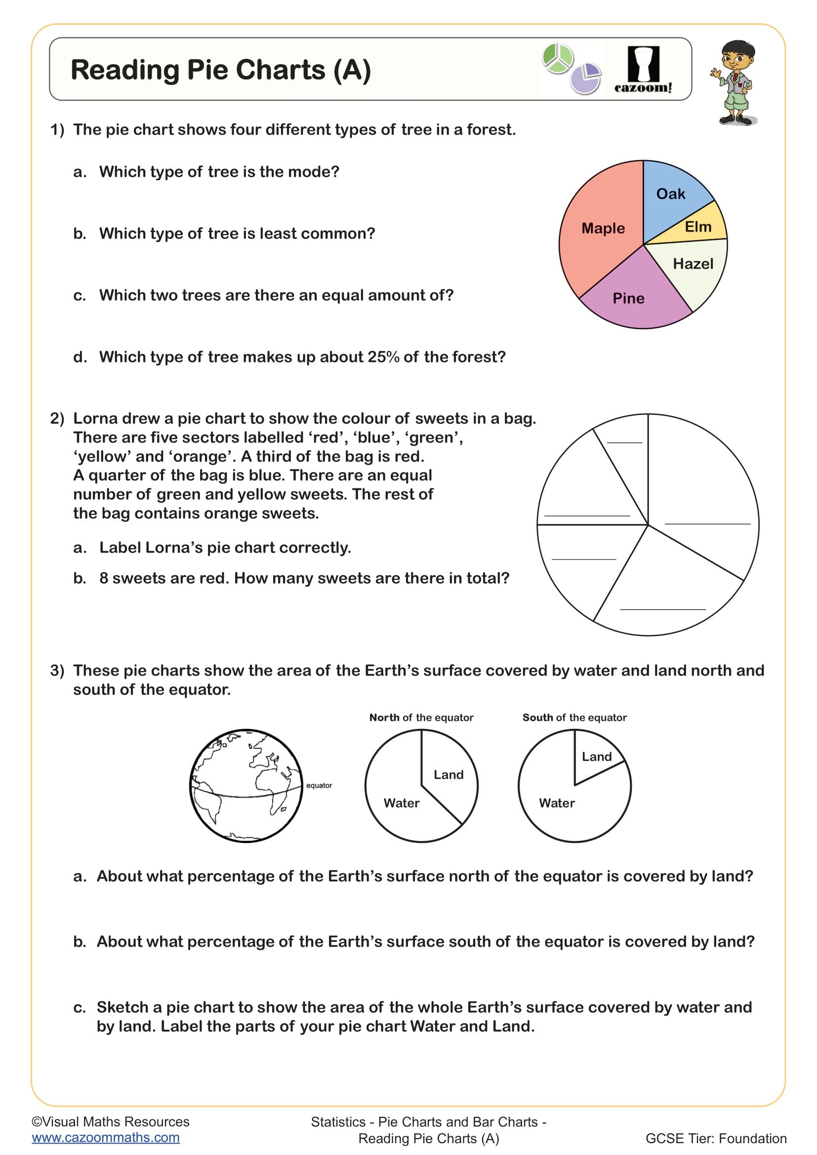
Reading Pie Charts (A)
Year groups: 7, 8
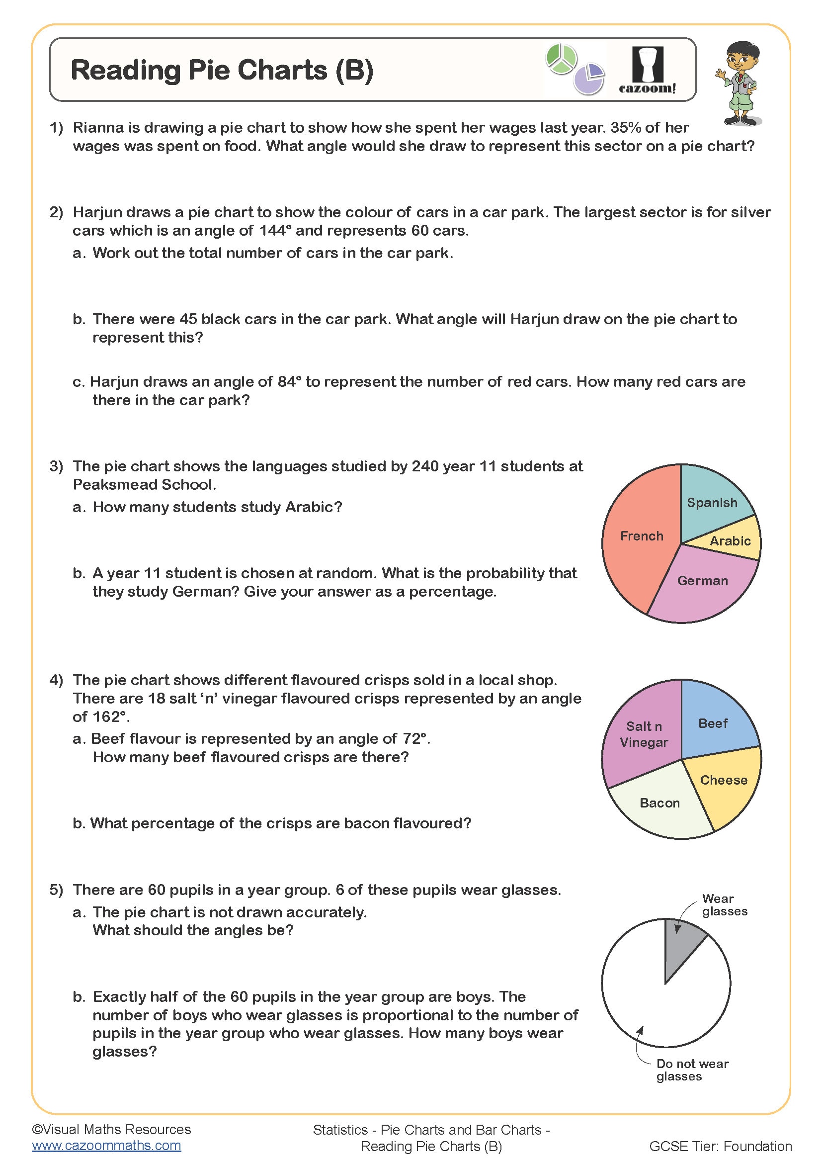
Reading Pie Charts (B)
Year groups: 7, 8
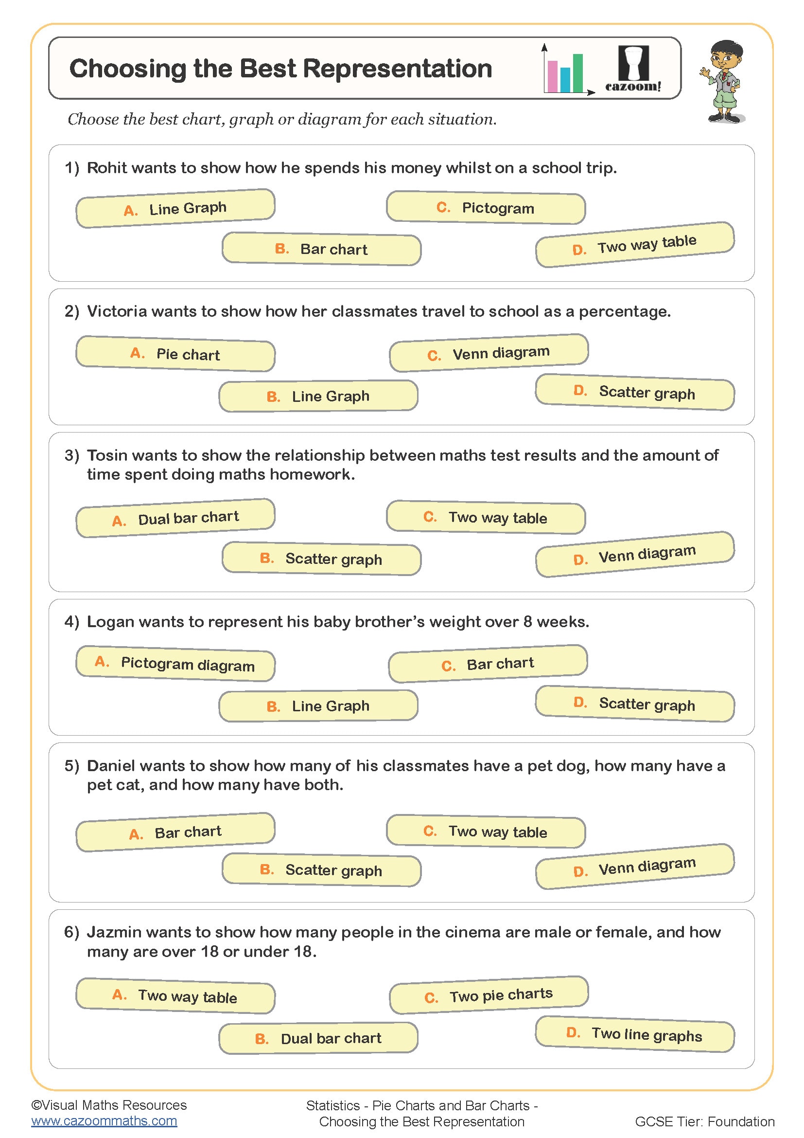
Choosing the Best Representation
Year groups: 8, 9
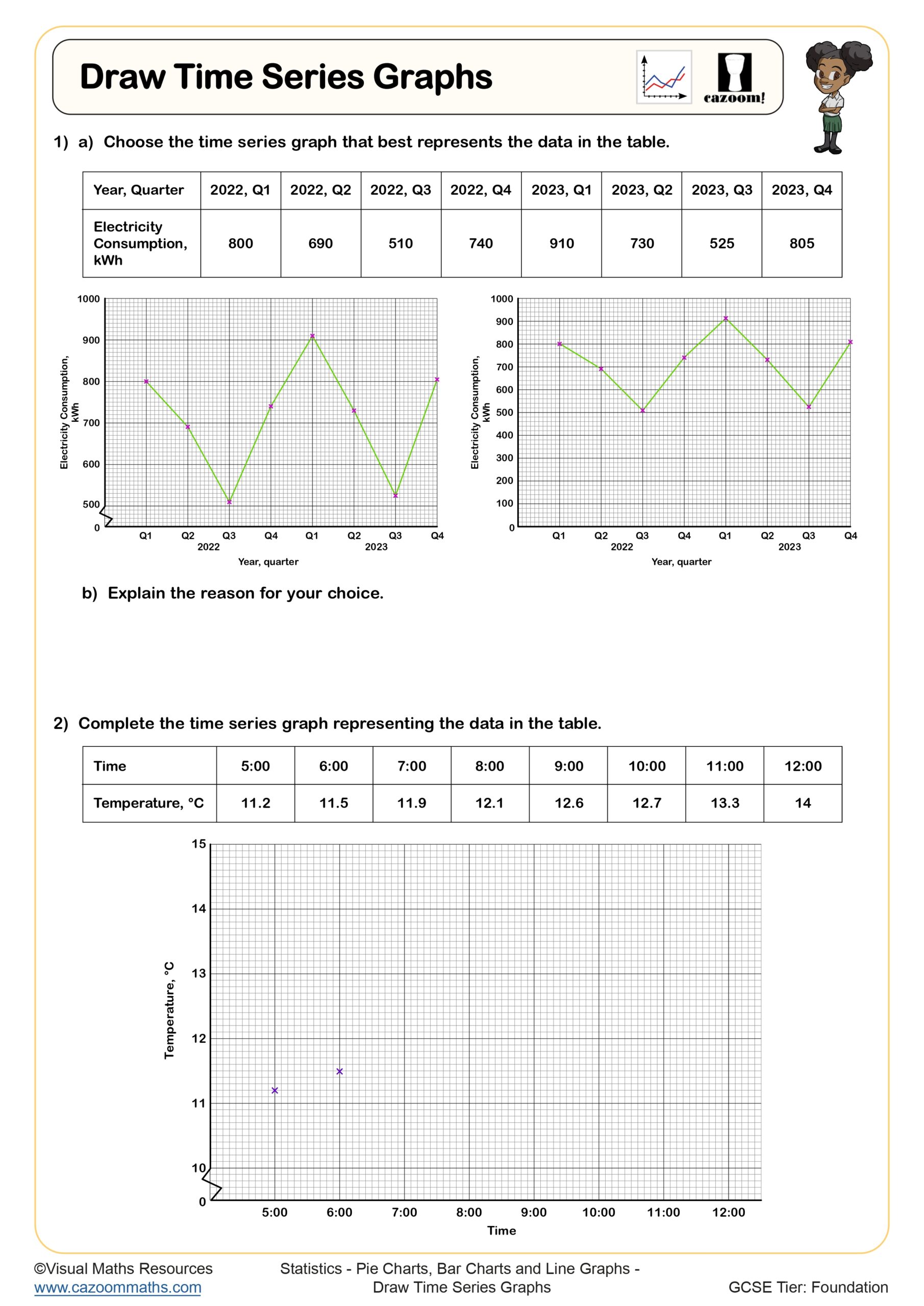
Draw Time Series Graphs
Year groups: 9, 10
All worksheets are created by the team of experienced teachers at Cazoom Maths.
What makes an effective pie chart worksheet for KS3 and KS4 students?
An effective pie chart worksheet should progress from interpreting existing pie graphs to constructing new ones, covering the full range of skills students need for GCSE success. The best pie chart questions with answers pdf resources include angle calculations, percentage conversions, and frequency table work within realistic contexts.
Teachers frequently notice that students who master pie chart construction through structured practice perform significantly better on statistics exam questions. The key is ensuring worksheets include both straightforward pie chart exercise problems and multi-step challenges that mirror real exam scenarios, particularly those involving missing data or comparative analysis between different pie charts.
Which year groups benefit most from structured pie charts questions practice?
Year 7 students typically begin with reading simple pie charts and calculating basic percentages, whilst Years 8-9 progress to constructing pie charts from frequency tables and handling more complex angle calculations. By Year 10-11, students need to tackle GCSE-level problems involving missing sectors and comparative data analysis.
Many teachers find that revisiting pie chart worksheets regularly throughout KS3 prevents the common Year 11 issue where students can interpret charts but struggle with construction. The visual nature of pie charts makes them particularly valuable for supporting students who find other statistical representations challenging, especially when combined with real-world contexts like survey data or budget analysis.
How should students approach converting between angles and percentages in pie charts?
Students need to understand that the complete circle represents 360° or 100%, creating the fundamental relationship where each 1% equals 3.6°. Most pie chart questions require students to use this conversion confidently, whether calculating missing angles or determining percentages from given sector angles.
Teachers consistently observe that students who memorise the 3.6° relationship without understanding often make errors when working backwards from angles to percentages. Successful pie chart exercise completion requires students to visualise the proportional relationship and check their answers make sense - for instance, recognising that a quarter-circle sector should represent exactly 25% or 90°.
What teaching strategies work best when using pie charts worksheets in lessons?
Starting each lesson with a quick interpretation task helps students activate their understanding before moving to construction problems. Teachers find that providing protractors and encouraging students to estimate angles before measuring develops both accuracy and number sense for pie chart work.
The most effective approach combines individual worksheet practice with paired checking, particularly for drawing bar graphs worksheet activities that follow pie chart lessons. Students benefit from discussing their methods and identifying where slight measurement errors occurred, as this builds the precision required for GCSE statistics papers where accuracy in construction can determine whether marks are awarded.