Year 7 Pie Charts, Bar Charts and Line Graphs Worksheets
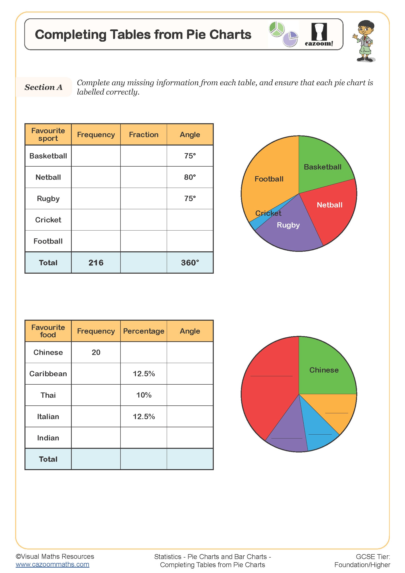
Completing Tables from Pie Charts
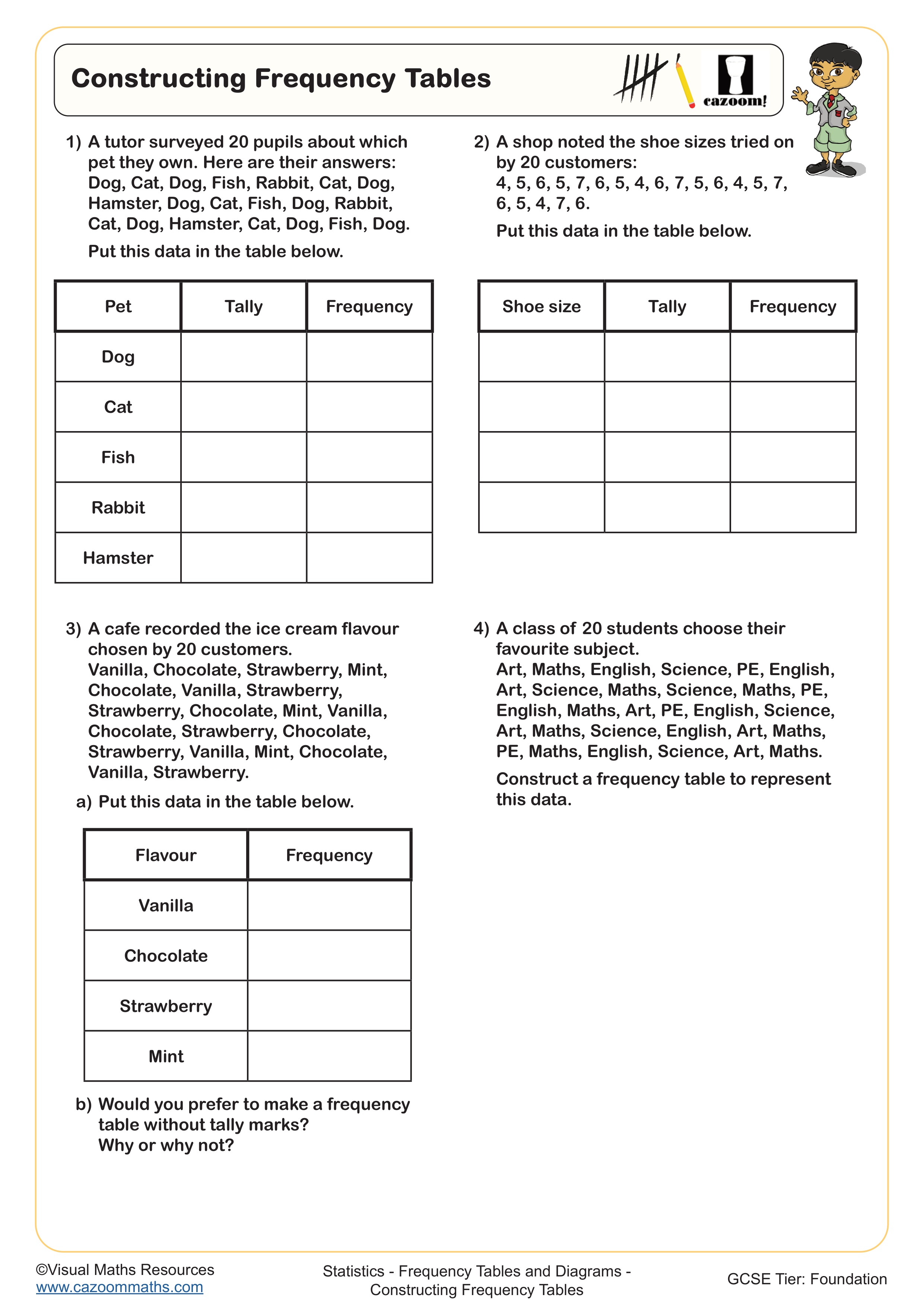
Constructing Frequency Tables
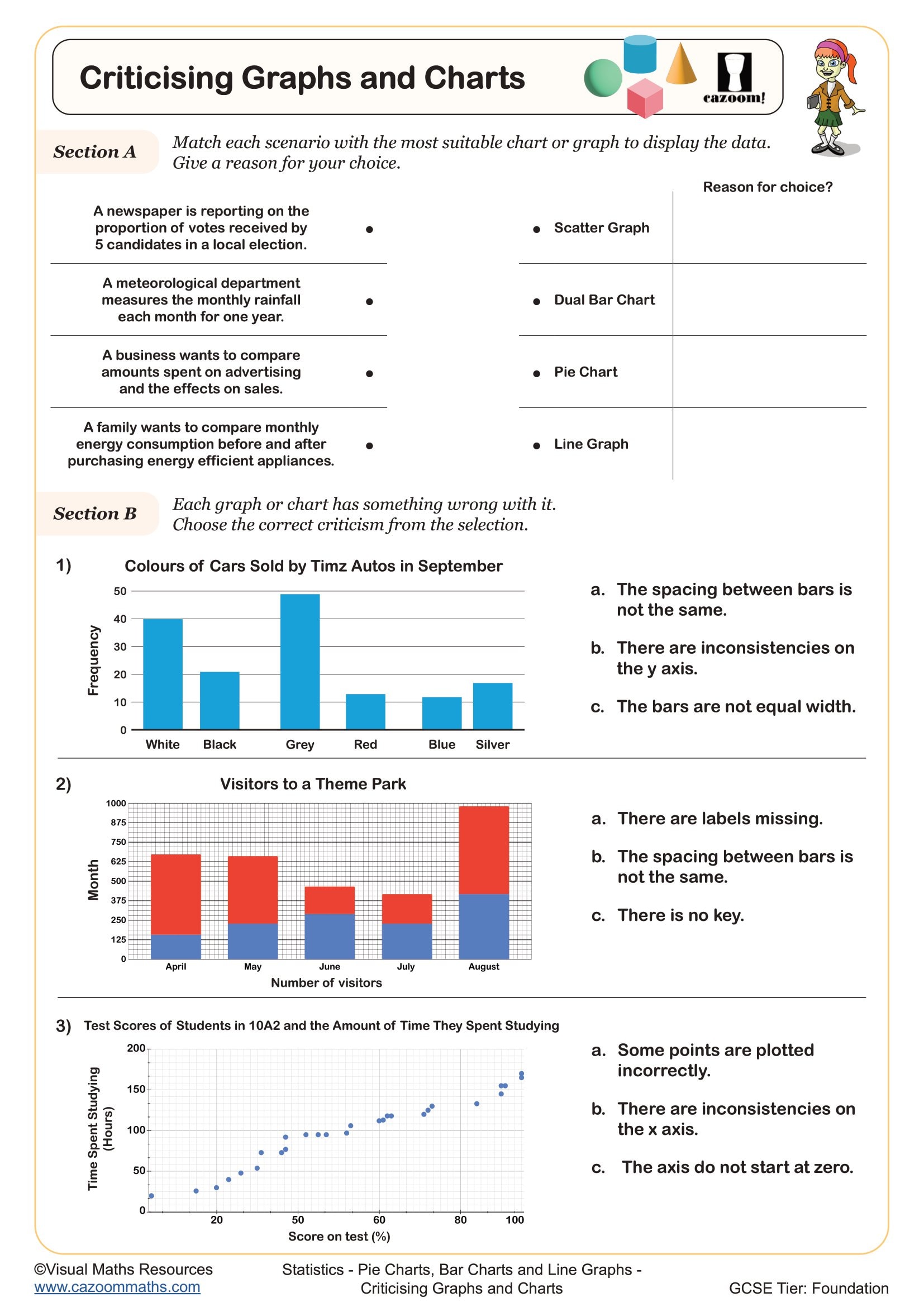
Criticising Graphs and Charts
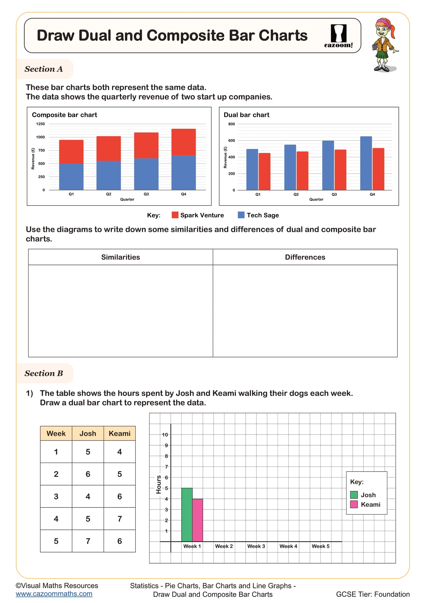
Draw Composite and Dual Bar Charts
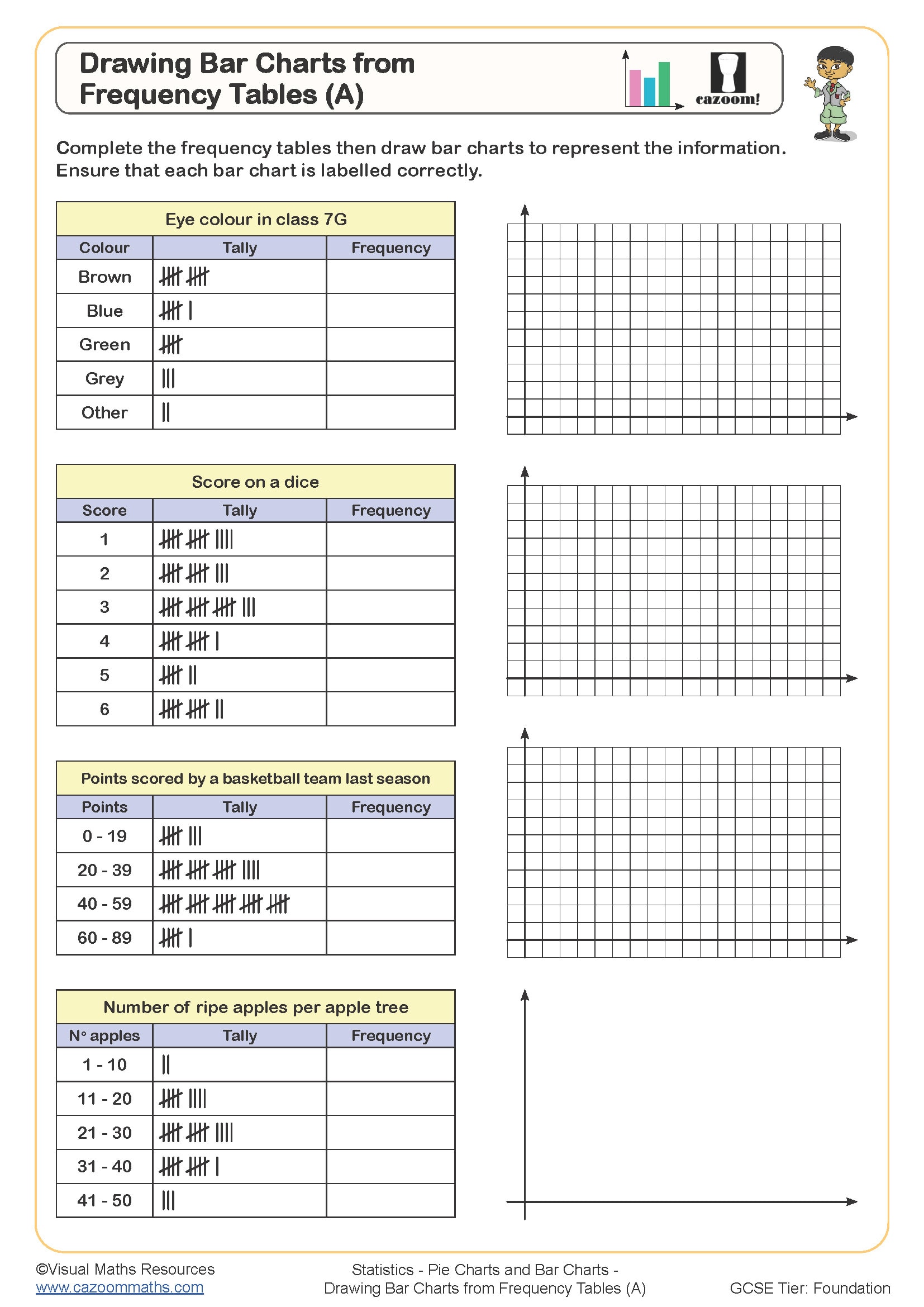
Drawing Bar Charts from Frequency Tables (A)
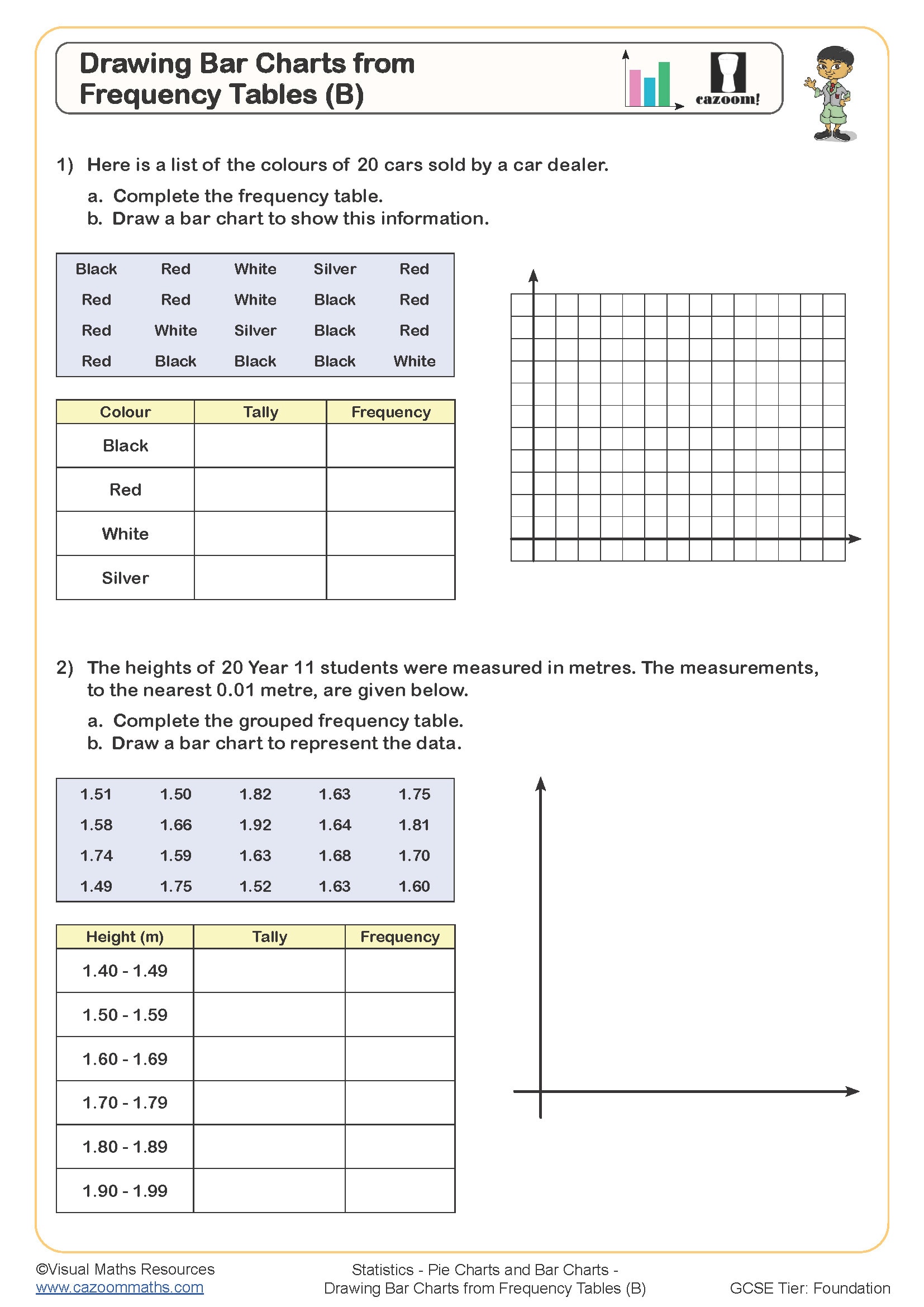
Drawing Bar Charts from Frequency Tables (B)
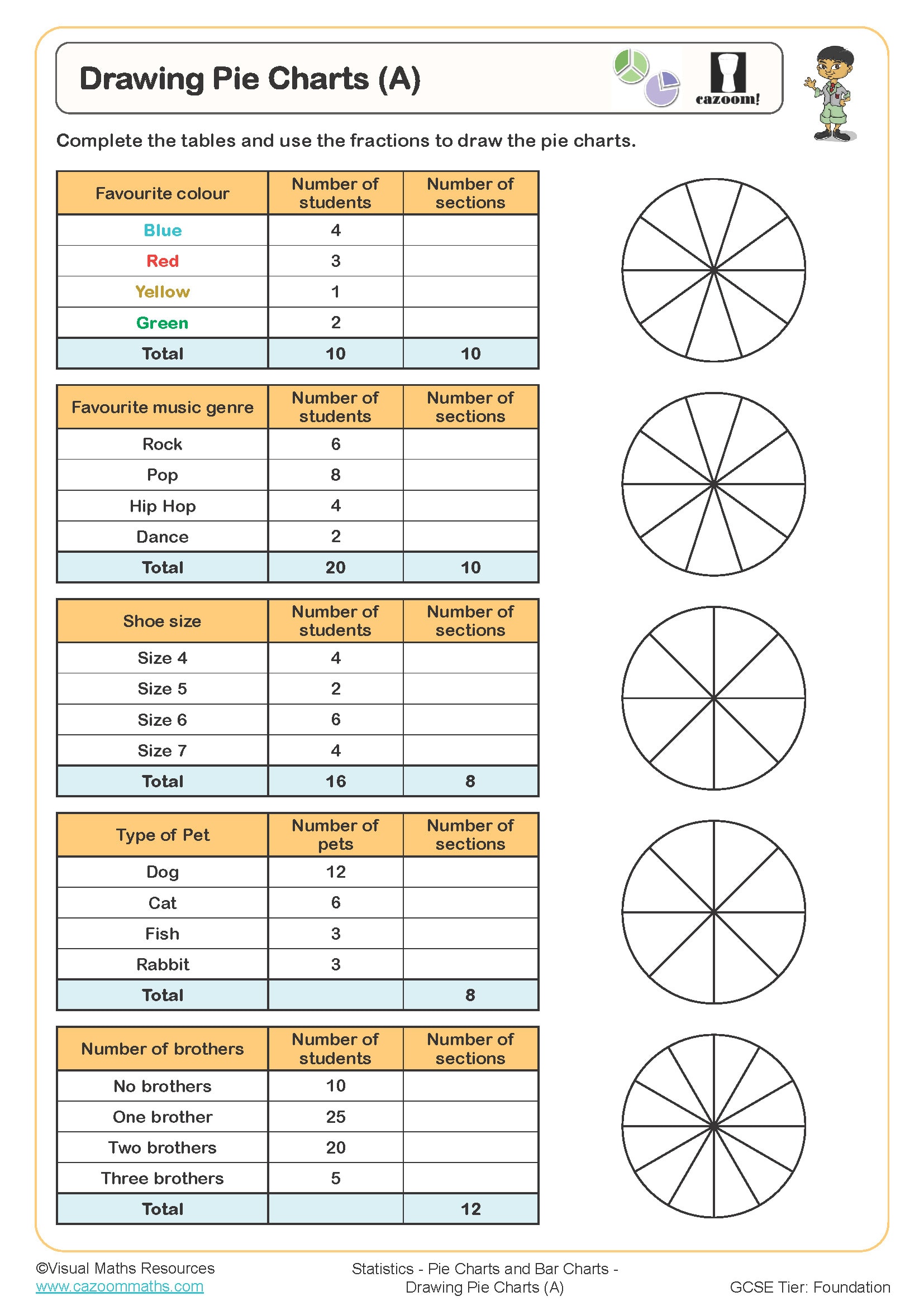
Drawing Pie Charts (A)
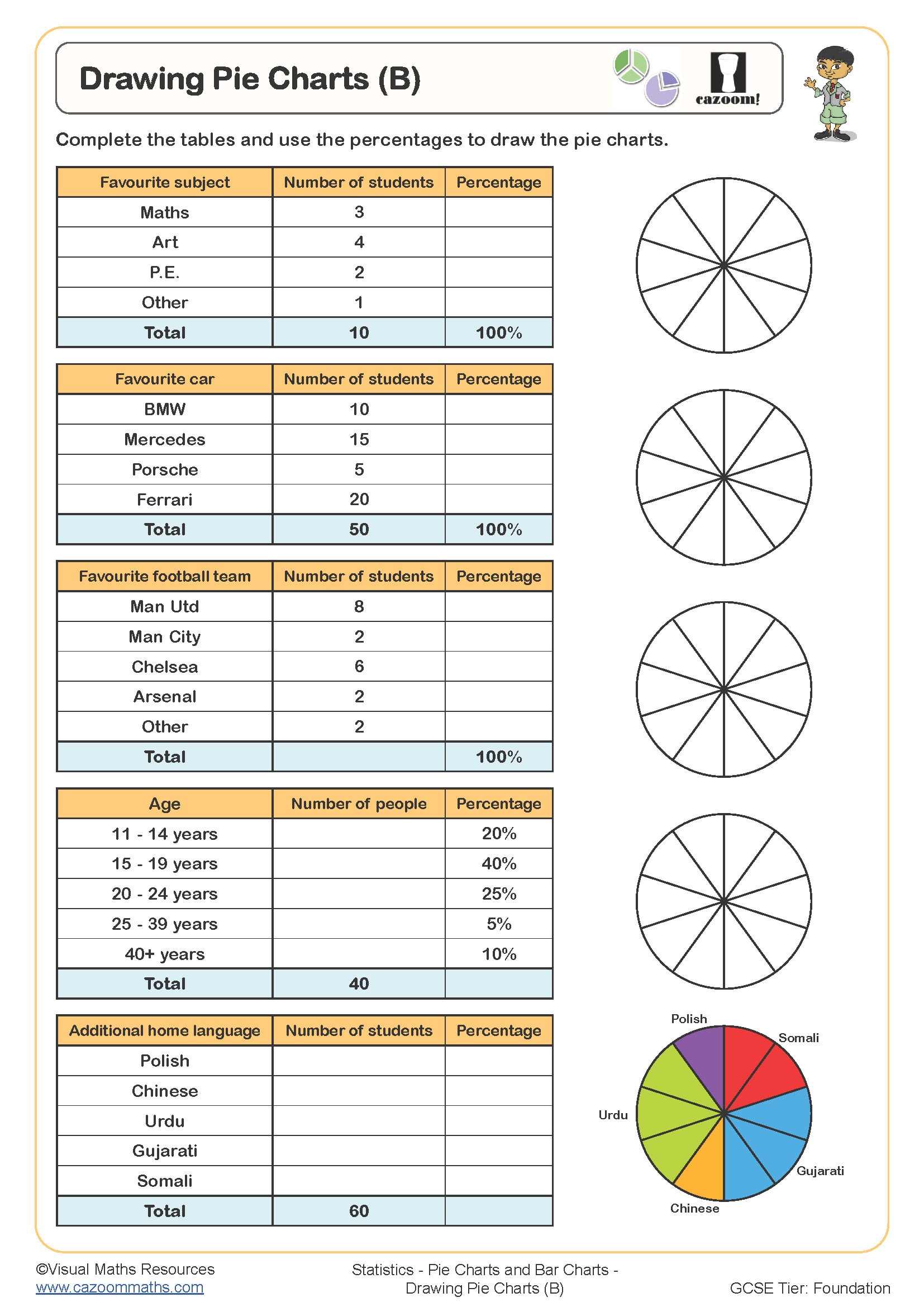
Drawing Pie Charts (B)
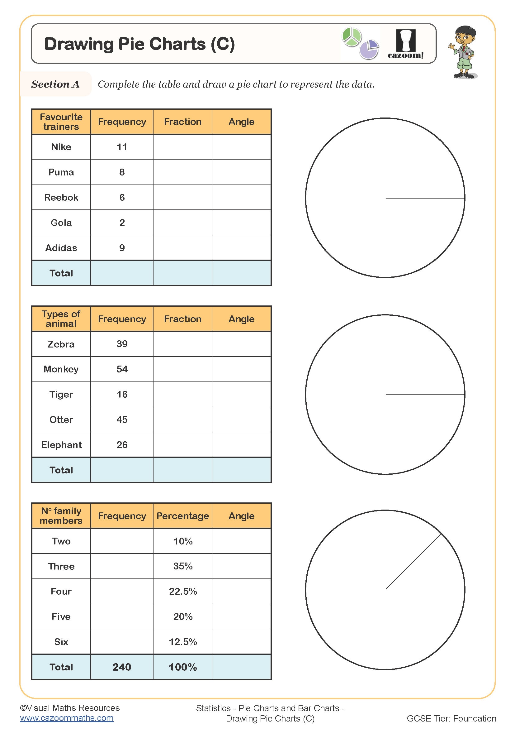
Drawing Pie Charts (C)
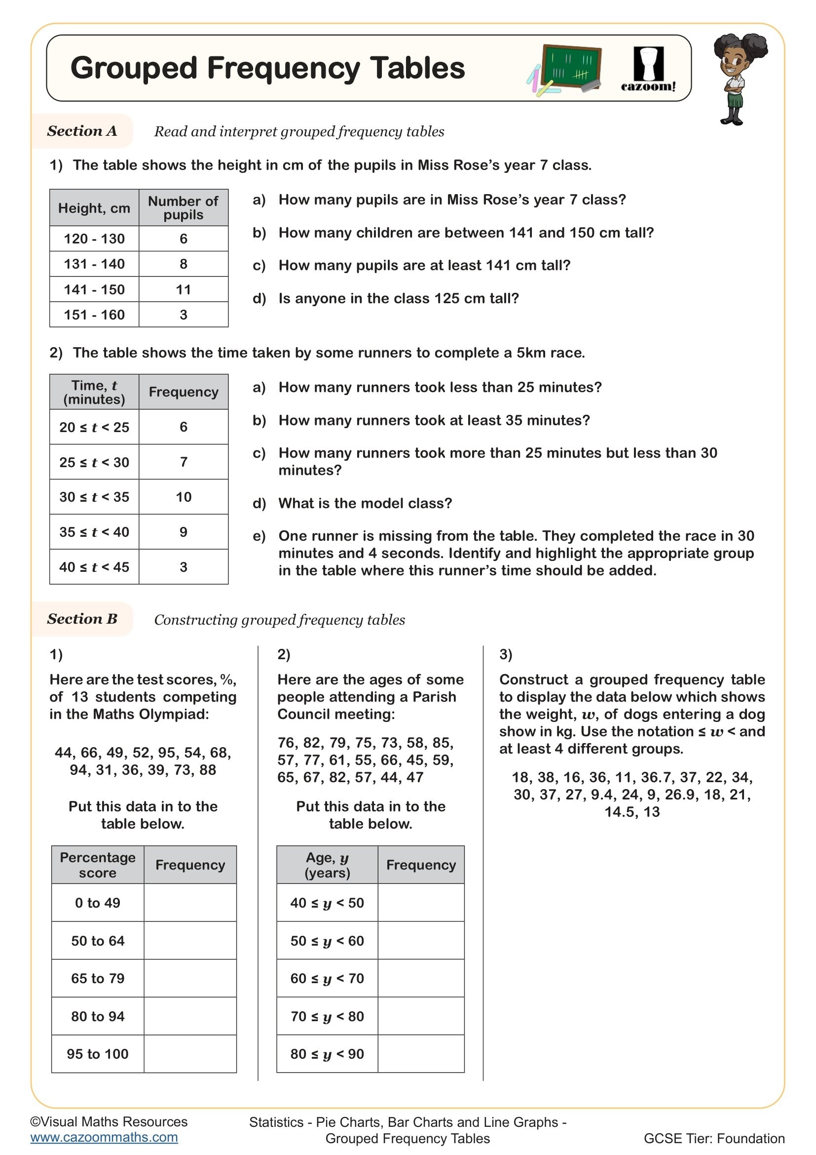
Grouped Frequency Tables
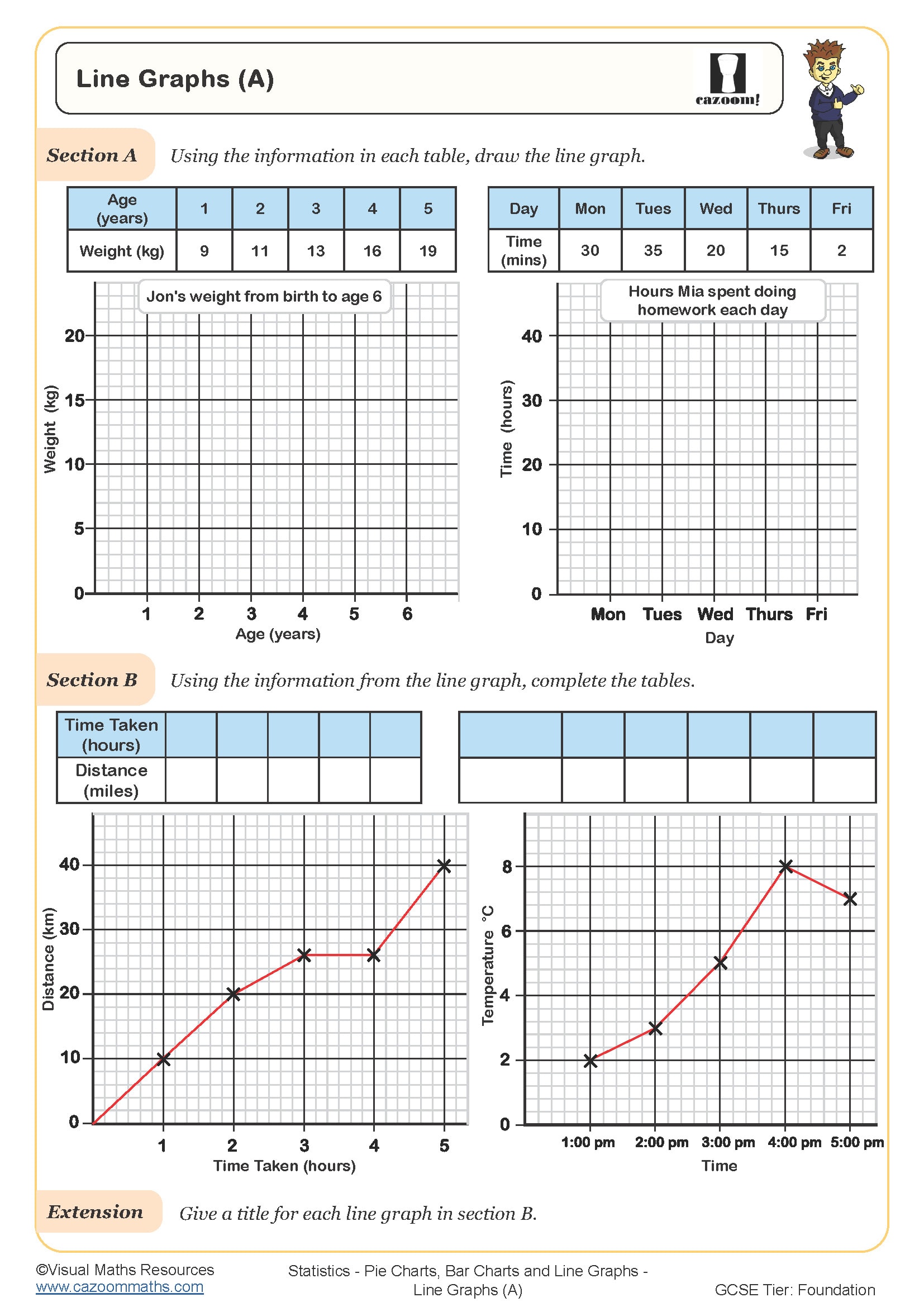
Line Graphs (A)
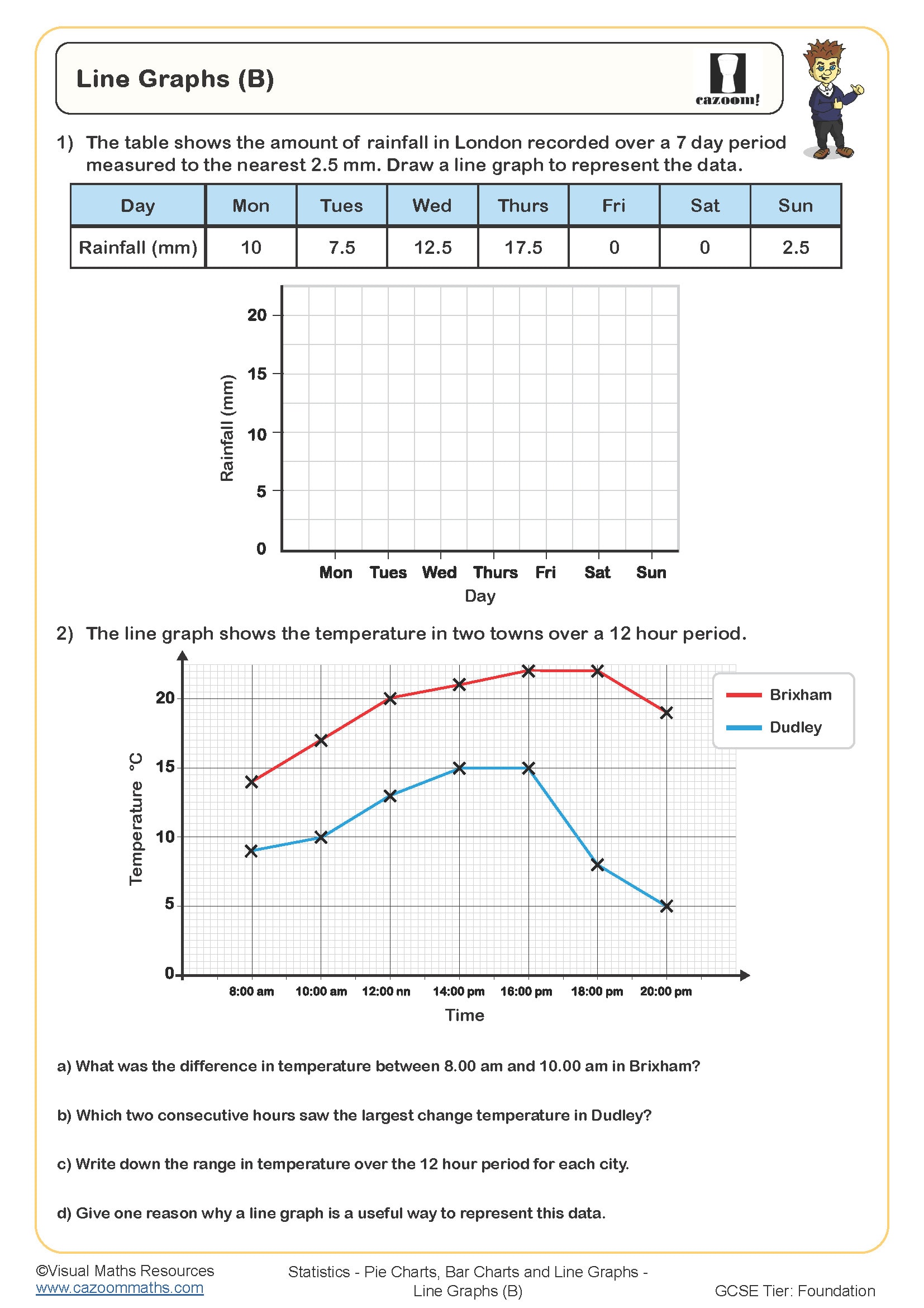
Line Graphs (B)
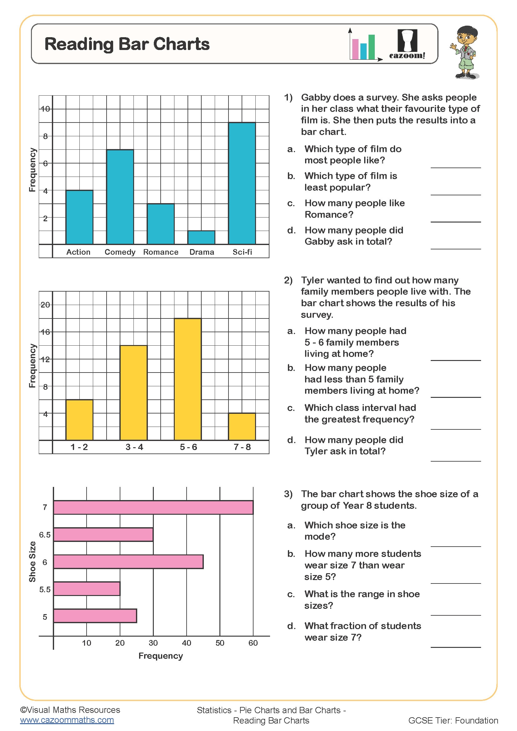
Reading Bar Charts
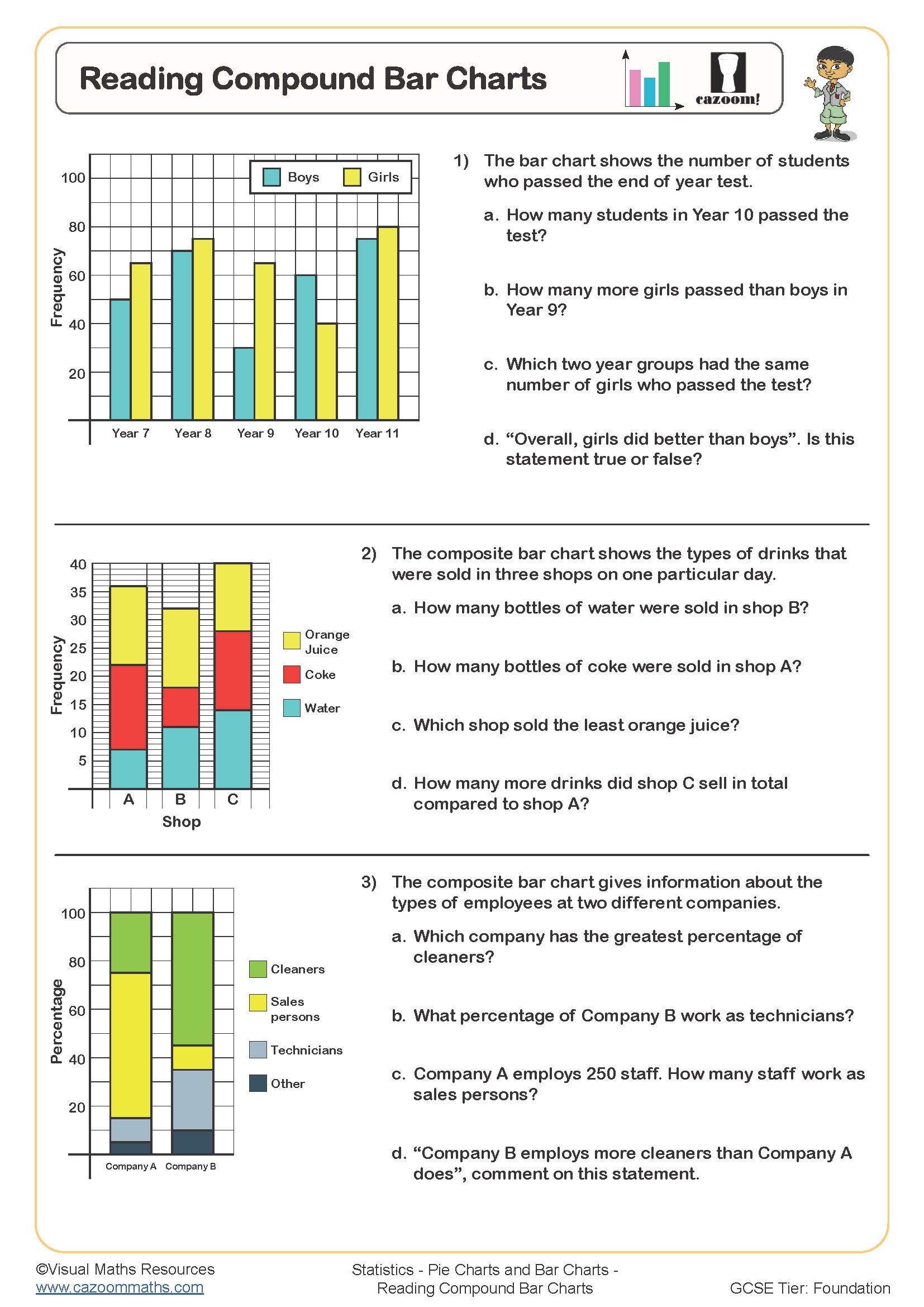
Reading Compound Bar Charts
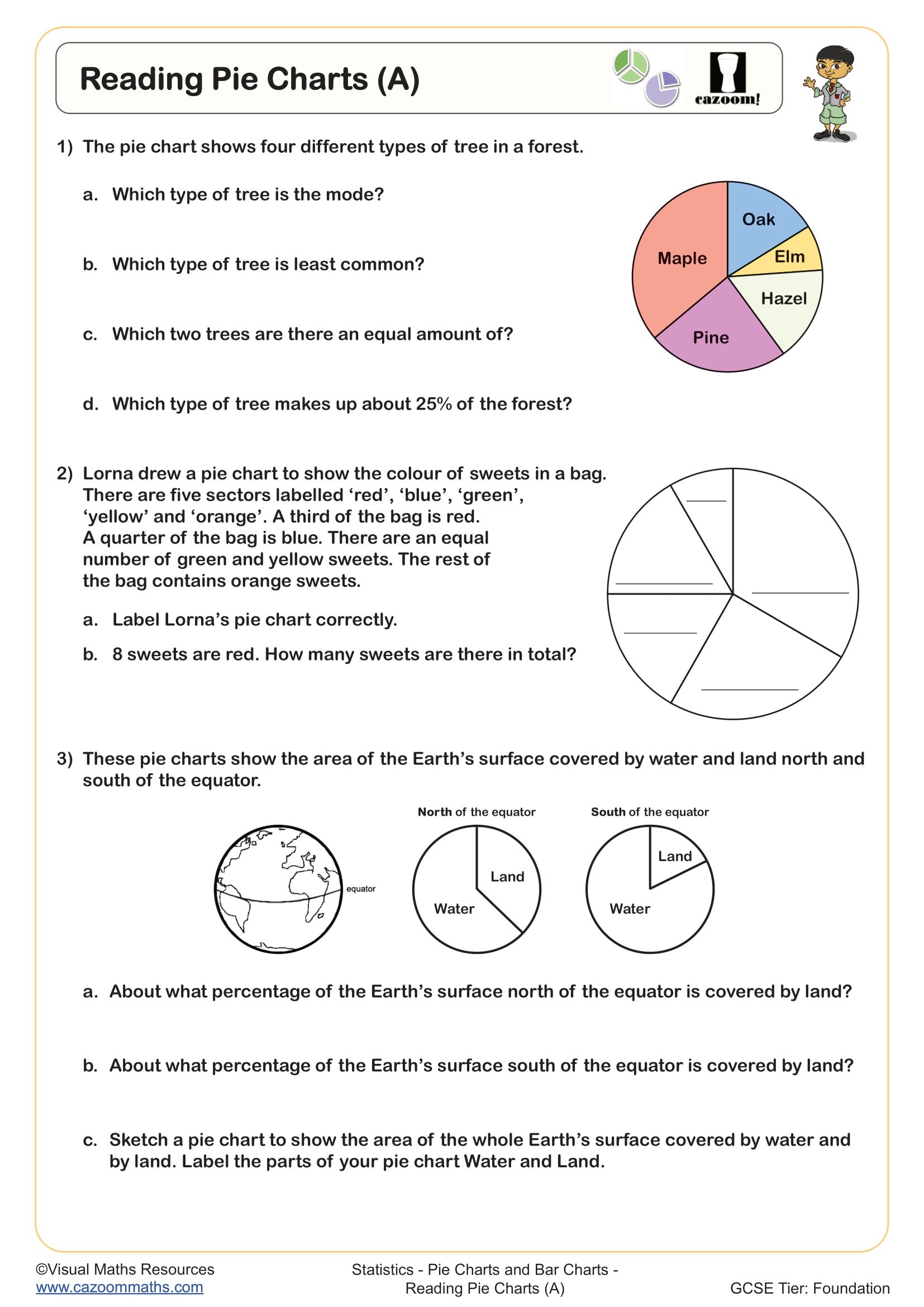
Reading Pie Charts (A)
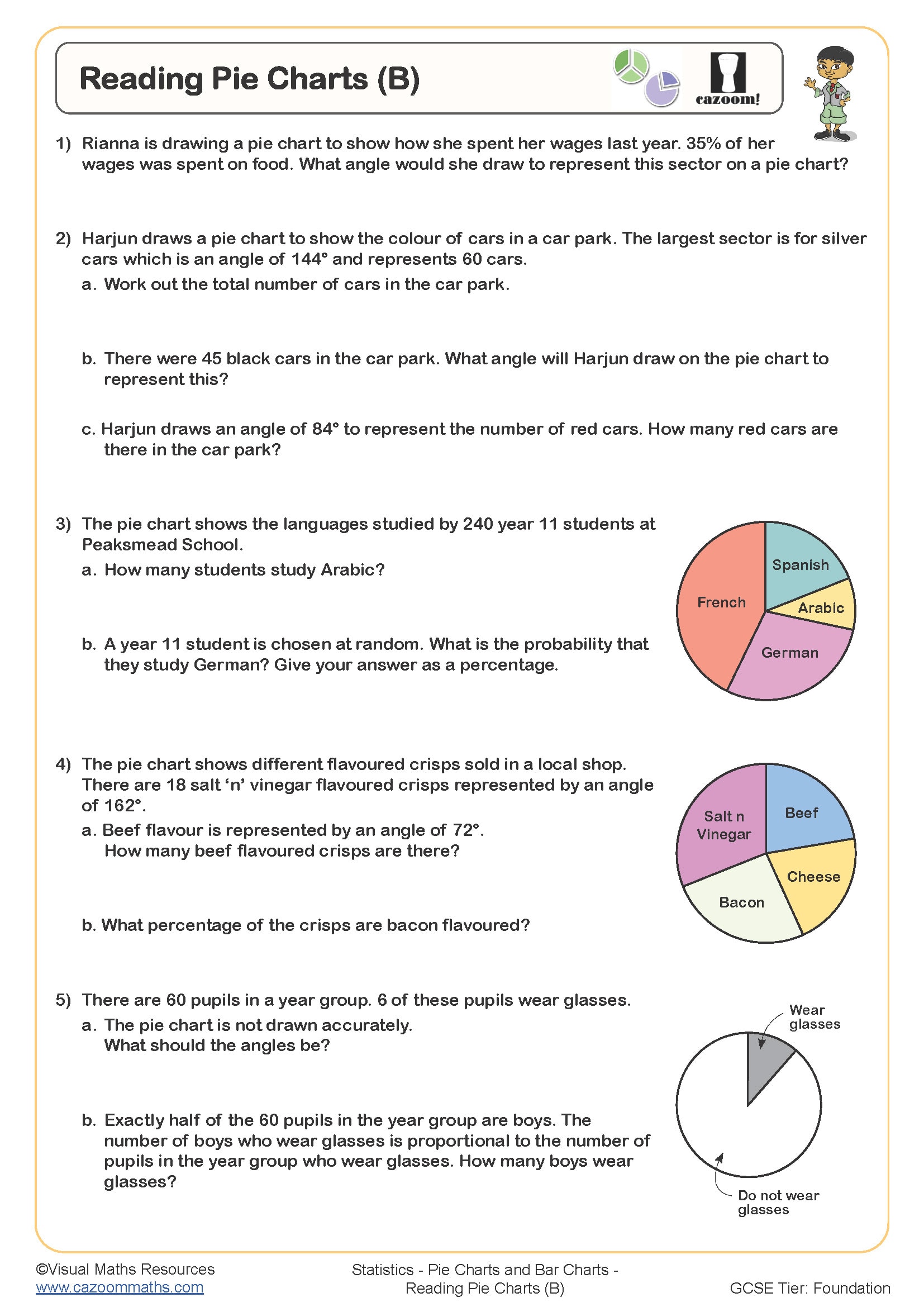
Reading Pie Charts (B)
All worksheets are created by the team of experienced teachers at Cazoom Maths.
Year 7 Pie Chart Bar Chart Line Graph PDF Resources
Our Cazoom Maths expert team has observed that advanced statistics skills can be overwhelming for your young students who are transitioning from KS2 to KS3. However, without mastering these basic statistical equations, your secondary school students will face difficulties in the future. To make this learning process smooth and convenient, we have created our worksheets in ready-to-use, printable PDF format. Each of these worksheets includes separate answer sheets to facilitate an easy checking process. Download our maths activities right now to provide the extra help your young learners need!
Complete Skills Guide for Data Representation Worksheets
Pie charts show how a whole amount is split into different parts (imagine cutting a pizza into slices). Bar charts compare different amounts using columns or bars, while line graphs track how something changes over time by connecting dots with lines.
With these Cazoom Maths activities, your students start with basic chart reading and progress through to complex data interpretation tasks. The pie chart sections are particularly popular with our Year 7 classes because they include both simple fraction work and percentage calculations. Students practise reading scales, identifying trends in line graphs, and comparing data sets across different chart types. There's also plenty of work on creating their own charts from raw data (surprisingly satisfying for most students).
How Chart Practice Boosts Year 7 Mathematics Performance
Our team of experts have observed that your young students who get regular chart practice perform significantly better on assessments. The connection between consistent worksheet practice and improved test performance is really clear with data representation topics. These skills appear in GCSE mathematics, so getting the foundations right in Year 7 makes a huge difference later on. The worksheets help students develop that crucial ability to extract information from charts quickly and accurately.
Benefits include:
• Improved chart reading speed and accuracy
• Better understanding of data relationships and trends
• Increased confidence with percentage and fraction calculations
• Stronger foundation skills for GCSE statistics topics
• Enhanced problem-solving abilities with real-world data
Real-World Uses of Pie Charts, Bar Charts, and Line Graphs
Basic statistical chart skills appear everywhere from social media analytics to sports performance tracking. We've found that students get genuinely excited when they realise they're already using these skills to interpret data on apps and websites. Geography lessons use line graphs for climate data, science uses bar charts for experimental results, and history lessons often include pie charts for population studies.
Real applications include:
• Analysing social media engagement statistics and follower growth
• Reading weather forecasts and climate data presentations
• Understanding sports statistics and performance tracking charts
• Interpreting news articles with statistical information and surveys
• Managing personal budgets using spending category breakdowns
• Comparing product reviews and ratings across different platforms