Year 8 Pie Charts, Bar Charts and Line Graphs Worksheets
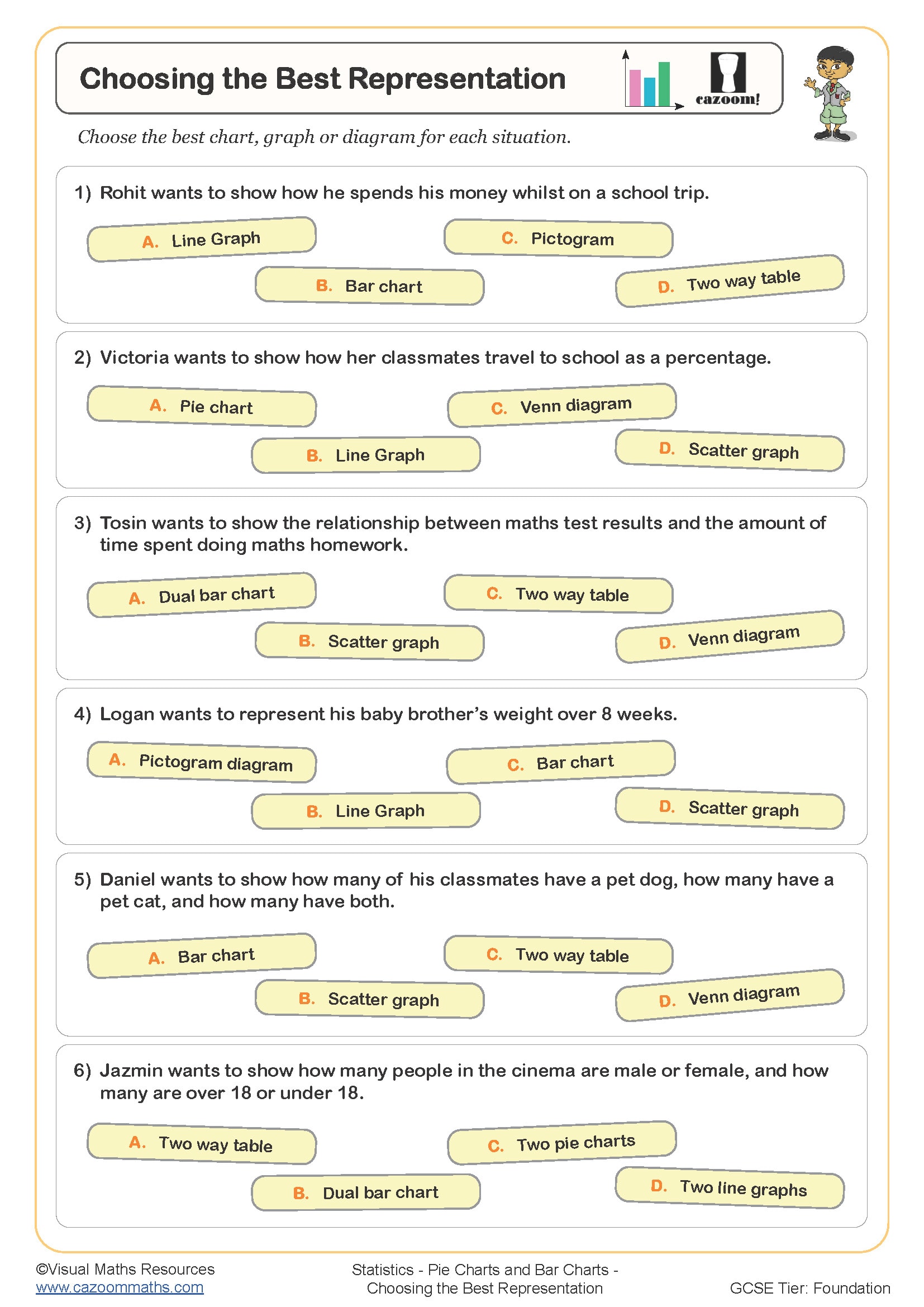
Choosing the Best Representation
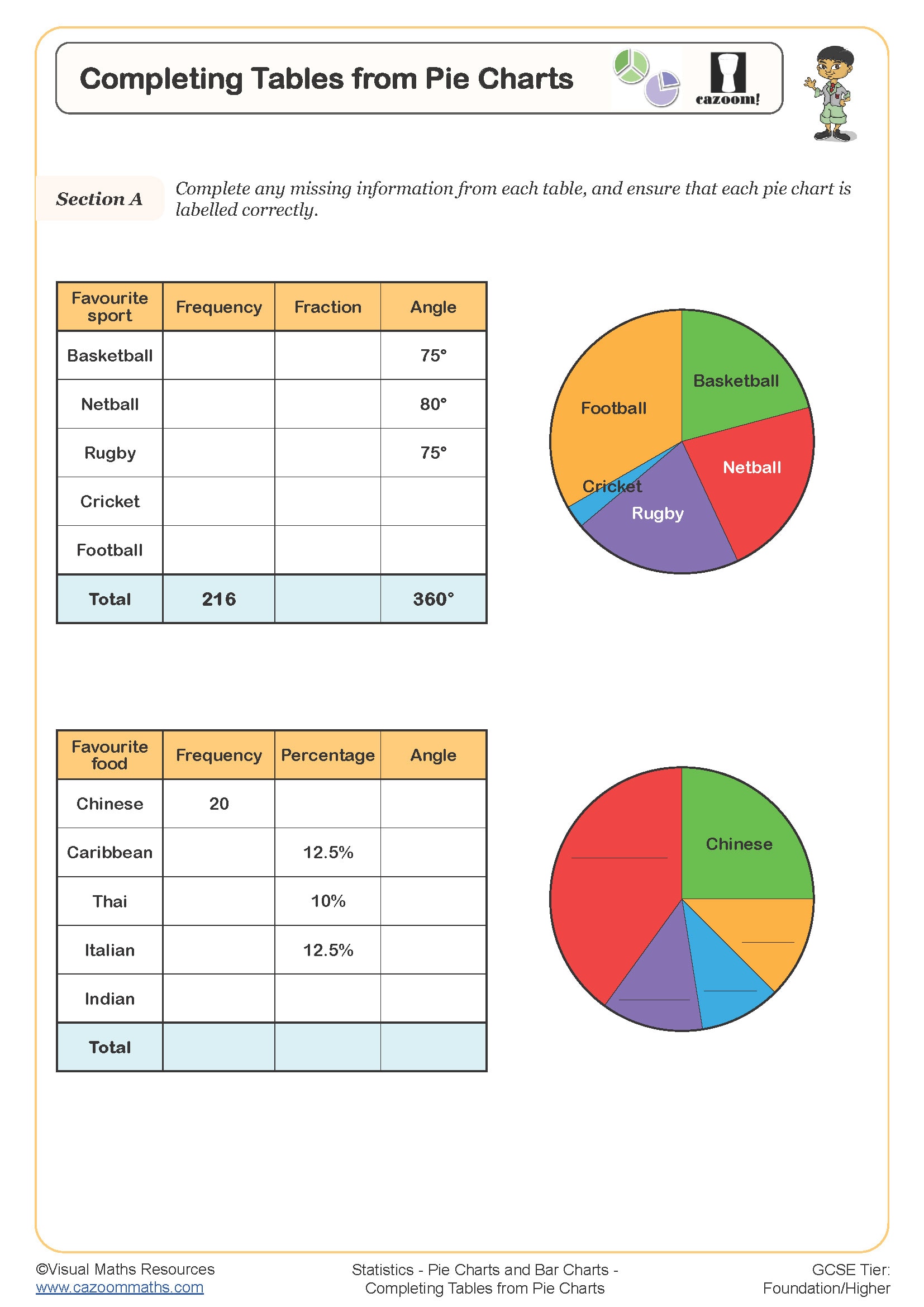
Completing Tables from Pie Charts
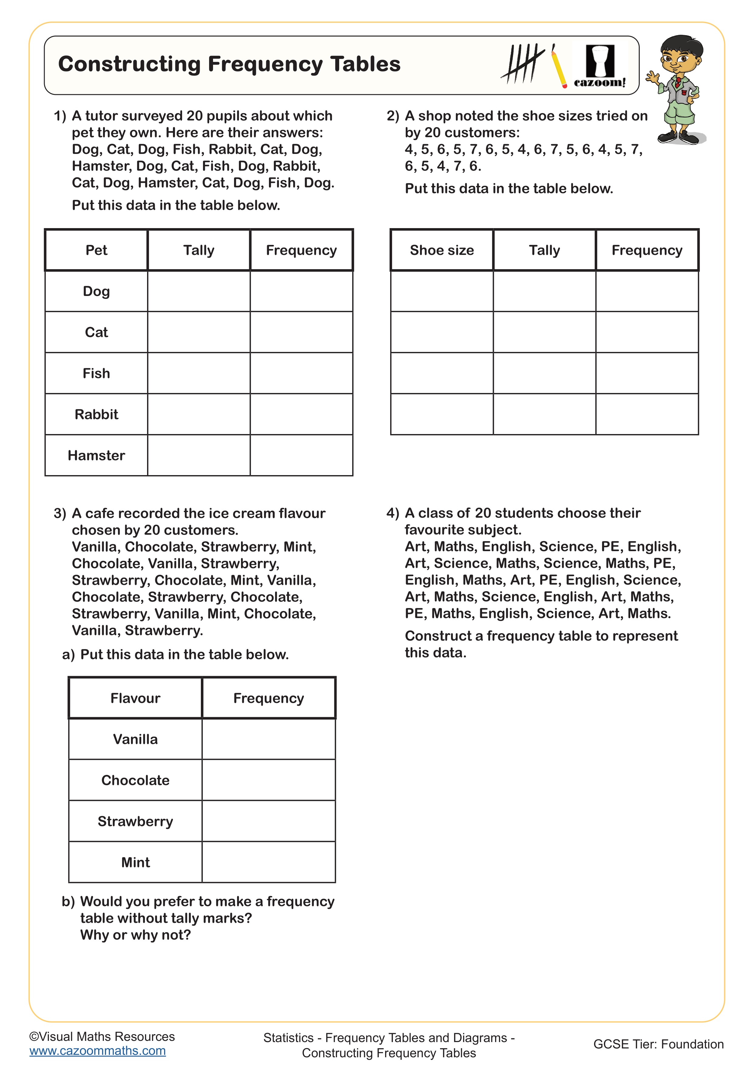
Constructing Frequency Tables
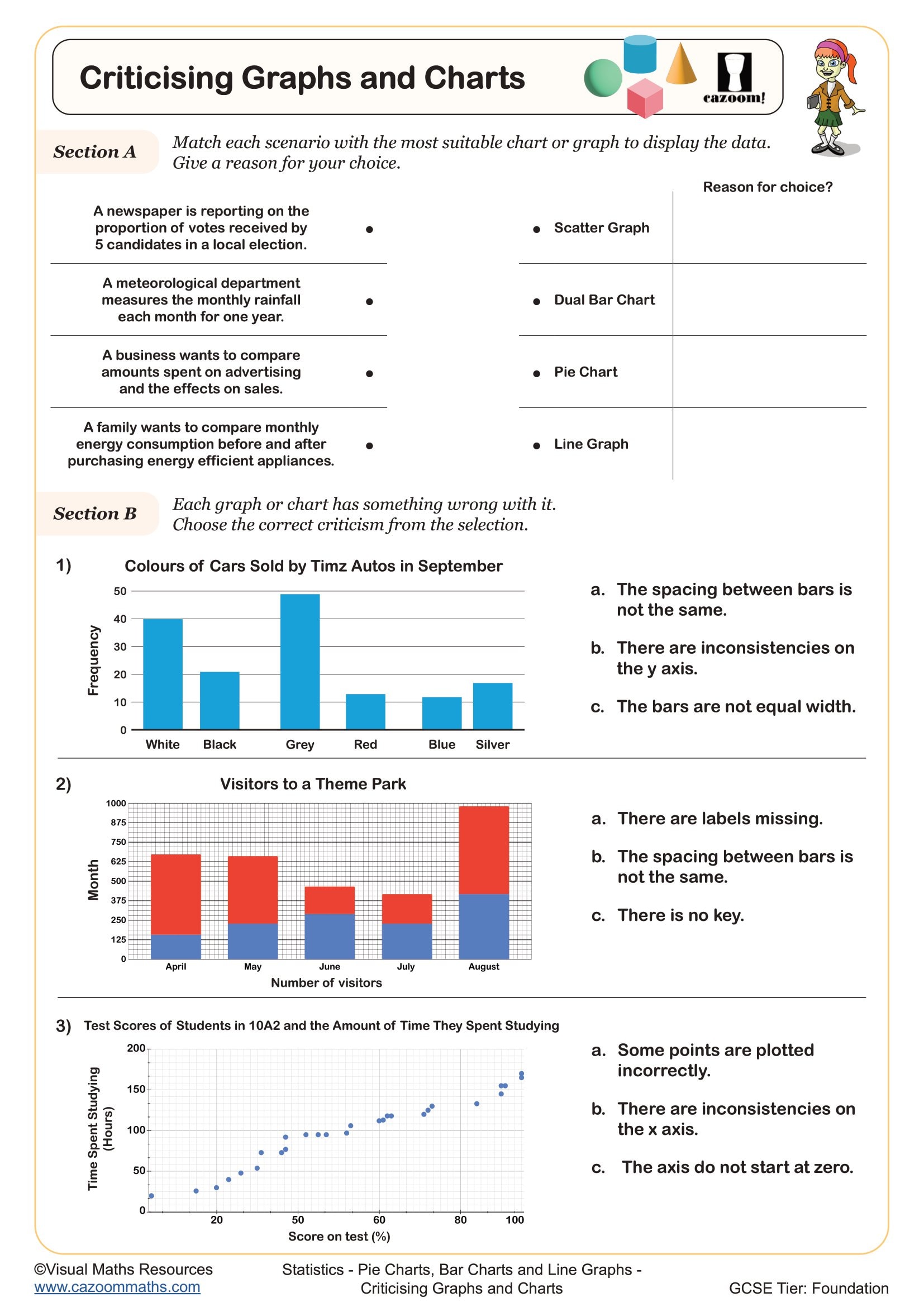
Criticising Graphs and Charts
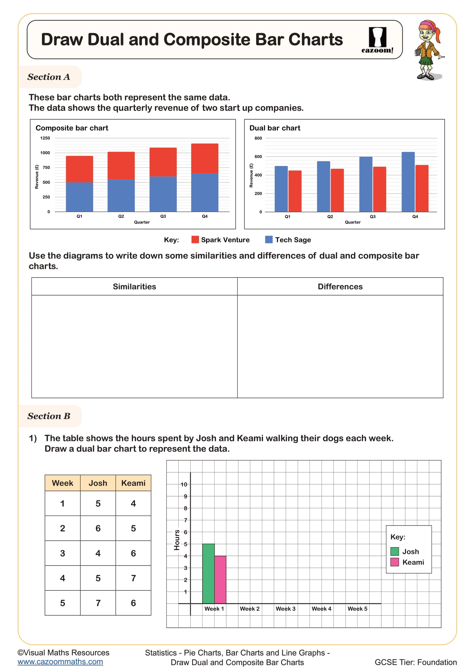
Draw Composite and Dual Bar Charts
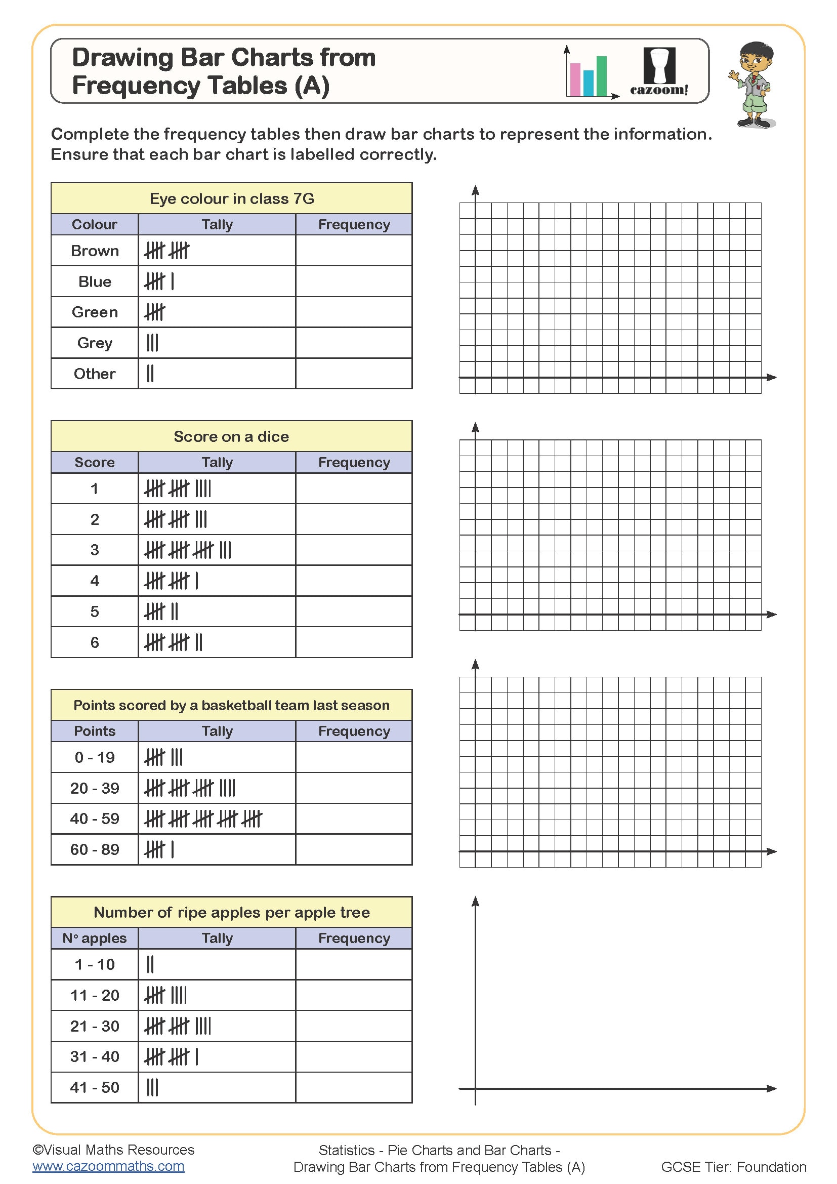
Drawing Bar Charts from Frequency Tables (A)
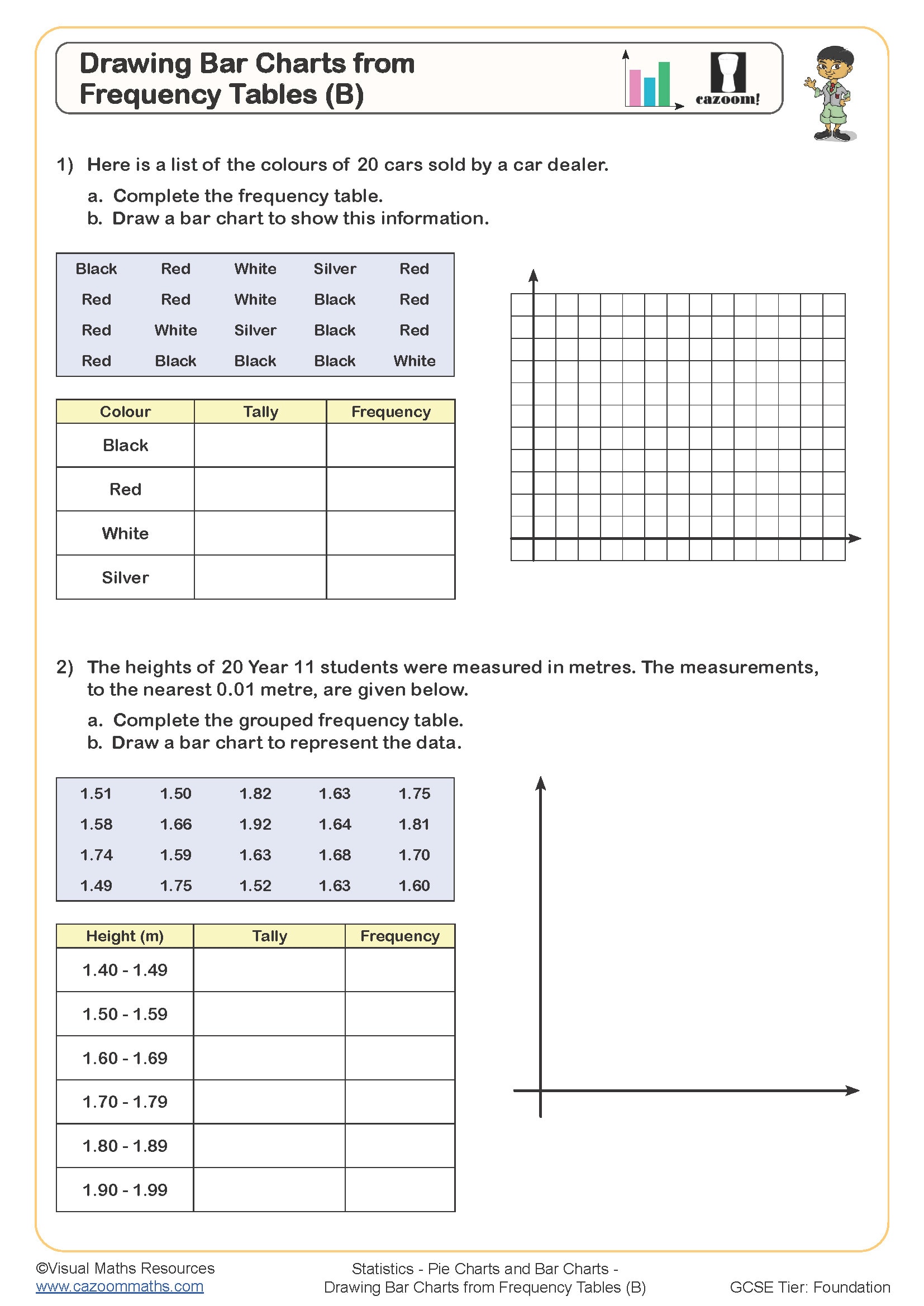
Drawing Bar Charts from Frequency Tables (B)
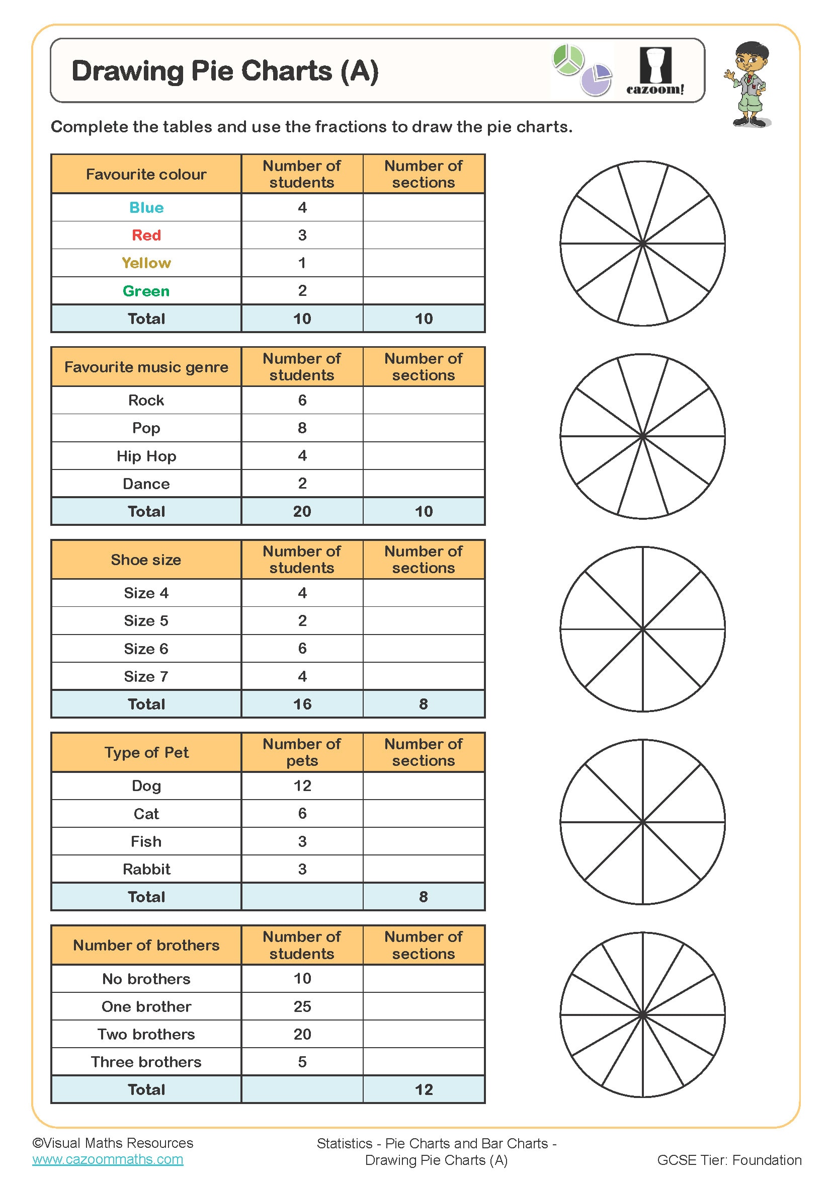
Drawing Pie Charts (A)
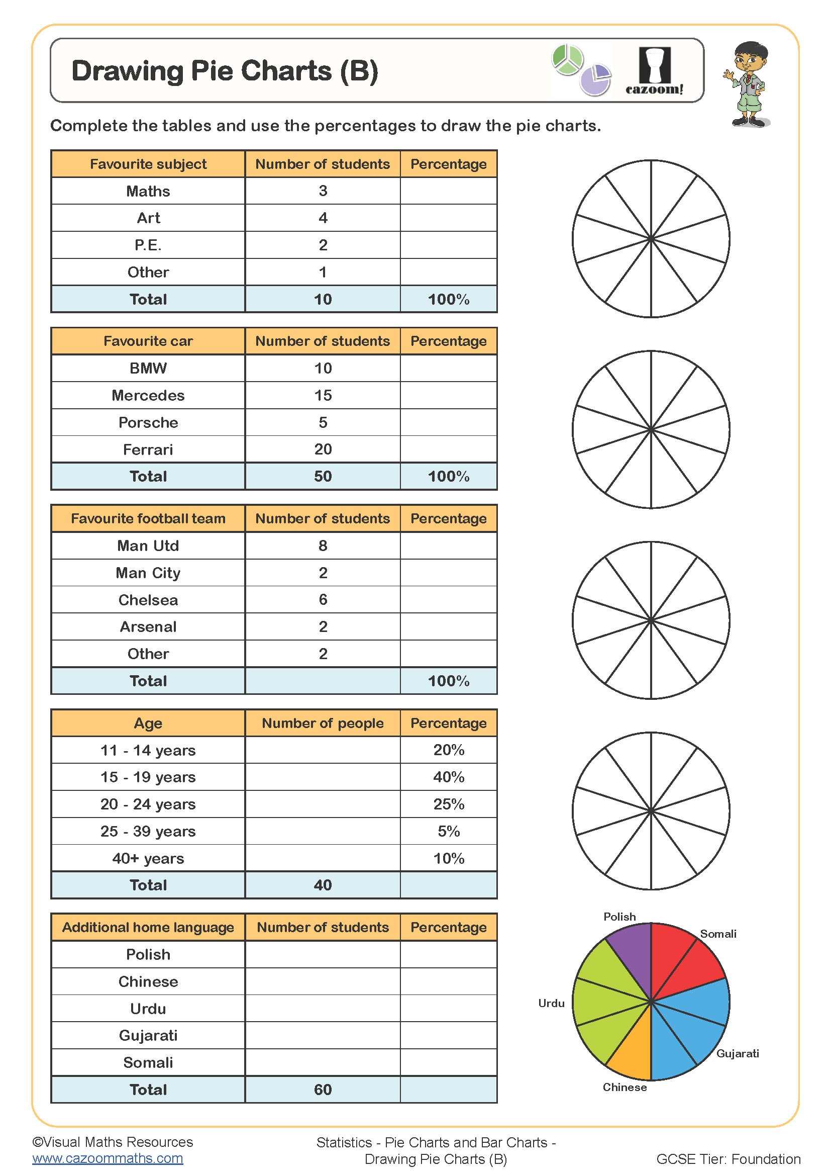
Drawing Pie Charts (B)
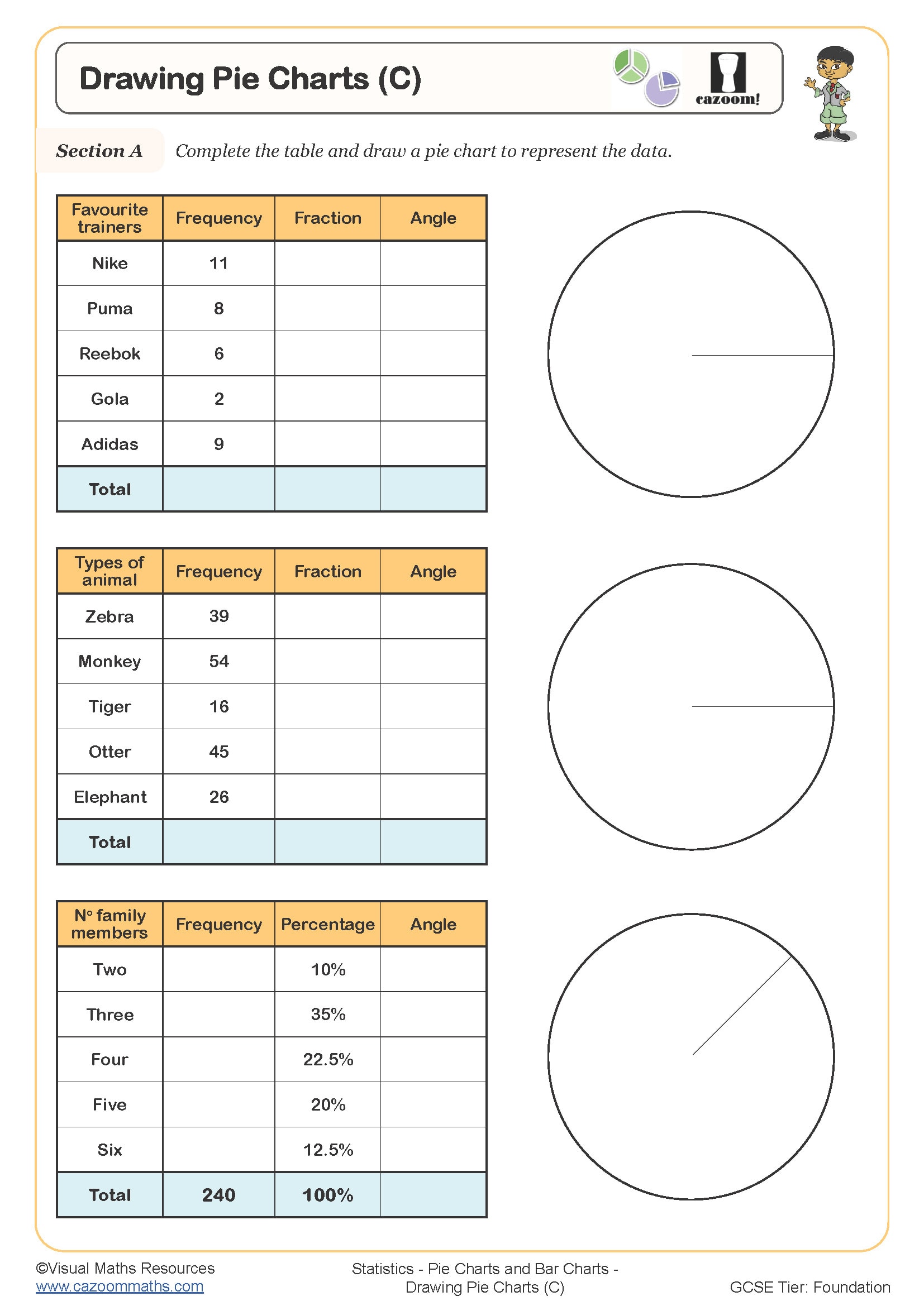
Drawing Pie Charts (C)
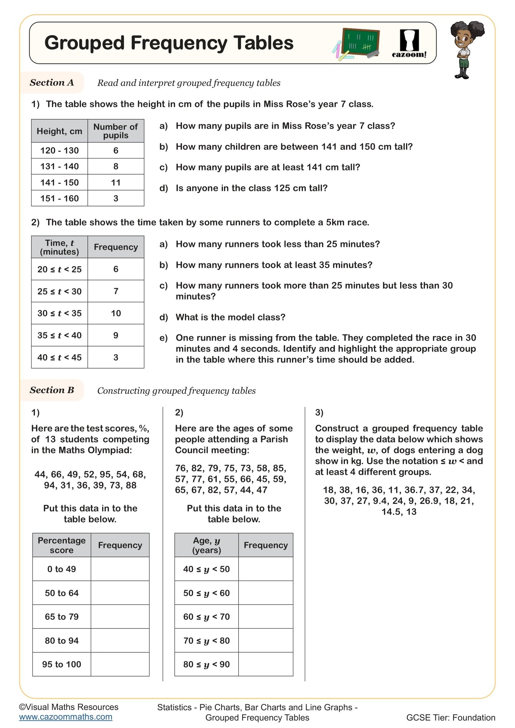
Grouped Frequency Tables
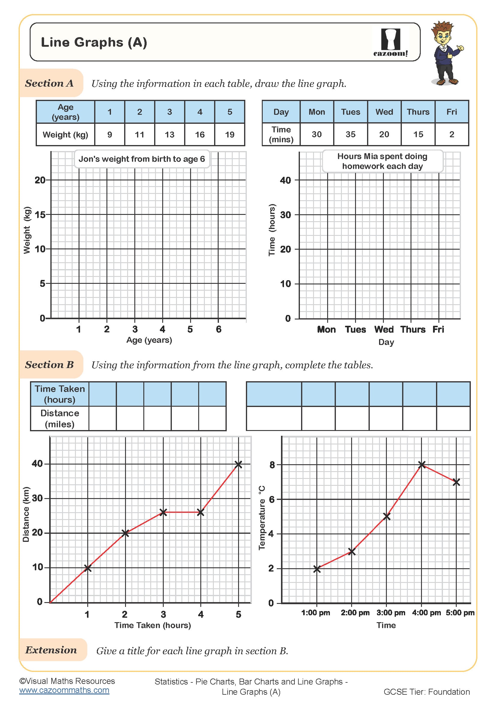
Line Graphs (A)
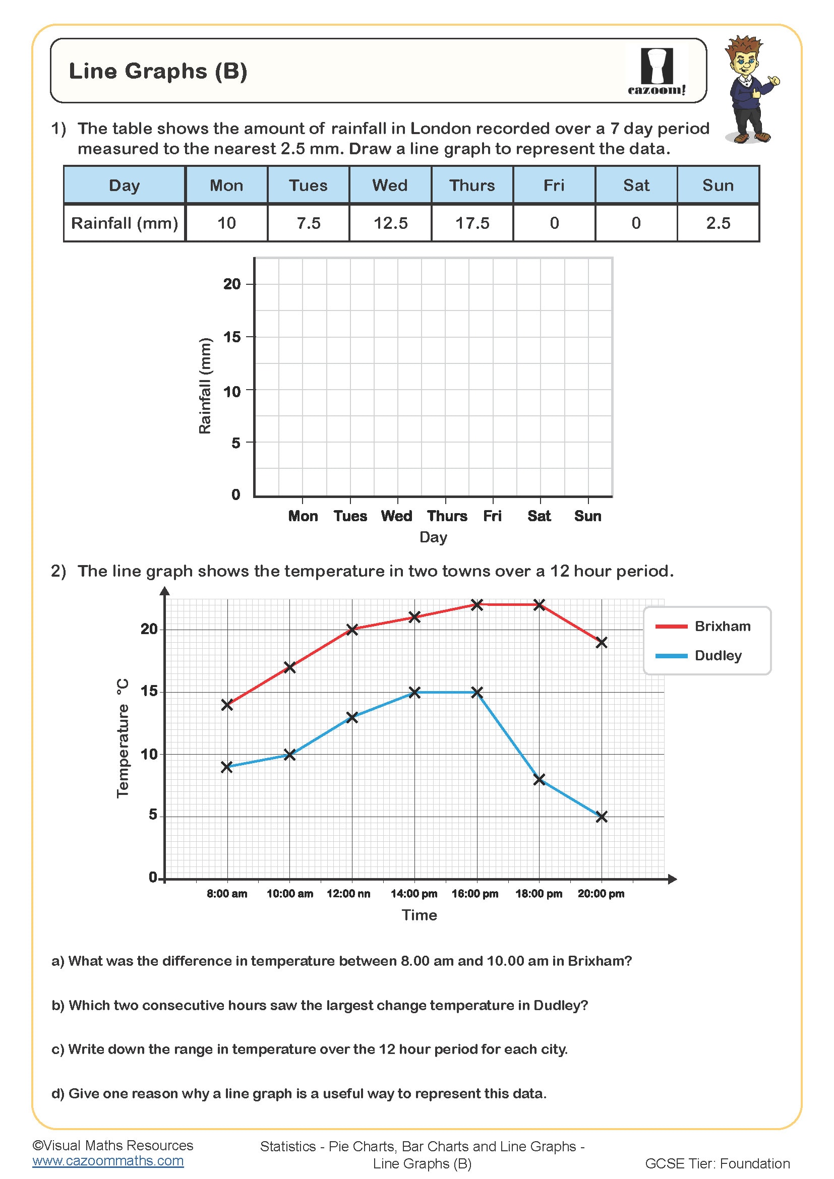
Line Graphs (B)
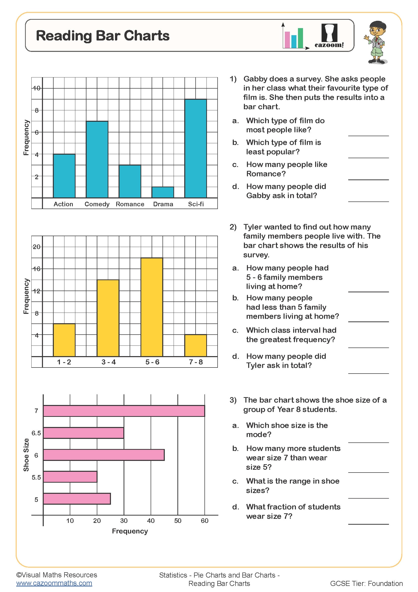
Reading Bar Charts
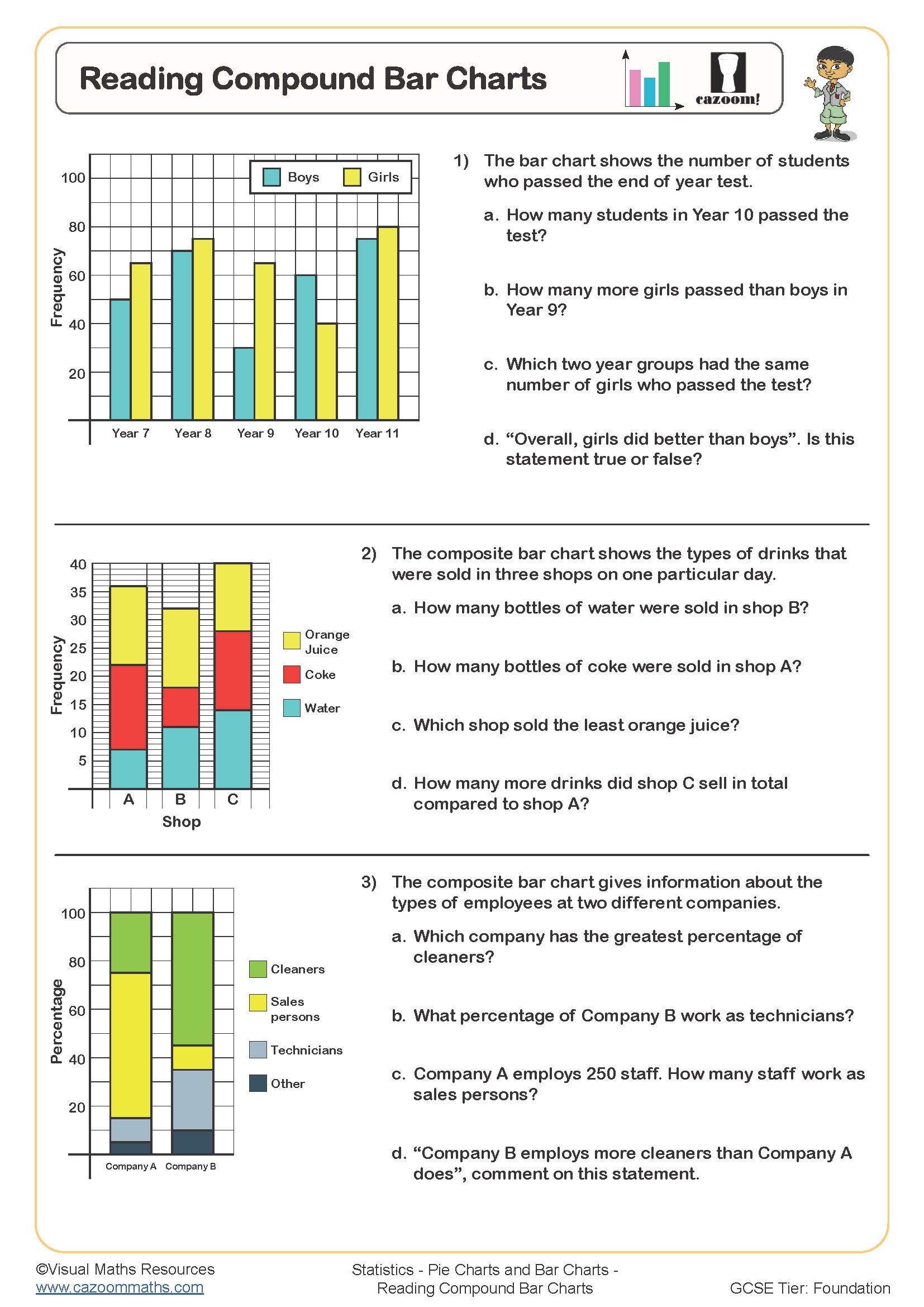
Reading Compound Bar Charts
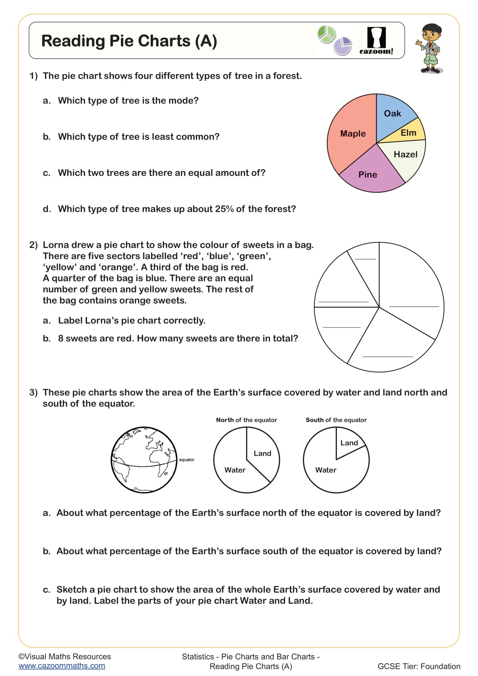
Reading Pie Charts (A)
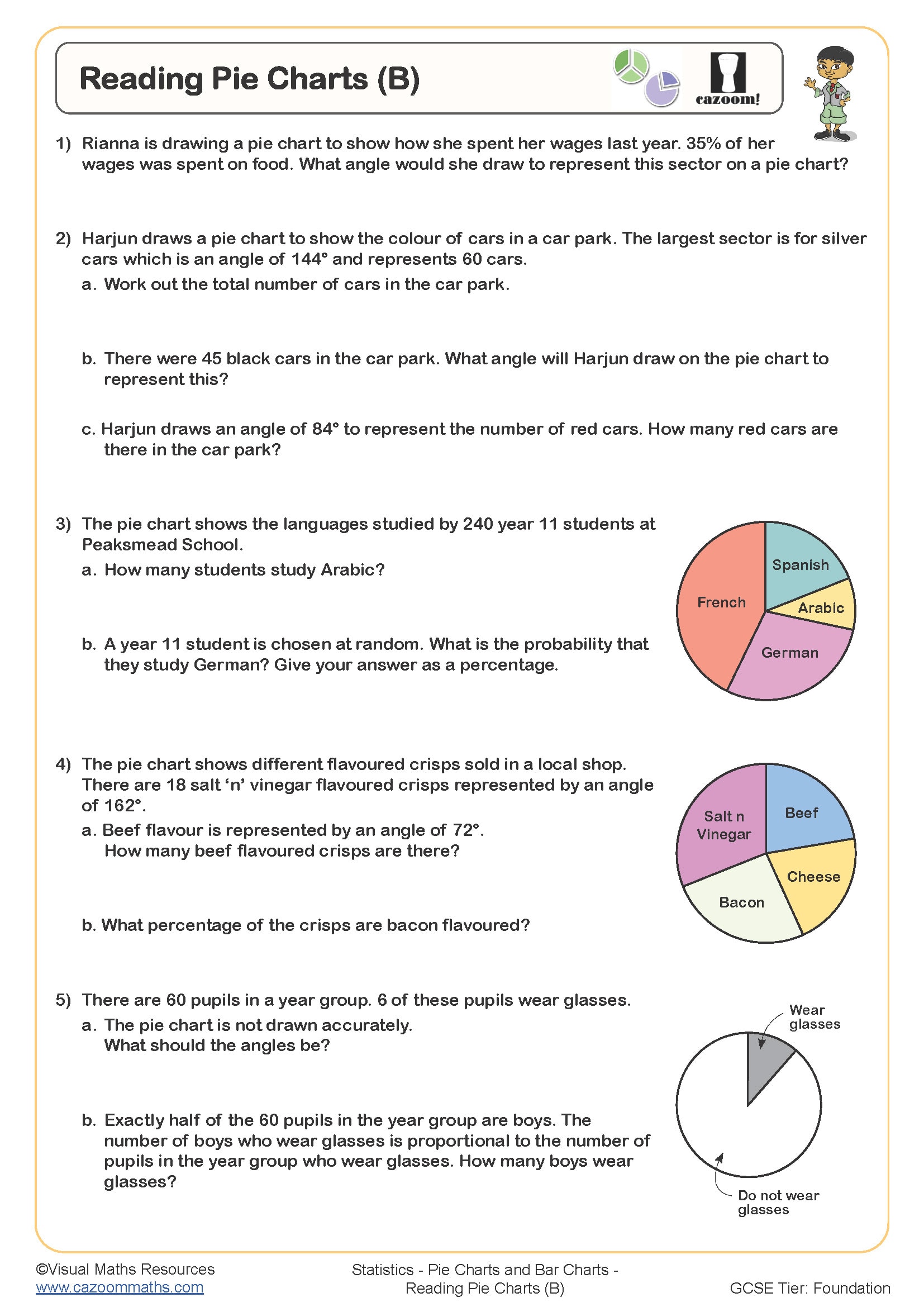
Reading Pie Charts (B)
All worksheets are created by the team of experienced teachers at Cazoom Maths.
How Year 8 Pie Charts, Bar Charts and Line Graphs Worksheets PDFs Build Confidence in Maths
Data representation forms the foundation of statistical understanding in secondary education, bridging Year 7 concepts with more sophisticated analysis required in Year 9 and beyond. The worksheets help students build essential analytical abilities which they use throughout their mathematics, science and geography classes. The step-by-step progression from basic chart reading to advanced graph construction helps students understand essential concepts before moving on to interpretation activities. The different question types enable students to identify patterns and trends and develop their abilities in result presentation. This consistent approach transforms initially hesitant students into confident data handlers who approach statistical problems with clarity and precision.
Specific learning benefits include:
• Master angle calculations for pie chart construction
• Develops scale selection for accurate bar charts
• Strengthens trend identification in line graphs
• Builds confidence in interpreting multi-dataset displays
• Improves accuracy when converting between representations
• Enhances critical evaluation of misleading graphs
• Prepares students for GCSE statistics questions
What Skills Do KS3 Students Learn About Pie Charts, Bar Charts and Line Graphs
The progression through these worksheets follows the proven concrete-pictorial-abstract approach, beginning with straightforward data reading before advancing to construction and critical analysis. Each resource includes worked solutions demonstrating step-by-step methods, allowing students to understand the reasoning behind calculations and representations. The variety ensures pupils encounter different contexts and data types, preparing them for examination questions and practical applications.
The worksheets in this collection include:
• Drawing Pie Charts (A) — introduces sector shading using simple fractional divisions
• Drawing Pie Charts (B) — advances to percentage calculations for accurate sectors
• Drawing Pie Charts (C) — requires angle calculations from frequencies and percentages
• Completing Tables from Pie Charts — develops reverse-engineering skills from visual data
• Reading Bar Charts — focuses on scale interpretation and value extraction
• Drawing Bar Charts from Frequency Tables — teaches axis labelling and appropriate scaling
• Interpreting Line Graphs — builds understanding of continuous data trends
• Criticising Graphs and Charts — encourages evaluation of misleading representations
• Comparative Charts — explores multiple datasets on a single displays
Why Schools Choose Our Year 8 Statistics Worksheets Over Other Resources
Teachers consistently select Cazoom Maths worksheets because they eliminate preparation time whilst maintaining exceptional quality standards. The differentiated structure allows simultaneous use across mixed-ability classes, with extension questions challenging advanced students whilst core exercises support those needing consolidation. Students can focus on math concepts by using clear formatting, which decreases their mental effort when reading instructions. The complete working methods on answer sheets enable educators to detect particular misconceptions when they mark student work. The printable format gives teachers the ability to use it for classroom activities, homework assignments, and revision sessions without the need for technology. The worksheets contain specifically designed problems that follow a structured sequence to prevent the confusion that comes from randomly generated questions without educational organization.
From Planning to Sports: Real-Life Data Representation for Year 8 Pupils
Statistical charts appear throughout daily life, from weather forecasts to social media analytics. Understanding these representations equips students with essential skills for interpreting information critically in an increasingly data-driven world.
• Comparing product prices and sales data in retail environments
• Analysing team performance statistics in football, cricket, and athletics
• Understanding nutrition labels and dietary information breakdowns
• Interpreting climate change data and environmental trends
• Reading public transport timetables and journey planning information
• Evaluating gaming statistics and achievement tracking systems
• Following election results and political polling data
• Managing screen time and digital well-being metrics